Tag: kranthi

Interactive Prototypes And Time-Savers With Adobe Fireworks


As interface designers, we’re often required to demonstrate the look and feel (and interactions) of the interfaces we design. We often begin with a series of flat images, and while these may be pixel perfect and show some amazing detail, they lack the context of the user experience.

Without context, it would be difficult for your clients to understand the flow of an app or website in the way you originally planned it. The best way to introduce context is by adding interactivity. By providing an interactive prototype (or interactive mockup), your clients can play around with it to their hearts’ content to get an idea of how the app will work and to test the interactions.

The tool for creating interactive prototypes that wins hands down is Adobe Fireworks. Fireworks focuses on designing, prototyping and exporting for the Web, and it has a few hidden features that can easily add interaction to your prototypes and that will speed up your workflow.

But first, a little introduction. My name’s Trevor Kay and I’m a designer for Exvo. At Exvo, we create a range of Web apps, from small widgets to full desktop-like Web apps. Using Adobe Fireworks has increased our efficiency in designing and maintaining our app prototypes. “How?�, you may ask. The answer is simple: pages and symbols: the best kept secrets in interface design!

Prototyping In Code Vs. Prototyping In Fireworks

There are many prototyping techniques, and the one you use will depend on your level of technical skill in coding, the speed at which you need to produce the prototype, and the level of visual fidelity needed. Lately, prototyping in the browser has become a popular trend. So, do we still need visual tools such as Photoshop and Fireworks, or can we start right in the browser?

The answer is, it depends! Sometimes prototyping in code is best, and sometimes designing (and prototyping) in the browser is certainly not the answer.

When the prototype needs only simple interactivity, must be created quickly or requires detail and polish in its appearance, then Adobe Fireworks is the perfect tool because you don’t need to know any code to make a live prototype in very little time.

Why not Photoshop? While both Fireworks and Photoshop are excellent design tools (and often compared in UI design), Fireworks can take you one step further and produce a live prototype right from your design. In this article, we’ll cover this subject in more detail.

Fireworks is also very good when you need to create graphics for more complex prototypes that are created in development environments or even in the browser, because it can quickly slice, optimize and export graphic assets and can even help provide the CSS code for layout and text styles.

On the other hand, if you are proficient with code and need to make a prototype with complex interactivity, then prototyping in the browser might be the better option.

Now, let me show you why Fireworks works so well for me in both the prototyping and design phases of my projects!

PNG, Pages, Master Pages

Pages (and PNG)

Fireworks’ best friend is the PNG file format. Together, they achieve some pretty cool things, such as storing a multi-page document in one Fireworks PNG file (known as a Fw PNG). But I hear you say, “PNG is a flat file format!� While this is generally true, a PNG can also be extended to include various types of meta data. By using this ability to add meta data, Adobe Fireworks can store multiple pages in one PNG file, while maintaining complete editability within Fireworks itself (of vectors, bitmap objects, pages, layers, live filters and so on).

The benefit of this is two-fold. First, editable PNG files are usually very small, much smaller than comparable Photoshop PSD files. The actual difference in size can be stunning, as some designers report: one Fireworks PNG editable file with approximately 30 pages (equivalent to 30 separate PSD files or one PSD file containing 30 layer comps) can be as low as 9 MB in size, while in some cases a three-page PSD file (with layer comps, which can partially simulate pages) can be as big as 100 MB or more! A small size also means that Fireworks’ editable PNG files are easy to share and quick and simple to sync, even over a slow Internet connection.

Secondly, by storing all of the screens of your app’s prototype as pages in one file, nothing gets lost, and sending the file itself to coworkers and clients is easy.

One PNG File vs Many PSD files
One Fw PNG file may contain many pages.

Pages give you almost unlimited freedom. You can have many pages in one PNG file, and each page can have its own unique settings. You can also give each page its own name (just like you can rename layers and states). Naming your pages clearly will help you when you make the prototype interactive.

Pages actually enhance the layer model that you might already be familiar with from working with Photoshop, because each page in Fireworks is like a separate file: each page may have its own size, optimization settings, and unique content as well as shared content from other pages. Fireworks also uses layers and states.

Think of each page as a flat canvas for you to place objects on. You can move these objects around and reorder them easily, because you can interact with them directly on the canvas (just as you would with objects in Illustrator), and not through the Layers panel, which can speed up your workflow considerably!

Master Page

Fireworks also has a master page feature, which is a template for all of the other pages in your prototype. Let’s say that the same toolbar appears on all pages of your app: simply place the toolbar on the master page, and it will appear on every page. This eliminates the need to constantly duplicate elements and can save you many hours. Creating a master page is easy: just right-click on any page in the Pages panel and select “Set as Master Page.�

If you need to update an element that appears on all pages, edit it on the master page and it will be automatically updated on all other pages!

Note that objects placed on the master page will appear at the same coordinates on all other pages connected to the master page. You cannot move or change the position of master-page objects on a per-page basis.

You can also share layers to pages, which is an alternative to using a master page. However, the master page always shares all of its layers to all pages, whereas sharing a layer from a page allows you to select which pages the contents of the shared layer should appear on.

Select Behind Tool, Subselection Tool, Symbols

Fireworks also provides two powerful tools to help you avoid touching the Layers panel (and work more efficiently): the Select Behind tool and the Subselection tool.

(A layer in Fireworks is a container for objects (much like a group in Photoshop), whereas a layer in Photoshop is an individual object.)

Select Behind Tool

The Select Behind tool (located in the Tools panel or by pressing V twice) enables you to select a top-most object, and, with repeated clicking, select each of the elements directly beneath it in turn. This is yet another feature that helps you work more efficiently by not requiring you to awkwardly navigate the Layers panel, searching for an object either by name or tiny thumbnail.

Select Behind tool
In this example, five individual objects are placed on the canvas. With the Select Behind tool, selecting any object beneath another object is easy.

Subselection Tool

The Subselection tool (located in the Tools panel or by pressing A) enables you to select individual objects that are part of a group. This speeds things up because you won’t have to continually ungroup and regroup objects.


In this example, five objects are grouped together. With the Subselection tool, selecting any object inside the group is easy.

Once you get into the habit of working with pages and objects, you will feel a weight lift from your shoulders. The Select, Select Behind and Subselection tools make it a breeze to interact with the elements in your design!

See the article “Using Pages, States, and Layers in Fireworks CS4� by David Hogue for an excellent explanation of how all three elements interact with each other in Adobe Fireworks.

Symbols

Symbols are another powerful feature in Fireworks, and they complement pages and master pages quite nicely. A symbol is a special graphic group that gives you “edit once, update everywhereâ€� functionality, which saves a lot of time, too. Any object, layer or group of objects can be turned into a symbol simply by pressing F8 or by going to Modify → Symbol → Convert to Symbol in the menu. (We’ll talk about symbols in detail later.)

Want to learn a bit more about symbols in Fireworks? Watch the useful video tutorial “The Power of Symbols in Adobe Fireworks� by Rogie King.

How To Create Interactive Prototypes

All of the Fireworks workflow improvements mentioned so far are important on their own, but the real magic happens when you start making interactive prototypes. Fireworks was originally created by Macromedia as a tool targeted specifically at Web designers, and Adobe continues to develop Fireworks in this direction. It covers a lot of the things we need: pages, master pages, symbols, styles, bitmap- and vector-editing tools, and one of the best image exporting and compression features. But Fireworks has another feature that the Web has pretty much forgotten about: image maps.

Image Maps and Hotspots

Fireworks uses hotspots to generate image map areas. An image map encompasses multiple areas, which are referred to as “hotspots.â€� Adding a hotspot is as simple as selecting an object on the canvas, right-clicking on it and selecting “Insert Hotspot.â€� Alternatively, you can use the shortcut Control/Command + Shift + U, or in the menu go to Edit → Insert → Hotspot. You can also manually add hotspots with the Hotspot tool (found in the Tools panel).

Hotspots may be rectangular, circular or polygonal, but the best practice is to use rectangular hotspots because you can’t replicate circular or polygonal hotspots with normal links, which the final product will have. Also, if you decide to export the prototype to a PDF, only the rectangular hotspots will export.

Two Hotspots in Fireworks
Two hotspots (notice the blue-colored overlay).

Once added, a hotspot will appear as a blue-colored overlay above everything else. If you wish, you can change the color of a hotspot in the Properties panel. Hotspots exist in the Web Layer, which always resides at the top of all layers in the Layers panel.

Web Layer in the Layers panel
Inside the Web Layer.

Note that when you export a prototype to HTML, the names that you gave to the pages in the Fireworks PNG document will become the names of the exported HTML files.

Manipulating Hotspots

When a hotspot is selected, the Properties panel will change and give you the option to add a link to the currently selected hotspot, as well as to specify how that link should open (in the same window or a new one, for example). The link could point to an external website (such as http://www.smashingmagazine.com) or to an internal Fireworks page. By linking to an internal page, you have taken the first step in making your prototype interactive.

Properties Panel
The Properties panel when a hotspot is selected.

The selector for link: is divided into two sections, separated by a horizontal divider. Below the divider are the pages in the current Fireworks file; above the divider are all links currently in use in the open Fireworks document, and they may be either internal or external links.


A list of URLs in the Properties panel.

Now, all you have to do is go through the rest of the prototype and add the links. Remember, anything may be a linked hotspot. Need that button to open a new page? Done. Need that image in the slideshow to look like it progresses to the next image? Done. Achieving these effects really is that simple, and it will change the way you present your design prototypes. Also, you don’t have to worry if the names of your pages change; Fireworks will handle that for you as well and will automatically change all relevant hotspot links so that nothing becomes unlinked.

Export the Prototype

Once you have created all of your hotspots, how do you go about sending your clients the interactive prototype? Of course, you wouldn’t send them the editable Fw PNG file. While the PNG file contains all of your pages and links, it isn’t interactive. Clicking on a hotspot in Fireworks would not take you to the linked page; it would just select the hotspot. To make the prototype interactive, you need to export it to HTML files. These HTML files are what your clients can view and click through. They can be opened in any browser (Firefox, Safari, Chrome, Internet Explorer, Opera), so you don’t need to worry about compatibility.

The Export Dialog in Fireworks
The Export dialog in Fireworks.

When exporting an interactive prototype, use the default option of “Put images in Subfolder� to keep everything neat and organized. This has the added benefit of allowing you to easily send only the images to the client, if required. The exported images may be in any common image file format: PNG8, PNG24, PNG32, JPG, JPG Progressive, GIF. Note that the default format of the exported images is determined by their page’s optimization settings and then overridden by any slice’s individual optimization settings, which gives you a fair amount of control and flexibility.

Fireworks Pages: What Is Their Limit?

Pages allow for the efficient creation of prototypes, but what happens if they become too efficient?

Handling a Fireworks PNG Document With Many Pages

I don’t know what the record is for a Fireworks document with the most pages in it, but I currently have one with over 150 pages, and it is still growing! While this is a complex file with a large number of objects, it shows how awesome Fireworks’ PNG file format is: the file’s actual size is only 16.6 MB!

Moar pages??
150 pages in one Fireworks PNG document? Possible!

Why would anyone need a prototype that big? The simple answer is that I’m designing a complex app (Exvo’s Web app), and many intricate parts need to be covered by the prototype, so I’ve let it keep growing and growing.

While Fireworks can handle that many pages, it is certainly not recommended, for performance reasons. Try to keep your documents to fewer than 50 pages inside. Once you get past 50 pages, you might notice that Fireworks starts to use more RAM and opens and saves the document more slowly than usual. Performance also depends on each page’s canvas size, the number of objects and more, so keep the pages to a reasonable number to maintain an efficient file.

Pages Under Control: Splitting a Complex PNG File

Should our Fireworks PNG file become too large and unwieldy, how do we reduce the number of pages and optimize it? Because we are now relying on Fireworks’ ability to link pages and hotspots to create an interactive prototype, the hotspot links need to remain intact, even if we split the complex Fireworks PNG into several files. So, how do we proceed? Is it possible?

First, go through the prototype and make sure it is structured as defined sections. If the prototype is properly structured, we can split it up into smaller, more manageable pieces. To do this, we will need to count how many sections are in the prototype. If there are 10 main sections, for example, we would duplicate the file 10 times.

After that, we rename the duplicated files to match the sections of the prototype. Then, we open each of the duplicated prototype files and simply delete the pages that are irrelevant to that section; this will take some time and you have to be careful, but it is worth the effort. And… that’s it! You have now successfully split up your massive project file into more manageable pieces.

We also have to ensure that the smaller prototype files keep things together so that the exported HTML continues to link up correctly. To do this, we have to make sure that all of our top-level page names stay the same. While the relevant links will be changed within the single prototype file to make sure there is no unlinking, the other files will not update and will thus become unlinked. If you do opt to change the name of a top-level page, you would have to go through all of the other Fw PNGs and alter the hotspot links by hand.

If you do opt to split up a Fireworks PNG into multiple PNGs, then the master page and symbols will become unlinked. If you make a change to one PNG file, you will need to make the same change in all corresponding PNG files.

One prototype now Split into Several Smaller Ones
The prototype (Fw PNG) is now split into several smaller files.

The massive prototype file we had is now split up into smaller pieces, so you will surely want to export it to be interactive. This is still possible and made easier if you still have the original large prototype file. Export the large prototype to a folder so that all pages are in the one folder. Keep this folder around because when you make changes to your smaller prototype files in the future, all you will have to do is export to this folder and overwrite the old files. Because all of our top-level links are still the same, everything will link up correctly as long as all of the exports are saved to the same folder.

Symbols

While pages facilitate file management and enable us to easily make interactive prototypes, Fireworks gives us other workflow improvements, too, such as symbols. Symbols originate in Flash and are an easy way to build a library of reusable elements. If UI design has one defining characteristic, it is reusable elements. Here are a few things that make symbols in Fireworks so powerful:

  • Once a symbol is created, you can save it to the Fireworks Common Library;
  • Fireworks symbols allow for intelligent scaling with the use of 9-slice scaling guides;
  • Symbols can be scaled as much as you like without losing quality.

Let’s take a close look at these features.

Reusability of Symbols

One of the best features of symbols in Fireworks is their reusability.

Symbols can be document-specific or available globally through the Common Library panel. Saving symbols to the Common Library means that no matter what document is open, all of your symbols will be available to use. The benefit is that you don’t have to recreate common UI elements across each prototype. If all of your apps have the same theme, then once your symbols have been created and saved to the Common Library, you will save yourself a lot of time by not having to redraw everything from scratch. This is an amazing time-saver because now all of your UI elements can be simply dragged and dropped into the current project!

The Document Library contains all of the symbols that have been used in the current document; these could include symbols selected from the Common Library, as well as symbols created specifically for that document. A benefit of the Document Library is that anyone who opens the Fireworks file will have access to all of the symbols being used in that document, including any symbols that were not created on their computer.

Symbol libraries
The Fireworks libraries of symbols: Common Library (left) and Document Library (right).

9-Slice Scaling Guides

Symbols may also include 9-slice scaling guides. These guides make it possible for you to define how a symbol will scale intelligently in all directions, and they reduce the number of times you need to manually edit vector points in order to change the object’s size. You can learn more about 9-slice scaling in a video tutorial by Jim Babbage and in a detailed article by Sarthak Singhal.

The 9-slice scaling guides are optional and are not included by default. You can decide whether to use them based on the type of object that you’re converting to a symbol. To make things even easier, Fireworks also gives you the option to activate or deactivate the guides for any existing symbol.

When you edit a symbol for which the 9-slice scaling guides are enabled, Fireworks presents you with the graphic for the symbol as well as four guides overlaid on top. These guides effectively divide the symbol into nine slices, with each determining how a particular part of the symbol will transform when scaled:

  1. Corner slices
    All corners will not resize and will stay the same size no matter what. This is very effective for buttons made out of rounded rectangles.
  2. Left and right slices
    These two slices will transform vertically but not horizontally.
  3. Top and bottom slices
    These two slices will transform horizontally but not vertically.
  4. Center slice
    This slice will transform both horizontally and vertically.

A Symbol in Symbol-editing mode
A Symbol in symbol-editing mode.

The ability to reuse and resize symbols without losing quality is what makes them so powerful. You will have a common set of elements ready to be dragged and dropped into your prototypes. The amount of time this alone will save you is amazing.

Just as Fireworks uses PNG as its primary file format, symbols are also stored as PNG files. All Common Library symbols can be found in the following location:

  • Mac OS X
    ~/Library/Application Support/Adobe/Fireworks CS5/Common Library
  • Windows XP
    C:\Documents and Settings\*username*\Application Data\Adobe\Fireworks CS5\Common Library
  • Windows Vista and 7
    C:\Users\*username*\AppData\Roaming\Adobe\Fireworks CS5\Common Library

(If you are using a different version of Fireworks, just replace “CS5� with the version you’re using.)

If you ever need to migrate to a new machine or give a coworker access to your symbols, all you need to do is copy your symbols to the new location and Fireworks will recognize them instantly!

The Common Library
The Common Library in Fireworks.

Download A Sample Fireworks PNG File

Want to jump right into pages and symbols and easily make an interactive prototype with Fireworks? To help you, we have created a three-page prototype of an iPhone music player for you to download. You can open the music-player-demo.fw.png file in Fireworks and export it to a small interactive prototype.

Three-page demo prototype for download

The sample Fireworks PNG not only will show you how hotspot links and pages work, but will give you a chance to play around with symbols. To export the Fireworks PNG as “HTML and Images,â€� just go to File → Export. Set the “Exportâ€� type to “HTML and Imagesâ€� and set “Pagesâ€� to “All,â€� and then select where on your computer to export it to. After the export, open one of the HTML files in a browser and try interacting with the prototype, navigating through the app by clicking the links.

When you’re testing the file, make sure the following panels are open in Fireworks: Pages, Layers, Document Library and Properties. Feel free to experiment with the prototype, add more hotspots and pages, and navigate around to see how the file is organized and how the pages inside are linked together. (Seeing which parts will be clickable once they’re exported is easy because the hotspots are marked in blue.) The file also makes use of symbols (stored in the PNG file itself — see the Document Library panel), shared layers and a master page.

Further Reading

(al) (jc)


© Trevor Kay for Smashing Magazine, 2012.


A Hands-On Experience Of The Rehabilitation Of The Script


Serifs, sans serifs and… scripts. In theory not a bad typographic palette to play with, but when it comes to practice, the options are always far fewer.

One member of that stylistic trio could never quite punch its weight. Over the last few years, however, we have seen something of a rebirth and revitalization of scripts, a category that once represented a care home for the typographically underemployed. Why has this come about, and why was one needed in the first place?

The problem with scripts was that, although they were supposed to offer a freer, natural, handwritten style of lettering, when you tried to use them, most turned out to be more rigid and constricting than sans serifs and serifs. There was little room for any play with letterspacing, because the characters needed to connect. Uppercase letters could be, to put it mildly, equivocal in terms of legibility.

Although one of their traditional default applications was wedding invitations, even there you could run into problems. If the RSVP address included a postal code composed of capital letters and numbers, the visual effect was clumsy at best, unreadable at worst. There was often a density of strokes in the x-height area that impeded legibility, an angle that always seemed to dog scripts; like handwriting itself, certain words could look ambiguous, or not readily identifiable. If you pushed nagging doubts to one side and persevered in your decision to use a script on aesthetic grounds—just because it looked great or felt right—it would frequently be shot down by client or editor, for lack of clarity.

For a typeface this is a considerable disadvantage; as designers we can sometimes be forgiving, but others can be brutally frank. Jan Tschichold, in his 1946 book An Illustrated History of Writing and Lettering, provides a possible explanation as to why this state of affairs came about, blaming eighteenth century “seductive engraved copy-books”, where a florid over-decorative style, which owed little to genuine penmanship, had emerged. What would be called the copperplate style, and commercial script, was a further distortion of this, using “regular alternation of fine and thick strokes [to disguise] the unnatural writing technique”.

Where it went wrong, according to Tschichold
Where it went wrong, according to Tschichold. The abandonment of a natural writing style in favour of decoration.

There was also a stylistic handicap. R.S. Hutchings, in A Manual of Script Typefaces (1965) says: “Until well into the 1930s it was exceptional for even a well-stocked composing room to hold more than a single script series, and their use was restricted almost exclusively to the circumscribed field of professional and social stationery”. To test this out I took a look at my copy of the beautiful A Book of Typefaces produced by printers WS Cowell of Ipswich, England in 1952.

In their main display of faces is a solitary script, Marina, a 1936 design from Stephenson Blake, the standard copperplate style that would have been hauled out if someone came in and wanted some wedding invitations printed. It’s this kind of lifeless, off-the-peg sophistication to which designer Michael Bierut alludes in Gary Hustwit’s Helvetica film, when talking of corporate makeovers of the 1960s; clients would have “some letterhead that would say ‘Amalgamated Widget’ on the top and some goofy… maybe a script typeface… the nuptial script and the ivory paper.”

Marina in action
Marina in action; although Cowell’s catalogue features some attractive pages of type in action, this is probably the least confident example. The fault of the type?

Style of American ads of the forties and fifties.
Scripts were almost a default headline style for American ads of the forties and fifties, a “visual bad habit that was endemic in those days,” says Michael Bierut. But some have since found them inspirational.

Later, more informal styles emerged, based on letters written with a brush, or contemporary handwriting. Several have become standards on computer operating systems; Brush Script, a 1940s American Type Founders advertising face by Robert E Smith, and the celebrated Mistral of Roger Excoffon (1953), a handwriting-style script that belonged, says Julien Gineste in Roger Excoffon et la Fonderie Olive, “to the ‘civilization’ of the ballpoint pen”. A more recent addition to the lineup has been Hermann Zapf’s magisterial Zapfino (1998).

Yet all three present problems. Think of the logo of world-conquering 1980s Australian soap Neighbours to get an aesthetic reading on Brush Script. Excoffon’s designs are wonderful but, outside of France, carry too much aesthetic baggage. They seem more like works of art than typographic workhorses. Zapfino is a cathedral; you want to fall to your knees before the power of its sweeping ascenders and descenders, but it feels like a script that no mortal hand could actually have formed. Just how or where do you use it?

Brush Script
Everybody needs good ones—scripts that is. Brush Script was used for the logo of Kylie’s springboard.

Roger Excoffon overcame the physical limitations of metal type while moving diametrically away from the rising Swiss aesthetic.

Label using Zapfino.
Cynical writer proved wrong; the designer of this label thought Zapfino was just the thing.

Fortunately the choice has broadened considerably. With it a lot of the old legibility issues seem to have disappeared; surely a result of faces being properly designed and considered for a purpose, rather than being bastardized historical hand-me-downs. Nick Cooke has recently released Rollerscript, described in MyFonts’ March 2012 Creative Characters newsletter as “the most realistic script face on the market”. Rollerscript is based on multiple versions of characters written in his own hand using a Pentel roller pen. I wondered if he thought there was a script renaissance, and what the reasons were:

“There has been a huge rise of script/handwriting fonts over the past couple of years and it’s definitely to do with more type designers exploring the features of OpenType and the complexities of programming. Designers are finally becoming aware of and are embracing OpenType technology and its possibilities for more expressive type usage, now that most programs are OT savvy, even the dreaded—by me—MS Word.”

Nick Cooke's latest typeface.
Nick Cooke’s latest comes in Rough and Smooth versions, seen here. Described as a “modern sister” to his Olicana, it has over 100 ligatures.

Developments in software are clearly a factor then, but maybe another is that different people are moving into the field. Nick continues:

“I noticed that when I released an earlier script, Olicana, in 2007 there were many more purchases from the USA than in Britain. I think scripts have been popular over there a lot longer than here. Of course there are a lot of very poor fonts but there are also many more fantastic new ones available from the likes of Alejandro Paul at Sudtipos, Laura Worthington and Emily Lime. This seems to be an area which attracts more women designers, which is a good thing. Type design has for too long been pretty much a male preserve.”

At the site of Argentinian collective Sudtipos, you can probably see more connecting and brush scripts in one place than anywhere else, or at any point in history. This struck me as possibly beeing culturally influenced, and brought to mind the beautiful individualistic script lettering you can often see on shop fascias in Spain. But assumptions can be risky. In Creative Characters: the MyFonts interviews, volume 1, Alejandro Paul says that Argentinian graphics are broadly European modernist in flavour, outside of packaging his own background. Much of his inspiration comes from early twentieth century American scripts.

Which brings us back to one of Nick Cooke’s observations. It’s a field in which Buffalo, NY-based P22 are strong. They offer as one option fonts based on the handwriting of artists: Cézanne, Van Gogh, Michelangelo, Rodin, Monet and Gauguin. Christina Torre’s Dearest is an elegant addition to this field, although using an anonymous nineteenth century German book as its source. But the twentieth century advertising feel is strongly represented too: Rob Leuschke’s Corinthia and Michael Clark’s Sneaky are two examples. Richard Kegler’s Casual Script is a “free-flowing thin brush style evocative of vintage product advertisements and packaging lettering”.

Alejandro Paul's Buffet Script.
Alejandro Paul’s Buffet Script was based on the calligraphy of American sign-writer Alf Becker. (image from Creative Characters: the MyFonts interviews, vol 1).

P22 Gauguin.
P22 Gauguin, based on the artist’s own handwriting.

P22 Casual.
P22 Casual—look at the ad picture above, and the source of inspiration is fairly clear.

Nick also picks up on a significant, wider trend; the desire for the handmade: “I think designers nowadays are looking for a personal touch and faux handwriting is just part of that ‘homemade aesthetic’ trend”. This is due partly to the turning of fashion’s wheel.

During the 1990s the complete dominance of computer-generated design made other methods look obsolete. It was a period in which photography dominated, to the point that Rick Poynor could write in Eye in 1993 that “the effect of the continuing preference for photography… is to make most design based on illustration look decidedly old hat”. Photography could be easily manipulated in Photoshop and—certainly in the UK—we saw the blanket dominance of the “fuzzy-photo” school of book cover design. Why spend money commissioning an illustration when you could use a stock photo, or even take one yourself? Crop in very close or take your subject at a great distance and then, crucially, blur to add mystery, obscure awkward details and cover up any technical shortcomings in the picture.

Eventually people tire of production line design that anyone can do, and turn again to the personal and the handcrafted, though. The latter also chimes with the post global-economic-meltdown, do-it-yourself aesthetic that has also seen a rise in popularity of traditional homemaking crafts previously considered moribund, such as sewing and knitting. But—and here I risk making myself very unpopular—I think there’s another contributing factor to the rise of the script. It may be sublimal, but significant—the ubiquity of Comic Sans.

Although it is not a script in the sense that the letter-forms connect, consider its source of inspiration. The lettering in the speech balloons of comic books are handdrawn, and often have a slight calligraphic incline to them. It is this characteristic that drew enough people to use it in its early years, as a bundled font for Windows 95, for it to reach a tipping point of familiarity, to over-familiarity. As its creator Vincent Connare has said: “People like it because it isn’t the kind of font that they would use to type a serious letter.” Although you might complain that that is exactly what a lot of people have been doing with it for years, his point is an important one. Comic Sans has had an impact on our feel for type, whether we like it or not. Part of that effect has been a new wave of lively, fun, informal scripts, definitely not the kinds that you would use for your society wedding invites.

Now I’m getting out of here before you start looking around for something to throw.

(il) (jc)

Note: A big thank you to our typography editor, Alexander Charchar, for preparing this article.


© Simon Loxley for Smashing Magazine, 2012.


Hands-On Experience: The Rehabilitation Of The Script


Serifs, sans serifs and… scripts. In theory not a bad typographic palette to play with, but when it comes to practice, the options are always far fewer.

One member of that stylistic trio could never quite punch its weight. But over the last few years we have seen something of a rebirth and revitalization of scripts, a category that once represented a care home for the typographically underemployed. But why has this come about, and why was one needed in the first place?

The problem with scripts was that although they were supposed to offer a freer, natural, handwritten style of lettering, when you tried to use them, most turned out to be more rigid and constricting than sans serifs and serifs. There was little room for any play with letterspacing, because the characters needed to connect. Uppercase letters could be equivocal, to put it mildly, in terms of legibility.

Although one of their traditional default applications was wedding invitations, even there you could run into problems. If the RSVP address included a postal code composed of capital letters and numbers the visual effect was clumsy at best, unreadable at worst. There was often a density of strokes in the x-height area that impeded legibility, an angle that always seemed to dog scripts; like handwriting itself, certain words could look ambiguous, or not readily identifiable. If you pushed nagging doubts to one side and persevered in your decision to use a script on aesthetic grounds — just because it looked great or felt right — it would frequently be shot down by client or editor for lack of clarity.

For a typeface this is a considerable disadvantage; as designers we can sometimes be forgiving, but others can be brutally frank. Jan Tschichold, in his 1946 book An Illustrated History of Writing and Lettering, provides a possible explanation as to why this state of affairs came about, blaming eighteenth century “seductive engraved copy-books”, where a florid over-decorative style had emerged which owed little to genuine penmanship. What would be called the copperplate style, and commercial script, was a further distortion of this, using “regular alternation of fine and thick strokes [to disguise] the unnatural writing technique”.

Where it went wrong, according to Tschichold
Where it went wrong, according to Tschichold, the abandonment of a natural writing style in favour of decoration.

There was also a stylistic handicap. R.S. Hutchings, in A Manual of Script Typefaces (1965) says: “Until well into the 1930s it was exceptional for even a well-stocked composing room to hold more than a single script series, and their use was restricted almost exclusively to the circumscribed field of professional and social stationery”. To test this out I took a look at my copy of the beautiful A Book of Typefaces produced by printers WS Cowell of Ipswich, England in 1952.

In their main display of faces is a solitary script, Marina, a 1936 design from Stephenson Blake, the standard copperplate style that would have been hauled out if someone came in and wanted some wedding invitations printed. It’s this kind of lifeless, off-the-peg sophistication to which designer Michael Bierut alludes in Gary Hustwit’s Helvetica film, when talking of corporate makeovers of the 1960s; clients would have “some letterhead that would say ‘Amalgamated Widget’ on the top and some goofy… maybe a script typeface … the nuptial script and the ivory paper.”

Marina in action
Marina in action; although Cowell’s catalogue features some attractive pages of type in action, this is probably the least confident example. The fault of the type?

Style of American ads of the forties and fifties.
Scripts were almost a default headline style for American ads of the forties and fifties, a “visual bad habit that was endemic in those days,” says Michael Bierut. But some have since found them inspirational.

Later, more informal styles emerged, based on letters written with a brush, or contemporary handwriting. Several have become standards on computer operating systems; Brush Script, a 1940s American Type Founders advertising face by Robert E Smith, and the celebrated Mistral of Roger Excoffon, (1953) a handwriting-style script that belonged, says Julien Gineste in Roger Excoffon et la Fonderie Olive, “to the ‘civilization’ of the ballpoint pen”.

A more recent addition to the lineup has been Hermann Zapf’s magisterial Zapfino (1998). But these three all present problems. Think of the logo of world-conquering 1980s Australian soap Neighbours to get an aesthetic reading on Brush Script. Excoffon’s designs are wonderful, but outside of France, carry too much aesthetic baggage. They seem more like works of art than typographic workhorses. Zapfino is a cathedral; you want to fall to your knees before the power of its sweeping ascenders and descenders, but it feels like a script that no mortal hand could actually have written. Just how or where do you use it?

Brush Script
Everybody needs good ones — scripts that is. Brush Script was used for the logo of Kylie’s springboard.

Roger Excoffon overcame the physical limitations of metal type while moving diametrically away from the rising Swiss aesthetic.

Label using Zapfino.
Cynical writer proved wrong; the designer of this label thought Zapfino was just the thing.

Fortunately the choice has broadened considerably. With it a lot of the old legibility issues seem to have disappeared, surely a result of faces being properly designed and considered for a purpose rather than being bastardized historical hand-me-downs. Nick Cooke has recently released Rollerscript, described in MyFonts” March 2012 Creative Characters newsletter as “the most realistic script face on the market”. Rollerscript is based on multiple versions of characters written in his own hand using a Pentel roller pen. I wondered if he thought there was a script renaissance, and what the reasons were:

“There has been a huge rise of script/handwriting fonts over the past couple of years and it’s definitely to do with more type designers exploring the features of OpenType and the complexities of programming. Designers are finally becoming aware of and are embracing OpenType technology and its possibilities for more expressive type usage, now that most programs are OT savvy, even the dreaded — by me — MS Word.”

Nick Cooke's latest typeface.
Nick Cooke’s latest comes in Rough and Smooth versions, seen here. Described as a “modern sister” to his Olicana, it has over 100 ligatures.

Developments in software are clearly a factor then, but maybe another is that different people are moving into the field. Nick continues:

“I noticed that when I released an earlier script, Olicana, in 2007 there were many more purchases from the USA than in Britain. I think scripts have been popular over there a lot longer than here. Of course there are a lot of very poor fonts but there are also many more fantastic new ones available from the likes of Alejandro Paul at Sudtipos, Laura Worthington and Emily Lime. This seems to be an area which attracts more women designers, which is a good thing. Type design has for too long been pretty much a male preserve.”

You can probably see more connecting and brush scripts in one place at the site of Argentinian collective Sudtipos than anywhere else, or at any point in history. This struck me as possibly a cultural influence, and brought to mind the beautiful individualistic script lettering you can often see on shop fascias in Spain. But assumptions can be risky. In Creative Characters: the MyFonts interviews, volume 1, Alejandro Paul says that Argentinian graphics are broadly European modernist in flavour, outside of packaging, his own background. Much of his inspiration comes from early twentieth century American scripts. Which brings us back to one of Nick Cooke’s observations. It’s a field in which Buffalo NY-based P22 are strong. They offer as one option fonts based on the handwriting of artists: Cézanne, Van Gogh, Michelangelo, Rodin, Monet and Gauguin. Christina Torre’s Dearest is an elegant addition to this field, although using an anonymous nineteenth century century as its source. But that twentieth century advertising feel is strongly represented too: Rob Leuschke’s Corinthia and Michael Clark’s Sneaky are two examples. Richard Kegler’s Casual Script is a “free-flowing thin brush style evocative of vintage product advertisements and packaging lettering”.

Alejandro Paul's Buffet Script.
Alejandro Paul’s Buffet Script was based on the calligraphy of American signwriter Alf Becker. (image from Creative Characters: the MyFonts interviews, vol 1).

P22 Gauguin.
P22 Gauguin, based on the artist’s own handwriting.

P22 Casual.
P22 Casual – look at the ad picture above, and the source of inspiration is fairly clear.

Nick also picks up on a significant wider trend, the desire for the handmade: “I think designers nowadays are looking for a personal touch and faux handwriting is just part of that ‘homemade aesthetic’ trend”. This is due partly to the turning of fashion’s wheel. During the 1990s the complete dominance of computer-generated design made other methods look obsolete. It was a period in which photography dominated, to the point that Rick Poynor could write in Eye in 1993 that “the effect of the continuing preference for photography… is to make most design based on illustration look decidedly old hat”.

Photography could be easily manipulated in Photoshop and — certainly in the UK — we saw the blanket dominance of the “fuzzy-photo” school of book cover design. Why spend money commissioning an illustration when you could use a stock photo, or even take one yourself? Crop in very close or take your subject at a great distance and then, crucially, blur to add mystery, obscure awkward details and cover up any technical shortcomings in the picture. But eventually people tire of production line design that anyone can do, and turn again to the personal and the handcrafted. The latter also chimes with a post-global economic meltdown, do-it-yourself aesthetic that has also seen a rise in popularity of traditional homemaking crafts previously considered moribund, such as sewing and knitting.

But — and here I risk making myself very unpopular — I think there’s another contributing factor to the rise of the script. It may be sublimal, but significant — the ubiquity of Comic Sans. Although it is not a script in the sense that the letterforms connect, consider its source of inspiration. The lettering in the speech balloons of comic books are handdrawn, and often have a slight calligraphic incline to them. It is this characteristic that drew enough people to use it in its early years as a bundled font for Windows 95 for it to reach a tipping point of familiarity to over-familiarity. As its creator Vincent Connare has said: “People like it because it isn’t the kind of font that they would use to type a serious letter.” Although you might complain that that is exactly what a lot of people have been doing with it for years, his point is an important one. Comic Sans has had an impact on our feel for type, whether we like it or not, and part of that effect has been a new wave of lively, fun, informal scripts, definitely not the kinds that you would use for your society wedding invites. Now I’m getting out of here before you start looking around for something to throw.

(il)


© Simon Loxley for Smashing Magazine, 2012.


Desktop Wallpaper Calendar: July 2012


We always try our best to challenge your artistic abilities and produce some interesting, beautiful and creative artwork. And as designers we usually turn to different sources of inspiration. As a matter of fact, we’ve discovered the best one—desktop wallpapers that are a little more distinctive than the usual crowd. This creativity mission has been going on for over four years now, and we are very thankful to all designers who have contributed and are still diligently contributing each month.

We continue to nourish you with a monthly spoon of inspiration. This post features free desktop wallpapers created by artists across the globe for July 2012. Both versions with a calendar and without a calendar can be downloaded for free. It’s time to freshen up your wallpaper!

Please note that:

  • All images can be clicked on and lead to the preview of the wallpaper,
  • You can feature your work in our magazine by taking part in our Desktop Wallpaper Calendar series. We are regularly looking for creative designers and artists to be featured on Smashing Magazine. Are you one of them?

Sun In July

"…enjoy the sun in July!" Designed by Marco Palma from Italy/Germany.

Smashing Desktop Wallpapers - July 2012

Bilberry Tiramisu

Designed by Kwestia Smaku from Poland.

Smashing Desktop Wallpapers - July 2012

Message In A Bottle

Designed by Pietje Precies from The Netherlands.

Smashing Desktop Wallpapers - July 2012

Blind Duck

"Would you let a blind duck lead you through July?" Designed by Yellow Duck Web Design from Essex, UK.

Smashing Desktop Wallpapers - July 2012

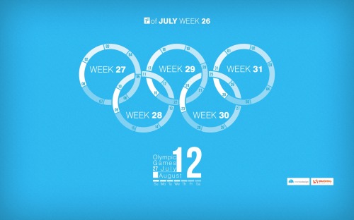
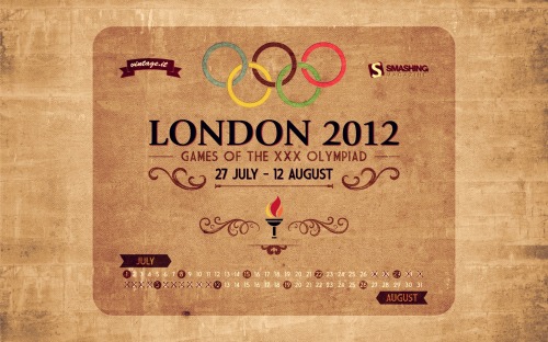
Jeux Olympiques

"Olympic Games and july 2012 weeks calendar’s infogrpahics." Designed by Sherif Saleh from France.

Smashing Desktop Wallpapers - July 2012

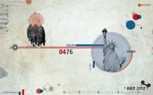
Fourth Of July

Designed by Cortando Pixeles from Argentina.

Smashing Desktop Wallpapers - July 2012

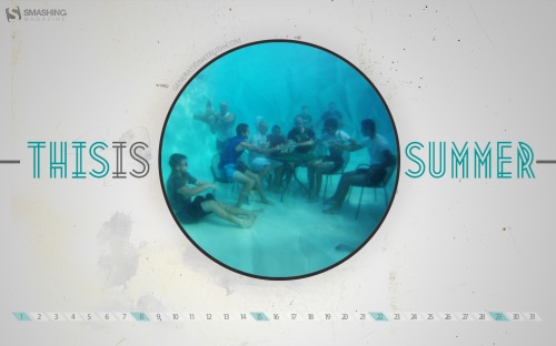
This Is Summer

"Design for 10th anniversary of our youth ministry’ summer camp!" Designed by Lex Valishvili from USA/Russia.

Smashing Desktop Wallpapers - July 2012

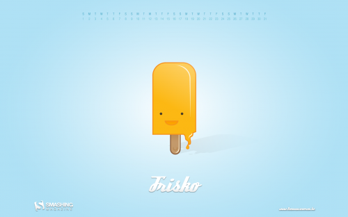
Frisko

Designed by Leen Van Severen from Belgium.

Smashing Desktop Wallpapers - July 2012

Cool Summer

"Even tough it is not summer in my country, I made a summer theme. A coolest approach to summer themes, tough, very fresh and “twilighty”." Designed by Marcos Sandrini from Brazil.

Smashing Desktop Wallpapers - July 2012

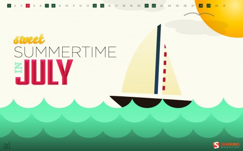
Sweet Summertime In July

Designed by Anna Downer from USA.

Smashing Desktop Wallpapers - July 2012

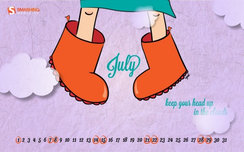
Up In The Clouds

Designed by Ioana Bitin (yoot) from Romania.

Smashing Wallpaper - july 12

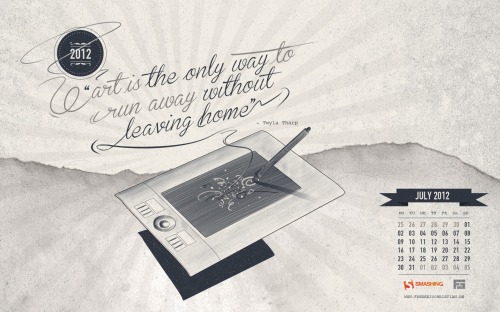
Art Is..

"A personal illustration for my new website and corporate identity i descide to share as free wallpaper! Hope you like it!www.fredericchristian.dewww.facebook.com/fredericchristianart." Designed by Frederic Christian from Germany.

Smashing Desktop Wallpapers - July 2012

Summertime Picnic

"Ants enjoying a summertime feast." Designed by Tommy Digiovanni from USA.

Smashing Desktop Wallpapers - July 2012

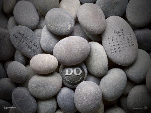
Do Zen

"The year is more than half-way through and this is a reminder to live life, be adventurist, and take a breather. Whatever the challenge is, Doers make it happen — they always find a way." Designed by Richard Hanley Jr. from USA.

Smashing Desktop Wallpapers - July 2012

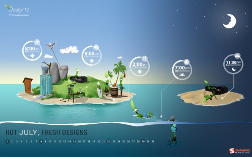
Hot July

Designed by Design19 from Romania.

Smashing Desktop Wallpapers - July 2012

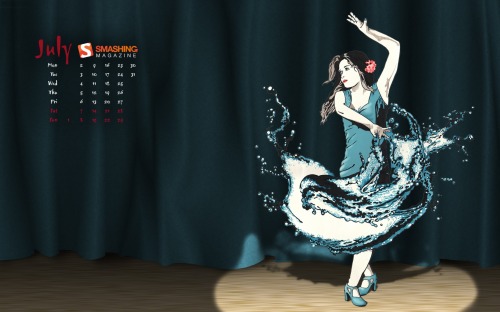
Splash Dance

"Most Flamenco dances are fiery, passionate affairs, this one however is a bit soggy…" Designed by James-n-osborne from United Kingdom.

Smashing Desktop Wallpapers - July 2012

Vintage Olympic Poster

Designed by Davide Vicariotto from Italy.

Smashing Desktop Wallpapers - July 2012

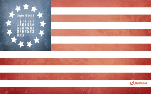
Original Thirteen

"A throwback to the original United States Flag in honor of the 236th birthday of the nation." Designed by Geoffrey Sagers from USA.

Smashing Desktop Wallpapers - July 2012

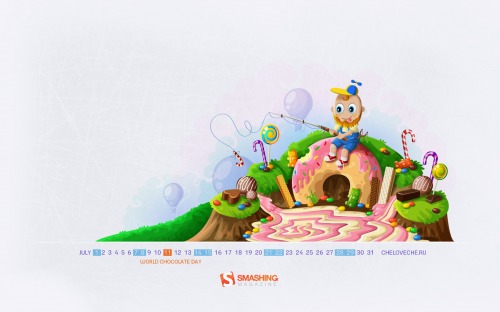
World Chocolate Day

Designed by Cheloveche.ru from Russia.

Smashing Desktop Wallpapers - July 2012

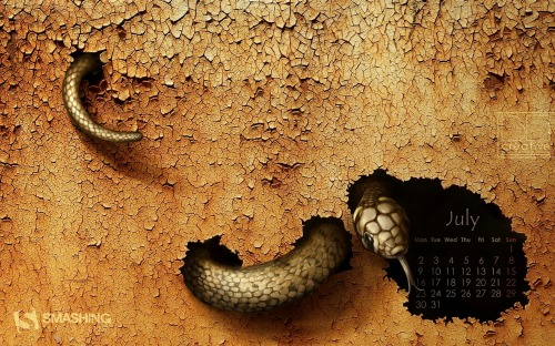
Cracked

Designed by Agata MaciÄ…gowska from Poland.

Smashing Desktop Wallpapers - July 2012

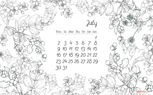
Floral Thing

"Wallpaper which I created consists of my personal sketches of Polish herbs and flowers and custom typography. I wanted it to be light and simple with a hint of romantic feeling. I hope you’ll enjoy it!" Designed by Beata Kurek from Poland.

Smashing Desktop Wallpapers - July 2012

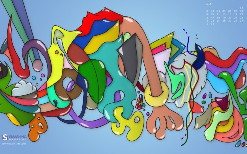
Summer

Designed by Ajan Navaratnasingam from London, UK.

Smashing Desktop Wallpapers - July 2012

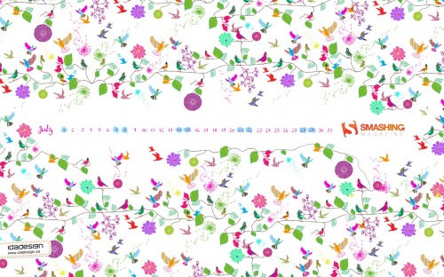
Birdie Nam Nam

"I have created a pattern that has a summer feeling. For me July and summer is bright color, joy and lots of different flowers and birds. So naturally i incorporated all these elements in a crazy pattern." Designed by Lina Karlsson, Idadesign Ab from Sweden.

Smashing Desktop Wallpapers - July 2012

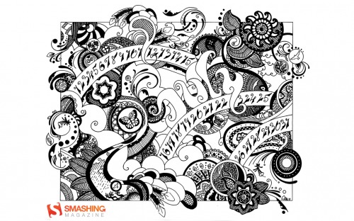
Inspired By Henna

"I wanted to bring the organic, flowing art of henna to the digital world." Designed by Tara M Baker from USA.

Smashing Desktop Wallpapers - July 2012

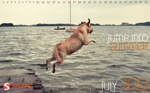
Jump Into Summer

"This is photography of my dog who is jumping into lake on our short vacation." Designed by Agencja Reklamowa Kalisz from Poland.

Smashing Desktop Wallpapers - July 2012

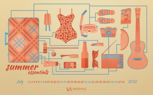
Summer Essentials

"A few essential items for the summertime weather at the beach, park, and everywhere in-between." Designed by Zach Vandehey from USA.

Smashing Desktop Wallpapers - July 2012

Join In Next Month!

Please note that we respect and carefully consider the ideas and motivation behind each and every artist’s work. This is why we give all artists the full freedom to explore their creativity and express emotions and experience throughout their works. This is also why the themes of the wallpapers weren’t anyhow influenced by us, but rather designed from scratch by the artists themselves.

A big thank you to all designers for their participation. Join in next month!

What’s Your Favourite?

What’s your favorite theme or wallpaper for this month? Please let us know in the comment section below.

Stay creative and keep on smashing!

(vf)


© Smashing Editorial for Smashing Magazine, 2012.


Why Account Managers Shouldn’t Prevent Designers From Speaking To Clients


Working as a Web designer can suck sometimes. This is especially true when you don’t get to work alongside the client. Unfortunately this scenario is more common than you would think. Many organizations have been carefully structured to keep the Web designer and the client apart. But is that really sensible? Would projects run much smoother without your account manager or boss acting as the middleman?

This issue came to my attention following the release of my latest book “Client Centric Web Design.â€� In this book I provide advice about how to work more effectively with clients. However, I had made an assumption in the approach I presented, an assumption which turned out not always to be true. It assumed that the Web designer and client can work collaboratively together. Following the book’s release I realized that for many Web designers that this is not the case.


Image credits go to Brett Jordan.

Whether working in house for a large organization or as part of a Web design agency, many Web designers never get to interact directly with their clients. Instead, the client’s requirements and comments are filtered through a middleman who manages the project.

In this post I examine why I believe this is damaging to projects and what can be done to rectify the problem. However, before we can answer these questions, we must understand why this way of working has become common in the first place.

Why We Have Account Managers

I want to make it clear that I believe that both project and account managers play a valuable role. There are good reasons why they are part of the Web design process and I am not suggesting they should be removed.

It is the role of account managers to provide outstanding customer service. This is a vital (if often overlooked) role of any Web design agency—we are not here just to build websites, we are here to provide a service to our clients. That means making our clients happy by communicating well, meeting deadlines and delivering within the budget. Our project managers regularly receive gifts from our clients thanking them for a job well done. This is how close the relationship between client and account manager can become. By lifting the responsibility for customer service from the Web designer, account managers allow us to focus on the job of actually designing and building websites—a luxury that many freelancers envy.

The account manager also deals with the plethora of organizational tasks which keep a project running smoothly, not to mention protecting us from the endless comments and questions from the client. I have had the misfortune of working on many projects where we have been drip-fed feedback from multiple stakeholders almost continually throughout the project. If it wasn’t for the account manager, I would have very quickly lost control of what needed to be done on the website. Lets face it, they also protect the client from us, as we sometimes have an overwhelming urge to rant at them uncontrollably (or perhaps that is just me). They also act as interpreters, taking our technobabble and translating it into a language that the client can understand.

In short, a good account manager ensures the client is happy and that the project remains profitable. Those are valuable roles and one that a designer would struggle to do on top of their other responsibilities. Just ask the average overworked freelancer.

If then the account manger is so valuable, where is the problem?

So Where Is The Problem?

Although having an account manager is incredibly useful, things often get out of hand. The role of account manager transforms from being a part of the project team to the sole conduit between client and designer. Instead of facilitating a smooth running project they become the bottleneck through which all communication must pass. This funnelled approach to communication prevents collaboration between the client and the Web designer. This kind of collaboration is essential to ensuring a happy client and a successful website.

Without collaboration, educating the client is difficult. Unsurprisingly most clients don’t know much about the Web design process. However, by working alongside the client throughout the project, the client learns the best practice for Web design and why certain design decisions are made. This educational process works both ways. The client will learn a lot about the Web design process, but the designer will also learn a lot about the client and his business. When the Web designer understands the nuances of the project, business and client, they produce better websites. Without that understanding they are much more likely to go down the wrong road by wasting time and money, while frustrating the client.

This isn’t just limited to designers either. Like many Web design agencies, we excluded developers from client meetings for a long time. Their time was precious and we didn’t want to waste it in meetings. However, we eventually discovered that when the developer understands the details of a project, they produce more elegant solutions and often suggest directions which nobody else had considered. When all communication has to pass through a middleman, the chances of misunderstanding and mistakes are further increased. Like a game of chinese whispers, what is said by the client or designer can be distorted by the time it has passed through an account manager.

I remember experiencing this regularly when I worked for an agency in the late nineties. A passing comment made by a client would become a dictate from the account manager that I had to follow. Instead of being a designer who could bring my experience to bear on a project, I became a pixel pusher. Because I wasn’t hearing directly from the client, I could not judge the strength of their feelings and so had no opportunity to challenge them over issues I felt passionately about.

Finally (and probably most importantly), without the client and designer working together on a project the client feels no sense of ownership over the design. The projects that inevitably go wrong at my agency are those where the final decision-maker is not actively involved in the design process. If a client has been involved in the design process, commenting and working with the designer at every stage, they are less likely to reject the final design—they will feel the design is as much their creation as that of the designer’s. However, if their feedback was through an account manager, they won’t have that sense of hands on involvement.

Fortunately, we can have the best of both worlds. We can have the benefits of an account manager, while still allowing the designer to work closely with the client.

The Best Of Both Worlds

At Headscape the role of the account manager is not to control all of the client communications, but to act as a facilitator for those communications. This provides all of the benefits of having an account manager and none of the drawbacks.

For a start, the Web designer and developer always attends project kickoffs, so they meet the client at the beginning of a project. This also ensures that they get all of the background on the project firsthand, rather than via the account manager. The Web designer also works directly with the client discussing ideas and presenting design. This gives the designer the opportunity to present their work in their own words and hear the feedback directly from the client. They can also work collaboratively with the client on some aspects of the design, such as wireframing, to help increase the client’s feeling of ownership and engagement. This also has the added benefit of allowing the designer to question and challenge the feedback they receive, engaging in a much richer discussion with the client.

The account manager is still very much a part of the process. He is still the client’s primary point of contact and remains responsible for ensuring the project stays on time and within budget. Also, whenever possible, he should be involved in discussions between the designer and client, to ensure he is fully aware of everything agreed upon. Where conversations take place without his involvement, the Web designer should report back to the account manager on the content of those discussions.

This all sounds great in theory. However, in the real world of company politics and long-held working practices, you may meet resistance when implementing this approach. In such situations it is important to proceed carefully.

Getting The Support Of Your Account Manager

None of us like change, especially when it involves others telling us how to do our job. It is therefore hardly surprising that you may well meet resistance from your account manager if you suggest the approach that I have outlined in this article.

The key is to not to get frustrated if you meet resistance. Look at it from their point of view: how would you feel if they came along and told you to design websites in a different way, or worst still, suggested they should be more heavily involved in the design of client websites?! No doubt you would be horrified, so take the time to empathize with your account manager and seek ways to make the transition easier.

I occasionally encountered designers who complain to me that they have tried to implement my approach and had been shot down by their account managers. Inevitably the reason behind this failure has been because they have tried to rush the transition. If you go in all guns blazing, the idea will be rejected. Instead, start small and build up over time.

One starting point that has worked for others I have spoken to is to sit in on key meetings. For example, if you are not normally part of the kickoff meeting, start with that. Or if you don’t get to hear the client’s feedback firsthand, ask to be involved in that call. Reassure the account manager that all you want to do is sit in so you can hear what was said. That way they won’t worry about what you might say in front of the client. Once you are involved in those meetings regularly it becomes easier for you to start slipping in the odd comment.

I also recommend thinking carefully about how you present this approach to your account manager. It would be easy to focus on why you want to do it. However, you will have much more success if you present the benefits the approach provides for them. Remember, their primary concern is to ensure that the project is delivered on time and within budget. Therefore, when suggesting your heavier involvement with the client, explain that this will reduce the chance of misunderstandings, leading to a faster sign-off. This in turn will mean less iterations and higher profits on the project—all music to the ears of your average account manager.

Finally, point out that if you work directly with the client it will ultimately mean less work for them. Everybody loves the sound of less work! If you present the idea of direct collaboration with the client as having benefits for the project (and for the account manager personally), the chances are you will meet a lot less resistance.

I confidently believe that allowing the Web designer to work with the client ultimately leads to better websites, happier clients and a greater sense of job satisfaction for the designer. However, I am also aware it has its challenges. I would therefore like to see more discussion about how to best get this collaborative relationship working with organizations that traditionally keep these two parties apart. Perhaps the comments are the place to kick start the conversation.

(jvb) (jc)


© Paul Boag for Smashing Magazine, 2012.


  •   
  • Copyright © 1996-2010 BlogmyQuery - BMQ. All rights reserved.
    iDream theme by Templates Next | Powered by WordPress