 |
Like most well-designed things, the magic of an iPad app comes from a union of usefulness, usability and meaning. Games aside, the app must be useful by solving a problem that people actually have through the right set of functionality at the right time. It must be easy to use and, just as importantly, easy to get started using, without a lot of pesky setup and learning steps. And it must hold meaning for the user through visual beauty, an emotional connection, personal insights, etc. In this article, we won’t outline the entire design process for creating an iPad app, but we will explore 10 of the key things to think about when designing your app (and planning the design process).
We’ve excluded tips that have already been mentioned in every single iPad design article ever written (such as, “Invite users to touch by presenting real-world metaphors in a skeuomorphic interface� —look it up!). Instead, we’ll focus on what to really think about when doing design work. By reviewing these considerations in the context of your own application, you can assess whether you’re making good decisions about your design.
Take A Goal-Oriented Approach To Simplify Functionality.
Good iPad apps are about simplicity and doing a few things well. This means you have to be selective about the functionality you include and not throw in the kitchen sink. Consider following a goal-oriented approach to figure out what functionality you need. List all of the high-level goals a user might have when using your app (better yet, watch users doing things that you hope your app will help with in order to get a full picture of what the user’s goals are — but that’s an article for another time). What would someone be trying to get done? Then, brainstorm all of the functionality that someone might want in order to accomplish that task. Look at that big list, and start pruning, with an eye for the minimum that is needed to help the user succeed. And then select a few magical, delightful features to complete the package.
For example, Epicurious does an excellent job of giving the multi-tasking cook exactly what they need. When viewing a recipe in landscape format, users can easily scan ingredients on the left while keeping track of the next instruction on the right, with a bright placeholder that can be dragged with the finger to the current spot. Reviews and additional tips for the recipe are easily accessible via tabs, but the main screen is kept clean and uncluttered, with just the basics.

Epicurious provides a clean interface for recipes, with an orange marker to keep your place.
By contrast, the Whole Foods app starts off being helpful by letting you add recipe ingredients to a shopping list. Unfortunately, it neglects to combine repeated ingredients, so items are listed multiple times. In the screenshot below, bananas appear three times, once for each recipe that requires them, instead of being combined into one entry.

Whole Foods should enhance its app by merging duplicate list items.
Also, don’t provide a button for every control the user might need to accomplish their goal. Think about what the user can infer about the UI through gesture. For example, Apple’s Notes app doesn’t have an “editing� mode; instead, you simply touch the screen to bring up the keyboard, and it auto-saves when you’re done. Basic editing controls such as cut, copy and paste also appear only in response to gestures as needed (and undo is accomplished by shaking).

The Notes app limits on-screen buttons and presents controls only if it detects they are needed.
Leverage What You Know To Create A Fully Personalized Experience.
No one wants to spend a lot of time setting up a $1.99 app. Leverage as much of what the iPad and other websites know about your users as possible (with their permission, of course). Could you use the user’s location, calendar, Twitter feed or contacts list to make the app smarter and more personalized?
Zite is a fabulous RSS reader for iPad that doesn’t wait for you to add sources, but rather connects to your Google Reader, Twitter or Delicious account and then presents articles based on what it has learned about your interests. I connected it with Delicious (where I store all of my bookmarks), and in five seconds it created a personalized magazine for me to explore new and interesting content! And just like Pandora, the more you use it, the more relevant and personalized the content becomes. So far, even though some argue that Flipboard’s UI is more elegant, engaging with Zite is easier because it’s all set up.

Zite sets things up immediately by connecting to an existing account.

Zite created my own personal magazine by learning about my interests through my Delicious account.
Think About The Place Of Use.
Assume that your user will be out and about when using your app — in a restaurant, in the car, in the kitchen, on a sofa, etc. How does that change the list of goals you’ve put together? For a user browsing recipes, are their needs different on the sofa than in the kitchen, or in a restaurant?
Open Table’s Web app for reserving tables displays a list of restaurants as the default view for search results (i.e. without a map). On the iPad, the default view is a large map with a list of restaurants on the right, along with an option to search your vicinity. This accommodates the common use case of someone trying to find a place to eat when they are out and about.

When you’re out and about with the iPad, Open Table shows you what is near.
Awesome Note opens with a set of default categories that reflect the various places that people might take notes on an iPad.

Awesome Note complements traditional categories like “My idea� and “To-do list� with out-and-about categories like “Travel diary� and “Shopping.�
GroceryIQ is a shopping list that organizes items by aisle to speed up shopping. It also allows filtering by store, which is handy.

GroceryIQ offers functionality to make your shopping trip more efficient.
Consider Multi-User And Multi-Device Cases.
Assume that multiple members of a family will be sharing an iPad or viewing the device at once. Unlike a personal computer, the iPad is not necessarily a personal device but could be treated more like a coffee-table book or magazine that multiple residents share. In addition to allowing users to switch accounts, indicating who is currently logged in is also important. An added benefit of accounts is that they facilitate syncing between devices (for example, an iPad and a smartphone).
Flipboard is a great example of shared use through multiple accounts. When you sign in, your name is displayed on the home page.

Flipboard makes clear that it knows who you are.

Like Flipboard, FedEx displays the name of the logged-in user (although the app’s heavy grayscale appearance is odd).
eBay, on the other hand, supports accounts but provides no indication of who is signed in until you touch the “My eBay� button in the corner.

eBay doesn’t make clear who is logged in until you touch “My eBay� in the corner.
Don’t Do Crazy Navigation Unless It’s A Game Or One-Hit Wonder.
Crazy, spinny, eye-catching interactions are fine for one-hit wonders and games. But stick with standard navigation for frequently used apps, such as news readers. If you do want to do something innovative, make sure it supports the task at hand and is extremely usable.
Martha Stewart Living, which is built on the well-designed Adobe Digital Publishing Suite, uses horizontal and vertical scrolling in a novel way by reserving horizontal scrolling for navigating between articles and vertical scrolling for navigating pages of an article. This is paired with a clever pane that visually shows how scrolling works, plus an overview of the current issue for even quicker navigation. With all that and a clickable table of contents, the whole experience is quite lovely.

Martha Stewart Living’s overview pane shows the clever horizontal and vertical scrolling scheme for content created with the Adobe Digital Publishing Suite.
The best thing you could do is actually use an iPad constantly for all kinds of things, and see what works for you. You’ll quickly discover inconsistencies and annoyances all over the app world, and you’ll figure out where to be consistent and where to branch out.
Here are three different methods that news readers follow to enable users to exit articles:

Huffington Post: top right.

New York Times: bottom left.

Zite: top left.
People tend to rest their thumb near the top left when holding an iPad, so putting the button there is easiest because then people wouldn’t have to change their grip. Also, Zite enables you to click anywhere on the screen outside of the article to close it, which makes for a nice flexible gesture. Similarly, the New York Times enables you to pinch an article to close it and return to the home page, which is even better, especially because the controls disappear once an article has been open for a few seconds — although a one-finger gesture closer to the top left would have worked better, because the two-finger gesture would probably require the user to change their grip.
Be mindful of how you yourself use features, and notice when something is usable and when you have to move your hand awkwardly or do something that disrupts your flow. Look around to find apps that do what you’re trying to do, assess their usability, and decide whether being consistent or doing something different would make more sense. iPad apps are still a new frontier, so now is not the time to buckle down and set conventions — but we should assess whether a new idea really adds something useful or is just novel for the sake of novelty.
Provide A Home Page.
People are used to home pages that orient them to what’s available and that give them a base of operations. Without one, discovering and browsing content can be disorienting and frustrating. Take the NASA news app, which has no home page. Upon launching the app, users are dropped directly into a news article. To view other articles, they would use the carousel arrows on the left and right, or press the tiny list icon in the bottom-left corner of the screen. The list view allows users to browse content in a small scrolling pop-over window that has only enough room for thumbnails and short headlines. The navigation is generally unwieldy and disorienting.

NASA does not provide a home page, but rather drops you into an article with vague pop-over navigation.
Pulse, on the other hand, is a great news app that uses a home page to quickly orient users and to introduce the navigation scheme, which is consistent throughout the app. From the home page, users can easily browse content, having plenty of space to view the large thumbnails and article descriptions to see what interests them. Drilling down into an article will collapse the navigation to the side so that you don’t lose context.

Pulse presents a horizontal scrolling list of articles on the home page.

Opening an article will collapse the navigation to a side panel in landscape view.

In portrait view, Pulse displays the navigation for one content source at the bottom, with easy access to the next page.
Beware Of Awkward Pop-Overs.
iPad offers the nifty interaction of a pop-over to help users retrieve content and navigation in context. But the interaction can also make for a jerky flow, cramming a lot of information into a tiny peephole. Given the limited width and height of a pop-over, avoid stuffing too much in it. Awesome Note tries to cram the interaction for editing a list of folders into a small pop-over, presumably to maintain context. Instead, we get a confusing interaction, with tabs duplicated on the screen and not enough room to get things done.

Awesome Note has a somewhat confusing pop-over that duplicates the information on the screen in a cramped space.
NASA’s complex navigation, which we saw in the preceding point, is a similar example of a bad pop-over.
Consider when opening a new page would make more sense than opening a pop-over. Unless context is critical, don’t be afraid to take users to a full-screen view to give the content some room to breathe.
Or consider using split views in clever ways:

Houzz has secondary navigation for each category in a convenient split view.

Martha Stewart Living displays the table of contents for an issue as a full-length pop-over, opening up space for images and descriptive headlines.

Flipboard favors a slide-out panel to give the navigation enough room to do its job.
Avoid Gratuitous Splash Screens.
Remember when the Web had splash screen, and then everyone got annoyed and left? They are even more annoying on the iPad because you’re usually trying to access content while someone is waiting for either you or the iPad. If you need a splash screen because something has to load, display it for the minimum amount of time possible. Better yet, display useful content while the rest of the app loads to give users a head start on the interaction.
Zite piques your interest by loading the first few photos on the home page while the rest of the app loads. When the app is ready, those initial photos animate into place, making for a delightful little welcome interaction.

Zite draws you in on the splash screen, with thumbnails of articles that will be ready once the full app loads.
Use Gestures In Clever Ways, But Don’t Overdo It.
Cool, useful gestures are a mainstay of iPad use. But the line between effective gestures and gesture overload is fine. For example, don’t provide a swipeable carousel and then also allow a generic swipe gesture on the same screen, because this would put competing swipe gestures at odds with each other.
And if a gesture is not obvious, give users a hint.

Zite indicates more content with a cute little “swipe� text at the bottom.
Discovr, a music-discovery application, integrates information about gesture controls right into the UI. The red circle in the screenshot below says “Tap me,� leading to information on how to expand nodes.

Discovr educates users with a red dot explaining the gesture options for the current screen.

Once basic information has been provided, another red node appears saying “Tap and hold me,� informing users how to access more content with a new gesture. With this information baked into the app experience itself, users learn about powerful features of the UI without having to be psychic.
Make Clear What’s Touchable, And Make It BIG.
Many apps suffer from what Jakob Nielsen calls “read-tap asymmetry,� whereby the font may be legible in size, but the tappable areas are so small that users are prone to missing the targets or are unsure whether the areas are even tappable. In the advertisement below, from the Martha Stewart Living app, the arrowed questions in the middle of the screen are tappable, but you wouldn’t know it because they have no affordance. If you’re going to go through the trouble of making more content available, then make it clear where to tap, and make the tappable area nice and big.

It’s not obvious where you would tap in this ad to get more information.

It turns out that tapping the light-gray boxes in the middle shows more information.
The image areas at the top of the Cool Hunting application are actually swipeable galleries, but we get no hint of it. What if there was some kind of affordance, such as dimensionality or a peek at another image to indicate there was more to the right?

Cool Hunting does not indicate that swiping the top image would reveal more images, which makes this functionality hard to discover.
In iOS itself, double-tapping the home key and then swiping left in the multitasking bar reveals a bunch of controls for sound and music, yet this functionality is pretty well hidden. Why not provide some affordance of what is available?

Double-tapping home and then swiping left on an iPad reveals hidden functionality.
What Else?
These are just 10 of the many things to consider when designing your iPad app, but it’s a good place to start. We’d love to hear your top considerations and examples in the comments. We especially lack a strong repository on the Web of examples of good and bad iPad app design. Please share examples of the different ways that apps treat the same functionality (such as exiting articles), and explain why certain solutions are better than others. Have you discovered other techniques through your own design work that you think everyone should put on their list of do’s and don’ts? Let us know.
Further Reading
- “iPad Usability: First Findings From User Testing,� Jakob Nielsen
- “iPad Usability: Year One,� Jakob Nielsen
- “Design for iPad: Reality Check,� Oliver Reichenstein
- “Thoughts on Designing for iPad,� Derek Powazek
- “Touch Gesture Reference Guide,� Luke Wroblewski
- “Useful Design Tips for Your iPad,� Jen Gordon
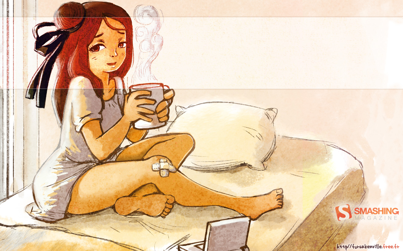
(Cover image: Johan Larsson)
(al)
© Julie Stanford for Smashing Magazine, 2012.


