Typography is one of the very important aspects to consider when designing a website. Well-written content finds its actual place and praise only then when it is placed properly in readable and as well as attractive format. Web typography can embrace everything from calligraphy to digital type — it is not only about using an array of fonts, but also focusing on the ‘where’ and ‘why’ when choosing a particular font’s size and color. Here are some of many examples of beautiful, interesting and inspiring typography-related sites out there. Please share with us other sites you’ve found typo-riffic!
Grip Limited
Ever thought of using scroll wheels for a site? This ad agency did:
Grafik
Very simple and elegant — Nick de Jardine’s site presented with large typography:
Pieoneers
A mighty colourful website that not only makes your mouth water but also arouses your interest to look around:
Justdot
A back-to-school feeling once your enter this site — pretty impressive:
Fail-ure
A well-made site with clear directions to where you can find the products with no ado:
Eighty Two Design
A vintage-styled site that prooves old fashion can also look swell:
Sibling Rivalry
A site project that three brothers have brought to life. Interesting use of type and images:
Uncle Emile
A French site that is full of art and very creative ideas:
August
Not only does the type look good here, but also the fantastic photography:
Cascade Brewery
Australia’s oldest operating brewery has a site and really makes good use of it:
Iron to Iron
An interesting way to reflect shades as well as light with typography:
Marie Catrib’s
This restaurant already looks very inviting from the looks of their site:

Kari Jobe
Having your site as a diary lookalike is not such a bad idea. You’d always be uptodate:
Elan Snowboards
A snowboard company that uses clear words and is very user friendly:
National Television
A design and animation studio based on creative collaboration:
Nike Better World
A single page template with some amazing CSS and JS features:
Arqandgraph
An interesting use of type and image blocks for a portfolio of the Arqandgraph Design Firm:
Poems Out Loud
A site not only dedicated to typography but also language itself:
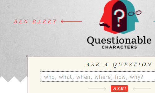
Questionable Characters
Asking Ben Barry and Frank Chimero — witty and informative:
Sushi Monstr
This creative site is made by a writer, usability designer and web developer:
Chama inc
Kepping it simple with black and white is always a good alternative as well:
Precinkt
Here is a good example of using just a few types as possible within one website:
Typejockeys
A site that offers everything from graphic design, type design and various fonts:
Oliver James Gosling
This Web developer and internet specialist really put a lot of effort and time into his site:
Lega-Lega
A playful way of attracting customers to your site with a self-drawn navigation menu:
The Old State
This is another good example of using black and white to achieve that classy effect:
Ben the Bodyguard
So why not use as much space as you can on your website? Scrolling down on this site takes you on an interesting adventure:
One Day without Google
A site that uses just about two colours. It’s not as bad as it sounds — take a look:
Mark Hobbs
A witty, colourful site that attracts the attention of any visitor passing by:
THE= SUM
A team of two who are dedicated to design and show it very well:
(ik)


