In my research into Golden Ratio Typography, I focused primarily on the core geometric properties of text—font size, line height, and line width.
But there’s another facet of text that nearly all of the existing research on typography deals with: It’s called characters per line (CPL).
If you’ve ever read a study on typography, you’ve no doubt encountered CPL. Many of these studies recommend “optimal” CPL ranges that include anything from 55 to 100 CPL.
With an “optimal” range that large, the CPL you use on your site ultimately comes down to personal preference. This raises one huge question:
How can you tune your typography to an exact (or, at least approximate) CPL?
Tuning Text for Characters Per Line
Before you can tune your text, you have to understand how CPL works and what the consequences of different CPLs are. Here’s the deal:
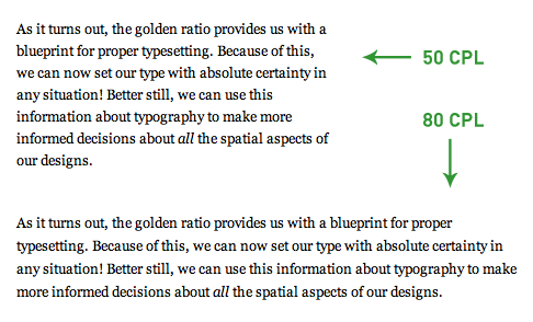
For any font size, as the CPL increases, the line width also increases.

Figure 1. For a given font size, line width increases as CPL increases. Designers must consider this behavior when determining how wide a column of text should be.
This has some significant design implications, and worse, most designers don’t even consider CPL when choosing a column width for their text. They simply pick a column width, and however many CPL that results in…well, that’s what you get.
Frankly, I can’t stand this imprecise approach. Every decision—especially those involving your design and typography—should have a meaningful rationale behind it.
The bottom line here is that your typography should dictate how wide your columns of text are, not vice-versa.
So, how can you tune your typography to a specific CPL and, therefore, a specific width?
There are two potential approaches you can take here. You can:
- Use the good ol’ trial and error method, whereby you select different widths, count the characters per line, and settle on the width that you prefer.
- Figure out a programmatic way to predict CPL, and then choose a width based on this prediction.
Choice number one is a laborious pain in the rear, and it gets old really quickly. On top of that, it’s simply an imprecise approach, and we all know how I feel about that…
Contrary to number one, choice number two sounds great and makes a ton of sense. Problem is, you don’t have a programmatic way to predict CPL…yet.
Using Math to Predict CPL
Recently, I became obsessed with the idea of predicting CPL at any font size, so I set out to uncover a mathematical relationship between font size and CPL.
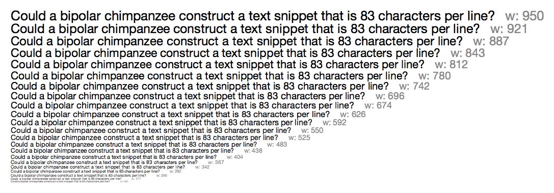
To do this, I examined text samples in the range of 40–100 CPL at font sizes between 5 and 26px for various fonts. You can see one of my samples in Figure 2 below.

Figure 2. Research sample with Helvetica Neue set to 83 CPL. To determine the average character width at a particular font size, you can divide the resulting width (shown in gray next to each line of text) by the CPL. Click to enlarge.
As I stated above, my goal was to determine the mathematical relationship between font size and CPL for particular fonts (obviously, this relationship will differ slightly from font to font). Here’s how I did it:
Using text samples like the one in Figure 2, I first calculated the average character width (cw) at each font size by dividing the resulting line width by the CPL value.

Not surprisingly, as the font size increased, the average character width also increased. The next step, however, is where things started to get interesting.
To relate font size and character width, I simply divided the font size (f) by the newly-calculated average character width:

And this is where I noticed something extraordinary—for any font, the value (μ) from the above equation remains constant, even at different font sizes. In other words…
Each font has a character constant, μ, associated with it that relates the font size to the width of each character.
It may not be obvious at first, but this character constant is awesome because it establishes a mathematical relationship between the vertical (font size) and horizontal (character width) dimensions of text.
For instance, if you have a font size of 12px, and the font you’re using has a character constant of 2.3, then 2.3 characters will fit in every 12px increment of width (on average).
Thanks to this relationship, it’s possible to predict CPL mathematically. Here’s how it’s done:
Start with a desired CPL value, and then divide it by the character constant for the font you’re using. This results in a width factor, xw, which is specific to the desired CPL and font:

The width factor from the equation above tells you how many increments of width are needed to reach the desired CPL. Once you have the width factor, all you need to do is multiply it by the font size to get the predicted line width, w, that will result in the desired CPL.

The aforementioned equations can be simplified and combined into one master equation that relates CPL, font size, and line width for any font:

Alright—now that you’ve seen the basic math behind CPL, let’s bring this together by looking at an example.
Sample Predicted Width Calculation Based on CPL
In this example, the goal is to achieve 75 CPL at a font size of 16px for a font that has a character constant of 2.28. You can use the master equation from above to solve this problem:

So, for a font with a character constant of 2.28 at a size of 16px, a width of 526px will yield approximately 75 CPL.
But what if you wanted to know how wide your text would have to be for this same font at 18px? This is easy because you can simply substitute a new font size into the master equation, like so:

So while you’d need 526px to achieve 75 CPL at a font size of 16px for this particular font, you’d need 592px to achieve the same CPL at a font size of 18px. Pretty sweet!
A Closer Look at Character Constants
The most important concept in CPL tuning is undoubtedly the character constant, μ.
As I stated earlier, the character constant is different for every font. In order to build a CPL prediction algorithm, it’s necessary to examine each font individually to determine its μ value.
This process is more complicated than it first seems, simply because different text samples have different average character widths (depending on the characters that appear in that particular sample).

Figure 3. Both text samples are set to 68 CPL, but the line widths (and thus, the average character widths) are different because the samples contain different characters.
When researching character constants, it’s possible to account for these differences by taking a large enough data sample. If you were to test enough different text samples with each font, you’d eventually nail down a statistically significant value for μ.
Ultimately, though, the character constant is only useful for predicting an approximate CPL value—actual CPL values will differ from line to line depending on the characters involved.
Here’s a quick rundown of the character constants I’ve compiled through my research thus far (note: none of these are statistically significant):
Serif Fonts
- American Typewriter — 2.12
- Baskerville — 2.51
- Georgia — 2.27
- Hoefler Text — 2.44
- Palatino — 2.30
- Times New Roman — 2.60
Sans-serif Fonts
- Arial — 2.31
- Gill Sans — 2.51
- Gill Sans 300 — 2.58
- Helvetica Neue — 2.26
- Lucida Grande — 2.07
- Tahoma — 2.30
- Trebuchet MS — 2.22
- Verdana — 1.98
Monospace Fonts
- Courier New — 1.60
The character constant provides a new, algorithmic way to understand how fat or skinny a font is. Lower character constants are “fatter,” and higher constants are “skinnier.”
Simply put, the character constant is an interesting new way to consider different typefaces.
It will prove handy for designers who are looking for a quick and precise way to select fonts that will exhibit particular aesthetics and spatial properties.
Also—and I really like this—smart programs can use the character constant to work with fonts in a more precise, more predictable way.
Update: A commenter pointed out a perfect potential application—building smarter CSS font stacks based on similar character constant values!
Math, Schmath. Software to the Rescue!
When I unveiled the Golden Ratio Typography Calculator, the point was to make it easy to explore finely-tuned typography without having to do heavy mathematical lifting.
Now, I’m pleased to announce that I’ve incorporated this new CPL research into the calculator, too. All that math you saw above? Yeah, you won’t have to do any of it :D
The upgrades to the typography calculator are powerful. Not only can you optimize your typography based on characters per line, but you can also explore the impact of different fonts on CPL in any setting!
Change fonts by using the font selector that appears on any typographical recommendation, and you can observe how the approximate CPL changes based on the typeface.

Figure 4. Use the font selector on any typographical recommendation to see how CPL changes relative to the typeface. Fascinating, I tells ya!
The Bottom Line
Typography is the most important component in all of design. There’s no doubt about it—design is a language of communication, and words are the most powerful communication tool we have.
It makes sense, then, that we should strive to understand as much as possible about typefaces, their metrics, and how they work.
Using the Golden Ratio Typography Calculator, you can explore the finer points of typography like never before.
You’ll gain insight into line heights, line widths, CPL, and how different fonts behave (grr, baby!). Best of all, you’ll be able to create beautiful typography on your site thanks to the precise recommendations from the calculator.