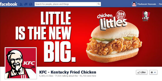
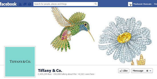
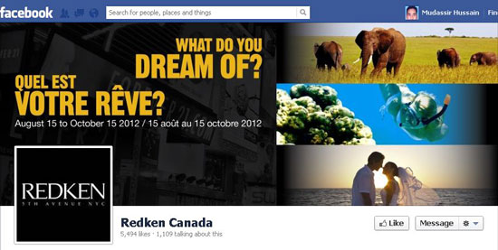
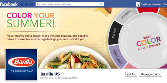
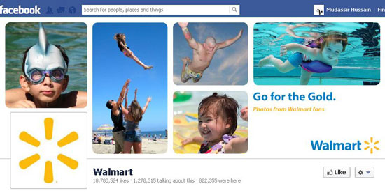
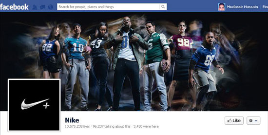
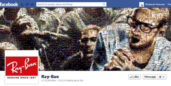
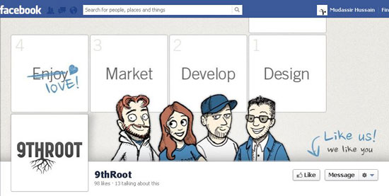
Facebook’s latest enhancements for both individuals and brands have changed the way to interact on the network. Besides lots of remarkable features like Timeline for brands, they also introduced Cover Photo, which is the first image a user sees after reaching the page. Cover Photo is the place where, for many, creativity begins. It is kind of a visual status update, which determines the voice and theme of the brand’s page. It is perfect to use this area for announcing new upcomings. You should of course update it frequently to retain the freshness and appeal for your fans.
For brands, the cover photo provides an immediate and great opportunity to convey a message in a creative way. Many geeks have presented creative takes and techniques to exploit the space to produce surprising results. People and brands are now featuring more on their cover photo and profile photos are becoming less important. The new Timeline era is all about visualization, where brands are using formatted media, like images, videos etc. in their daily posts. These entice visual interest and are more likely to be featured by the community.
There is lots of creative potential for brands in the new Timeline format. The message and image of the brand is not as momentary as it was previously. The large cover photo has created a huge canvas for the brands, which enable them to show stuff in a broader width. Brand pages are now more visually appealing and allow greater branded experience. In this article, we will present practical guidelines, which are easy to follow and will lead you to design your best Timeline Cover Photo. Let’s start.
Steps to Create a Great Timeline Cover Photo
1. Get Inspired
Before you start making your cover photo, visit Facebook and see a few other brands’ cover photos that catch your eye. Go to the pages of popular brands. Ask yourself, WHY they grabbed your attention, what is it?… The photo? The layout? The font usage? The colors, voice, theme or tone of the brand? Or the combination of it all? Utilize the same elements that fascinated you in other brands’ cover photos to inspire your cover photo’s design. Let your inspiration drive you and make sure you don’t get limited by your tools.
2. Select The Right Photo
Never save your time or money while considering the cover photo. A well-designed cover photo will get your brand’s page acknowledged and, more significantly, liked and followed up! That’s why your cover photo should be of a the best possible, high-resolution quality. Your cover photo should address the interests of your community or tell a story. A carelessly chosen photo can not help you in building the community. Select a photo, which has some direct association with your community, shows action, has unusual colors, was captured from unusual angles or a blend of all of these; remember the word “�UNUSUAL�.
In 99 of 100 cases, it’s the first impression that expands your community. Therefore, you must exploit the powerful medium of photos to make a very good first impression.
3. Select A Font (If Necessary…)
If you can’t avoid to use text in the cover photo, select fonts carefully. The selection of fonts has a great impact on the entire professionalism of a cover photo. Avoid excessive use of font faces as it will visually confuse your community. The reader will get into trouble finding the real story. Too much “stuff” will be tiring for the readers’ eyes. If you need to put in text at all, use fonts that are comfortable in reading and don’t put stress on the eyes. For example, serif fonts, particularly small form, are read easily as compared to the san-serif fonts. The eye moves across the serifs of the alphabet, which makes them easy to read. Also, avoid using CAPS, as CAPS of any font are hard to read. If there is a need to emphasize on any word, consider making it bold. Don’t stretch or compress words, it does not look good and causes inconvenience.
4. Make Heavy Use Of White Space
Use “white space� generously, though your creativity may not let you do this. You should consider leaving sections of the photo blank. Stuffing to the maximum will make your cover photo visually overwhelming to the visitor. Experiment with white space in different areas of your photo, like, try showing text on one side and leave the other side without text or try putting your text down the photo and reserve the upper half for a photo.
5. Don’t Pass The Border
You will see many cover photos with images or text too close to the border of the photo, which is not good aesthetically. Again, avoid filling up the whole space. It is suggested to keep a 50 to 60 pixel margin on both sides. This will also add to white space giving your cover photo a more professional look.
6. Carefully Select Your Profile Photo
The profile photo must work on its own. Remember that your profile picture is displayed as a 32 x 32 pixel thumbnail everywhere else on Facebook, e.g. with the comments you leave on other pages. Therefore, select a profile picture that can also work outside of the surrounding of your brand page and has its own identity. Seen that way, combining cover photo and profile photo is not a very good idea in most of the cases. That’s only half the truth, read on…
7. Be Surprising
As the cover photo overlaps with the profile picture, which comes in at 160 x 160 pixels on the Timeline, it is clever thinking to combine them together to make a single image. Do some experiments by swapping different images and checking which ones your community likes the most, i.e. by getting their response. Cover photo does not limit you to use just images. You might consider using text, charts, or graphs. Best is always what supports your brand’s message most. But keep the above mentioned tips for better creativity in mind .
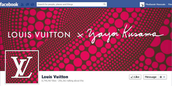
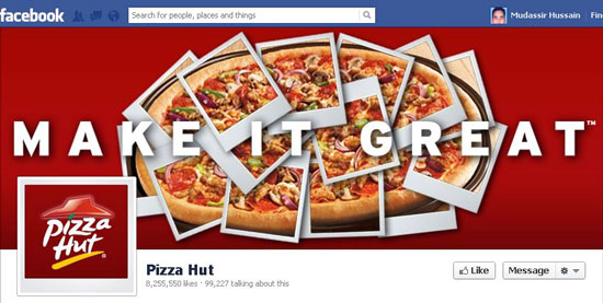
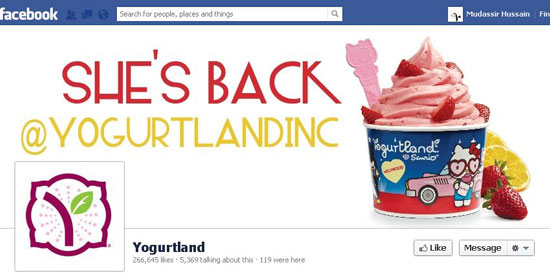
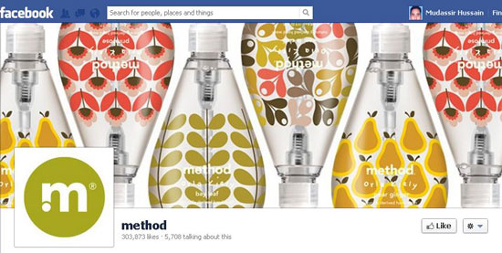
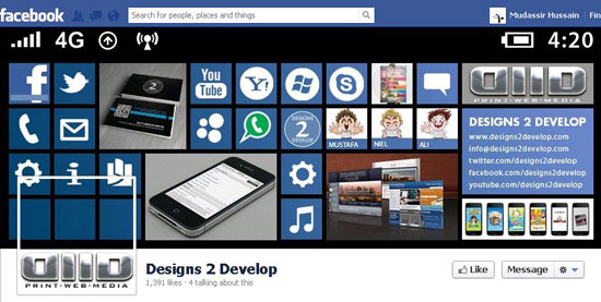
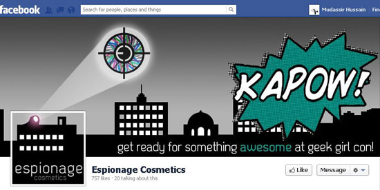
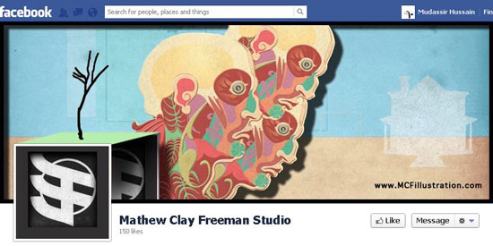
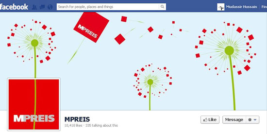
Do you want to create a new cover photo for your brand? Start with getting some inspiration. Below are a few selected individuals’ and brands’ pages, which are creative and beautiful and show different approaches in designing the cover photo.
Best Practice for a Brand Page: Real Life Examples
Examples of Unification of Cover and Profile Photo
(dpe)

