Archive for September, 2012

Smashing Conference Live — Day 2


During the two days of the Smashing Conference, we provide you with insights, photos and highlights on Smashing Magazine — live from the conference venue. Our team will be posting updates from the early morning to the late evening on both dates to bring you as close to the conference as possible. You can also track the tweets from the conference by following the hashtag #smashingconf and permalink for the live updates.

Bookmark this page to follow the updates in real-time. Please notice that no live stream is available, but all videos will be made available for free after the event. You might want to check the schedule of the conference as well and the report from day 1.

Tuesday, September 18th 2012

12.15


The opening titles for the Smashing Conference are now available online. Designed by the fantastic team by Joaquín Urbina from No-Domain from Barcelona, Spain. Thank you, guys, for the fantastic work!


© Smashing Editorial for Smashing Magazine, 2012.

20.37


And that’s it. The conference is over, and it was a truly fantastic, smashing experience. It was such a pleasure meeting so many talented, hard-working people, and it’s so rewarding to meet attendees saying that the conference inspired them a lot. That’s why we wanted to create a conference in the first place.

Thanks to everybody involved, speakers, our fantastic team, sponsors and attendees. Thank you, Marc for your help and your fantastic input! And let’s see what the next year will bring!


© Smashing Editorial for Smashing Magazine, 2012.

19.05


“A tool that Adobe… yes, Adobe, the company that gave us Flash and other diseases.” — Christian Heilmann


© Smashing Editorial for Smashing Magazine, 2012.

18.49


“Things without single points of failure are more sustainable. Great argument for web over native platforms.” — Christian Heilmann


© Smashing Editorial for Smashing Magazine, 2012.

18.43


“We need access to the metal. JavaScript has to talk to the hardware only then we have a fair comparison.” — Christ Heilmann


© Smashing Editorial for Smashing Magazine, 2012.

18.41


“Firefox OS is (partly) written in JS. So you alter the height of the keytones in an Javascript-Array. If you want to.” — Christian Heilmann


© Smashing Editorial for Smashing Magazine, 2012.

18.40


“Emulation brings frustration. Web apps cannot be native apps and shouldn’t try. Too many people don’t understand that.” — Christian Heilmann


© Smashing Editorial for Smashing Magazine, 2012.

18.36


“With all these Javascript MVC frameworks and hardcore development, it’s easy to feel obsolete and stupid.” — Christian Heilmann


© Smashing Editorial for Smashing Magazine, 2012.

18.23


Christian Heilmann actually titled his talk “To Be Announced”. Now, if that’s not confusing, what is?

Christian Heilmann


© Smashing Editorial for Smashing Magazine, 2012.

18.21


The conference is coming to an end. The last talk by Christian Heilmann.

Christian Heilmann
Christian Heilmann


© Smashing Editorial for Smashing Magazine, 2012.

17.30


“Craft is a vehicle to put a little bit of ourselves into the things we make.” — Aarron Walter


© Smashing Editorial for Smashing Magazine, 2012.

17.24


“Make better things in a better way.” — Raleigh Denim by Aarron Walter.


© Smashing Editorial for Smashing Magazine, 2012.

17.18


“Falling in love with your tools is a dangerous thing, because you lose the focus of communicating.” — Aarron Walter


© Smashing Editorial for Smashing Magazine, 2012.

17.17


Aarron Walter is speaking about the importance of personality and voice in design.

Aarron Walter


© Smashing Editorial for Smashing Magazine, 2012.

16.37


“To load the Facebook, Twitter and Google Social Media buttons for a total of 19 requests takes 246.7K in bandwidth”. — Brad Frost


© Smashing Editorial for Smashing Magazine, 2012.

16.36


“There are so many ways to design a responsive carousel in a wrong way. If possible, avoid them at all costs.” — Brad Frost


© Smashing Editorial for Smashing Magazine, 2012.

16.25


“Today’s landscape is boot camp for tomorrow’s insanity.” — Brad Frost on responsive design.


© Smashing Editorial for Smashing Magazine, 2012.

16.19


Mobitest: a free mobile Web performance measurement tool.


© Smashing Editorial for Smashing Magazine, 2012.

16.19


“Performance is invisible. You can’t mock up performance in Photoshop.” — Brad Frost


© Smashing Editorial for Smashing Magazine, 2012.

16.17


Brad Frost on the stage. “Embrace the squishiness.”
“71% of mobile users expect mobile sites to load as fast if not faster than desktop sites.” — Brad Frost

Brad Frost
Brad Frost


© Smashing Editorial for Smashing Magazine, 2012.

16.12


“Ubiquity is Web’s superpower.” — Brad Frost

“Diversity is not a bug… It’s an opportunity.” — Stephanie Rieger


© Smashing Editorial for Smashing Magazine, 2012.

15.33


“Don’t code CSS for the page. Code it for the system. Naming convention clarifies intent. Use child selectors, please!” — Jonathan Snook


© Smashing Editorial for Smashing Magazine, 2012.

15.21


“Use class over ID. Don’t use a grenade when a shovel will do.” — Jonathan Snook


© Smashing Editorial for Smashing Magazine, 2012.

15.19


“Define what’s going to apply to 90% of the use cases and then figure out what the variations are. Embrace the cascade.” — Jonathan Snook


© Smashing Editorial for Smashing Magazine, 2012.

15.17


Photos from the Smashing Conference. The atmosphere was fantastic!

Smashing Conference
Smashing Conference
Smashing Conference
Smashing Conference
Smashing Conference
Smashing Conference
Smashing Conference
Smashing Conference
Smashing Conference
Smashing Conference
Smashing Conference
Smashing Conference
Smashing Conference
Smashing Conference
Smashing Conference
Smashing Conference
Smashing Conference
Smashing Conference
Smashing Conference
Smashing Conference
Smashing Conference
Smashing Conference
Smashing Conference
Smashing Conference
Smashing Conference
Smashing Conference
Smashing Conference
Smashing Conference


© Smashing Editorial for Smashing Magazine, 2012.

15.12


Jonathan Snook is talking about the techniques and strategies to improve the structure and ease maintenance of CSS.

Jonathan Snook


© Smashing Editorial for Smashing Magazine, 2012.

15.09


“It’s a good idea to check the CSS of your site when you are done and see what happens if you remove reset.css. Quite often, not a bit will change.” — Jonathan Snook


© Smashing Editorial for Smashing Magazine, 2012.

14.35


“Problem is that designers look, they don’t read.” — Tim Ahrens


© Smashing Editorial for Smashing Magazine, 2012.

14.31


“If you use uppercase in your designs, you should almost always increase the letter-spacing in CSS.” — Tim Ahrens


© Smashing Editorial for Smashing Magazine, 2012.

14.12


Tim Ahrens is speaking about Web fonts. “Today I am the font guy on a web conference. Normally I am the web guy at font conferences.” — Tim Ahrens.

Tim Ahrens


© Smashing Editorial for Smashing Magazine, 2012.

12.44


“The DNA of the Web is a fluid, hyperlinked document with default typographic hierarchy.” — Josh Brewer


© Smashing Editorial for Smashing Magazine, 2012.

12.43


Josh Brewer mentioned Oliver Reichenstein’s article Web Design Is 95% Typography and Oliver Reichenstein sitting right on the stage.

Smashing Conference


© Smashing Editorial for Smashing Magazine, 2012.

12.39


Josh Brewer on stage, talking about the most important qualities of type-based responsive design process.

Smashing Conference
Smashing Conference
Smashing Conference


© Smashing Editorial for Smashing Magazine, 2012.

11.56


A plenty of Instagram photos from the conference: Smashing Conference photos.


© Smashing Editorial for Smashing Magazine, 2012.

11.35


Lea Verou is showing the new CSS tricks. Audience goes nuts.

Lea Verou


© Smashing Editorial for Smashing Magazine, 2012.

11.29


© Smashing Editorial for Smashing Magazine, 2012.

10.25


“We need to have combined design and development processes that facilitates iteration.” — Andy Clarke


© Smashing Editorial for Smashing Magazine, 2012.

10.21


“It’s impossible to predict all the complications of a responsive design up front. We need a more fluid workflow.” — Andy Clarke

Andy Clarke


© Smashing Editorial for Smashing Magazine, 2012.

10.19


“We treat responsive design as a creative challenge, but it’s more of a business problem. Others need to be bothered.” — Andy Clarke


© Smashing Editorial for Smashing Magazine, 2012.

10.19


Andy Clarke on stage. “Rigid waterfall processes needs to fucking die. UX > Visual > Development > Implementation doesn’t work for responsive Web design.”

Andy Clarke


© Smashing Editorial for Smashing Magazine, 2012.

09.51


Freiburg greets us with fantastic weather again. The room is getting filled with attendees. And that although some of them had a long party yesterday! 15 minutes left until the second day starts.

Smashing Conference
Smashing Conference
Smashing Conference


© Smashing Editorial for Smashing Magazine, 2012.

08.04


A couple of photos from yesterday.

The Conference
The Conference
The Conference
The Conference
The Conference
The Conference
The Conference
The Conference
The Conference


© Smashing Editorial for Smashing Magazine, 2012.

07.11


The first day of the Smashing Conference was a truly remarkable experience. Jeremy Keith reminded us about what the true nature of the Web is; Rachel Andrew spoke about the challenges of modern content management systems; Stephen Hay introduced us to the ways designers can use command line to create style guides; Oliver Reichenstein proposed that a beautiful design is neither new nor nostalgic — it’s a continuous iteration taking place in small steps.

Nicole Sullivan provided some (deep) insights into her experience with SASS and OOCSS; Paul Boag reminded us that we should solve clients’ problems first and not design just for the users; Jake Archibald managed to explain the topic as dry as Appcache in a (comprehensive) diagram with a grain of fantastic British humor; and Mark Boulton reminded us that trends aren’t important in Web design, and that we should go beyond that to create meaningful, beautiful things. His experience in CERN, Switzerland, was a great introduction to the Smashing party afterwards, and apparently, he is quite fond of his personal heroes: “Bob Ross is the reason why I’m a designer”. Image credit.

Bob Ross

The party afterwards was a great opportunity to meet the attendees, grab a beer and enjoy the conversations. The music was too loud at times, but the free beer made sure that the atmosphere is fantastic. And yes, we even had a Smashing Cocktail! Most attendees will probably wake up with a hangover, but we’re prepared for that. The coffee will be ready when the doors of the conference open for the second day!

The Party


© Smashing Editorial for Smashing Magazine, 2012.

We’re extremely excited and happy to welcome 16 fantastic speakers such as Andy Clarke, Rachel Andrew, Aarron Walter, Christian Heilmann, Jeremy Keith, Oliver Reichenstein, Lea Verou, Mark Boulton or Paul Boag as well as remarkable attendees from all parts of the world. The conference is a big deal for us, but we want you to be a part of it as well.

During the two days of the Smashing Conference, we will provide you with insights, photos and highlights from the conference venue live on Smashing Magazine website. Our team will be posting updates from the early morning to the late evening on both dates to bring you as close to the conference as possible. You can also track the tweets from the conference by following the hashtag #smashingconf.

Bookmark this page to follow the auto-updates in real-time. Please notice that no live stream is available, but all videos will be made available for free after the event.

The conference takes place in Freiburg, Germany at the legendary Historical Merchants Hall at the foot of the Black Forest. The two-day single-track conference will present talks on September 17th and 18th, as well as three workshops on September 19th.

Facts

We’re very excited about the Smashing Conference, and we wish you attended the conference as well. Please share in the comments what exactly you’d like us to post, and feel free to submit your questions for speakers as well. We’re looking forward to the two inspiring and exciting conference days!


Visualising <audio> elements with the Web Audio API

A Blue Perspective:   <p>

For a new project I'm working on I'd like to create an audio-reactive visualisation using analysis of the music that's playing. The new Web Audio API lets you do this pretty easily in the browser (Webkit-only at the moment).

I'm posting my documented code here with an explanation for anyone else who would like an easy snippet to get them started down the music visualisation path. You can view a demo here and download the source code here.

The main concept in the Web Audio API is that you wire up a bunch of modules together. The output from one module going into the input of another module. To this with an <audio> element, you have to create a Web Audio source with it, wire that up to an analyser, and then wire the analyser up to your speakers (so that you can hear the original <audio> again).

The code for all that looks something like this:

var audio = document.getElementById('music'); var audioContext = new webkitAudioContext(); analyser = audioContext.createAnalyser(); var source = audioContext.createMediaElementSource(audio); source.connect(analyser); analyser.connect(audioContext.destination);

Once you've done that, the analyser is now listening for any output from the <audio> and will have data waiting for you whenever you ask it.

Once you set the audio.play()ing you can query the analyser at any time and check what the current frequency data of the sound is. If we put that analysis into a simple draw() loop then we can graph out what the sound looks like:

function draw() { // Setup the next frame of the drawing webkitRequestAnimationFrame(draw);  // Create a new array that we can copy the frequency data into var freqByteData = new Uint8Array(analyser.frequencyBinCount); // Copy the frequency data into our new array analyser.getByteFrequencyData(freqByteData);  // Clear the drawing display canvasContext.clearRect(0, 0, canvas.width, canvas.height);  // For each "bucket" in the frequency data, draw a line corresponding to its magnitude for (var i = 0; i < freqByteData.length; i++) { canvasContext.fillRect(i, canvas.height - freqByteData[i], 1, canvas.height); } }

You can see a demo of this running in my experiments section. I've just done a very simple line rendering of the frequency data but your imagination is the limit. Download the source code and see what you can do with it!

Stay tuned for the prettiness that I've actually got planned for this code.


KISS: A Showcase of Beautifully Simple Blog Design


As a member of the design community you have probably heard the expression ‘KISS’ before. For those of you who haven’t, it stands for ‘Keep it Simple Stupid’. It’s an established design rule that you should not over-complicate your layouts, but rather focus on the core aims for your page. The trouble is that designing a simple web layout is notoriously difficult. Despite containing less data and less graphics, a successful minimal web design is actually very difficult to produce. There is no hiding behind flashy graphics or other such distractions. Every detail must be just right, and it is these details that can make or break a simple web design.

There is a vast difference between some text slapped on a plain background and a stunningly minimal website design.

Often several aspects can distinguish a simple design as something special:

  • Awesome typography: Everything from line-spacing to letter-spacing needs to scream professionalism.
  • Subtle but effective graphics: In a simple design graphics won’t be particularly overt, but can still add some great touches to your page. A creative logo design or clean icons beside your blog posts can really help set your design apart.
  • Great visual hierarchy: Just because your page is simpler, doesn’t mean you wouldn’t have to focus on where you want to point your visitor’s gaze. Use typography, padding and color to draw your user’s eye down your page effectively.
  • Coding matters more: In a page that is so basic little coding tricks can go a long way. A smooth html5 effect here, or a css3 show-off there can turn a minimal page from boring to stylish and impressive.
  • Less columns = more: If you’re opting for a simpler design then consider a 1 column layout. This can really help focus attention on your key content and leaves less room for distractions.

KISS: A Showcase of Beautifully Simple Blog Design

Biblioteket
Biblioteket is a classically simple blog design. The color palette is very limited, using a splash of teal for the background border and logo text. The menu and textual content is very basic also. The entire design focuses mainly on the book covers posted, which provide the core content. As a ‘book cover blog’ this is entirely appropriate, and shows how a minimal design can give clearer focus to the key content. This focus is amplified by the large amount of white space and padding around each book design.

Simple Blog Design

Jason and Erin
Jason and Erin is a charmingly minimal blog run by a couple from Brooklyn. The site feels very focused, avoiding any sidebar content and concentrating instead on a basic one column design. The clean header and user-friendly menu provide the perfect intro to the blog content, which is quite literally a list of photos and text, lovingly formatted.

Simple Blog Design

Ordered List
Ordered List is the archetypal minimal site, with a monotone color scheme, and distinct lack of images. In fact, the design is almost entirely constructed of black text on a white background. Simple? Yes. Boring? No way! This blog manages to look effortlessly stylish and elegant through it’s minimal approach. The text has been formatted to perfection, with every padding, line spacing, bold styling, font size and heading feeling just right. A great example of good design being in the details.

Simple Blog Design

Old Guard
Another fantastic example of highly minimal design, Old Guard is a blog that just begs to be read. Whilst it is largely text based, the blog design beautifully implements images and video into certain posts. It also does a great job at guiding users through the page. You’ll notice varying shades of black/gray throughout the content, which clearly establish a visual hierarchy. For example, the large black post titles receive considerably more attention than the smaller, fainter text detailing the date. Similarly blue is used sparingly for links and underlines, immediately drawing our eye and encouraging action.

Simple Blog Design

Bird is Not a Cat
Bird is Not a Cat is a lovely minimal blog from photographer Nazar N. In this design the content almost takes a back seat to the panoramic, scenic photographic backdrop to the site. The 1 column, narrow content area lets the eye easily scan down it, almost like reading a receipt. There are no distractions within this design and the main focus is on the work of the artist.

Simple Blog Design

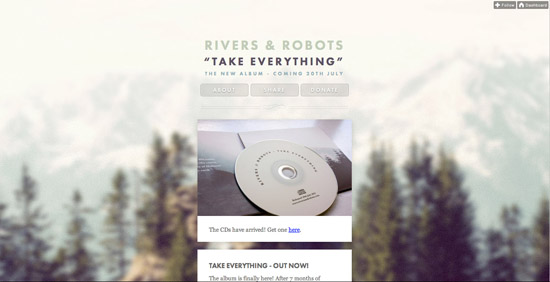
Rivers and Robots
Quite interestingly Rivers and Robots have created a mini-blog specifically to promote their album Take Everything. Due to the narrow focus of content they have been able to use a really minimal design, using a very narrow content arrow and one column approach. This type of minimal, narrow layout really makes their content more scannable. There is no clutter of a busy navigation, just three basic menu links.

Simple Blog Design

Josh Collie
A blog so minimal that it doesn’t even have a header, logo or menu! Josh Collie’s website is proof that content truly is king, as despite omitting several conventions of blog/website design, it is entirely readable, engaging and beautiful. The text is perfectly padded and feels very easy on the eyes. The large interspersed images and videos help to break up the page nicely.

Simple Blog Design

Simple Bits
Simple Bits has been held up as a modern day trend-setter for simplistic blog design. Originally it was the design that dared to be different in it’s minimal approach, but now it has inspired thousands of designers to strip away the detail in their own sites. The blog design is almost entirely type-based, yet doesn’t feel bare in any way. The stylish, minimal icons besides posts add a lovely element of detail while the varying, elegant typefaces provide an element of visual interest.

Simple Blog Design

Fran Exposito
I may not be able to understand the content on this non-English blog, but it doesn’t stop me appreciating the minimal design! This blog design is a great example of how a creative, engaging logo design can hold up an entire website. Without the logo this design would be solid, but perhaps a little boring. However, the logo perfectly frames the content below it and adds as the visual centerpiece for this design.

Simple Blog Design

Table 37
Table 37 is another blog held up for it’s creative design within the design community. It is essentially a very basic two column, textual layout. However, the use of some subtle background textures and a striking, creative logo make this a true minimal design gem. Our eye is drawn immediately to the larger right column containing the blog posts, and the left sidebar acts as a natural supporting area of content for this. Basic design principles at their best.

Simple Blog Design

MMMinimal
As suggested by it’s name, MMMinimal has a wonderfully simple blog design. Interestingly, the site focuses the user’s attention on the pictures that accompany blog posts, rather than the textual content, which is less obvious, using a faint gray font. The slick, centered layout is in no way obtrusive, and simply acts as a subtle frame for the blog post previews.

Simple Blog Design

Art Equals Work
Art Equals Work uses a super sleek, simplistic blog design. A light gray sidebar helps distinguish content areas, and the design remains essentially text-based. Visual hierarchy is artfully achieved through use of text-sizing, color and padding. The bright blue post titles are what draw our eye first, and the blog content is framed nicely by the minimal, artistic logo icon.

Simple Blog Design

Usable Efficiency
Usable Efficiency is another minimal blog design that really puts emphasis on the content. The plain background, and limited teal color palette, as well as an omission of distracting sidebars means that the blog posts are the only place to look. Presented in video format they make a particularly striking visual piece for the design, which even in it’s details is understating (see the faint twitter bird top-right).

Simple Blog Design

90 Four
Despite having a three column layout and a reasonable amount of content, 90 Four manages to still feel very minimal. This is largely due to the lack of graphics, as instead the site opts for a text-based layout over a plain white background. The design is still visually impressive due to the creative logo, great typography and deliberate use of color throughout.

Simple Blog Design

Trent Walton
Whilst many designs in this showcase use a narrow layout Trent Walton effectively uses as much space as possible in the browser. This wide, yet minimal design really allows the large text to breathe. It also helps to clearly distinguish the various areas of content. The color palette is limited to black, with rare uses of red for key links. I also like how the blog post images are displayed as a small thumbnail, which is much less obtrusive than typical formats.

Simple Blog Design

ForeFathers
A design that has inspired many designs since it’s first iteration, ForeFathers blog has now migrated to Tumblr, giving it an even more minimal approach. The textured background and old-style typography of the header is not overbearing, and leads down to a clear 1 column layout for the post content. This type of minimal layout let’s the user’s eye be drawn straight down the page in a natural fashion.

Simple Blog Design

Strange Native
Another fantastic example of a minimal design that works really well due to it’s subtle touches. This design is largely text based, but the basic logo icon and date/comment icons add a lovely touch of detail to the page. The text is very well padded and uses varying shades of gray as well as text sizes to establish a clear visual hierarchy.

Simple Blog Design

The Design Cubicle
Another pioneer in simplistic blog design, Brian Hoff has created a beautiful one column blog layout that gives primary focus to the content. Rather than detracting from the blog posts, the bold, bright background serves to frame the central content area.

Simple Blog Design

Flux Blog
Flux Blog is another minimal blog design that relies heavily on it’s creative logo to frame the otherwise simplistic design. Underneath the vibrant, colorful logo, the blog design is really very basic, with basic text sitting on a plain white background. There isn’t even anything distinguishing the various content areas, apart from differing sizes of text. Surprisingly the result is not chaotic, but the eye is naturally drawn down the larger left column of text through the various blog posts.

Simple Blog Design

Icon Bakery
Another minimal blog design framed by a beautiful logo design. As this blog discusses icon design it seems appropriate that the visual point of interest is the elegant logo icon. The rest of the header and main content area is very simplistic, avoiding overly complex graphics and opting for clean icons and text. Rare splashes of color are used to guide the visitor’s eye down the page and emphasize key headings.

Simple Blog Design

Modernerd
One of my favorite blog designs there is just so much to love about this website! Everything from the logo to the menu and blog posts feels effortlessly minimal. Essentially the site would just be a boring three column textual layout. However, several aspects combine to make the page beautiful. Firstly, if you look closely the background using an incredibly faint, subtle pattern design, which adds an element of depth to the page. Then crucially the typography uses non-standard web fonts to make each heading, each menu link a work of art in it’s own right. The best element of the page has to be the genius logo design though, which perfectly sums up the blog’s audience.

Simple Blog Design

Eight Face
One of the simplest designs in this article, but one of the most effective. If we break down the page design it is essentially a single column of text. However, it’s another great example of how quality typography can make all the difference. The two carefully chosen fonts contrast and spark visual intrigue, as the clean logo/heading text combines with the more elegant menu/blog post text. Even the logo icon screams minimalism as it effortlessly communicates ’8′ ‘E’ and ‘F’ in a few simple lines.

Simple Blog Design

Josh Spear
Josh Spear’s site is so simple that it manages to feel like you’re reading a personal diary. There is no excess clutter on the page, instead giving focus to the content. The elegant typography is enough to make the page interesting, which is helped by a creative logo icon and some cool styling effects. The user’s eye is drawn straight to the text on the page and they can’t help but read.

Simple Blog Design

MNML
MNML’s tagline ‘simply disruptive’ is the perfect description of their blog design. The site is incredibly simple, comprised mainly of plain text over a plain background. However, unlike many minimal designs that stick to a single column or rigid grid, MNML’s opts for a deliberately disrupted layout. The various content areas are put out of alignment with one another which means that the user’s eye flows more in diagonals than directly down the page. An interesting design that shows what can be achieved by breaking the mold.

Simple Blog Design

Simon Collison
Simon Collison’s blog design became instantly infamous after launching. It is considering a very minimal design, yet spices things up with some awesome illustrations and some html5 responsive design magic. This design has plenty of details, such as the page background pattern, yet none of these detract from the content which remains at the forefront. Any visual details are very subtle, and take a back seat to the blog posts. The red color in the design is used sparingly to guide the reader’s eye down the page.

Simple Blog Design

Vaullt
There is a reasonable amount going on in this design, yet it still feels quite minimal. The monotone black/white color palette helps to keep things very simple, and the content, whilst prevalent is very well spaced and doesn’t feel overbearing. Even the typography is very consistent, using a single, primary font throughout the page.

Simple Blog Design

Jack Osborne
A design so simple that you really need to visit it and play around to appreciate it’s finer points. At first glance it’s simple a column of text with some relatively attractive typography. However, the beauty of this design are in the subtle details. Firstly, the top blog post takes precedence as the other lower posts are all collapsed (until you expand them). Upon hovering over these collapsed posts you’ll see a bar come up which varies based on the number of words in that article. It’s little touches like this that can distinguish between a boring design and a daringly minimal design.

Simple Blog Design

Bobulate
Bobulate is a wonderful, single column blog that utilizes some beautiful typography. The design has a presidential feel to it through the use of a blue/red/white color palette. Even at first glance you can identify a clear visual hierarchy on the page, as your eye is drawn down from the bold blue logo, to the smaller headline text, and finally to the lighter gray blog post text. It’s essentially a very minimal blog design, but the varying typographic elements help add a lot of visual diversity to the page and make it a very attractive design.

Simple Blog Design

Pat Dryburgh
Pat Dryburgh has one of the simplest designs in this entire roundup. However, as a very minimal design it really works. The attractive typography uses ‘Proxima Nova’ which has become synonymous with modern web design. The color palette is limited to black, gray and blue and the blue is used to draw your eye down the page through a series of key links. The real merits of this design are how the incredible photography embedded into blog posts is integrated into the page, but you’ll have to visit the site and check out below the fold to appreciate this!

Simple Blog Design

Cherry Pow
Cherry Pow is fairly content heavy, yet still feels overly minimal. This is partly due to the limited fonts in the design, yet also because of the non-obtrusive header background design. Besides the logo icon this faint background design is the main graphic element of the page, which is actually largely text-based. The reader is not presented with a load of unnecessary options when browsing the design, and rather naturally scans down through the prominent blog posts.

Simple Blog Design

What Do You Think?

We would love to hear your opinion. Do you have any favorite examples from this post, or did you perhaps find a design that stood out to you especially? Let us know in the comments below.

(dpe)


Smashing Conference Live — Day 1


During the two days of the Smashing Conference, we will provide you with insights, photos and highlights on Smashing Magazine — live from the conference venue. Our team will be posting updates from the early morning to the late evening on both dates to bring you as close to the conference as possible. You can also track the tweets from the conference by following the hashtag #smashingconf and permalink for the live updates.

Bookmark this page to follow the auto-updates in real-time. Please notice that no live stream is available, but all videos will be made available for free after the event. You might want to check the schedule of the conference as well.

Monday, September 17th 2012

20.32


What a fantastic, fantastic day at the very first Smashing Conference. Mark Boulton just crowned the conference day with a truly inspiring talk. It’s time for a party now. Thank you all for following us and see you tomorrow!

“The design process is weird and complicated because it involves people, who are weird and complicated.” — Mark Boulton


© Smashing Editorial for Smashing Magazine, 2012.

19.54


A view at the conference from the top. A fantastic photo by blumenberg.

A view from the top


© Smashing Editorial for Smashing Magazine, 2012.

19.52


“Skeumorphism is festering everywhere like a virus. WHO KEEPS TO-DO LISTS ON A PLANK!?” — Mark Boulton


© Smashing Editorial for Smashing Magazine, 2012.

19.51


“Trends are bullshit. If you want to be in a trendy industry, go work in fashion, not Web design.” — Mark Boulton


© Smashing Editorial for Smashing Magazine, 2012.

19.49


A couple of photos from our great friend and attendee John Davey.

Smashing Conference
Smashing Conference
Smashing Conference


© Smashing Editorial for Smashing Magazine, 2012.

19.44


Last talk of the evening after a break by Mark Boulton. What a fantastic, entertaining talk!

Smashing Conference
Smashing Conference
Smashing Conference


© Smashing Editorial for Smashing Magazine, 2012.

17.59


“When you’ve got a slow internet connection, it’s like watching a one-legged dog play fetch. It’s depressing.” — Jake Archibald


© Smashing Editorial for Smashing Magazine, 2012.

17.56


A couple of fantastic photos from the Smashing Conference attendees. Now, what a fantastic day, and what a fantastic audience! Image credits: depone, kontour, Kahili Lechelt.

Photos by attendees
Photos by attendees
Photos by attendees
Photos by attendees
Photos by attendees


© Smashing Editorial for Smashing Magazine, 2012.

17.51


“Who doesn’t have JavaScript? Everyone doesn’t have javascript until the JavaScript is loaded.” — Jake Archibald

Jake Archibald


© Smashing Editorial for Smashing Magazine, 2012.

17.25


Jake Archibald is as entertaining as always. “Offlinification. Appcache support: Firefox, Chrome, Safari, Opera, iOS, Android 2.1+, BB 6+, Opera Mobile.

Jake Archibald


© Smashing Editorial for Smashing Magazine, 2012.

16.39


“Client communication best practices: avoid misunderstandings, don’t just use email, be honest.” — Paul Boag


© Smashing Editorial for Smashing Magazine, 2012.

16.28


“Not all clients come ready-packed as good. Some of them need upgrading.” — Paul Boag


© Smashing Editorial for Smashing Magazine, 2012.

16.27


“If you know what HTTP stands for, that makes you… interesting.” — Paul Boag


© Smashing Editorial for Smashing Magazine, 2012.

16.22


“We’re a service industry. The client must be involved, it’s about the client, not the user.” — Paul Boag (Image credit)

Paul Boag
Paul Boag


© Smashing Editorial for Smashing Magazine, 2012.

16.16


Some snacks to accompany the drinks and the British Paul Boag’s sens of humour. Now, that’s the preparation for the beer afterwards! Image source.

Brezels


© Smashing Editorial for Smashing Magazine, 2012.

16.13


“Client work offers unique challenges: exposure to different industries and people, fast-paced, exciting.” — Paul Boag


© Smashing Editorial for Smashing Magazine, 2012.

16.13


“Don’t pretend the client is the issue — Paul Boag wants Web designers to change attitude.” — Paul Boag


© Smashing Editorial for Smashing Magazine, 2012.

16.10


Uh-oh. Paul Boag has just started screaming. Ah right, that’s how excited he is about client work.


© Smashing Editorial for Smashing Magazine, 2012.

15.28


“In SaSS, use @extend if a relationship is implied and use @include if one is not.” — via Nicole Sullivan.


© Smashing Editorial for Smashing Magazine, 2012.

15.23


Concentrated attendees at Nicole’s talk. Probably the most technical talk we’ve had so far. Nicole is sharing her experiences with SASS and SASS for optimizing CSS code.

Audience


© Smashing Editorial for Smashing Magazine, 2012.

15.18


“The Inception Rule: never go more than three levels deep with nesting in SASS.” — Nicole Sullivan


© Smashing Editorial for Smashing Magazine, 2012.

15.07


Nicole Sullivan on stage, speaking about SASS and OOCSS.

Nicole Sullivan


© Smashing Editorial for Smashing Magazine, 2012.

15.02


“Facebook has 2 Mb of CSS.” — Nicole Sullivan


© Smashing Editorial for Smashing Magazine, 2012.

14.52


“Designing in the present is about finding the balance between borrowing from the past and looking towards the future.” — Oliver Reichenstein


© Smashing Editorial for Smashing Magazine, 2012.

14.18


“Nostalgia is a thriving industry: Mad Men, Lana Del Ray, Amy Winehouse, Instagram, etc, etc, etc. Designing in the present is about finding the balance between borrowing from the past and looking towards the future.” — Oliver Reichenstein


© Smashing Editorial for Smashing Magazine, 2012.

14.16


The Smashing Lounge is getting quite popular, especially among speakers.

Lounge
Lounge


© Smashing Editorial for Smashing Magazine, 2012.

14.14


Oliver Reichenstein (@iA) on stage, starting with a scene from Mad Men.

iA


© Smashing Editorial for Smashing Magazine, 2012.

13.51


Great to get outside during the lunch break! This is how the Smashing flags look like at the building.

Flags


© Smashing Editorial for Smashing Magazine, 2012.

13.50


Time for a lunch break before Oliver Reichenstein gets on the stage. Many attendees went to the Minster market to get some traditional Freiburger sausages!

Oliver coming up next


© Smashing Editorial for Smashing Magazine, 2012.

12.43


“Command line vs Photoshop: command line is friendly and even says your name!” — Stephen Hay


© Smashing Editorial for Smashing Magazine, 2012.

12.42


“Are you scared designers? Here comes the command line!” — Stephen Hay


© Smashing Editorial for Smashing Magazine, 2012.

12.39


“Developers have a wealth of all sorts of great tools, while designers have…Photoshop.” — Stephen Hay


© Smashing Editorial for Smashing Magazine, 2012.

12.29


Stephen Hay is on stage talking about style guides being the new Photoshop. “We need two things in order to replace Photoshop: static web prototypes and style guides. Pattern libraries are not style guides. Style guides explain when and how to use a particular pattern.” — Stephen Hay

Photos
Photos
Photos


© Smashing Editorial for Smashing Magazine, 2012.

11.52


“You wouldn’t give clients Dreamweaver to update sites, so why do we give them a CMS that mimics that behavior?” — Rachel Andrew.

Photos


© Smashing Editorial for Smashing Magazine, 2012.

11.51


“Avoid inserting raw HTML into your content at all costs. Clean content is far more portable.” — Rachel Andrew.


© Smashing Editorial for Smashing Magazine, 2012.

11.44


“A giant blank text area is terrible UX. Remember, our content creators are our users too!” — Rachel Andrew.


© Smashing Editorial for Smashing Magazine, 2012.

11.37


“CMS allows designers to make semantic decisions so the editor doesn’t have to.” — Rachel Andrew.


© Smashing Editorial for Smashing Magazine, 2012.

11.36


Rachel Andrew on stage, talking about the future of content management systems. “A CMS should help content editors make good decisions.”

Rachel Andrew


© Smashing Editorial for Smashing Magazine, 2012.

10.48


Jeremy explains how he avoided responsive images altogether by introducing multiple columns instead of scaling up images. (via Brad Frost)


© Smashing Editorial for Smashing Magazine, 2012.

10.41


To designers: “The Web is responsive by default, you make design decisions that screw it up!” — Jeremy Keith.


© Smashing Editorial for Smashing Magazine, 2012.

10.39


“Progressive enhancement isn’t about designing for the lowest common denominator. It’s just about starting there.” — Jeremy Keith.


© Smashing Editorial for Smashing Magazine, 2012.

10.36


“There is a difference between support and optimization”. — Brad Frost


© Smashing Editorial for Smashing Magazine, 2012.

10.34


We’ve set up a Smashing Lounge with our sofas and tables for attendees to get some work done. Happy surfing! (vf)

Smashing Lounge
Smashing Lounge
Smashing Lounge
Smashing Lounge


© Smashing Editorial for Smashing Magazine, 2012.

10.33


It’s weird to see most people not using laptops or mobile phones while Jeremy Keith is speaking. Jeremy Keith definitely draws attention to his talk. (vf)


© Smashing Editorial for Smashing Magazine, 2012.

10.31


Jeremy Keith on stage, talking about the Spirit of the Web.

Jeremy Keith

Jeremy Keith


© Smashing Editorial for Smashing Magazine, 2012.

09.56


People are enjoying the Smashing Lounge, having a morning coffee and charging their devices for the upcoming first talks… Pay us a visit if you are around! (sp)

Smashing Lounge


© Smashing Editorial for Smashing Magazine, 2012.

09.27


The opening titles for the Smashing Conference are now available online. Designed by the fantastic team by Joaquín Urbina from No-Domain from Barcelona, Spain. Thank you, guys, for the fantastic work!

The room is filling with truly smashing attendees! And the coffee seems to be quite popular as well. The first speaker after the Welcome note is Jeremy Keith. (vf)

Smashing Conference


© Smashing Editorial for Smashing Magazine, 2012.

09.03


The registration opens! It looks like it’s going to be a beautiful day. Last check-ups. And yep, we’ve produced the flags to put on the building as well. Exciting! (vf)

Smashing Conference
Smashing Conference
Smashing Conference
Smashing Conference
Smashing Conference
Smashing Conference
Smashing Conference


© Smashing Editorial for Smashing Magazine, 2012.

06.35


Here we go. Waking up early, adding photos to the post and double checking the introduction slides. The Smashing Conference is coming! (vf)


© Smashing Editorial for Smashing Magazine, 2012.

Sunday, September 16th 2012

Sunday, 20:48
Speaker dinner up in the hills of Freiburg. On the left: Josh Brewer, Mark Boulton, Oliver Reichenstein. On the right: Jeremy Keith. Yep, his thoughts are far, far away. And no, it wasn’t as boring as this picture looks like — on the contrary, it looked like some speakers were having the time of their lives!

Speaker Dinner

Sunday, 19:30
Finally, almost all 16 speakers have arrived safely. Most of them had to deal with delayed flights and trains, but we picked them up ourselves. Well, and almost all are right in time before the speaker dinner! Waiting outside the hotel.

The Speaker dinner

Sunday, 18:44
The Smashing Crew’s t-shirts. If someone has a question or needs assistance, we’ll be easy to recognize by the orange t-shirt. Time for a photos break. We’ve got to set things up.

The Smashing Crew

Sunday, 17:02
Final checks at the conference venue. All bags and badges are waiting for attendees inside. Setting up Wi-Fi, testing slides, checking audio and light, preparing for registrations, drinks, snacks and sponsors stands. If you look closely at the venue, you might be able to detect some fine details. The building, Historical Merchants Hall, was built between 1520 and 1530. (vf)

The walls

In the venue

Preparations

Main Venue

Sunday, 16:45
Flyers for attendees with directions to the party. (vf)

Preparations for the Conference

Sunday, 16:34
The t-shirts, lanyards, badges, stickers, bags and swag are ready. (vf)

Preparations for the Conference

Sunday, 11:14
Our team at Andy Clarke’s workshop. Andrew (on the left), our eBook manager, and Iris, our senior editor. It looks like they are having fun as well! (vf)

Andrew and Iris

Sunday, 10:16
Andy Clarke’s first workshop. All seats are taken. The reason why we had to organize the workshop on Sunday is that the first workshop which Andy will host on Wednesday was fully booked within 2 weeks. We had to be creative and organized a pre-workshop on Sunday. (vf)

Andy Clarke's Workshop

Saturday, September 15th 2012

Saturday, 22:44
The first speakers have arrived. A pre-warm party near the venue. On the right: Andy Clarke, Brad Frost and Jonathan Snook. And yes, that’s a schnitzel. (vf)

First speakers

Saturday, 19:45
First attendees are arriving in Freiburg. For most of them, travelling to Freiburg isn’t easy, and quite time-consuming. Freiburg has many beautiful sides, one of them are beautiful cobbled streets in the city centre. A photo by John Davey. (source). (vf)

Streets

Friday, September 14th 2012

Friday, 13:37
Packing, packing, packing. The conference welcome 350 attendees, and each of them has to have a bag ready for them at the registration. It took quite a while for Lisa to prepare the bags, but she doesn’t look very annoyed.

Bags

Bags

Friday, 13:30

After months of planning and preparations, the conference is finally coming. The Smashing Conference — our first two-day community event for Web designers and developers in our home town Freiburg, Germany — is starting today. Back in May, we have invited our dear community to come together to share and gain practical knowledge in an intimate, informal atmosphere. Admittedly, we haven’t expected that all 350 tickets will be gone within two weeks.

Preparations for the Conference

We’re extremely excited and happy to welcome 16 fantastic speakers such as Andy Clarke, Rachel Andrew, Aarron Walter, Christian Heilmann, Jeremy Keith, Oliver Reichenstein, Lea Verou, Mark Boulton or Paul Boag as well as remarkable attendees from all parts of the world. The conference is a big deal for us, but we want you to be a part of it as well.

During the two days of the Smashing Conference, we will provide you with insights, photos and highlights from the conference venue live on Smashing Magazine website. Our team will be posting updates from the early morning to the late evening on both dates to bring you as close to the conference as possible. You can also track the tweets from the conference by following the hashtag #smashingconf.

Bookmark this page to follow the auto-updates in real-time. Please notice that no live stream is available, but all videos will be made available for free after the event.

The conference takes place in Freiburg, Germany at the legendary Historical Merchants Hall at the foot of the Black Forest. The two-day single-track conference will present talks on September 17th and 18th, as well as three workshops on September 19th.

Facts

We’re very excited about the Smashing Conference, and we wish you attended the conference as well. Please share in the comments what exactly you’d like us to post, and feel free to submit your questions for speakers as well. We’re looking forward to the two inspiring and exciting conference days!


Paper for iPad: Intuitive Sketchbook for Creative Professionals


An iPad-App by the simple name of Paper wants to transform your Apple-device into one of the oldest, but still most intuitive user interfaces there is. Thoughts, sketches, drawings, notes, whatever can be caught on a piece of paper can now be stored on your iPad, without sacrificing the ease of use of a simple blank sheet. This may not sound very spectacular, but really is a big thing, if you look deeper into it.

[This is the first article in our new series "iOS for Creative Professionals". Hope, you'll like it!]


With Paper sketching is fast and easy, just as on its wood-based role model

UI designers know it. The simpler an interface can be handled, the more intuitive it gets, the more complicated it is designwise. Hiding all the necessary background processes from user’s sight and handling all possible errors seamlessly is a tedious task for every developer. Keep in mind, what Einstein said: Things should be as simple as possible, but not simpler

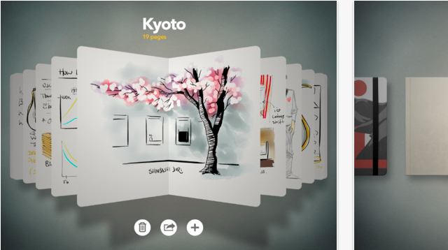
In my opinion, Einstein would be happy with the work of 53, a little software smithery based in New York. Paper is a sketch- and note-container, which can hold as many content as you like it to. Content in Paper is organized into books and inside these books handled pagewise. You can have an unlimited number of pages in each book. Web developers for example could organize each project in a separate book, doing the preliminary sketching and developing up to the state of a wire frame. If you’re more into movies, you could as well develop the scenes of your next blockbuster using a book inside Paper. If you’re more like an average person, you could of course just write your shopping list, Paper won’t hold it against you…


A draft of a site structure, taken from the included example pages

Paper: Fresh ideas for a fresh concept

Paper went to the App Store at the end of March 2012 and just got a big update a few days ago. Its interface is based fully on swipe- and touch-operation. The app’s surface is not only not crowded, but astonishingly nearly completely empty. Establishing new sketchbooks is very simple. The start screen shows already stored books, which can easily be scrolled through via swipes. Tapping the plus symbol at the lower end of the app window will produce a new and empty book. Tapping on a book will open it and present its content in the form of pages. Swiping lets you scroll through the pages. Tapping the already known plus creates a new page. Tapping on the newly created page or any other page opens it. If you want to close a page or the whole book, you can easily do so by pulling thumb and forefinger together. Other apps use this gesture for zooming out.


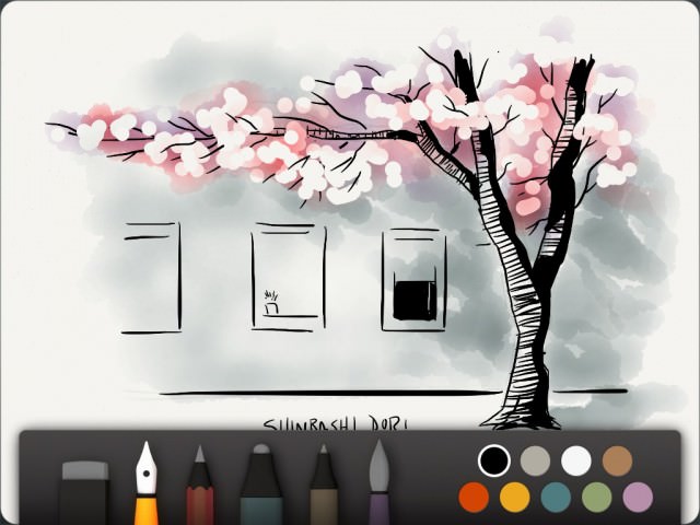
If you’re skilled enough, you can even create drawings like the one shown above

On page level you’ll notice a toolbar at the lower end of the screen. This bar includes five different tools for writing and drawing, a rubber and a very basic colour palette with nine different hues. Swiping from the top of the app down to the bottom hides the toolbar, swiping from bottom to top brings it back into sight. Undoing is simple. You take two fingers and turn them counterclockwise. The longer you turn, the more steps are made undone. Turning clockwise again brings them back again.

Paper: Not all tools are free of charge

Paper can be used free of charge, but has a limited tool set then. You only get one of the five pens and brushes, and can make use of the rubber. The freely available pen allows you to draw sketches. You can vary the stroke width by moving faster or slower on the surface. The faster you draw, the thicker the stroke will become. This is a little unusual at first, but can not be handled differently as the iPad is not touch-sensitive in the form of being able to react to different levels of pressure put to it. You’ll easily get used to this technique, I promise.

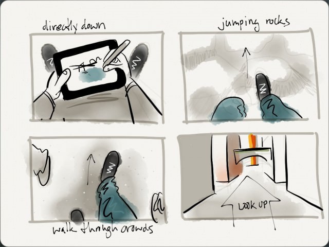
Other tools enable you to create pencil drawings. Another pen doesn’t vary the stroke size and can be used as a marker. There is a dedicated pen for writing and a brush, that lets you paint as if with watercolour. Each tool must be bought separately and sets you back 1,99 USD. Alternatively you should consider buying the whole package for a slightly leaner 6,99 USD.


This storyboard makes use of all the tools available

Understandably there’s some criticism to this policy. Not all clients understand why they should buy additional tools while the app is declared as free on the App Store. Probably a paid version would have been the cleaner solution. Anyway, as the whole package is nothing near of expensive and regarding the fact, that the free drawing tool is able enough for many basic needs, Paper is a must-have for every creative professional out there. As long as they use iPads of course…

Paper: Share your sketches easily

Paper has me. I ditched my Moleskine in favour of the app and can hardly find any flaws or downsides. If you want to criticize on a high level, you could complain about the lack of export features, such as saving to PDF, but wait, my Moleskine didn’t have that either.

Paper can be connected to Facebook, Twitter and Tumblr. Sharing of sketches is fast and easy that way. Moreover all content can be shared via e-mail. Since version 1.1, available from September 14th 2012, pages can be exported to the iPad’s camera roll. Saving takes place in the native resolution of the iPad running Paper.


Tumblr, Twitter and Facebook can be reached from within Paper

Paper: Now with more features

With version 1.1 Paper did not only get more open in ways of exporting its contents, it got provided with useful functionality around the administration of books and pages, too. Now you can duplicate books and pages or move them from one book to another. Paper is one of the few apps that supports multi-touch gestures. You need both hands to benefit from the new features. Tap a page and hold it, take your other hand and close the book, swipe through the books and tap the one, where you want to insert the page, which you are still holding tapped, into. Swipe through the pages to the place where your copied page shall appear, let it go. I’m amazed, once again…

Related Links:

  • Want your sketches featured by 53? Send them in! – 53 Blog
  • The product’s website pleases with a fresh design – Paper by 53
  • iTunes App Store provides you with Paper – iTunes-Link
  • Vimeo carries a few videos to demonstrate Paper’s feature set – Paper on vimeo

  •   
  • Copyright © 1996-2010 BlogmyQuery - BMQ. All rights reserved.
    iDream theme by Templates Next | Powered by WordPress