An iPad-App by the simple name of Paper wants to transform your Apple-device into one of the oldest, but still most intuitive user interfaces there is. Thoughts, sketches, drawings, notes, whatever can be caught on a piece of paper can now be stored on your iPad, without sacrificing the ease of use of a simple blank sheet. This may not sound very spectacular, but really is a big thing, if you look deeper into it.
[This is the first article in our new series "iOS for Creative Professionals". Hope, you'll like it!]

With Paper sketching is fast and easy, just as on its wood-based role model
UI designers know it. The simpler an interface can be handled, the more intuitive it gets, the more complicated it is designwise. Hiding all the necessary background processes from user’s sight and handling all possible errors seamlessly is a tedious task for every developer. Keep in mind, what Einstein said: Things should be as simple as possible, but not simpler
In my opinion, Einstein would be happy with the work of 53, a little software smithery based in New York. Paper is a sketch- and note-container, which can hold as many content as you like it to. Content in Paper is organized into books and inside these books handled pagewise. You can have an unlimited number of pages in each book. Web developers for example could organize each project in a separate book, doing the preliminary sketching and developing up to the state of a wire frame. If you’re more into movies, you could as well develop the scenes of your next blockbuster using a book inside Paper. If you’re more like an average person, you could of course just write your shopping list, Paper won’t hold it against you…

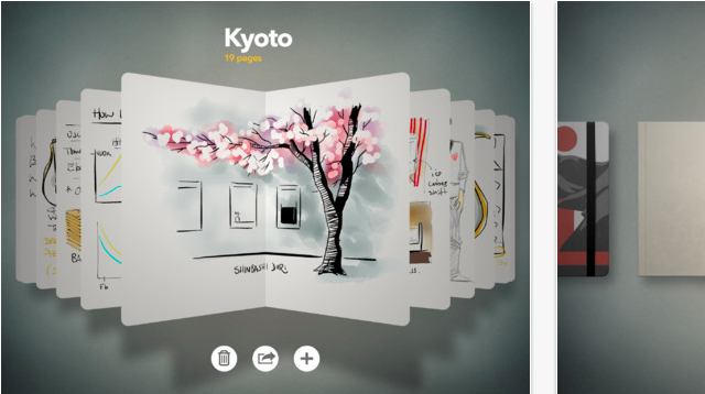
A draft of a site structure, taken from the included example pages
Paper: Fresh ideas for a fresh concept
Paper went to the App Store at the end of March 2012 and just got a big update a few days ago. Its interface is based fully on swipe- and touch-operation. The app’s surface is not only not crowded, but astonishingly nearly completely empty. Establishing new sketchbooks is very simple. The start screen shows already stored books, which can easily be scrolled through via swipes. Tapping the plus symbol at the lower end of the app window will produce a new and empty book. Tapping on a book will open it and present its content in the form of pages. Swiping lets you scroll through the pages. Tapping the already known plus creates a new page. Tapping on the newly created page or any other page opens it. If you want to close a page or the whole book, you can easily do so by pulling thumb and forefinger together. Other apps use this gesture for zooming out.

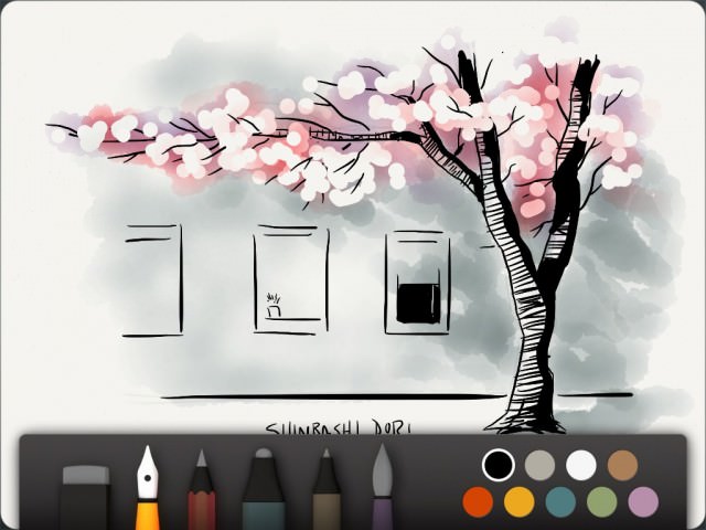
If you’re skilled enough, you can even create drawings like the one shown above
On page level you’ll notice a toolbar at the lower end of the screen. This bar includes five different tools for writing and drawing, a rubber and a very basic colour palette with nine different hues. Swiping from the top of the app down to the bottom hides the toolbar, swiping from bottom to top brings it back into sight. Undoing is simple. You take two fingers and turn them counterclockwise. The longer you turn, the more steps are made undone. Turning clockwise again brings them back again.
Paper: Not all tools are free of charge
Paper can be used free of charge, but has a limited tool set then. You only get one of the five pens and brushes, and can make use of the rubber. The freely available pen allows you to draw sketches. You can vary the stroke width by moving faster or slower on the surface. The faster you draw, the thicker the stroke will become. This is a little unusual at first, but can not be handled differently as the iPad is not touch-sensitive in the form of being able to react to different levels of pressure put to it. You’ll easily get used to this technique, I promise.
Other tools enable you to create pencil drawings. Another pen doesn’t vary the stroke size and can be used as a marker. There is a dedicated pen for writing and a brush, that lets you paint as if with watercolour. Each tool must be bought separately and sets you back 1,99 USD. Alternatively you should consider buying the whole package for a slightly leaner 6,99 USD.

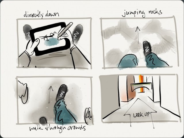
This storyboard makes use of all the tools available
Understandably there’s some criticism to this policy. Not all clients understand why they should buy additional tools while the app is declared as free on the App Store. Probably a paid version would have been the cleaner solution. Anyway, as the whole package is nothing near of expensive and regarding the fact, that the free drawing tool is able enough for many basic needs, Paper is a must-have for every creative professional out there. As long as they use iPads of course…
Paper: Share your sketches easily
Paper has me. I ditched my Moleskine in favour of the app and can hardly find any flaws or downsides. If you want to criticize on a high level, you could complain about the lack of export features, such as saving to PDF, but wait, my Moleskine didn’t have that either.
Paper can be connected to Facebook, Twitter and Tumblr. Sharing of sketches is fast and easy that way. Moreover all content can be shared via e-mail. Since version 1.1, available from September 14th 2012, pages can be exported to the iPad’s camera roll. Saving takes place in the native resolution of the iPad running Paper.

Tumblr, Twitter and Facebook can be reached from within Paper
Paper: Now with more features
With version 1.1 Paper did not only get more open in ways of exporting its contents, it got provided with useful functionality around the administration of books and pages, too. Now you can duplicate books and pages or move them from one book to another. Paper is one of the few apps that supports multi-touch gestures. You need both hands to benefit from the new features. Tap a page and hold it, take your other hand and close the book, swipe through the books and tap the one, where you want to insert the page, which you are still holding tapped, into. Swipe through the pages to the place where your copied page shall appear, let it go. I’m amazed, once again…
Related Links:
- Want your sketches featured by 53? Send them in! – 53 Blog
- The product’s website pleases with a fresh design – Paper by 53
- iTunes App Store provides you with Paper – iTunes-Link
- Vimeo carries a few videos to demonstrate Paper’s feature set – Paper on vimeo
