Archive for February, 2022

How to engage users on your website? 10 Hacks To Use Today

Website engagement hacks help a great deal in engaging users and increasing conversions. The strategies to improve online engagement include many different activities that can have a positive result on the overall user experience of your website.

Metrics To Track User Engagement

(source: Pixabay)

There are multiple metrics that can help to measure engagement. Here are few of the most important ones:

1. Bounce Rate:

This metric defines how many users leave the website without interacting with it. The lower the bounce rate, the more engaging your site is. If you have a very high bounce rate maybe people cannot find what they were looking for on your website or they might find better information somewhere else so they leave immediately. 

2. Time On Website:

This metric shows how long users stay on your website. It’s crucial because if people spend lots of time on your site, it means there are relevant contents and things to learn from it. Tracking this metric will help you engage visitors better by understanding what kinds of content they appreciate most.

3. Returning Visitors:

This metric represents people who come back to your website and browse it again. Website engagement strategies include tools that help you to better engage returning visitors and that encourage them even more for next visits.

What is website engagement?

Website engagement usually refers to the process of encouraging users’ engagement with contents on a web page, such as by adding social media buttons or displaying comments sections on blog posts. 

Website engagement can also refer to encouraging user interaction with other parts of the website through features like quizzes or surveys. 

Top Website Engagement Hacks You Should Know

So, let us explore 10 Website Engagement Hacks to use today:

1. Add Social Media Buttons To Your Website

(Source: Pixabay)

Social media buttons are the easiest way for users to share your content with their network or follow you on social media platforms. Once you have noticed an increase in traffic from these shares, consider offering something special only to those who followed through the links provided by you. 

This could be a discount code, free premium access, or a simple invitation to give feedback about the site’s features. Remember that sharing is not going to influence anything unless users feel rewarded for it.

2. Website Popups

Website popups are one of the most known ways to improve your site’s conversions. Website popup example that evokes curiosity, can be used in re-engagement efforts or help with boosting sales by offering alternative payment options (for instance customers who did not pay using PayPal could get the option to pay using a credit card). 

Website popups should be subtle and short enough to leave visitors no other choice but to interact if they want to exit the page. Website popup examples like this one work because you don’t need more than 10 seconds’ worth of attention span from users while providing useful information at the same time (such as coupons, marketing campaigns, etc.).

3. Make Your Website Responsive

(source: Pixabay)

Having a responsive website can help you to engage more customers. Website responsiveness is especially important for e-commerce websites since users are expecting the same experience everywhere they are browsing or shopping online. 

Make sure your site responds nicely on different devices so avoid building one website version for every device, instead focus on providing tablets and mobile users with simplified interface options that will improve their browsing experience. 

Website responsiveness examples like this one include offering a single version of content that is easily readable on all devices. A responsive website makes it accessible to a larger audience

4. Website Countdown Timers

Website countdown timers have shown to be effective at increasing conversions during sale events by encouraging visitors to buy before time runs out. 

Website countdown timers can also be used as re-engagement efforts – for instance, if there is some promotion running only for the next 48 hours you could include a counter on your website with this information in order to encourage users to act before it’s too late.

Website countdown timers offer serious motivation in taking action fast in order to get an attractive discount or benefit upfront.

5. Website Scrolling Mechanic

Website scrolling mechanics are helpful for showing additional content based on the user’s behavior and preferences, these usually appear right after first landing on a certain web page and can be used as re-engagement efforts (for instance showcasing free premium content if the first 3 articles were read by visitors). 

Website scrolling provides further insight into customers’ browsing behavior and allows marketers to identify what exactly needs to be improved so that more customers would convert.

6. Website Reviews 

Website reviews are one of the most popular ways for marketers to understand their targets’ needs and interests, website reviews can be either product or service related, but they are definitely one of the best re-engagement efforts these days – especially if they are coming from people who have shown some interest in your brand online. 

Website review shows trustworthiness to website visitors by showing targeted testimonials straight from people who were actually using services provided by you.

7. Include Video Tutorials On Your Website

(Source: Pixabay)

As video content is very engaging (users love videos nowadays) it would only make sense to include them on your website in order to engage more users and increase conversions at the same time. 

User-friendly video tutorials are especially important for website usability since there is no better way of guiding your customers to use your website or services. 

Website videos help visitors a visual guide to using the site, by breaking down things into easier steps and it’s always better than written instructions that are hard to follow.

8. Website Navigation & Flow Improvement 

Website navigation improvement is all about customer-focused experience which can significantly increase conversions if handled carefully. Website navigation is an often overlooked part of every website design process that needs constant adjustments in order to match business objectives with customer expectations. 

Website navigation example with color coding helps users understand where they are on the web page, what other options are available and how to return back easily if needed. 

Website flow improvement is all about creating a smooth browsing experience for your visitors and it’s especially important when trying to increase conversions.

Website flow improvement (including quick and easy registration and checkout process) can help you make the website buying process as fast as possible which increases conversion rates without actually annoying users with troublesome sign-up procedures.

9. Product Screenshots 

Product screenshots are helpful in providing additional information to certain web pages. They usually appear on the home page, feature pages, or product detail pages. 

Product screenshots offer clear insight into a company’s credibility by showing real-world numbers that definitely improve website trustworthiness and show true popularity of certain brands online.

10. Include FAQs 

Website FAQ (Frequently Asked Questions) is another way of engaging users on a website. Website FAQs are helpful for improving website navigation and user experience since they provide answers to the question that visitors might have about a specific web page or product.

The FAQ’s section helps customers understand what you offer without forcing them to go through the entire web page every time they visit your site.

What is Your Favourite Hack?

We have explained some of the best hacks to improve website engagement that can give you better metrics and business revenues.

Now it’s your turn to implement these tips on your website or online store to grow your business. Let us know in the comments below how these hacks have helped in meeting your goals.

The post How to engage users on your website? 10 Hacks To Use Today appeared first on noupe.


How to Create a User Journey That Users Will Actually Follow

Have you ever wondered why users do not complete certain actions on your website or why you don’t see enough conversions? The reason might be a need for a website redesign – or a poorly designed user journey.

A user journey maps out all steps that a user takes when interacting with your software product. Its ultimate goal is to naturally lead the user towards completing a certain goal and this is why the user journey design is so important. Unfortunately, many business owners do not take it seriously enough which results in low conversions and low user engagement. So how do you craft an engaging and intuitive user journey? This article aims to shed light on the issue.

What exactly is a user journey and why does it matter so much?

As already stated, a user journey is a path that a user takes when interacting with a product in order to reach a specific goal. This process starts from the first point of interaction (i.e. launching an app) and includes all actions that a user performs (browsing, interacting, selecting categories, etc.) until the goal is complete.

Think of a user journey as a map that shows how exactly a user behaves when interacting with a product. Of course, you can never predict one’s behavior with 100% accuracy but by studying your target audience, you can get a pretty solid understanding of what your users want and how they expect to achieve it.

So why is user journey design so important? Here are the core reasons:

  • A good user journey boosts user experience: if a product has intuitive navigation and does not cause any confusion, users will most likely become more interested and engaged. This, in turn, promotes conversions as they’ll be more motivated to complete them.
  • A detailed user journey uncovers any blind spots: it may reveal some weak areas in your app’s design that you have not noticed before.
  • A user journey helps make the app’s design more interactive: for example, by knowing the main touchpoints, you can adjust the design correspondingly.

The main components of a user journey

One of the biggest misconceptions that one can make about a user journey is that it consists of user actions only. This misconception, in turn, leads to poorly designed user journeys that users do not wish to follow.

The first step in creating an intuitive and user-friendly user journey is listing down and understanding its main components. They are:

  • Your buying persona or your target audience: who is the person that you target?
  • User interaction: are you mapping out a real or an anticipated interaction?
  • Journey stages: what steps/stages does a user go through until the goal is reached?
  • Emotions and thoughts: what emotions does a user feel at each stage of the journey?
  • Touchpoints: what are the main points of interaction between a user and a product?

Yes, all these things need to be considered when creating a detailed and efficient user journey. Now, let’s dissect the process step by step.

The process of creating a user journey

When you approach a user journey design without a thorough plan, chances are high the user journey will make users stumble on their way. Hence, it is vital to follow the steps that we listed below to make sure you covered all aspects of the user journey creation.

Set your primary goal

The first thing that you need to think about is the goal that you want to achieve. It may be a bigger number of conversions, better user engagement, or an increased number of product downloads. Whatever your goal is, it will be your base for outlining a user journey and you will be building the touchpoints around this goal.

Define your target audience

The next step to take is to actually define who your audience is. Here is where you might face some hidden rocks.

The thing is, you might be having several target audiences and that’s completely fine. Note though, that every target group will need its own unique user journey so make sure to invest time and resources into designing them.

Once you determine whether you want to build a user journey for one or several user groups, you’ll need to create a comprehensive profile of your perfect user. We highly recommend not to rely on your intuition solely and to question real users instead. In this way, you’ll get a solid understanding of their online behavior, their most acute needs, things that motivate them to continue the interaction, and things that set them off. 

Define user goals, expectations, and pain points

After you understand who your target users are, it’s time to define what they want from your product, what they expect from it, and what problem the product can help them solve. You will use these findings as a base to make the journey from point A to point B as smooth as possible while also paying attention to users’ emotions during the process. This leads us to the next point.

Identify users’ emotions 

Throughout the interaction with your product, users feel a range of emotions, from excitement to frustration. Your task here is to identify (and partially predict), what kind of emotion each step of the user journey evokes. 

For example, if your current user journey is not user-friendly and causes confusion, it will leave users frustrated and even angry, thus decreasing their motivation to complete a conversion. By knowing what emotions the stages of a user journey cause, you will be able to adjust these stages and improve the overall experience.

Identify touchpoints

Touchpoints are the points of interaction between a user and your product. Examples include:

  • Product demos
  • ustomer support
  • Feedback
  • Onboarding process
  • Loyalty program

As you see, in all these examples a user somehow interacts with your business and gets something in return. Touchpoints play a major role in leading a user towards completing a conversion, so you need to list down all touchpoints in your user journey and analyze how users actually interact with them. Do they interact with all touchpoints and if not, then what might be the reason? 

Identify the steps that a user takes

When users interact with your product, they perform a sequence of certain tasks, for example: 

  • Find (they come across your product for the first time)
  • Explore (users browse your product and check the available features)
  • Use (they make a decision and proceed to make a conversion)
  • Follow-up (users leave their feedback on the product).

This is a very simplistic outline of a possible list of user actions but it gives a good idea about the way a user starts and finishes using the product. By knowing these actions, you can correlate them with the following points:

  • Doing: what does a user do during each step, i.e. during the “find” stage?
  • Thinking: what does a user think about? It may be “I need to order lunch from the nearest restaurant”, meaning, you need to analyze what kind of an objective a user sets.
  • Feeling: this directly relates to the emotions that we talked about earlier.
  • Touchpoints: identify touchpoints that are available to a user at a certain step, i.e. during the “explore” stage.
  • Opportunities: what kind of opportunities does your product offer to the current user needs? I.e., during the “explore” stage, how can your UI convince the user to proceed?

This may sound overwhelming and it’s not obligatory to perform such deep analysis but it will undoubtedly help you better understand your target audience and how to fulfill their needs in the most effective manner.

Tips to enhance your user journey

To sum up, here are several tips that can help you improve your current or future user journey and ensure users complete it without skipping any steps:

  • Define and outline all possible obstacles that prevent users from completing a journey and/or interacting with touchpoints;
  • Define KPIs to achieve: a certain percentage of conversions or a certain number of sales;
  • Take the journey yourself and see whether it’s as smooth as you think and whether the website design supports it;
  • Choose the user journey map format that suits your company the best.

And don’t forget to constantly test your ideas with real users and collect their feedback. Last but not least: remember that a user journey is not a constant but rather something that is changing so you’ll need to review it from time to time, especially as your product grows and evolves.

The post How to Create a User Journey That Users Will Actually Follow appeared first on noupe.


3 Not-So-Obvious Mistakes that Ruin Your Project Management Strategy

No matter how big or small your company is, getting tasks done is a lot easier if you have a formal structure in place. Thanks to project management tools, it’s now super easy to give structure to tasks as simple as ordering new printer paper to those as complex as leading a sales team.

And while the number of project management tools has been growing daily, the one thing that hasn’t changed is the human element. It’s as easy as ever to make mistakes that no tool in the world can fix.

Here are our top mistakes that you may be making in your project management strategy and how to fix them.

Scope creep

You may have heard of the term before but you don’t know what it means. Scope creep is when you agree on a certain project under certain conditions, and then you start working, only to realize that there’s no way to achieve what you promised.

For example, I’ve had many situations where I agreed on writing a set of blog posts for a client in a period of one month. When the work starts, the client asks for new sections, images, product comparisons, keyword optimization, and all of that with four different rounds of revisions.

Source: Dilbert

This happens in project management too – you promise to deliver a certain amount of work in a certain amount of time and conditions change – which is normal.

To avoid scope creep, make sure you analyze the entire situation before the work starts. What changes could happen, who will do the work, what the manager (client) might ask for, and anticipate this in advance. 

If you need 7 days to get the work done, state that you’ll finish in 10. If you do end up finishing in 7, you’ll look great in the eyes of your manager or client. If things get complicated, you’ll have 3 days of room to work with.

If you’re pitching potential clients, it’s a good idea to lay out all the details in your business proposal before the work starts. That way, they know exactly what they get and they’ll sign for those conditions too. A great proposal template helps a long way here.

Lack of metrics to measure success

What gets measured, gets improved. As a project manager, you’ll often consider a completed project a good one and leave it at that. After all, if the task is complete, there’s no need to look into it further, right?

In reality, it’s much better if you keep things under control.

One of the keys to our great internal organization is that everyone gets their own set of KPIs for success, on the level of the:

  • Company
  • Department
  • Team 
  • Individual employee

That way, everyone has a set of common targets to reach but they also have their own personal goals for which they are most responsible. If the targets at the very top level of the company don’t get hit, you can look from the top to bottom to see where the bottlenecks are and how to remove them.

Micromanaging a team of experts

As a project manager, you should know the strengths and weaknesses of your team. Before each new project, you should have a good idea of who the right person is for a job so it can be done quickly and efficiently.

Once the job starts, the worst possible thing that you can do is check into progress with your team members every once in a while, just to make sure that they’re doing their job. Once you start micromanaging, you risk upsetting your teammates and actually slowing the progress down instead of doing the opposite.

Source

There are two key conditions for preventing micromanagement.

The first one is hiring great people and assigning the right people for the right job. If you know an expert is working on a task, there is no need to check their work diligently.

The second condition is setting realistic goals and following up on them as the job is complete. For example, we have a designer whose goal for the week is to finish up 4 pages within one workweek. Instead of checking daily on the mockups, we just check on Friday if the work is done and whether they need some extra time or help.

While remote work and the lack of a physical office have made micromanaging more difficult, there are still ways it can happen. Thanks to a variety of messaging and project management tools, it’s easy to go overboard in monitoring employee progress. Simply let great people do great work and worry about the results.

Inefficient communication

I realize that this can be a broad term, but hear me out. Communication is one of the foundations of great project management, and the diversity of communication channels nowadays is a blessing and a curse at the same time.

On the one hand, you can send someone a Slack message, email them, send them a voice message, tag them in a Trello card or Notion, assign them something in Google Docs… You name it.

On the other hand, trying to find a message in all those channels becomes a nightmare. We faced two issues: 

  • Finding who sent a message and where
  • Determining what the most important messages were

To prevent this from happening, we agreed on a set of rules. We determined which channels will be used for what type of messages and who the stakeholders are. 

The most important internal messages go in Slack as announcements. Task-related messages go in our project management tool while important customer-facing messages go in emails. Chit-chat and informal communication go in personal Slack messages and channels.

This saves a ton of time and makes it much easier to manage projects. We know when a notification comes in how urgent it is and what needs to be done about it. Moreover, we know immediately where to look for a message if we need it for reference. With unified communications becoming omnipresent, effective communication will become crucial in the future.

Wrapping up

On the surface, it may seem like managing projects is easier than ever before. With a (mostly) remote workforce, great talent from all over the world, and a variety of tools to use, it appears that project management is a walk in the park. Regardless of how advanced the tools get, it’s important to keep in mind that you’re working with humans at the end of the day. This is how you’ll avoid the biggest project management strategy mistakes easily.

Author: Mile Zivkovic; Better Proposals
Photo by Ross Sneddon on Unsplash

The post 3 Not-So-Obvious Mistakes that Ruin Your Project Management Strategy appeared first on noupe.


Full Guide On How To Design A Perfect App Icon

In the first quarter of 2021, Google Play had almost 3.5 million apps, and App Store – more than 2,2 million. It means that while users don’t have to limit their demand, developers struggle to keep up with the competitive edge. The way to the client’s heart is long and tedious: you should perfect everything about your app, and the icon isn’t an exception. That’s what we are going to discuss in the article –  how to make an ideal icon?

What Is an App Icon?

Let’s start from the very beginning – an app icon definition. It’s a small, usually square image on your home screen, by tapping on which you call out an app. It’s extremely important as it should be eye-catching to grab the users’ attention and tune your brand identity at the same time. 

Sometimes, an app icon is mistakenly perceived as a brand logo. While this can be true, both are actually very much different in terms of approach to work, design process and tools, metrics.

Why Should You Bother About an App Icon?

That’s probably one of the most popular questions since an app icon seems to be too small to be significant – it’s just a tiny image, after all. In reality, the user’s brain will process this image much faster than the name of your app. It means that if the icon fails to attract attention, the chance of user acquisition drops. 

We are sure that icons are of utmost importance when it comes to App Store Optimization (ASO) because it helps to build a rapport between a user and an application. No one has ever suffered from an appealing wrapping as books are judged by their covers. Only a few focus on app mechanics and features, neglecting its design. 

So, we can say that an app icon contributes to establishing an emotional connection with the target audience, which in turn leads to an increased number of downloads. Besides this, with a beautiful wrap, you can count on a competitive advantage in the App Stores due to a positive first impression.

4 Steps on the Way to a Stellar App Icon

Although you should pay specific attention to an app icon design, the whole process isn’t rocket science. You should proceed with four steps only.

1. Identify a Design Idea

You can’t just implement the first icon idea that came to your mind. You need to embed the tiny image into your brand concept. Here are three golden rules that will guide you:

  • Be customer-oriented. The colors and patterns should reflect your target audience if you wish to use an icon as a powerful marketing tool.
  • Be true to yourself. Don’t confuse users by copying someone else. You may provoke negative associations and alienate users in the end.
  • Be eloquent. Speak with the icon. Let it tell users more about you, your app, and your offer. Descriptive keywords that you will present in the form of symbols are one way to do this.

2. Study the Platforms Requirements

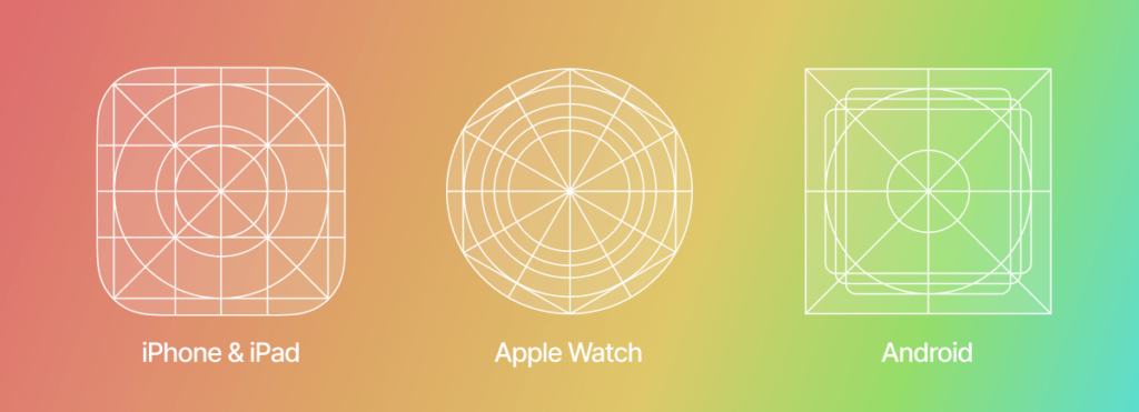
Besides attractiveness and brand identity, your app icon should meet the app stores standards in terms of patterns, resolutions, styles, layouts, etc. All the guidelines are present on “ Design for Android” and “iOS Human Interface Guidelines”. While they are pretty different, there is no need to create two designs. You can merely adapt one according to the technical requirements.

 Google Play Store (Android)App Store (iOS)
Dimensions512px × 512pxiPhone: 180px × 180px (60pt × 60pt @3x), 120px × 120px (60pt × 60pt @2x)

iPad Pro: 167px × 167px (83,5pt × 83,5pt @2x)

iPad, iPad mini: 152px × 152px (76pt × 76pt @2x)

App Store: 1024px × 1024px (1024pt × 1024pt @1x)
Format32-bit PNG PNG 
Color modesRGB sRGB or P3 
ShapeSquare – Google Play automatically rounds off corners (20% of icon size) and add shadows Square without shadows or rounded corners 
Source: https://orangesoft.co/

3. Create, Create, and Create

Now that you have everything ready, it’s time to let your creative spirit out. The design stage is one of the key steps as your job is to express beauty in a tiny image. Otherwise, according to Comscore, 20 percent of millennials will delete your app.

To facilitate the task for you, we have prepared six design tips:

3.1. Don’t forget about scalability

The icon is like the face of your app: it will represent the app everywhere and anywhere. However, the icon size varies from store to store. That’s why you need to ensure it is optimized so that the image quality isn’t lost. You can test different sizes with the Appsparky tool.

3.2. Don’t overdo

You may be tempted to make your icon sophisticated, but it’s not a winning strategy. Too many details on a small image diffuse the focus. That’s why you should adhere to a minimalistic approach and reduce the number of symbols as much as possible. 

Such an approach allows you to be clear with your audience about what you want to express. Our advice is to choose one symbol and stick to it. This way, your icon will be easy to comprehend.

3.3. Don’t stay under the radar

Here we are speaking about uniqueness. Users should recognize your icon, ideally as easily as they do with McDonald’s or Facebook. In such a case, your brand has managed to build an emotional connection, which is a driver of improved brand awareness and customer loyalty. 

What is more, if your icon is unique, you are ahead of your competitors. Those who try to imitate them, however, risk unintentionally promoting rival applications and lose the connection with the target audience.

3.4. Don’t ignore colors 

One thing that interacts directly with the user’s subconsciousness is colors. These three pieces of advice are for you to consider when thinking about which shades to use:

  • Be bold. Catch the attention with the right color. For instance, you can follow the successful examples and use blue with red and white. But don’t overdo with contrasting colors: two are more than enough.
  • Be branded. You need to tell a cohesive story, and colors play a major role here. Use branded shades only.
  • Be aesthetic. A beautiful icon is a sure way to success. That’s why you need to find those colors that appeal to your audience and look good on different backgrounds.

3.5. Don’t use a lot of text

A lot of words won’t do you any good because the app icon is too small for users to read it. Instead, it’s better to speak with symbols. You can leave only very short texts or letters. Look how Skype features “S” and Facebook “F”: their icons are branded, recognizable, and easy to comprehend.

3.6. Don’t neglect your essence

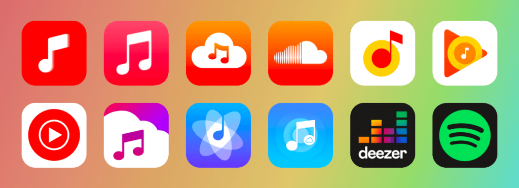
A good icon is one that isn’t only beautiful but also informative. It should describe what your app is about. That’s why e-commerce apps feature a shopping cart, reading apps – books, music apps – a music note, etc. 

While it may seem too primitive for you, users are likely to easily grasp the idea of the app. Remember: simplicity is key as it allows your audience to quickly comprehend and process the image.

Music apps’ icons

To make sure that you have designed a brilliant icon, you need to test it. Typically, you will have several options to try. You can assess the success by:

  • Setting up a focus group. Use an A/B testing approach: show two different designs to two separate focus groups made up of your target audience. Ask the people if the icon matches your app’s concept and if it’s beautiful or not. You may also present several icons, competitors’ ones included, and let the users choose the best one. You can turn for feedback to Google Experiments’ (Android solutions) or Facebook’s communities. If you are on a budget, conduct the research among your friends, employees, and family.
  • Conducting a technical test. Besides assessing attractiveness for users, you also need to check if the icon is optimized for different mobile devices and if the image is good regardless of its size. 

Tools to Create an App Icon

Here are the tools for you to use to design your ideal app icon:

  • Graphic Editors like Adobe Photoshop or Adobe Illustrator – offer extensive functionality to implement even the wildest ideas.
  • Design Apps like Adobe XD, Sketch, Figma – similar to the previous ones in terms of functionality but also mostly preferred by UI/UX designers.
  • Online graphic designers like Canva, Appicon, Font Awesome, Logaster, Iconsflow – beginner-friendly, offering simple navigation and templates.

Speak With Your Icon

In the era of brands, when consumers seek authenticity, a brand icon is more than just an image to click on to run an app. It’s the embodiment of your application, its nature, and its essence. It’s a powerful tool that helps you to build the very first connection with a user who can potentially become your brand ambassador. Therefore, never save neither your time nor your money when it comes to an app icon.

The post Full Guide On How To Design A Perfect App Icon appeared first on noupe.


5 Ways To Improve Your Webinar Content To Increase Sales

Did you know that webinars do not only build brand awareness but can also bring you sales to your product/service? However, attracting the audience’s attention and making them stick till the end is entirely up to the content you share during the webinar. 

Since the emergence of webinars has caused the ripple effect, every individual, brand, and the tech giant has started hosting webinars across various domains. Thus, standing out and connecting with the right target audience has become more difficult than ever. 

So, we’ve brainstormed and listed 5 ways to create content that attracts and keeps your audience’s attention intact.

1. Organize Value-first webinars

When you conduct webinars, providing value to the audience brings sales and not your product/service. People sign up for a webinar and invest one to two hours to learn something new. If your product or service is new in the market, discuss the pain points of your customers first, and then tell them how your product or service solves them. But, if there are many people who already use your product but stand clueless about a specific set of features, conduct a webinar to help them find answers. 

To know if you’re addressing their pain points,

  • Listen to your customer conversations. 
  • Follow your target audience or look-alikes on social media and understand what they struggle with. 

This will help you to understand their most unanswered problems. So, when your webinar gives them the solution to that, they come flocking to learn about it and your product becomes their top-of-the-mind solution.

2. Bring Guests Who Bring Value

People are no longer hooked to the PPT slideshow for a 45 mins session followed by a Q&A session. So, even when you have the most beautiful-looking slides ever, people will not pay attention, stay till the end or be interested in your product. 

That’s exactly why you have to bring in industry leaders, experts, or anyone who knows what they’re talking about. Bringing a guest from outside of your brand can help you in different ways:

  • Your audience will be more interested to learn from people who have tested the waters and made it to the shore
  • You can tap into the guests’ audience 
  • You can build brand authority as the guest—an expert in the industry will become an advocate of your brand during the pre-promotions & post-marketing activities. 

You might have figured it out by now—the conversational style webinars are the best way to keep your audience hooked till the end. 

As Lakshman from Vmaker, who has hosted more than ten guests from different industries, says,” The remote culture has left us with “screen fatigue”. Staring at the screen during webinars does not motivate the audience anymore. It annoys them. So, conversational-style webinars are my pick when I put value first”

3. Interactive Webinars For The Win

The remote etiquette of making everyone included in the webinar is essential but often most looked over. Even though the host & guest share the stage, the audience runs the show here. The audience retention rate drops dead low if they don’t feel “included” in the webinars or any online events. 

Here’s how you can keep the audience engaged till the end:

  • Begin the webinar a few minutes early and ask your audience to introduce themselves in the comments/chat section. (If your audience is from across the globe, ask them to drop the countries they’re from & their time-zones)
  • Run quick polls and share the results with them.
  • Before you pitch your product, ask the audience how they’re solving the problem (without using your product)
  • Take questions from your audience in between and not hold the entire set for the last.
  • Acknowledge them by their first name. This is non-negotiable. 
  • Make use of QR Codes linked to additional resources for each slide to keep an interactive element alive throughout your presentation.

When webinars start to feel like the group discussions that people used to have in their colleges, the audience decides to stay till the end.

4. Add personality, not just a pitch

Webinars, no matter if it’s a community-only or a global one, will have a product plug. Your audience will know that the host or the guest will talk about the product during the webinar, but they don’t listen to it when you promote it directly. 

Instead, add your brand personality to the pitch. 

  • Is your messaging across the content channel humor and humanized tone? Add it. 
  • Did any of your recent social media posts/reel make some noise? Loop that in.
  • Have you received the most heart touching customer feedback ever? Play that recording.

Selling the solution by tying the social proof of your product with it is definitely a hit! Adding the sales pitch in between the webinar is the buried-in-the-backyard technique, but an answer to their problem which puts your brand as a credible solution is evergreen.

5. Send The Webinar Recording Via Emails

According to Venture Harbour, sharing the recorded videos post the webinar has increased the registration rate to 42.46%, which is twice the original rate. Not only does making the webinar videos available on-demand increase the sign-up rate, but also increases brand awareness and adds up to the lead conversion rate. 

Most webinars happen mid-week and the recordings help people to catch up on the session if they had missed out due to work that keeps them on their toes. Thanks to remote work!

You can use a simple and cost-effective screen recording software like Vmaker to record videos of the webinars without any hiccups or glitches in between the sessions. You can then email the recording to the registrants within 12 to 18 hours of the webinar. With Vmaker and its advanced analytics suite, you can find out the number of people who’ve actually watched the recordings after clicking on the link. 

This will help you to track the success rate of the webinar from the sign-up to sending the on-demand videos. 

Here’s the TL;DR for the skimmers:

If you’re hosting the webinar for your brand, make sure to put the goal of increasing the sales in the back seat and give the head start to value-first content. The best bet to make your content valuable is by addressing the “pain point(s)” of your target audience. 

Then, start reaching out to the potential guests that your audience would love to learn from. With the internet connecting us, it’s not as difficult as it used to be. It’s an added advantage! Also, the audience will have a chance to interact more with your brand. 

From the sign-ups to the “Thank you” slide on the webinars, you have the opportunity to convert them from the audience seat to the customers’, if you can hit every touchpoint right. So, here’s how you can leverage the power of webinars in your style in 2022 and convert the warm leads into sizzling hot leads aka customers. 

The post 5 Ways To Improve Your Webinar Content To Increase Sales appeared first on noupe.


  •   
  • Copyright © 1996-2010 BlogmyQuery - BMQ. All rights reserved.
    iDream theme by Templates Next | Powered by WordPress