Archive for June, 2022

9 Web Design Mistakes that Harm your SEO

Your website is the virtual front door to your business, and for that reason having a website that manages to engage and retain customers is vital. But what about attracting customers?

That’s where SEO comes in. Even though you may have a well-designed website, that’s not enough. If it’s not optimised for SEO, you’ll fail to attract high quality traffic. In an increasingly competitive digital landscape, it’s essential to perform well in the search results, for your targeted key terms.

To help boost your SEO, make sure you avoid these 9 web design mistakes:

Web design and SEO

A website needs to do more than just look good. While it’s important to maintain consistency in your web design with your brand image, not every web design choice will positively impact your SEO.

Search engine optimisation (SEO) is the process of optimising your website and content to increase search engine positioning. Implementing an effective SEO strategy helps to drive more high-quality traffic to your site.

To determine the ranking of pages in search results, Google (and other search engines) use bots to crawl pages on the web. The crawlers go from page to page collecting information about the contents of pages.

The information collected by crawlers allows Google to index these pages. Then, when providing listings for a search query, algorithms determine what order web pages should appear in search results.

The many ranking factors that can influence your positioning in the search results mean it’s increasingly important to focus more on the user experience of a website. Even the smallest of mistakes could significantly impact your SEO. Make sure you avoid these mistakes:

1. Poor navigation

Poor navigation affects both the user experience and your SEO. Good navigation is the hallmark of a positive user experience, and without it you are likely to see a high bounce rate.

It’s important to make sure that users can easily navigate their way around your site and find the content they are looking for. Visitors to your site will not jump through hoops to find something and will just leave your site if they get frustrated.

When navigation is one of the most important elements of a well-designed website, make sure it’s easy for users and crawlers to easily navigate and find content. You can improve navigation by:

  • Implementing a clear and well-structured navigation menu or bar
  • Create internal links throughout your site
  • Create an XML sitemap
  • Avoid using long pages or infinite scrolling
  • Create a clear site structure

2. Not optimized for mobile

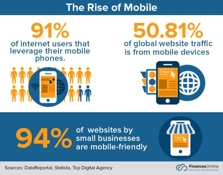
By the end of 2021 mobile devices accounted for 54.4% of website traffic worldwide. As more people use their smartphones to browse the web, it’s important to make sure your web design is fully optimized for mobile.

Considering how popular mobile devices are becoming, Google has now started to favor mobile-friendly websites. Google now uses a mobile-first indexing approach. This means Google will often use the mobile version of the content for indexing and ranking.

Google offers a free tool to check whether your web page is mobile-friendly. You can also check to see what your site looks like on different devices.

If you are using Chrome, right-click and select inspect. Then, at the top left of the inspect window, you’ll see an icon with a tablet and mobile. Click on that and you can change the dimensions, size and throttling of the display view.

Here’s an example on the Noupe homepage:
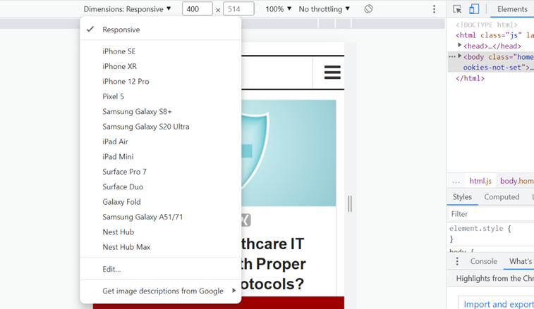
The best (and recommended solution by Google) is to use a responsive web design. All your pages use the same URL and content across all devices, but the site design responds based on the display size.

3. Slow loading speeds

Loading speeds have become increasingly important for web users. The longer it takes for your page to load, the more likely people are going to abandon your site and never return. Slow loading speeds will leave an unfavourable impression on your business.

Page load time is a ranking factor meaning that your SEO will be affected by slower loading speeds. Not only does it irritate users, but it also affects search engine indexing with crawlers being able to index fewer pages in their allocated crawl budget.

The general consensus is that your website should load within 2 – 3 seconds. You can check your page speed using Google’s free tool. To improve your page speed, consider:

  • Optimizing images
  • Minify your code
  • Remove render-blocking JavaScript
  • Enable GZIP compression
  • Use a content distribution network
  • Remove unnecessary plugins

4. No titles and headings

Headings should be used on all web pages, ideally before any other content. Not only do headings provide navigational pointers to different content on your site, but they also help crawlers understand the contents of a page when gathering information for indexing.

A heading should be identified on a page through an H1 tag and should encapsulate what the page is about. They essentially tell everyone the summary of your page’s content. After using an H1 heading for titles, you should use header tags for all subsequent headings.

All subsequent headings after your title should use H2-H6 tags. It then makes it much easier to tell what topics and subtopics are covered in a piece of content.

Not providing any titles and headings is a bit like a book without a title or chapters, so don’t forget to include them.

5. Thin content

Content that provides little or no interest or appeal to your users is classed as thin content. As well as providing nothing of any value to your readers, thin content can hinder your SEO.

Pages with thin content include:

  • doorway pages (pages that are used to manipulate search engines to rank for a certain keyword)
  • pages with little or no content
  • content that has been automatically generated
  • pages with keyword stuffing
  • thin affiliate pages

As Google seeks to provide meaningful and relevant results to users, pages that use thin content will be penalised in the search results. Instead, if you want to rank highly in the search results, make sure your content has lots of rich information and keywords are used appropriately.

6. A balance between content and whitespace

A well-designed website will manage to strike the right balance between content and whitespace. Overloading your pages with content could be slowing down your speed, and it also creates a negative user experience.

Now that user experience is also a ranking factor in Google’s algorithms, you should be pulling out all the stops to try and create a meaningful experience on your site. Whitespace is something that can help you achieve that.

As well as finding the right balance between written and visual content, you should find the right balance between content and whitespace. Using whitespace is not wasting space as it allows your content to breathe. It’s also worth noting that whitespace can be any colour too, not just white!

Minimalist web designs focus on a less is more approach by utilizing whitespace.

7. Missing or unclear call-to-actions

Call-to-actions (CTAs) help guide your users to key areas of your website and can improve conversions. CTAs can be used for lots of different purposes on a site, whether to download a piece of content, submit a form, or make a purchase. Without them, a user is more likely to drop off your site, losing you a potentially valuable lead and increasing your bounce rate.

The CTAs you incorporate into your site need to be strategically placed in locations where a user is more likely to act. They should also adopt a language and tone that matches your brand.

Using certain words and phrases at the start of a CTA can also help improve conversions through positive affirmations and speaking in the voice of your customers. Most importantly, the choice of color can make a big difference. Consider the psychology of color when using colors in your web design.

8. Annoying pop-ups

Pop-ups are a form of online promotion used for advertising or generating leads, usually in a small window. But pop-ups have gained an unfavourable reputation with web users for being irritating and disruptive, causing a bad user experience (which can also affect your SEO).

That’s not to say that you shouldn’t use pop-ups at all, just be careful about how you use them. When used successfully, pop-ups have an average conversion rate of 11.09%, helping to boost subscriptions, increase content offer downloads, and reduce bounce rate.

If you want to implement pop-ups without them being annoying and damaging your SEO, consider:

  • Using them to help enhance user experience, for example with ‘exit intent’ pop-ups.
  • Keep your pop-ups clear and to the point. Keep a consistent style and theme within your pop-ups as the rest of the page.
  • Don’t use pop-ups for the sake of it. Instances of high traffic and high bounce rate could be an effective example of when to use a pop-up.
  • Optimise for mobile
  • Test to find the right placement and time to display pop-ups.
  • Use slide-ins and slide-downs instead of pop-ups, as these tend to be less intrusive

9. 404 pages

A 404 page is an error page that is displayed to users when they have reached the requested domain, but no information is available on the searched URL. 404 pages are also displayed when broken or dead links are clicked on.

While most websites will incorporate a 404 page into their design, not all manage to work effectively at keeping users on their site. Many 404 pages will just display an error message without giving any guidance or instructions to keep the user on your site.

A 404 page is a fantastic opportunity to keep a visitor on your site and try and convert them to a customer. Include links to other similar content, provide an invitation to subscribe to a newsletter, or include a search bar for your site. If nothing else, at least provide a link back to your homepage.

By avoiding these 9 web design mistakes, you’ll be able to improve the design of your website, enhance the user experience, and keep your SEO in check! And remember, as user experience becomes increasingly important in SEO, it makes sense to focus on keeping your users happy. If you can do this successfully, you’ll be rewarded with increased conversions and improved rankings!

The post 9 Web Design Mistakes that Harm your SEO appeared first on noupe.


UX vs. UI: Guide to Distinguishing User Experience and User Interface Design

Well, they certainly sound like they’re all about the same thing.

When you design the user interface, surely what you are dealing with is user experience. Is it that simple? Or are there significant differences between the two? What consequences would such a difference have for design? Will there be any more questions in this paragraph? What do you think?

Let’s put both user experience and user interface under the microscope and see just what we’re dealing with. 

The Key Difference Between User Experience and User Interface Design

There’s one key specific difference between the two forms of design. Let’s look at website design. 

Image source

In this arena, UX takes in the entire user experience and uses this to design the website on the basis of feel. UI however looks at specific design elements, usually visual elements, and assesses how they direct user behavior on the site. 

So, there we are. Wasn’t too tricky, was it? Thanks and goodnight. 

Alright, then, you’ve got me. Nothing’s that simple. We need to dig into what we mean by the two terms before we know for sure what the difference boils down to. 

User Experience Design

Right, so User Experience design is about certain elements, but chief among these is that it is an approach that emphasizes how human users comprehend the user environment they’re put in. For instance, with contact centre call recording systems, the designer will be interested in the user state during each of the component tasks, from initial recording to playback and analysis. 

It’s all about what happens to the user and how the user is made to feel when they are given a product to manipulate. 

Here’s a word from somebody who knew a thing or two about UX design. 

‘You’ve got to start with the customer experience and work back toward the technology. Not the other way around’

Steve Jobs

What’s interesting here is what the turtlenecked tycoon doesn’t say. He doesn’t even mention the need for the product or the problem it’s trying to solve. For him, the key ingredient in design is how it impacts on customer experience. This is why his products are so enjoyable to use. 

Sure, the iPod solved a problem. It meant no more jiggling around between CDs (or even cassettes) while on the move. But the key impact that it had was born of the fact that it was a joy to use. From opening the packaging to using the earbuds, it was such a cool experience. 

Image source

UX design may be closely linked with technology, for instance working to prioritize landing page speed because of the effect it has on the user. But it’s not limited to the technology sector. 

Any product or service that a user has a relationship with can be shaped with the principles of UX design in place. It just so happens that it’s the arena of technology in which UX design has really taken off. This is because of two things:

  1. Technology has become so ubiquitous that it’s important for it to be designed well. Everyone, or just about everyone, needs to be able to use it in the desired manner. If its design prohibits universality, then at best you have ‘Some User Experience, otherwise referred to as ‘SUX’ (observed engineer Billy Gregory). 
  1. Technology has the potential to be really very unusable indeed. This is because, at heart, it’s completely alien to most non-technical users. There are some more primitive machines, for instance a spinning wheel, in which the process is fairly intuitive and one can muddle through a construct of the process in one’s head. 

    But a lot of the workings going on in devices or systems, such as eCommerce platforms, today are way way beyond what the average user can comprehend in any meaningful sense. So the design has to render an extremely complex array of processes and data flows down into a simple to grasp and use an item. 

What does a UX Designer Do?

The UX designer will factor several elements into their thinking. Remember, they’re concerned with how the product or environment or process or whatever it is being designed will impact on the user. 

For this to succeed, they often break down operations into task analyses. How easy is it, for example, to access the royalty free music youtube artist of a user’s choice? Can we make it a little easier? 

A UX designer will effectively act as the mortar at the center of the product team. This is because the feel of a product is key to its success. 

Image source

For this reason, then, a UX designer will interact with product developers to give them feedback on how their product is succeeding or otherwise. A UX designer will be part of the design process from the very first wireframing stage, through prototypes, testing, and iteration, to the finished product. 

UX designers will also interact with marketers to make sure that the product and its promotion are of the same voice. 

But a UX designer’s job doesn’t end there. They also are involved in data analysis regarding competitors (How do the competition’s products feel?), and customers (do we have a good idea of who our customers are and what they want?)

They will then also be involved in assessing usage data once the product is out there. It’s often down to the UX designer to improve upon the product’s usability or to jettison it in favor of the next step. 

We’ll finish on UX design with this nice quote.

‘User Experience Design is the science and art of designing a product so that it’s easy to use, fits expectations, and meets business goals.’

Susan Weinschenk, CEO, The Team W 

User Interface Design

UI is actually an older discipline than UX, but it can be trickier to define, due to the misinterpretations that have cropped up over the years. Here’s one immutable factor: UI is just about digital products. Its only valid usage is in the sphere of interaction between user and technology. 

UI design is all about looking at the device or system and making all the processes that affect the user as straightforward as possible. This means, in particular, an emphasis on optics. So, for a website, UI design will look closely at the fonts, colors, and icons used, as well as the spacing and overall layout on the screen. It will seek to make the important information as prominent as possible. 

The key aim of UI design is to enable the user to get where they want to go without having to think too much. If they have to claw their way through a process while referring to instructions galore, then the UI design has failed. 

What Does a UI Designer Do?

A UI designer will perform a lot of the functions that are covered by a UX designer, in terms of product inception and development, but will come at it from a predominantly visual perspective. So the UI designer will have a solid grasp of color theory and the effects on the user of certain forms of typography and design patterns. 

They will also be adept at utilizing the potential of different devices with different screen sizes. For instance, they will be very aware that online call conference solutions need to demonstrate good visual design on phones as much as on big screens. This need to make visuals work on all screens is emphasized by the rise in mobile website access.

Image source

While we’re on websites, it’s quite often the case that UI designers will have an extremely influential role over the eventual look of the whole site, and are in fact seen in some quarters as in the process of taking over the traditional web developer role.

Or, to focus on databases for a second, a UI designer will want to see to it that what can be an off puttingly data-heavy area, will benefit from great visuals so that users aren’t put off. Consequently, Elasticsearch Documentation, for instance, will be as friendly-looking as a UI designer can manage.   

It’s Not Either/Or

Here’s the thing about the difference between user experience and user interface. They may be different, but that doesn’t mean you don’t want to use both. Far from it. It’s in a combination of the two that really exciting user-centered design takes place. Whatever your output, whether a smartwatch or a killer means of meltdown and spectre testing, it will benefit from a blend of UI and UX. 

Let’s consider an app that gives you suggestions on what to cook for dinner. 

It may be fantastic at factoring in what ingredients you have and coming up with something delicious for you to put together from them. It may be super-quick at doing it too. It may even help you by putting in grocery orders where necessary. But if its colors clash and its font fail to stand out, then its design is lacking. 

In short, it has good UX design, but terrible UI design. 

It’s easy to conceive of the converse. Let’s say your business provides a hosted VoIP solution. The phones look amazing. But they’re impossible to use. That’s a great UI and awful UX. 

So, a blend of both is what’s required. 

To Sum Up

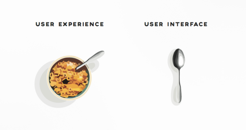
You should now be clear on the difference between UX and UI. If not, try this analogy: 

Image source

In other words, UX is all about the way the product feels to used in its intended setting. How easy is it to eat cereal with a spoon? UI is more about how the product comes across in the first place. How much do you want to use the spoon to eat the cereal? 

Put like this, it’s easy to see how co-dependent these pursuits are. If you’re going after one and not the other, you need to re-think your approach. So, wake up and eat the cornflakes.

The post UX vs. UI: Guide to Distinguishing User Experience and User Interface Design appeared first on noupe.


List of Power Words in Meta Titles that Boost Conversions

The role of SEO in driving traffic from the internet cannot be neglected by any means. It has become an important asset for digital marketers to regularly generate organic leads from the internet.

That is the major reason why they always pay huge attention to using the correct practices of SEO. They cannot make any mistake while writing the meta tags, especially the titles and descriptions. Both of these things play a crucial role in defining the intent of the pages to the search engine. Their powerful wordings can not only help to grab people’s attention, but could also allow to boost site conversions regularly through the internet.

Some individuals think that just using targeted keywords in meta titles is important. This theory is half-correct because keywords alone cannot totally force people to click on the pages. They need some extra bit of value in words to get attracted to any site. This could be done by using power words in the meta titles. It is the first thing that comes to the notice whenever a person sees any site on the search engine. If the title is supported by some inspiring words, then people do feel attracted to them no matter which position they are placed in.

In this blog, we will enlist some of the popular words that could make your meta titles engaging to read. But before moving into it, let’s first understand how to improve your on-page SEO by using a creative meta title.

Importance of Meta Titles for SEO

Meta titles play a huge role in grabbing the eyeballs at the first glance. They basically draw a strong picture in the minds of the readers that are looking for some potential answers. This can lead to increased traffic on the web pages if they are properly displayed on the search engines. That is how conversions will also increase, giving SEO writers some good results from their hard work.

According to top SEO experts, writing correct and engaging meta titles is the most important part of on-page SEO. It has the capability to grab people’s attention, provided the words are chosen according to the intent. If you will not write these titles wisely, then you could face fragile daily traffic, no matter how strongly you have placed keywords in the title. It is therefore advised to write your meta titles smartly, so that they can get maximum clicks from the daily visitors.

For instance, if you are creating a meta title for an article written on informative speech topics, then make sure to write it with some sort of inspirational words. This technique will help to make your meta title more attractive, as well as better understandable for the search engine indexing bots.  

30 Power Words That Could Make Meta Titles Strong

It is important to know about those words that could make your meta titles unique among others. These words vary according to the nature of the page and the content defined in it. If you will master to pick them according to the intent of the page, then your meta titles will certainly grab a lot of attention from the visitors.

Here are some of the powerful words that you could use in the meta titles according to the given expression requirements.

Power Words for Showcasing Excitement

A lot of SEO professionals recommend to add a flare of excitement to the page titles. It offers various types of benefits, such as making the readers excited about the overall content. It is not a clickbait technique, but an organic method to drive genuine interest of people towards any page or web blog.

If you do not know what are these words and how they should be used, here are some examples given below. 

  1. First Ever
  2. Famous
  3. Bona Fide
  4. Elated
  5. Final
  6. Ignite
  7. Iron-clad
  8. Last Minute
  9. Extra
  10. Epic

Power Words for Showcasing Emotion

Emotional words in meta titles can be very useful in encouraging people to show interest in your content. A lot of time, this trick works well for those articles that define any type of solution to the people. These articles are centered around discussing the pain point and defining its core solution to the readers. Adding emotional words in these articles brings more value to the content, as well as the solution defined in it.

Here are some of the commonly used emotional words that could make your web copies and articles worth reading.

  1. Loveable
  2. Trusted
  3. Honest
  4. Never
  5. On-demand
  6. Pride
  7. Sacred
  8. Valor
  9. No Risk
  10. Fun-loving

Power Words for Showcasing Strength

It is also recommended to add those words in the meta titles that could showcase some sort of strength. These power words can add a bit of authority to your titles, encouraging people to show more interest in them. Some people think that these words could only be used in the headlines as they suit more on the upper positions. However, as per the current trends, you can also use them in the meta titles if they could be perfectly connected with the context of the content.

If you do not know which type of power words should be used to demonstrate this expression, take a look at some of the examples given below. 

  1. Solid
  2. Research-packed
  3. Energetic
  4. Fail-proof
  5. High Tech
  6. Huge
  7. Insane
  8. Proven
  9. Result-oriented
  10. Superb

Final Words

That takes us to the end of this article in which we have discussed different types of power words you could use in meta titles. These words are termed very important because they can allow your titles to look more catchy among others. It should be noted that these words should also be picked and used wisely according to the context of the page. You cannot just randomly place them in the meta titles, as it will totally look illogical to the readers. This should be done by knowing the right tone and content category that suits perfect with these power words, just like the examples that have been listed above. 

The post List of Power Words in Meta Titles that Boost Conversions appeared first on noupe.


How Artificial Intelligence & Machine Learning Empower Enterprise Software Development?

Software development has seen a significant transition in recent years. Enterprises have quickly adapted and implemented developing technology to preserve a competitive edge, and Artificial Intelligence (AI), especially Machine Learning (ML), is no exception.

Enterprise software is well-positioned to be smarter and more resilient, with AI app development company prominently integrated into software development processes.

According to IDC, by 2025, 90% of new enterprise apps will be AI-powered.

This strategy promises to improve their capacity to develop new goods and services, provide better client experiences, and streamline their operations.

With Agile test automation and Robotic Process Automation, we’ve already seen the influence of AI on application development (RPA). Smart algorithms try to make each repetition easier, quicker, and more dependable in this environment.

Shorter reaction times, higher customer happiness, and more success with product innovation are predicted to help organizations achieve a competitive edge using this method.

How AI & ML are Changing & Improving Enterprise Software?

Every level of corporate software development today includes the use of smart algorithms. Each iteration of AI, ML, and Deep Learning (DL) algorithms improves and optimizes the process, from discussion through implementation and beyond.

Companies may also speed development while minimizing technical debt with the aid of AI and automation. Through each iteration, this method helps minimize expenses while limiting risk.

1. Planning and Analysis 

The greatest human interaction is required during the conceptual phase of the development cycle. When AI and Natural Language Processing (NLP) technologies are included, however, you may swiftly gather relevant data to uncover faults, loopholes, inconsistencies, and flaws in the system.

NLP technologies are built to comprehend business and consumer needs and to create accurate predictions using analytics. Human software programmers would need many hours to collect, analyze, identify, record, and segregate data, while AI can accomplish it in seconds.

2. Software Design

Close coordination across many departments, such as research and development, software developers, and designers, is required for software design. It’s a difficult and time-consuming part of the software development process that necessitates open and honest communication.

When sophisticated algorithms are added to the mix, a cognitive approach to software design becomes possible. AI and machine learning, for example, gather relevant data (user needs, business verticals, geolocation, and so on) and intuitively offer the best design strategy (which demands the least manual or human intervention).

These clever algorithms get wiser via significant training and experience, allowing them to engage in software creation more rapidly and effortlessly. As a result, bespoke development teams can offer a clear answer and decide on the best design without the chance of making mistakes.

3. Software Programming (with Some Automation)

Hundreds of millions of lines of code are used to create robust corporate software. Until, this was done by hand, line by line, by numerous software engineers.

In this case, machine learning and natural language processing (NLP) is used to decipher the concept and project requirements and translate them into executable code (and reduce the workload to some extent). While AI can’t create the entire software for you, it can help relieve some of the pressure on developers.

4. AI-Driven Testing

Enterprise application development is incomplete without testing. It’s the only way to make sure the product does what it’s supposed to do. AI is likely to take over the whole process of software and AI in Quality Assurance testing shortly.

While AI hasn’t yet reached full autonomy, it does play a big part in labor-intensive, repeated tests, allowing for a more cost-effective time to market. The best thing is that AI-based testing solutions can quickly and precisely engage in many complicated testing sessions.

5. Deployment 

When it comes to deployment, AI and machine learning play a role. Smart algorithms aid the development team in making tactical decisions, determining viability problems, and using AI and ML models in this scenario.

Software development teams may also look back at previous projects and make decisions that lower the chance of failure while also potentially increasing the return on investment.

6. Fraud Detection

Every year, the prevalence of fraudulent activities contributes to losses for a company. By detecting fraud early, enterprise software with a machine learning architecture has aided in the reduction of fraud. Machine learning algorithms utilize pattern recognition methods to detect any abnormalities in processes such as transactions.

The finance division of a company is an example of how machine learning might aid with fraud detection. Machine learning may be integrated into corporate software to analyze transaction data and external sources to detect any fraudulent activity or abnormalities in transactions involving a network of people.

SAS was a pioneer in the use of machine learning in areas such as fraud detection. SAS ventured into fraud detection in finance, and its software was utilized by various financial institutions to reduce fraudulent transactions.

Key Benefits of AI & ML in Enterprise Software

When companies make their workplace software smarter, machine learning takes over the crucial task of extracting useful information. Know why do businesses need enterprise AI because machine learning frameworks guarantee that relevant data is gathered, cleaned, and analyzed to improve overall efficiency and production.

If you’re a store, for example, using ML-based software may disrupt established procedures, increase comprehension, and better predict client behavior.

Benefits of creating smart company software include:

  • Achieve enhanced data security
  • Enable and enhance employee intelligence
  • Enable seamless bugs and error identification
  • Facilitate smart business decisions
  • Generate accurate insights and analysis

Summing Up

Organizations have profited greatly from advances in computers, such as machine learning, by making them more efficient and streamlined. Organizations that have adopted a machine learning enterprise software model have a competitive edge over those that continue to rely on outdated technology.

As a result, more businesses are moving their focus to machine learning or are contemplating investing in it. In the next few years, more businesses will use enterprise software powered by machine learning to take advantage of its potential for driving corporate innovation and success.

The post How Artificial Intelligence & Machine Learning Empower Enterprise Software Development? appeared first on noupe.


2022 Trends to Watch in Wide-Format Printing

The year 2021 was a difficult one for the print industry. Due to lockdowns and restrictions, market demand for traditional print applications has decreased. Other applications like labeling, light packaging, and wide format have grown in popularity. Businesses that were quick enough to pivot into new markets saw rapid development.

The sector, on the other hand, is displaying strong signs of economic revival. The year 2022 is expected to be significantly better. We anticipate that there will be several chances for print enterprises to diversify and increase their offerings. Those who do will play a larger part in the success of Trends to Watch in Wide-Format Printing for 2022 as rising trends.

As the new year begins, we take a look at some of the hot themes we expect to see this year. So, what might we expect in 2022? Let’s take a closer look:

The market continues to be dominated by sustainability efforts.

Manufacturers are investing more in developing truly sustainable solutions, rather than merely appearing green. Consumers request that PSPs supply alternatives, such as recyclable materials and media produced from recycled water bottles, even if the cost is higher.

Manufacturers are developing ground-breaking solutions, like the Elements Andes Recycled Satin Canvas SUV, to get eco-friendly applications into the hands of consumers. Other businesses are working to increase their already stringent sustainability criteria. HP was named to the Global 100 Most Sustainable Corporations in the World ranking for the sixth time in a row earlier this year.

As more businesses implement eco-goals before the end of the decade, it appears that the sustainability movement will continue for some time.

Personalization has been enhanced.

With the opportunity to personalize everything from mugs to hats to reusable shopping bags, printing is already a personalized service. People are looking to personalize their at-home workspaces as they continue to work from home or split their time between home and the office.

According to CraftJack.com, 41 percent of those who work from home have purchased art and décor or printed photographs to improve their backgrounds, with an average purchase price of $195.

Consumers are seeking ways to create a professional workstation out of their homes, whether by requesting bespoke backdrops, putting wall graphics, or adding unique wall décor.

Election Signage Is Necessary During an Election Year

An election requires more temporary signs than any other event. The campaign season offers a plethora of applications that might keep commercial printers and print service providers busy through November, ranging from the yard and large commercial signs to bumper stickers and direct mailers. Begin making plans for the approaching election season as soon as possible. 

Diversification

The word “pivot” was one of the most overused in 2020, yet it was overused for a purpose. When businesses began to close, many companies and workers were forced to pivot, and in-person activities and going into the office were replaced by virtual trade displays and working from home.

PSPs who diversify into other print-related industries see continuous growth, success, and client loyalty. It has never been more important to learn new talents and diversify one’s portfolio.

Purchasing New Equipment

Spending money on new equipment is one of the most difficult decisions a business owner must make. However, with recent color trends, booming sustainability interest, a growth in larger customized projects, and diverse portfolios on the horizon for 2022, purchasing new equipment may not be such a difficult option after all.

Features of Wide-Format Printing:

Wide Format Printing has numerous features as it is rapidly increasing its popularity due to its feature and functions. Let’s discuss web2print solution and its features:

Key Features

Highlights of the wide-format printing web to print software solution that includes a variety of key features. Wide-format printing needs the special web to print features and here’s the list for you:

  • Multi-store Setup with Centralized Administration
  • Readymade Templates with Custom Height & Width
  • Quotation Workflow
  • Offer Products in any Shape and Sizes
  • Options based Pricing
  • Complete Support for B2B Customers
  • Inherent Artwork Approval Workflow
  • Color Management

Detailed Features of wide-format Printing

Printing technologies grow in lockstep with technological advancements. Previously, wide-scale printing was uncommon due to high wait times, inefficient costs, and a scarcity of resources.

With their speedy turnaround times and available printing materials, these sorts of printers now offer a cost-effective printing web2print solution to organizations, which is why large-scale printing is becoming more common in every office environment, regardless of size.

Wide-format printing, also known as large-format and grand-format printing, is used for printing projects that require a greater size than the standard 8.5 inches by 11 inches; some of these printers can even print up to 18 inches by 100 inches and are known as plotters.

Originally, pens inside the printer were used to produce the design on the paper or vinyl. This was the kind of old-school technology that wasn’t cheap and required a long time to complete. There are now inkjet and laser wide format printers available that can complete the work swiftly and efficiently. Nowadays, there are many banner design software available that helps in creating banners or other things to print and customize.

Technology advancements have also enhanced the environmental quality of these printers; the ink available is getting more environmentally friendly with each technological advancement. It also comes with readymade Templates with Custom Height & Width.

Wide-format printing is classified into two types: printer-only and multi-function. The goal of a wide format printer only is to print whatever files are provided to it through a computer or USB drive. The other type, multifunction wide format printers, have a scanner on top or to the side of the printer.

Multi-purpose wide-format printers with a scanner mounted to the top are often smaller than those with a standalone scanner. The size of your office and the purpose of the printer should determine which type of printer is appropriate for your company.

Print job automation is a simple and convenient approach to avoid waste, cut expenses, free up office space, and save time. A web to print software, such as print MIS, provides workflow improvements and automatic alerting for routine repairs and maintenance, preventing unexpected turnaround time and improving customer experience.

Businesses with wide format printers have more freedom when it comes to getting exactly what they want because these printers offer greater diversity in the sort of printing job and how it’s done. It gives complete Support for B2B Customers as it is more reliable. A wide format printer, whether it’s a promotional poster or a giant banner design, gives users the ability to manage the final product aesthetic without relying on a third party.

Conclusion

As with the advancement in printing technology in recent years wide printers have come on a large scale. They have gained much popularity due to their functions. There are numerous options and advantages to wide format printing. With so many alternatives, businesses are able to print whatever they need, such as giant maps, blueprints, posters, or large adverts. Wide-format printing is the solution for your “bigger” projects, whether for your workplace or a client.

The post 2022 Trends to Watch in Wide-Format Printing appeared first on noupe.


  •   
  • Copyright © 1996-2010 BlogmyQuery - BMQ. All rights reserved.
    iDream theme by Templates Next | Powered by WordPress