
Every mobile application needs a well-designed user interface (UI).
UI determines how easy it is for someone to navigate an app and complete the app’s intended purpose.
For example, the UI in a mobile banking app needs to support the user in checking their bank balance and previous statements, initiating a transfer, speaking to customer support, and so on.
When UI doesn’t help someone complete tasks and easily interact with the app, it causes user frustration. They’re less likely to use the app, which is the last thing any company wants.
In this blog, we’ll discuss four ways to guarantee your app’s UI delights your users.
Understand Your User
Many companies make the mistake of storyboarding and wireframing their app before they’ve taken the time to understand their user’s needs.
Never assume you know what they want, and take the time to understand user expectations.
One of the most underrated ways to understand your user’s needs is through public forums.
Brands rarely visit sites like Reddit and Quora to learn about their users.
Many focus their efforts on industry reports and surveys. While those have value, public forums are mercilessly blunt and honest (and provide insight into user behavior), and that is what you need.
A quick Google search of ‘mobile banking app Reddit’ led us to this forum where a user is asking other members about which bank to switch to based on their app.
The answers are helpful, but what’s more striking is a user’s willingness to leave a company and switch to its competitors based on their experience with the app.
This goes to show the crucial role an app plays in helping companies retain their users.
Apart from secondary research, you can sit down with potential users in a focus group setting to dive deeper into their needs and preferences. The key is to have empathy for your user’s needs.
This puts you in their shoes as you design the app.
Keeping the Navigation Simple
Apps aren’t escape rooms! You don’t need to make your users work to find what they want.
Help them out with a KIS (keeping it simple.)
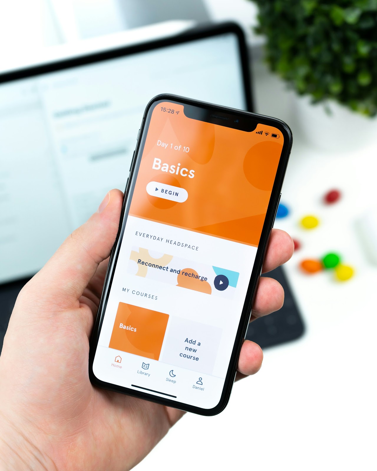
You do this by using familiar design patterns and visual elements. Mobile apps have been around for a while and have slowly developed standardized patterns like a navigation bar on the left, hamburger menus, and tabs.
There’s no need to reinvent the wheel and fix something that isn’t broken.
Don’t flood the home page navigation with too many options. Make all options available and findable in the app, but keep the core actions on the home page.
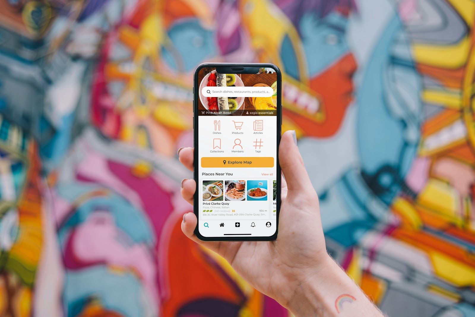
It’s also important for users to know their finger taps are working. When they tap a button, use subtle animation and visual cues as a sign of the app’s responsiveness.
If a function of your app requires multiple steps and going through several screens (like creating an account) use appropriate step numbers and arrows to signal progress.
Developers do face challenges in balancing smooth navigation, responsiveness, and aesthetics with functionality.
However, a website builder can simplify this process by enabling developers to design a mobile-friendly UI without deep coding expertise. By embedding the web UI into a mobile app using a web view, developers can streamline development, reduce workload, and achieve a polished, user-friendly interface with minimal effort.
The other option is to try a plethora of the latest no-code or low-code apps.
Use Consistent Design Elements
Every app’s design needs a sense of familiarity. Each design element should be geared to help someone use the app. Consider adding the below considerations to your design process.
Uniform Branding
The app’s branding should reflect the larger company brand. It would be strange for Microsoft to abandon the blues we’ve all become familiar with and go with a radically different color on their apps.
People are less confused and more inclined to use an app when the branding is consistent because identity and familiarity breed trust in the subconscious mind.
As a result, make sure your app’s background color, accent color, and the shades of all interface elements represent your overall brand.
Typography
The typography (fonts) used across the app should remain the same, no matter what screen the user is on.
Make sure there are clear distinctions between subheadings, headings, and body text. Similarly, anything that is clickable (like buttons and other interactive elements) should be made obvious and apparent. Additionally, it should follow a consistent color scheme, shape, size, and placement.
Both iOS and Android have established design principles that help create seamless user experiences. Apple’s Human Interface Guidelines and Google’s Material Design provide best practices for typography, spacing, motion, and interactivity. Following these guidelines ensures that your app feels natural on each operating system.
Use Familiar Interactions and Symbols
We all have something called muscle memory. It’s how we instinctively tap our smartphone’s passcode without having to look at where each digit is. Muscle memory is built by making movements repeatedly.
You want to take advantage of muscle memory in your app’s design. Choose your gestures and stick to them on every screen. For example:
- Double tapping to make something bigger.
- Swiping right to delete.
Users shouldn’t have to keep relearning how to use your app. It is annoying and leads to a poor experience.
Standardize your symbols and their placement, too. Some internationally recognized symbols are:
- A magnifying glass for search.
- A house icon to return to the home screen.
- Menu drop-down on the top corner of the screen.
- A cog icon to symbolize settings.
Continuous Usability Testing
There is research you would have done before designing your app (focus groups, Reddit search, etc). Then there needs to be regular testing during your app’s development and post-launch.
When you get to your prototype vs MVP, get a cohort who represents your target audience to test the app for useability. User feedback can help you make meaningful iterations.

When the app launches, build a button they can click on to submit feedback on the app. User preferences are regularly changing or there may have been something you missed entirely.
An open feedback loop is important to ensure your app is always giving users the best experience.
Final Thoughts
UI makes or breaks an app. People today want something easy to navigate and use. And they don’t like being worked hard in figuring out how to interact with an app.
Good UI is a combination of having a deep understanding of what your user wants while following the already-established principles of good and intuitive design. These, combined with an open feedback loop, are your ticket to an app that will never disappoint.
Good luck!
Featured image by Kelly Sikkema on Unsplash
The post How to Design an Intuitive User Interface for Mobile Apps appeared first on noupe.