Author Archive

Batch Processing: 25 Tools and Techniques for Images and Documents


Converting images or files by hand can be a hugely time-consuming process. But how often do clients send us files in formats that can’t be directly used on their website or project? If you’re like most designers, your answer is probably “pretty often.”

Batch processing takes a lot of the headache out of converting, resizing, or otherwise manipulating image or document files. There are some fantastic tools and techniques out there that can make performing these batch processes nearly painless. In most cases, you want to choose the most efficient tool that can do what you need.

Image Processing

I’m sure a lot of designers turn to Photoshop whenever they need to batch process some images, but if all you need to do is resize a dozen images, it’s kind of overkill. Or what if you need to resize 100 million images or more? Photoshop isn’t exactly the most efficient way to do that. The tools and techniques below can handle a variety of batch processing tasks, so take the time to research each one and then pick the one appropriate for your task.

Techniques

These techniques will show you everything from processing over a hundred million images in a batch to how to resize a few photos at once using software already found on a Mac.

Batch Processing Millions and Millions of Images

What would you do if you had to resize 135 million images? That’s exactly what Etsy had to do when redesigning their website. Resizing by hand would take well over a hundred years to complete, even if you worked around the clock. So obviously that’s not an option. This article explains the techniques and tools they used to get it done in just 9 days.

How to Batch Resize Images Without a Photo Editing Program on Your Mac

This tutorial from eHow shows how to use Automator to batch resize your images without the need to use a graphics program.

Why “Preview” is the Best Batch Photo Resizer for Mac

This article gives a quick technique for batch resizing images you have open in Preview. It’s a great option if you only need to resize a few dozen images, though obviously it wouldn’t work for significantly larger batches.

Batch Processing and Cropping using Actions Scripting

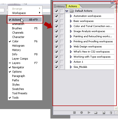
This tutorial will show you how to create Action Scripts in Photoshop to perform complex batch processing on images.

Batch Processing Images in Photoshop

This tutorial from the Wired How To Wiki shows simple steps for setting up actions for batch processing. The example given is for resizing images for web, but the same basic instructions can be used for creating more complex actions.

Creating Actions for Batch Processing

This tutorial will show you how to record more complicated actions that can then be used for batch processing, with screenshots for each step.

Tools

If the above techniques don’t work for you, then maybe one of the tools below can do what you need. There’s everything from simple file re-namers to tools that can perform relatively complex image editing in batches.

BDSizer

If your batch imaging needs are limited to resizing photos and resaving with a maximum file size, then the free BDSizer (Windows) might be just what you’re looking for.

FastStone Photo Resizer

FastStone (Windows) allows for more than just batch resizing. You can also rename, crop, rotate, change color depth, or add text and watermarks.

BIMP (Batch Image Processor)

BIMP (Windows) is another free batch image processor with a lot of controls over not only the image but also the file name (it can, for example, remove spaces and underscores, or rename using sequential numbering).

Phatch

Phatch is a cross-platform (for Linux, Mac OS X, and Windows) batch image processor that lets you resize, rotate, invert, flip, watermark, shadow, and more with your images.

Sizerox

Sizerox is a Mac-only batch image resizer that also lets you rotate, rename, crop, and watermark your images using a drag-and-drop interface.

EasyBatchPhoto

EasyBatchPhoto (Mac) lets you perform resizing, watermarking, and other common repetitive tasks with an easy to use interface and smooth workflow. It’s $23.95 for a single user license.

QuickScale

QuickScale (Mac) lets you quickly resize or crop images and re-save them with a simple and clean GUI. It also supports watermarking of images.

Pixillion Image Converter Software

Pixillion (Mac) can convert your images, resize and rotate them, adjust the quality of JPEG files, add captions, and more. There’s a free version for non-commercial use or a paid version for commercial users.

Advanced Batch Converter 5.6

Advanced Batch Converter (Windows) can convert from over 180 file types into 44 common file formats (including jpg, png, and tiff). It can also resize, rotate, flip, mirror, crop, filter, watermark, or perform other functions on your images. It’s $69.95 for a personal non-commercial license or $139.95 for a business license.

DBP (David’s Batch Processor)

DBP is a GIMP plugin for batch processing images, and can be used for color correction, resizing, cropping, sharpening, renaming, and more.

BatchBlitz

BatchBlitz (Windows) is a free program that can categorize, filter and batch edit your images.

Rename Master

Rename Master (Windows) is the perfect solution if all you need to do is rename a batch of image (or other) files.

Document Processing Tools

Images aren’t the only kinds of files that need batch processing. How often has your client sent you a series of PDF files with all the content for their website, including images? Maybe they’re even password-protected PDFs, which means you can’t just copy and paste the information into text files. And it’s not just PDFs you might need to convert; there are also Excel spreadsheets, Word documents, and more. The tools below can make batch processing these files a lot faster and easier.

Tools

PDF Creator

PDF Creator can batch process your Microsoft Word documents into PDFs without the need for Adobe Acrobat.

HTML Batch Editor

HTML Batch Editor can batch process HTML, text or other files, including binary ones. It can be used for a variety of purposes, including renaming thousands of files while relinking relevant hyperlinks.

PDF to Text Converter

PDF to Text Converter (Windows) can convert a batch of PDFs into plain text documents, while helping preserve layout features.

AnyBizSoft PDF Converter for Mac

PDF Converter for Mac can batch convert your PDF files to Word documents, Excel spreadsheets, text files, PowerPoint presentations, HTML documents, and EPUB eBooks.

DocuFi Batch

DocuFi Batch lets you split, name, and route scanned files in a single step. It includes barcode recognition, image cleanup, and blank page detection. It also includes redaction technology for removing sensitive material, and can apply DRM to your PDF files.

HTML Enforcer (alpha)

HTML Enforcer is an alpha release that can let you edit a batch of HTML files with a single click. Change things like title and meta tags, remove unnecessary tags, or insert a tag or JS file throughout the whole site.

Batch Text & HTML Editor

Batch Text & HTML Editor makes it easy to process a number of text or HTML files at one time. You can replace words or lines, insert words, remove empty lines, remove words or phrases, and more.

Total HTML Converter

Total HTML Converter ($49.90) can convert your HTML files to Word documents in seconds. If the page being converted has Flash content, Total HTML Converter includes a screenshot of that content, and it lets you add footer and header text or a watermark.

Batch PDF Password Remover

I’m sure a lot of people would look at a program like this and immediately think that it was only useful if you were trying to pirate content or otherwise do something illegal. But the truth is, sometimes clients send us PDFs with password protection that they need us to get content from, but for whatever reason they can’t give us the password (maybe they don’t even know it). That’s where tools like this come in handy.

Conclusion

Whatever your batch processing needs are, there are certainly tools and techniques out there that can help you quickly convert or manipulate your files in whatever way necessary. Use the above as a starting point for finding your own useful batch processing tools (and feel free to share your findings in the comments).

(rb)


Review Of Cross-Browser Testing Tools

Advertisement in Review Of Cross-Browser Testing Tools
 in Review Of Cross-Browser Testing Tools  in Review Of Cross-Browser Testing Tools  in Review Of Cross-Browser Testing Tools

At some point in the future, the way that all major browsers render Web code will likely be standardized, which will make testing across multiple browsers no longer necessary as long as the website is coded according to Web standards. But because that day is still a way off (if it will really come at all), testing your design the advanced browsers as well as legacy browsers is a necessary part of any project.

The old-school way to test code was to load your website on as many computers as you could find, using as many different combinations of browsers and operating systems as possible. That was fine if you had access to a bunch of different computers (and had some time to kill). But there are much more efficient ways to test across browsers, using either free or commercial Web services and software. In this article we review some of the most useful ones.

Free Cross-Browser Testing

Good news: very powerful free testing tools are available for Web designers today. Some are more user-friendly than others, and some have significantly better user interfaces. Don’t expect much (if any) support with these tools. But if you’d rather not spend extra money on testing, some great options are here as well.

Adobe BrowserLab

Adobe BrowserLab is a free cross-browser compatibility tool that lets you test a number of modern and legacy browsers, including various versions of Chrome, Safari, IE and Firefox. It gives you a number of ways to view pages, including a full-page view in a single browser, as well as side-by-side comparisons of browsers and an onion skin view. The service can access dynamic pages across the web, or viewed locally via Firebug or Adobe Dreamweaver CS5. The ability to create pre-defined browser sets is also useful, in case you don’t need to test on older browsers.

Adobebrowserlab in Review Of Cross-Browser Testing Tools

Browsershots

Browsershots is probably the most comprehensive free testing tool available. It includes Linux, Windows and BSD browsers. It also includes a number of browsers you’ve probably never heard of (like Galeon, Iceape, Kazehakase and Epiphany). For the most part, Browsershots tests on the most recent version of each browser, as well as on legacy versions.

While Browsershots does support a huge variety of browsers, the more you test, the more slowly it prepares the results. So, you may want to stick to the major browsers.

Browsershots in Review Of Cross-Browser Testing Tools

SuperPreview (Free and Commercial)

SuperPreview is Microsoft’s offering in this space (and it’s compatible only with Windows). It lets you define your own “baselineâ€� (or default) browser, and it works with any browser installed on your system (and comes with the IE6 rendering engine built in). The fact that it only works with your built-in browsers does make it faster (because you’re not uploading anything or waiting for a remote server), but it also limits the number of browsers you can compare.

SuperPreview trial comes with 60 days of cloud services before you have to either buy it or go into reduced, (local browsers and IE 6-9 mode). In an online version, you have support for Chrome, Safari (Mac) 4+5, Firefox 3+4. You can also use an interactive mode to log into sites that require a login before displaying the page you want to test. There are also debugging tools for the DOM and onion skinning available in Adobe Browserlabs. Unfortunately, there is no support for Opera whether installed locally or in the cloud and you do have to have the version included with Expression Web to get the cloud services option but the base version with support for IE 6, IE 7, IE 8 (and IE 8 rendering as IE 7) are included with the free version as well as IE 9 if it is installed locally. (Thanks, Cheryl D Wise)

Superpreview in Review Of Cross-Browser Testing Tools

Lunascape 6

Lunascape is a triple-engine browser for Windows. It runs Trident (IE), Gecko (Firefox) and Webkit (Chrome and Safari), so that you can see how your website looks in all three, side by side. While it’s not a traditional browser compatibility tester, it is nonetheless a useful tool for designers and developers. One major benefit is that you get to view your website instantly in all three major rendering engines. There’s also support for Firefox extensions and plug-ins, so you can use developer tools like Firebug to diagnose compatibility problems.

Lunascape in Review Of Cross-Browser Testing Tools

IETester

IETester is a free (both for personal and professional usage) browser for Windows that allows you to have the rendering and JavaScript engines of IE10 preview, IE9, IE8, IE7, IE6 and IE5.5 on Windows 7, Vista and XP, as well as the installed IE. Only an alpha version of the tool is available. Windows 7, Windows Vista or Windows XP with IE7 minimum are required for the tool to run.

Ietester1 in Review Of Cross-Browser Testing Tools

IE NetRenderer

IE NetRenderer lets you check compatibility in Internet Explorer versions 5.5 through 9. You’ll have to check each version individually, but the service is free.

Ienetrenderer in Review Of Cross-Browser Testing Tools

Spoon

Spoon is an application emulation service. It provides free versions of Firefox, Chrome, Opera and Safari for Windows users. A number of versions of each browser are included: Firefox 2–5, Chrome 4–8, Safari 3–5 and Opera 9–10. Bad news: Internet Explorer is supported by Spoon virtualization but is not available by request of Microsoft.

Spoon in Review Of Cross-Browser Testing Tools

Sauce Labs (free and commercial)

Sauce Labs provides a lot of browser and OS options and sets you up with a browser dedicated VM instance that you operate inside the browser of your choice. It also records a video of your entire testing session. The service offers 200 free minutes of testing per month and allows you to quickly build automated tests from your browser with Selenium.

Sauce-labs in Review Of Cross-Browser Testing Tools

Browsera (free and commercial)

Browsera provides automated compatibility testing. It automatically highlights differences in the way browsers render your design, thus simplifying the testing process. It also detects JavaScript errors, and the commercial version can test pages behind subscription or log-in walls. It can also test dynamic pages.

The free plan includes a limited number of browsers and low-resolution screenshots. Premium plans start at $39 for a single project and $49 to $99 for monthly subscriptions, and they support more browsers, provide high-resolution screenshots and let you test private pages.

Browsera in Review Of Cross-Browser Testing Tools

Browserling (free and commercial)

Browserling is a relatively new cross-browser testing app. It supports a limited number of browsers (and not necessarily the newest versions), which makes it of limited use to some developers. It’s still in beta, though, so hopefully more browsers will be supported in the near future.

The free version comes with a five-minute session limit, and the developer version is $20 per month with no time limit.

Browserling in Review Of Cross-Browser Testing Tools

Commercial Cross-Browser Testing

Commercial tools often have features not found in the free ones, including live interactive browser virtualization and mobile device testing.

Mogotest

Mogotest does complete browser-compatibility testing, including for private pages. There’s an API, so it can be integrated in your current tools and workflow. Mogotest also offers a website health report that tells you about broken links and pages, redirect loops and other issues common to new websites. The service also offer screenshot comparison tools for testing screenshots against each other as well as site-level testing including page consistency testing and individual page tests. HTTP basic and cookie-based login systems are supported as well.

There are two plans for individuals: a personal plan starting at $15 per month that lets you test up to 50 pages on three websites, and a freelancer plan for $45 per month that includes up to 10 websites and 350 pages. The team plans start at $125 per month and go up to $4499+ for unlimited access. The two highest-cost plans include custom reports.

Mogotest in Review Of Cross-Browser Testing Tools

Cloud Testing

Cloud Testing offers functional cross-browser testing. You record the user journey with your browser and Selenium IDE, upload it, and then Cloud Testing will run that script in multiple operating systems and browsers. It then provides screenshots and HTML and component diagnostics. No prices are listed on its website.

Cloudtesting in Review Of Cross-Browser Testing Tools

BrowserCam

BrowserCam includes testing tools for both desktop and mobile browser compatibility (the latter is still absent in many other tools). It also offers remote access for live testing on Windows, Linux and OS X configurations, and email capture for checking your HTML, RTF and TXT emails.

Pricing for BrowserCam starts at only $19.95 per day for a single service (and $24.95 for the browser, remote access and email capture package), up to an annual subscription price of $399.95 for a single service (and $499.95 for browser capture, remote access, email capture and multi-user access, or $999.95 for all of those features plus device capture).

Browsercam in Review Of Cross-Browser Testing Tools

Multi-Browser Viewer

Multi-Browser Viewer covers both desktop and mobile browsers. It includes 26 virtualized Web browsers, 5 mobile browsers (including the iPhone and iPad) and 61 screenshot browsers (meaning you can see how the website renders but not interact with it). It’s also available in five languages: English, Spanish, German, Russian and French.

Multi-Browser Viewer is $139.95 for a single-user license and includes a year of product usage and updates. Updates after the first year are currently $99.95. A free trial is available through the website.

Multibrowserviewer in Review Of Cross-Browser Testing Tools

CrossBrowserTesting

CrossBrowserTesting provides live interactive browser testing with remote VNC sessions. It also generates automated screenshots across multiple browsers for more basic testing. There are more than 100 browser and operating system combinations, including many mobile platforms.

Monthly subscriptions range from $29.95 to $199.95, depending on the number of users and the minutes of testing (minutes can roll over to the next month, but they’re not unlimited). A one-week free trial is available for all plans.

Crossbrowsertesting in Review Of Cross-Browser Testing Tools

Testing Services Compared

The chart below shows the basic features offered by these cross-browser testing services and applications, making it quick and easy to compare.

Tool Number of browser versions supported IE? Interactive testing? Side-by-side testing? Pricing
Adobe BrowserLab 13 IE6+ No Yes Free
Browsershots 60+ IE6+ No No Free
SuperPreview Varies IE6+ Yes Yes Free
Lunascape 3 IE6+ Yes Yes Free
IETester 6 versions of IE IE5.5+ Yes Yes Free
IE NetRenderer 5 versions of IE IE5.5+ No No Free
Spoon 16+ no IE Yes No Free
Sauce Labs 40+ IE6+ Yes No Free — $499 per month
Browsera 9 IE6+ No Yes Free – $99/month
Browserling 9 IE5.5+ No No Free – $20/month
Mogotest 7+ IE6+ No Yes $15 – $4,499/month
Cloud Testing 4+ IE6+ Yes Yes Not specified
BrowserCam 90+ IE5.2+ Yes Yes $19.95 – $89.95/month
Multi-Browser Viewer 80+ IE6+ For some browsers Yes $139.95
CrossBrowserTesting 100+ IE6+ Yes Yes $29.95 – $199.95/month

Conclusion

Regardless of the tool you choose, testing early and often during the Web development process can save you from a lot of headaches later. Find a tool that fits your workflow (so that you’ll actually want to use it and it won’t be a hassle), and test whenever you make major changes to a design.

What tools do you use for cross-browser testing?

How has your experience been with cross-browser testing tools and services? Which ones do you use? How do you integrate cross-browser testing in your professional workflow? Let us know in the comments!

Related Posts

You might be interested in the following related articles:

(al)


© Cameron Chapman for Smashing Magazine, 2011.


A Graphic Design Primer, Part 3: Basics of Composition

Advertisement in A Graphic Design Primer, Part 3: Basics of Composition
 in A Graphic Design Primer, Part 3: Basics of Composition  in A Graphic Design Primer, Part 3: Basics of Composition  in A Graphic Design Primer, Part 3: Basics of Composition

In the first two sections of this primer, we covered the basic elements of design, and the basic principles of design. In this section, we’ll cover the basic principles of composition.

There are a variety of different composition theories you should familiarize yourself with. Since this is just a primer, there’s a brief overview of the most common and important theories. You’ll want to study each in more depth before putting them to use, so we’ve included some additional resources for each.

Single Visual

The single visual method of composition is where a single, generally striking, visual image is used as the basis of the design. This is sometimes seen on single-page websites, or more commonly in print design.

The single visual pattern is the easiest composition to successfully achieve. Pick a strong image and let it do the bulk of the work for you. The key here is to make sure that other elements of your design (in most cases, the typography is the other major element of the design) support and reinforce the main visual, and don’t try to compete with it.

Sites like those created on About.me are a great example of the single-visual composition pattern.

Veen in A Graphic Design Primer, Part 3: Basics of Composition

Jamie Brown’s website has a similar single visual design:

Jamiebrown in A Graphic Design Primer, Part 3: Basics of Composition

The Divine Proportion

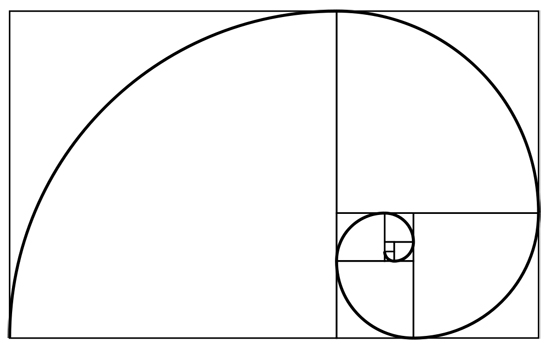
The Divine Proportion (also known as the Golden Ratio, Golden Spiral, Fibonacci Spiral, Golden Rectangle, or Phi) is approximately 1:1.618. It’s a ratio that is found throughout the natural world in the proportion of various things to one another. Placing elements along the lines created by the Divine Proportion

Fibonaccispiral in A Graphic Design Primer, Part 3: Basics of Composition

If you’re interested in designing websites according to the Golden Ratio, you may want to check out The Golden Grid, which was built with the ratio in mind.

The Rule of Thirds

The Rule of Thirds is sometimes confused with the Divine Proportion, but they are not the same. The ratio present in the Rule of Thirds is 1:1.667. In effect, though, it can serve as a sort of “lazy man’s” Divine Proportion. Most commonly, the Rule of Thirds is seen in photography (many cameras have built-in composition grids that follow this rule) and fine art, though it’s also regularly seen in graphic and web design.

Resources:

Focal Point

A focal point gives viewers of a design something to look at. It adds a sense of direction to the design, and can act as a grounding point for visitors. Every design should have a focal point of some kind. This could be an image, a bit of typography, a button, or something else entirely.

Think carefully about what your focal point will be. It should directly relate to the purpose of your design. If your site’s goal is to sell something, then you may want to make sure your call to action is the design’s focal point. If the goal of the site is something else, think about what makes sense as the focal point in relation to that goal.

The large typography is the obvious focal point here:

Girlfriendnyc in A Graphic Design Primer, Part 3: Basics of Composition

Grid Theory

Grid design is probably one of the most familiar design patterns for many graphic and web designers. Grids add structure and order to designs, and can be a useful method for achieving good proportion among elements in your work.

There are a huge number of grid frameworks out there (including both fixed and fluid grids). Some sites designed within a grid framework are obviously grid-based, while others are more subtle. In either case, though, a pre-defined grid can add a sense of pre-meditation to your designs that makes them cleaner and more refined.

The Oi Polloi site is a great example of an obvious grid design:

Oipolloi in A Graphic Design Primer, Part 3: Basics of Composition

Artworklove is another example of a grid-based design, with very specific vertical alignment:

Artworklove in A Graphic Design Primer, Part 3: Basics of Composition

Resources

Gestalt Principles

Gestalt is a German word meaning “whole”. In relation to design, it’s a study of the behavioral and psychological processes of people, and their visual perceptions of things. In other words, it’s a set of scientific principles for how the visual design of something has a direct psychological impact on the viewer.

Gestalt can be broken down into five distinct principles: closure, similarity, proximity, continuance, and alignment. Understanding and using these principles can help you more effectively control the emtional and intellectual reactions people have to your design.

Closure

Closure is the idea that your brain will fill in missing pieces in an image. For example, with a dotted line forming a circle, your brain recognizes it’s a circle, even with big chunks of the line missing. Simple shapes and images are the most easily recognized, but more complex images can also benefit from closure if they’re familiar (faces are one such example).

Closure in A Graphic Design Primer, Part 3: Basics of Composition

Effective use of closure leaves the viewer feeling more involved with the design, as they become an active participant, rather than just an observer.

Similarity

When too much visual information is presented, the brain naturally tries to group that information to make sense of it. Similarity is the idea that these groupings are often done based on what something looks like, regardless of any similarity beyond superficial appearance.

Similarity in A Graphic Design Primer, Part 3: Basics of Composition

There are a few visual cues that help indicate similarity between items: size, shape, and color are the three most common.

Proximity

The proximity of items—how close they are to one another—is an important psychological indicator of relationships. Items in close proximity are going to be perceived as related more closely than items that are further apart.

Proximity in A Graphic Design Primer, Part 3: Basics of Composition

Proximity can either reinforce or counteract similarity among items.

Continuance

Continuance is the principle that once you start looking in a direction, you’ll continue to look in that direction until something significant catches your eye. There are a few different ways to achieve continuance. First, if a person in an image in your design is looking in a particular direction, visitors to your site will be drawn to look in the same direction.

Paths in an image can also direct the eye in a particular direction. Things like roads, lines of trees, or other similar paths all direct the eye. Perspective does a similar thing, directing your eye toward a focal point.

Continuance can be used to direct a visitor’s attention to a specific element on your website.

Alignment

Alignment is such an obvious composition principle that it’s often overlooked. But there are different types of alignment, and each can be used for different effects.

Edge alignment is when shapes or elements are aligned based on their edges. Edge alignment is most commonly seen among simple geometric shapes like rectangles or triangles.

Center alignment is when elements are lined up based on their centerlines. This type of alignment works better with irregular shapes, though it can be used with simple geometric shapes, too.

Overlapping or inserted elements are another method of alignment, and are often seen in design (think of photo layouts where the images overlap one another for the most obvious example).

The Saga website is a great exmaple of edge alignment:

Saga in A Graphic Design Primer, Part 3: Basics of Composition

Veronika Goldberg’s site offers a great example of centered alignment:

Veronikagoldberg in A Graphic Design Primer, Part 3: Basics of Composition

The Giraffe website has overlapping elements in their grid-based design:

Giraffe in A Graphic Design Primer, Part 3: Basics of Composition

Resources

Z Layout

The “Z” Layout is based on common eye movement patterns. Eye-tracking studies have shown that people generally look at a website or other design in a roughly Z-shaped pattern (starting at the upper left, moving across the screen, scanning to the bottom left, and then reading across to the right again). Since this is a natural pattern, it makes sense to align important elements of your design along these lines.

A similar pattern is the F-shaped layout. It’s a similar concept, that people read the top line first, and then work their way down the page, scanning less of the content to the right as they go.

A great example of a Z-shaped layout:

Miguelbuckenmeyer in A Graphic Design Primer, Part 3: Basics of Composition

Another example of a Z-shape:

Thebrander in A Graphic Design Primer, Part 3: Basics of Composition

The Backpage Football site is a good example of an F-shaped design pattern:

Backpagefootball in A Graphic Design Primer, Part 3: Basics of Composition

Resources

Conclusion

By building a solid foundation in graphic design, including a thorough understanding of the elements and principles of graphic design, as well as the compositional patterns most common, you’ll have a stronger grasp of what makes a good design. The resources and points discussed in this series are only a starting point, but should give you a sense of where your current knowledge is lacking, and what you should spend time learning more about.

(rb)


A Graphic Design Primer, Part 2: The Principles of Design

Advertisement in A Graphic Design Primer, Part 2: The Principles of Design
 in A Graphic Design Primer, Part 2: The Principles of Design  in A Graphic Design Primer, Part 2: The Principles of Design  in A Graphic Design Primer, Part 2: The Principles of Design

In the last part, we covered the elements that make up most designs. In this part, we’ll cover the principles you can apply to those elements to create a design. All of these principles can be applied to any project, and have a direct impact on the success of that design.

Learning to recognize and apply these design principles to your own work is a key step in becoming a better, more competent designer. Some of these elements are inherent in any design, regardless of whether they were consciously applied or not. The key to creating better designs is learning how to master these principles and apply them proactively to your design work, so that you use each to its maximum effect.

Balance

Balance is the way elements are distributed throughout a design. Good balance lends stability to the design. Bad balance leaves it looking off-kilter and skewed. However, it is possible to create designs that are slightly off-balance, in order to emphasize one element of the design over others.

There are three basic types of balance: symmetrical, asymmetrical, and radial. Symmetrical balance occurs when two sides of a design are the same. Generally, this happens along a vertical line, though sometimes it can also happen along a horizontal line (and sometimes both).

Asymmetrical balance is when the two sides of a design aren’t the same, but have elements that compliment one another and still provide the same kind of stability a symmetrical design provides. Asymmetrical designs are generally more visually interesting than symmetrical ones.

Radial balance occurs when design elements are laid out in a circular pattern. Radial balance can give a real sense of movement to a design, though it’s also one of the most difficult to achieve in a web design environment while still maintaining good user experience.

Balance can be achieved through the use of shapes, lines, colors, textures and other elements. Think of each element as having a “weight”, with brighter, larger, and more visually striking elements being heavier than other elements. The goal is to balance a scale set on the imaginary center line of the design. So on one side you might have a small but bright red element, while on the other side you have a larger gray element. The brightness of the one element offsets its smaller size, making it have the same visual weight as the larger element.

2-asymmetricalbalance in A Graphic Design Primer, Part 2: The Principles of Design

Examples

Scribble and Tweak
An example of slightly asymmetrical balance, especially in the header.

Scribbleandtweak in A Graphic Design Primer, Part 2: The Principles of Design

Quirky Kid Clinic
A good example of a symmetrical design.

Quirkykidclinic in A Graphic Design Primer, Part 2: The Principles of Design

Proportion

Proportion is the scale of elements in relation to one another. Proportion has a strong effect on the dominance of elements, with larger elements having a stronger visual impact than smaller ones, all other things being equal.

The proportion of elements in your designs is an effective way to indicate what’s important in the design and what isn’t. The most important parts of a design should logically be larger than the less important elements.

Notice how your eye automatically falls on the largest rectangle in the layout below. This is an example proportion effects our impression of what’s important.

2-proportion in A Graphic Design Primer, Part 2: The Principles of Design

Examples

SimpleGeo
SimpleGeo uses proportion of different elements to place emphasis on different areas of the page.

Simplegeo in A Graphic Design Primer, Part 2: The Principles of Design

Bluecadet Interactive
The very large slideshow is a good example of using proportion to draw the eye to a specific element.

Bluecadet in A Graphic Design Primer, Part 2: The Principles of Design

Dominance and Priority

The priority of elements within a design can make the difference between a good user experience and a bad one. Without some kind of priority or dominance among elements in a design, it’s difficult for the user to figure out what they’re supposed to do. Dominance of one element over another gives us a sense of what’s important and what’s not.

There are generally three levels of priority. Primary elements are the most important. In a website design, these are things like a call to action or headline.

Secondary elements are important, but they’re not vital. These are things like the images you use to illustrate a point or your navigation. They need to be easy for a visitor to find, but they’re not the most important part of the design by any means.

Tertiary elements are mostly unimportant. These are things like meta information on blog posts, some navigation elements, or footer links. Tertiary elements, to an extent, sort of “blend in” with the rest of the page’s design, rather than calling attention to themselves.

Examples

Disqus
There’s a definite sense of priority and hierarchy on this page.

Disqus in A Graphic Design Primer, Part 2: The Principles of Design

Wigolia Design
Another site with a definite sense of priority in the design.

Wigolia in A Graphic Design Primer, Part 2: The Principles of Design

Contrast

Contrast is fairly self-explanatory. Good designs have sufficient contrast between elements so that each element stands out as much as needed. Note that in some cases, contrast is minimal, because the intention is for elements to blend together. In other cases, contrast is high, because each element needs to be distinct.

The most basic method of creating contrast is through color. But you can also have contrast with style (this is especially common in typography), texture, shape, and other elements. Contrast should be used to reinforce the priority of elements on a page.

Examples

Fairhead Creative
A good example of a site design that has varied contrast for different elements within the design.

Fairheadcreative in A Graphic Design Primer, Part 2: The Principles of Design

Titi Vidal
The varied contrast among different elements effects the emphasis placed on each.

Titividal in A Graphic Design Primer, Part 2: The Principles of Design

Rhythm and Flow

The rhythm of a page directs the visitor from one element to the next. There are a handful of different rhythm patterns. Regular rhythm is orderly and even. There’s no variation in a regular rhythm. Think of it like a staircase: each step is the same height and width, and the same distance from the previous step.

2-regularrhythm in A Graphic Design Primer, Part 2: The Principles of Design

Fluid rhythm is more organic in nature. There’s variation between the elements, and movement between them is not in a regular, orderly pattern. Think of fluid rhythm as a river: all the water is flowing in the roughly same direction, but there’s variation in how it moves.

2-fluidrhythm in A Graphic Design Primer, Part 2: The Principles of Design

Progressive rhythm could also be called sequential rhythm. There’s a definite sequence in how the eye moves from one element to the next. Progressive rhythm could best be thought of as like a fanned-out deck of cards.

2-progressiverhythm in A Graphic Design Primer, Part 2: The Principles of Design

Examples

David DeSandro
There’s a definite regular rhythm to this layout.

Desandro in A Graphic Design Primer, Part 2: The Principles of Design

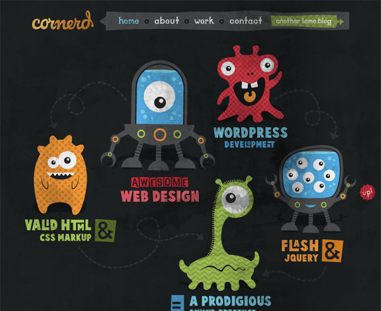
Cornerd
The Cornerd site is a good example of a fluid rhythm in design.

Cornerd in A Graphic Design Primer, Part 2: The Principles of Design

Harmony and Unity

Even if you follow all the principles listed above, without unity and harmony, it’s impossible to create a good design. When all of the elements of your design are working together, you achieve unity.

Without that unity, all you have is a bunch of individual elements on a page, without any real “design”. The elements should complement one another, and work together to create a design that’s both functional and pleasing to the eye.

Examples

SeatGeek
All the elements here work together, while following the principles above.

Seatgeek in A Graphic Design Primer, Part 2: The Principles of Design

Moove Agency
The Moove site uses all of the elements above to great effect, creating a unified design.

Mooveagency in A Graphic Design Primer, Part 2: The Principles of Design

More Examples of Design Principles in Action

Keith Homemade Cakes
This design gives a good sense of priority, and uses both symmetrical and asymmetrical balance in different sections of the site.

Keithcakes in A Graphic Design Primer, Part 2: The Principles of Design

International Storytelling Center
A great example of a site with asymmetrical balance and excellent proportion used to influence the priority of elements on the page.

Storytellingcenter in A Graphic Design Primer, Part 2: The Principles of Design

Quincaillerie Sucree
Another site that uses roughly symmetrical balance, as well as a regular rhythm.

Quincailleriesucree in A Graphic Design Primer, Part 2: The Principles of Design

Platform45
Platform45 is a great example of how proportion effects priority. The site also has excellent unity throughout.

Platform45 in A Graphic Design Primer, Part 2: The Principles of Design

SiteOptimizer
SiteOptimizer uses slight progressive rhythm in their header, as well as proportion to make some elements dominate others.

Siteoptimizer in A Graphic Design Primer, Part 2: The Principles of Design

Wade | A Retrospective
One of the few successful site designs out there that uses radial and asymmetrical balance, as well as fluid rhythm effectively.

Waderetrospective in A Graphic Design Primer, Part 2: The Principles of Design

James Pedrazzini
An excellent example of good contrast, regular rhythm, and symmetrical balance.

Jpedrazzini in A Graphic Design Primer, Part 2: The Principles of Design

Experiencia Lecom
A good example of a site with moderate contrast and a symmetrical design.

Experiencialecom in A Graphic Design Primer, Part 2: The Principles of Design

Youandigraphics
Very creative use of balance, proportion, dominance, and contrast.

Youandigraphics in A Graphic Design Primer, Part 2: The Principles of Design

Turks & Caicos Sporting Club
A great example of how proportion is used to create a visual hierarchy.

Tcsportingclub in A Graphic Design Primer, Part 2: The Principles of Design

Up Next…

In the third installment of this graphic design primer, we’ll cover different composition methods and guides, including the rule of thirds, Gestalt principles, and grid layouts.

More Resources

(rb)


A Graphic Design Primer, Part 1: The Elements of a Design

Advertisement in A Graphic Design Primer, Part 1: The Elements of a Design
 in A Graphic Design Primer, Part 1: The Elements of a Design  in A Graphic Design Primer, Part 1: The Elements of a Design  in A Graphic Design Primer, Part 1: The Elements of a Design

There are many elements that make up any visual design, whether it’s good or not. Becoming familiar with the parts of a design is necessary before you can start to apply the principles of good design to your own work, in the same way that a doctor needs to have an understanding of anatomy before he can learn to heal a patient.

There are seven basic elements of any design. Some are easier to grasp than others, but all are important. Once you can identify the elements of a design, whether it’s your own or someone else’s, you can learn how the principles of good design are best applied.

Line

Lines are generally present throughout a design. They can be thick or thin, straight or curved, solid or dashed or dotted. Lines can be any color and any style. Straight lines are often used as delineations between sections of a design, or they may be used to direct a viewer’s vision in one direction or another.

The width of a line has a direct effect on its visual impact. Thick lines are bold and strong; they draw attention to themselves. Thin lines tend to do the opposite. Color also effects the impact of a line, with brighter and darker colors drawing more attention than lighter and paler colors. The style of a line also has an effect: dotted or dashed lines are less imposing than solid lines.

Curved lines often give a more dynamic or fluid look to a design. They indicate movement and energy. They’re also more common in designs with an organic nature, as they’re more likely to be seen in nature. Straight lines are more formal and structured, and indicative of “civilized” culture.

Examples

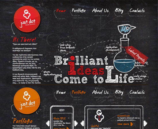
Justdot
Justdot is another example of a site that uses a lot of curved and dashed lines to indicate movement and energy.

Justdot in A Graphic Design Primer, Part 1: The Elements of a Design

RePrint
RePrint uses a number of curved lines to direct the eye of the visitor.

Reprint in A Graphic Design Primer, Part 1: The Elements of a Design

VideoDSLR
VideoDSLR uses straight lines of varying widths to delineate content sections.

Videodslr in A Graphic Design Primer, Part 1: The Elements of a Design

Form

Forms are three-dimensional objects within a design, like a sphere or cube. You can have forms that are actually three-dimensional in your designs (like with product packaging), or forms that are actually two-dimensional but are displayed in a way as to imply that they’re three-dimensional (like a line-drawing of a cube).

Forms are common in actual three-dimensional graphic design, of course, but are also seen in web and print design. Website designs that use 3D techniques are making use of forms. Another common place to see forms is in logo designs where a sphere or cube is present.

Examples

Print Mor NYC
Print Mor NYC uses a 3D effect behind their main content.

Printmornyc in A Graphic Design Primer, Part 1: The Elements of a Design

Arlo Vance
Another example of a 3D effect in website design.

Arlovance in A Graphic Design Primer, Part 1: The Elements of a Design

Shape

Shapes are two-dimensional. Circles, squares, rectangles, triangles, and any other kind of polygon or abstract shape are included. Most designs include a variety of shapes, though deliberate use of specific shapes can give a design a certain mood or feeling.

For example, circles are often associated with movement, and also with organic and natural things. Squares are more often seen with orderly, structured designs. The color, style, and texture of a shape can make a huge difference in how it is perceived.

Examples

Method Design Lab
Method Design Lab uses ovals and other rounded shapes throughout their design.

Methoddesignlab in A Graphic Design Primer, Part 1: The Elements of a Design

Passion About Design
Circles are used throughout the design.

Passionaboutdesign in A Graphic Design Primer, Part 1: The Elements of a Design

Cappen
The Cappen site uses triangles throughout their site.

Cappen in A Graphic Design Primer, Part 1: The Elements of a Design

Texture

Textures are an important part of just about any design. Even designs that, on the surface, don’t seem to use textures actually are (“smooth” and “flat” are textures, too). Textures can add to the feeling and mood of a design, or they can take away.

The most commonly seen textures, apart from flat or smooth, are things like paper, stone, concrete, brick, fabric, and natural elements. Textures can be subtle or pronounced, used liberally or sparingly, depending on the individual design. But texture is an important aspect of design, that can have a surprising effect on how a design comes across.

Examples

The Heads of State
The Heads of State site uses a few subtle textures.

Theheadsofstate in A Graphic Design Primer, Part 1: The Elements of a Design

Doublenaut
Doublenaut uses a more pronounced texture in their background.

Doublenaut in A Graphic Design Primer, Part 1: The Elements of a Design

Cuban Council
The Cuban Council website uses textures on virtually every element of their design.

Cubancouncil in A Graphic Design Primer, Part 1: The Elements of a Design

Color

Color is often the most obvious thing about a design. We’re taught colors from an early age, and even go so far as to identify some things with color descriptors (“my green jacket” or “my red shoes”). Color is also capable of creating strong reactions among people, who consciously and subconsciously apply certain meanings or emotions to different colors (this is also influenced by culture, as many colors mean different things in different cultures).

Color theory is an important aspect of design, and something designers should at least have casual knowledge of. You should know the difference between a shade (when black is added to a pure color), tint (when white is added to a pure color) and tone (when gray is added to a pure color). You should also know terms like chroma, value, and hue. But more importantly, you should know how all these things work together to create a mood or feel in a design.

For a more complete overview of color theory, check out our archived series, Color Theory for Designers.

Examples

Go Live Button
The very bright colors used on the Go Live Button website have a definite impact on the perception of the visitor.

Golivebutton in A Graphic Design Primer, Part 1: The Elements of a Design

Camp David
The more muted colors here give a completely different feeling than the site above.

Campdavidfilm in A Graphic Design Primer, Part 1: The Elements of a Design

Old Putney Row to the Pole
The Old Putney Row to the Pole site uses darker but still muted colors, which gives yet another impression.

Rowtothepole in A Graphic Design Primer, Part 1: The Elements of a Design

Value

Value is closely related to color, but it’s more general. It’s how light or dark a specific design is. Again, this relates directly to the mood a piece gives. Darker designs convey a different feeling than lighter designs, even with all other design elements being equal. This is one reason you’ll often see designers releasing both light and dark versions of their themes.

Not every piece has a clear-cut value. With very colorful pieces, you might not really be able to tell how high or low the value is. One trick is to convert the design to grayscale, to get a better sense of how light or dark it is. You can also look at the histogram of an image to get an idea of where the value is more heavily concentrated.

Examples

This After That
This After That is an example of a site with a relatively light value.

Thisafterthat in A Graphic Design Primer, Part 1: The Elements of a Design

The Lounge
The Lounge has a relatively dark value.

Thelounge in A Graphic Design Primer, Part 1: The Elements of a Design

Space

There are two kinds of space in design: positive space and negative space. Positive space is that which is occupied by design elements. Negative space (also called “white space”) is the area that’s left over. The relationship between positive and negative space has a strong influence on how the design is perceived. Lots of negative space can give a piece a light, open feeling. A lack of negative space can leave a design feeling cluttered and too busy, especially if the designer is careless.

Negative space can create its own shapes and forms, which impact the design. Understanding the effect of negative space and how to use it to your advantage in a design is one of the most important techniques a designer can learn, and can make the difference between a good design and a great design.

Examples

80/20 Studio
80/20 Studio has a lot of negative space in their design.

8020studio in A Graphic Design Primer, Part 1: The Elements of a Design

Dazed Digital
Dazed Digital, on the other hand, has very little white space in their design.

Dazeddigital in A Graphic Design Primer, Part 1: The Elements of a Design

Poster Roast
Another example of a site without a whole lot of negative space.

Posterroast in A Graphic Design Primer, Part 1: The Elements of a Design

Up Next…

In the next installment, I’ll be covering the principles that make up a good design, and how to apply them to the elements we covered here.

Further Resources

(rb)


  •   
  • Copyright © 1996-2010 BlogmyQuery - BMQ. All rights reserved.
    iDream theme by Templates Next | Powered by WordPress