Author Archive

Make it Stretch: Full Image and Video Backgrounds in Web Design


Big is the new trend around the web because nearly everyone wants it. It is imperative that one stays up on trends as a web designer. Never do you want to put yourself in jeopardy of offering someone (or yourself) a web design that is boring and outdated. It seems that almost every year or even every six months, there are new trends springing up across the web. For many the route now is go big or go home.

Today, we are going to showcase some of the best full image and video backgrounds that are offered online today. Prepare to be dazzled.

Make it Stretch

A Book of Beards

This site is dedicated to selling a coffee table book filled with pictures of beards. The site works not just because of the great beards, but because the images are the same ones in the book. Without a doubt, you’re going to want to know what the experience of the book is before purchasing it.

Volkswagen Beetle

If there’s a car on the market you’re thinking about purchasing, what do you do? You’re going to want to test drive it, see how it rides and how it looks. The wonderful thing this site does is it recreates the experience you get when driving a Beetle, from the video footage to the interface.

Beyonce

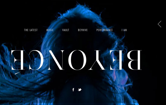
Beyonce is well known for her music, her performances and all around her brand. Every square inch of the screen in filled with her on her website by using images and video. You become enthralled in her every being by just visiting.

Sean O’Brien

You may be interested in Sean O’Brien for whatever reason, but when you go to his website, you must take notice of the reason he is who he is. Much like the Beyonce website, this site is tailored to the fun and exciting brand that is Sean O’Brien. You always have your eyes on him.

Jordan Melo M6

Carmelo Anthony stars in this website by giving viewers a walkthrough of how he created his new shoes. The perspective of the video used allows you to actually feel as if you’re talking and walking with Carmelo on this journey. It’s much more effective full screen than it is as a small view of the video.

Hiut Denim Co.

The images used in this full page site aren’t just here for decoration. They actually add to the story of the website and visually contribute to the ideas being tossed around.

Y. Co

High quality products need to have high quality offerings when it comes to web design and other types of collateral. This site dedicated to a luxury brand of yachts uses full screen video to take you inside and around the yacht.

Chicago L-Shirts

These are some nice, well designed shirts. The developer could’ve slapped them on any type of website with an e-commerce theme and called it a day. They decided to go full screen and use elements that consistently represent the brand.

DesignKitchen

There are really many ways you can approach a full screen website. This approach was to use a lot of detailed design work and display it an appealing manner. With full screen designs you have to be careful because people are seeing everything. This design figured that out and really focuses on great design work.

Pixel Pimps

Sometimes the use of many embellishments and decoration really work to make a website exciting. It isn’t always all about minimalism. This site offers great design as well as wonderful decoration and development. This person is really displaying all their skills in once place.

Modoluce

Again, full screen sites will always benefit the company that wants to show off it’s brand and what they stand for. It’s one thing to have pictures of products, but it’s really another experience to wrap your entire site in them. Modoluce figured that out and really created a website that’s all about them and their product.

Planet Propaganda

This is another example of a very detailed design centric website. Everything is well connected and makes sense as far as the user interface is concerned. The full image allows for excitement and a change of scenery along with every page to page navigation.

Hearts’ Cry Inc.

This site uses a simple execution of full page design by offering only one image as used primarily for the background. The design and development puts a focus on all the copy by essentially taking that off the full page design.

Onside Sports Agency

This is more of a minimalist approach in full page design. While we use the full image size, there isn’t a ton of busy things going on with the design. The full image actually helps to make everything interesting and fun.

Healing Histories

With the great advances in technology today, we can pretty much do anything when it comes to websites. This full page site doesn’t just tell you a story, it asks you to get interactive in picking and choosing your story.

Oh Land Music

This website for a music label allows viewers to know exactly what kind of music they create just by looking. The look is fun, fantastical with a little bit of rock. The fullness of the site makes it easy to grasp quickly.

Parachute Journalists

Designers have so much control in guiding the eyes of the viewers. This website utilizes that, first by only using one page with everything visible that’s completely relevant and helpful to their purpose. All useful, no fluff here.

Sandlewood

With furniture and renovation sites, many developers like to give lots of information with furniture placed sporadically around. Rarely is there a focus on the actual work that’s done. Here, the developer used the full page website to essentially make himself stand out and draw attention to the furniture.

Form Rausch

This website utilizes the full image development to show portfolio work in close to high res. Nobody likes going to a website to have to check thumbnails only to get to images that are as small. This helps show the detail in their work.

Twenty8Twelve

Fashion is one of those things where you have to see it in it’s entirety to really get it. If you see a good shirt on a model, you want to know what it looks like paired with the pants and shoes, etc. This website understood that and used the full page method to help display their fashions.

Ben Thomson Photography

Again, this photographer used the full image idea as a way to allow you to see the detail in their quality and composition. It also allows you to get a sense of who he is.

BlackNegative

Full image backgrounds allow for you to get really creative. This time, the creativity is highlighted in the development of this page. This is easily one of the most epic pages online right now.

Damien Hirst

Rather than just give us a big photograph or a huge video of something we can catch on YouTube, this agency used the background to tell us what they’re doing in their studio. The live feed keeps you up to date on the workings of Damien Hirst.

Alex Arts

Bigger canvased websites allow you to break out of the mold of the grid or fixed width website. That allows you to do a bit more and be a bit more creative. This page is a different approach to a portfolio, but fun to interact with and enjoy.

X-Doria

Cool interaction in a website can get you increased traffic as people are more likely to share. This site utilizes the trend and adds a bit of spice by making this site fun and easy to navigate.

Vivacitas

This developer used the trend to create his own little world. It sucks you in and gets you caught up in the wonderful design as well the movement of the page.

Adidas Design Studio

Navigating through this site requires no mouse and is exceptional. The full pages here allowed for well thought out navigation with uncluttered and easy to read information. This probably took lots of time to make, though they made it look really easy.

Ideal

One could play around with this site all day. The navigation is really outside the box and the atmosphere the design helps create is spot on with the work presented. There’s actually some pretty hilarious and great content on this site.

Elastic Minds Studios

Another great portfolio site utilizing video and images for their backgrounds. The interaction and navigation is also out of the box and well planned.

Peripheral Audio

Upon first look, many know exactly what type of group they are viewing. This site is simple yet effective, as it links viewers to all videos dealing with this group.

Conclusion

Whether you are using Flash or jQuery, making single page sites or full sites, full background websites are a great trend to hop on. It makes a lot of sense and can work for almost any brand or business. They’re great to look at (when executed well) and often exciting in a world full of mundane, cookie cutter websites. Are there any full image or video background sites you’d like to share?

(rb)


Stripped: Minimalist Movie Posters and Album Artwork


As consumers, there are a lot of different products that companies want us to purchase or get into. When you’re in a position to make one choice amongst many products, there is a need for it to stick out; you need to be swayed. Companies do this through things like features and pricing; is it what you need? or is it in your budget? Many times, all the features and prices can be relatively similar, so what do people turn to? The design.

Design is important not just because it can make what you’re selling look better, but often times because it gives us a sneak peek into what’s in store. The purchase of an album or a movie ticket is no different. If you’re looking for a good movie or album, you’re often taking a look at the related artwork.

Though an unfortunate truth about movie and television artwork, as well as album artwork, is sometimes it can be a bit over done. Most times, it’s your first impression, so typically production companies want to cram in as much as possible–or either they’re completely off. Either way, after you listen or you watch you have an idea of what you just consumed; it’s either the same or very different.

The Artwork

What would happen if you just stripped down movie posters and album artwork to what it really is or could be? What if one decided to pick one thing to single out and used that as the artwork? Well, fortunately we don’t have to ask as many designers have done so. Below are some of our favorite minimalist movie posters and album artwork; some are clever, and some are just the essentials.

For added fun, as you scroll, stop at the title of the work and try to imagine what you would use as the design then scroll to the picture and see what you get. It’s very fun to see how people strip down different things.

True Blood by Albert Exergian

Batman by RCrosby93

The Simpsons by Albert Exergian

The Help by Nelos

Radiohead’s “The Bends” by Danix54

Sex and the City by Albert Exergian

Slumdog Millionaire by ThreeProngs

Superman by Haden Yale

Roger Water’s “Amused to Death” by Abrickinthewall

Titanic by Pedro Vidotto

Teenage Mutant Ninja Turtles by Ahrima13

Alice in Wonderland by Rowan Stocks-Moore

The Avengers by William Henry

From Dusk Till Dawn by Grilherme Grecu

Fight Club by Pedro Vidotto

Juno by Theckboom

Forrest Gump by Pedro Vidotto

Hangover by Cameron X. Coleman

Home Alone by Backstothewall

Jay-Z’s “Blueprint 3″ by Minimal Album Artwork

Kill Bill Vol. 1 by Ibraheem Youssef

Captain America by Marko Manev

Pulp Fiction by by Ibraheem Youssef

The Shawshank Redemption by Nick Tassone

Shutter Island by Kenzo Giunto

The Social Network by Kairon Sarri

Coldplay’s “Fix You (Single)” by Ty Lattau

REM’s “In Time: The Best of R.E.M., 1988-2003″ by Mr. Brocklehurst

Pink Floyd’s “Dark Side of the Moon” by Ty Lattau

The Beatles’ “Abbey Road” by Abrickinthewall

Nirvana’s “Nevermind” by Ty Lattau

AC/DC’s “Back in Black” by Ty Lattau

System of a Down’s “Mesmerize” by Chris Siegle

Wall-E by Tom Cross

Wolverine by Marko Manev

Your Turn

Did you play along when scrolling? Pick three titles from above and let us know what you would have designed in our comments. Everyone has different ideas, so share yours!

(rb)


Artistically Designed: Get to Know Andrew Archer


Art and design are often very subjective fields when it comes to who and what is good. They can also be very subjective in determining where a particular piece fits. Is it art, or is it design? There are, however, basic principles we all tend to agree on; design is generally more calculated while art is more free. Every so often, you stumble upon a piece that gives you the best of both worlds, great design and great art.

It does not happen often that the piece of work is surrounded by other works that are just as amazing. This time, we’ve stumble upon a wonderfully kept secret by the name of Andrew Archer. He’s an illustrator from New Zealand that has a great artistic eye that works with various design principles. Today, we get to pick his brain a little to see how he comes up with such amazing work.

Question & Answers

Q: First off, thank you for agreeing to this interview. Could you start by telling our readers a little bit about your creative process? How do you get a project rolling?

A: I always bounce a few emails back and forth or hit Skype with the Art Director to get a clear idea of what he likes about my work or thinks would be good for the project. From here, I put a series of thumbnails (sketches) on paper – I normally pick 1-3 of my strongest, [because] I’m not a super fan of sending a huge set of thumbnails unless I’m lost for ideas. From there the client/art director and I will make any tweaks if necessary and I’ll do some research on the subject for the good linework/image. At this point I don’t really care for anything but a strong composition, everything else can come after.

Q: When it comes to your work, what are your weapons of choice (your go to tools)?

A: I do all my thumbs and refined sketches on paper and most of my good linework, also. I use the tablet for fills, controlling colour and values. Pencils, Photoshop, charcoal, acrylics and watercolours are my most used tools. I often make silk screens for certain things and/or scan anything I need – sometimes it can be coffee stains, sometimes crayons – it really is determined by the project itself, but I don’t limit myself to a set process for every project. Sometimes I use more by hand, others more digital – it really depends.

Q: How did you get started in the art and design fields?

A: I studied graphic design originally and worked in the field for 1-2 years. I studied when I was around 18 and didn’t really know what I wanted from design except to ‘design cool things’. The industry is a lot different than most think it is – I was one of those people who thought you would [get] into a job designing snowboard artwork, realistically it’s far from this. I worked as a graphic designer for around 18 months. Most of my design work was illustration related but with a lot of design attributes.

Q: Of your many fantastic pieces, what is your favorite? What is the story behind this piece?

A: ‘Little Large Tokyo‘ and ‘Bully School‘ are probably two of my favourites, mainly due to them relating to me personally. ‘Little Large Tokyo’ reminds me of everything I love about asian culture, the art style, the food, the transport and system. ‘Bully School’, I like the rawness and contrast.

Q: How do you stay inspired? Do you have any inspirational tricks for beating creative blocks to pass along to our readers?

[I'm inspired by] Travel, cultures, food, music and a massive Tumblr dashboard that fires awesome work from awesome artists at me all the time. Except the [aforementioned], I’m naturally an extremely motivated person and will not give up on anything until I have done or mastered it. It’s a good and bad thing, drives me nuts some days but also I know it’s what fuels me. I feed off knowing I can do better/greater work personally. There’s no real trick for me, I dont really feel like I need to beat a creative block – I’ve always been full of a lot of ideas and can normally picture in my head how I want something to look when I first read the project. My frustration/hard work comes with colour and the delicate process of achieving an interesting palette. [The] Trick is to keep going!

Q: Are there any projects that you are currently working on that you could tell us a little bit about?

Currently working on some fashion spreads, a film poster and a few editorial pieces.

Q: If you had your way, what would your future in this arena be like? 

To be able to keep illustrating, build a long term body of personal and commercial work that I’m proud of, is true to me and enjoyed by others. I see my personal work as the ‘bigger’ thing which brings the most enjoyment.

Q: Do you have any side hobbies — that thing you do really well when you are tired of doing illustrations?

I play basketball a lot; around 3-5 times a week. I’m super good at eating and obsessed with food, watch a lot of korean film/movies, play some games and watch way too much NBA. I never really get tired of illustration, I believe you really need to be obsessed with your craft to do well, so it’s always in and around my life.

Q: What was the biggest challenge you faced getting started that you wish someone had warned you about?

A: That it takes time, it really does. You need to be prepared to work hard for quite a long time to develop the portfolio and work ethic to do it professionally. You need to be prepared to be in it for the long run and really work on it every day – it’s definitely not easy, but it is rewarding. There’s quite a big difference between illustrating as a hobby/side thing and professionally. The business side is so important and very rarely talked about.

Q: Do you have any bits of advice that you would like to impart before we wrap-up the interview?

A: The most important thing in my opinion is dedication, persistence and diligence. It’s a competitive industry but I strongly believe those who are really passionate and loving of their craft will shine through.

The Work of Andrew Archer

A set of illustrations for an editorial about eating, food types, digestion and general tips to losing weight.

Illustrations for ESPN magazine about record-breaking big wave pro surfer Garrett McNamara and NHL Philadelphia flyers goalie Ilya Bryzgalov.

[Archer] worked together with Oktobor to create and develop a city and 13 characters for Twisties new animated commercial and campaign. The characters and city were all related to music and interact with each other using various instruments and environments.

Cover of the NY Observer … An exclusive tally of the wall streeters who never die.

Illustration for OUT’s Symposium section – A Single Man.

Poster illustration of X-rated movie characters vs G-rated movie characters having a full scale battle in downtown Auckland.

Personal Work (Sharing Alike)

Opener and spot illustration for Triathletes World about drafting and slip streaming within triathlons.

Illustration for Q Magazine of John Niven reading quotes from his new book about people with Tourette’s syndrome.

Illustration for an article about barbie and her 50th birthday coming in 2009.

Series of illustrations & type created for the World Nude Day website.

Various illustrations for John Niven’s column for Q Magazine UK.

Illustration about the growth of steroids and the top steroid influenced outcomes of sporting history.

Conclusion

Via the interview questions, Andrew really dropped some jewels for those of us trying to make a path or living for ourselves, not just with Illustration but any type of artistic career. Not to mention, his work is definitely pleasing to look at and draw inspiration from. What artists inspire you creatively, as well as professionally?

(rb)


Art on Board: Skateboarding and the Artistic Sub-Culture


When you think of sports, probably the last thing you think about is art or the freedom of expression. You probably think about the high energy. The excitement. The competition. The sweat. The blood. The tears. All of these tend to be associated with sports, from the most physical ones like football, to the least physical ones like golf. But art and sports are not mutually exclusive. Far from it, in fact. Just look at skateboarding.

Never have we seen a sport so closely linked to art as the skateboarding community. It’s a bit odd, because when you think of athletes, you might think of the stereotypical “dumb jock” and not of an “exceptional artist.” In that sense, you have to give your respect to the skateboarding community–without creativity or artistic freedom, skateboarding would probably be just seen as another crazy competitive sport. As it stands, it is also a powerfully creative force.

Skateboard Art

There’s a belief that skateboarding was a spin off of surfing culture; the guys want to ride the waves when there weren’t any waves, so they ended up shortening the board and putting wheels on them to ‘surf’ the streets. Of course, eventually, it evolved into less of a spin off and more of it’s own thing–it’s own community, that started to become popular in the 70′s and 80′s. From then to now, people had a real connection with their craft–it wasn’t just another thing to be good at, it was an extension of themselves and what they liked to do.

The ever growing popularity of the culture is great and as artists, it’s tough not to pay attention. Skaters have these great connections to their boards. They are aware that their board is part of them and they treat it as such. One of the most important things to a skater about their board is often the art on it. Most of the time skaters try to get a skateboard with art that relates to them or they customize them to continue to be a reflection of the individual.

This culture is built around, and promotes, creative individuals. Whether it’s by adding stickers to their boards, designing it in Photoshop or painting on them with acrylics or spray paint, skateboard art is a force to be reckoned with. There are some amazing things seen on skateboards that one couldn’t even fathom for canvas. Skateboard art and skateboard culture go hand in hand. Here are some examples of some great skateboard art from individuals and companies.

Art on Board

Zombunny by Klownhed

049: 112.1 by HateFuel

Rose Garden by YASLY

Bold is Beautiful by Jeff Finley

Buddy by Icanady

Eureka’s Castle Village Skateboard by David Diliberto

Dead Heart Skateboard by OptimusDesigns

Death is so Near by NOF ArtTherapy

The Exact Moment by Chuck Anderson

Gun Deck Skateboard by OBX Russell

Places You Can’t Imagine by Chuck Anderson

Rail Gun by Kiran-X

Retrocks – Board Collection 2 by JKohohen

Rihanna Skateboard by Artistlsak

Sk8 by God of Insects

Skate Branding by ChickenChild

Skateboard by FairyTale Thriller

Skateboard by Funeral Edition

Skateboard by Kitten-Nyo

Skateboard by Sir SiriX

Demon Hunter Skateboard by Stephen Tian

Skateboard Design 002 by Broken Brain Designs

Skateboard Design 4 by Tyra WM

Skateboard for Popdeck by TheHermitDesign

Skateboard Update by UnDead Amy

Spray Candle Skate Deck by Gwaraddict

Vector Skateboard Deck by Alvaro93

Wolf or Whale by Katie Major

Wood Morning Decks by Artendrju

Fierce Skateboard by Luis Diaz Artist

Conclusion

Skateboarding is really a sport like no other, one that promotes creativity and free thinking. It has sometimes blatantly, and other times silently, influenced many other cultures, especially in the realms of music, fashion and art. When one gets past the stereotype that the sport is for punks who are up to no good, it’s really easy to appreciate not just the physical and technical sport, but the art form. How do you feel like skateboard art and culture have influenced you?

(rb)


Just My Type: Super Clean, High-Quality & Free Fonts


Whatever type of designer you are, you want to be able to offer potential clients a nice variety of styles. In this current day, many designers and clients are looking for really clean, minimalistic design work. One of the main ways one can execute a very clean look is via your choice of fonts. Luckily, there are tons available, especially free fonts.

Not every one is going to be great for your project–quite frankly, there’s a lot of trash and there’s a lot of fonts that simply don’t fit. The font you choose, however, can have a great impact on the design. Good typography can often lead to good design, and the number one rule in typography is if you can’t read it, don’t use it.

Clean fonts are a necessity to any designer. Not just because clean and minimalist design is popular, but because cleaner fonts don’t have a ton of decoration and are therefore easy to use for different occasions. Below, we have a list of 25 fonts that are lacking a lot of decoration, but are high quality and of good detail. Did we also mention most of them are free for personal and/or commercial use?

Super Clean Fonts

Bebas Neue

Boarder

Coneria Script

Designosaur

Directory

 Elsa

Great Vibes

Homizio

Hype

Men-Nefer

New World

Open Sans Condensed

Ostrich Sans

Pacifico

Piximisa

Quicksand

Raspoutine

Rawengulsans

Reznor Broken

Roboto

Sports World

St. Marie 

Stromline 

St. Ryde

Trocchi

 Conclusion

Some of these fonts are great for just headlines, and some of them are great for your body text. Whatever your usage, we hope you make the most out of them. Fonts can be a very important and intricate piece of your design–if you pick the wrong one you can end up losing your audience. Don’t make that mistake by using some awful, poorly put together font. High quality, and free fonts are hard to come by so hopefully you find this post helpful. Are there any other super clean or versatile fonts that you really enjoy using?

(rb)


  •   
  • Copyright © 1996-2010 BlogmyQuery - BMQ. All rights reserved.
    iDream theme by Templates Next | Powered by WordPress