Author Archive

20 High Quality, Extraordinary & Free Web PSD Templates


No matter who you are or what your business may be, you will always want your website design to stand out. Having an extraordinary website allows you to stay on the mind of most of your visitors and can help translate how unique your product or service is to someone.

The problem with creating a standout site is sometimes you have no clue where to start. You may have the colors you want, and you may simply have an idea; but as far as it really being unique, you don’t have a single clue. It can sometimes be hard to start with absolutely nothing and try to make it into something that will stick with someone.

Fortunately, there are folks out there who help out by creating fabulous PSD templates to help anyone get started on making a website. The unfortunate truth however, is sometimes, most of these freebies aren’t worth even going through. So, today we’ve created a list of 20 amazing PSD templates to do the sorting work for you and get you inspired with your own website design.

The Templates

All of these PSD templates are free. Please read the license agreements carefully before using the PSD’s exclusively for commercial use.

Gallerise

This is a great place to start off this round-up as this template comes in 9 different colors and is absolutely free. The design is very clean and clear and leaves a lot of room for excess developments.

Template Features:

  • 16 PSD files; 9 different color schemes.
  • Doubles as a Photo Gallery.
  • Well organized for easy editing.
View | Download (Pay With a Tweet)


Sleeko

This is a one page template, made with most designers and creatives in mind. Showing off a very clean design and use of trendy elements, this is a no-brainer for any one looking to begin on a single page portfolio.

Template Features:

  • Uses 960 px grid system.
  • Designed contact form.
  • Comes with complimentary social media icons.

Ecommerce Web Template

When doing e-shops and e-commerce, it can be pretty challenging to think of new ways to reinvent it, but this template here has done great at making a welcoming and fun website. A great start for a creative, fun, or family product.

Template Features:

  • Fresh, bright, clean design.
  • Comes with necessary buttons and icons for a web shop.
  • Uses standard fonts (Arial and Rockwell).

Redux Business Website Template

Perfect for pretty much any product or service, this clean web PSD pretty much comes with everything you need. You can use it as is or put your own little spin on it.

Template Features:

  • Flawless design, easily customizable for all. 
  • Leaves room for lots of modern features (slide shows, video screen shots, etc.)
  • Well organized for easy editing.

3D Creative Layout

The navigation of this particular template is the star here–and when coded you’d probably use a script that makes it work similar to most Mac navigation. It’s a very creative concept and can be widely used.

Template Features:

  • Super unique layout.
  • Includes several icons.

Church Website Layout

This is a pretty self explanatory template, with a great layout and attention to detail. It doesn’t just make it look like you’re just going to ‘church’, but to an ‘experience.’ This template could work well with churches as well as bands and musicians.

Template Features:

  • Fully designed photo slider.
  • Social media icons included.

Agregado LifeStream Theme

This theme is not only a PSD, but it is also a WordPress theme. Fortunately, we all don’t use WordPress, so the PSD is available. This is another versatile template, with a wonderful color scheme.

Template Features:

  • WordPress theme is free as well.
  • Fully designed contact form, comments and tags.
  • Uses standard fonts.

Modern Design Studio Template

Textures can add that extra ‘umph’ to sites and this template demonstrates that well. Playing around with textures pretty well without crossing the line and over doing it.

Template Features:

  • Modern, usable design.
  • Uses standard fonts.

Creative Portfolio Template

This is a super crisp and clean template that utilizes a really fresh take on portfolio layouts, not to mention the design is pretty much impeccable. This is definitely a template to keep near by.

Template Features:

  • Resizing is easy with ‘Smart Objects’
  • Includes useful social media icons.
  • 6 PSDs; Home Page, About, Contact, Services, Blog Post, Blog Entries.

Events PSD Template

A one page website that is a great splash site or small site for upcoming events. You’re able to show off exhibits or performers/speakers as well as get your audience to purchase tickets. This is a nice, quick fix for many website needs.

Template Features:

  • Extremely unique design.
  • Uses 960 pixel grid system.
  • Fully customizable contact form and purchase buttons.
View | Download (must Re-Tweet)

Yellow! Minimalist Blog Template

Minimalism is a style that can work for almost any person or product. Here, we have a nice simple blog template, with a wonderful pop of color.

Template Features:

  • Unique one-column design.
  • 2 PSDs; Home Page and Inside Page.
  • Minimalist design

Crisp Presentation

A good mix of crisp, clean and beautiful work. This template uses a very sophisticated color palette, and also has a nicely thought out layout.

Template Features:

  • 2 PSD files; Home Page and Inside Page.
  • Includes useful icons.
  • Extremely versatile design.

oWire Template

This template brings a fresh look at websites, especially their headers. Boasting a colorful palette with clean design elements, this is a great site for agencies or designers.

Template Features:

  • 4 PSD files; Home Page, About, Contact, and Work.
  • Creative and grungy design.
  • Comes with icons and designed contact form.

Education Template

This template sports a very unorthodox layout and design for an education website, but in a very good way. It could use some help as far as the typography is concerned, in regards to making all that clearer; but this template is a great start.

Template Features:

  • 2PSD files; Home Page and Inside Page.
  • Unorthodox and fun layout.
  • Uses standard fonts.

Digital Rust Template

With seven different PSDs, and a very fresh look at website design, this template is nothing short of awesome, and is extremely high quality. This is a great template if you are looking to do something new without straying too far away from the basics.

Template Features:

  • 7 PSD files; Home Page, About, Work, Work Item, Contact, Blog Post and Blog Page.
  • Easy resizing using ‘Smart Objects’ and shapes.
  • Well organized for easy editing.

Inkfolio

This is a rather simple template, but the detail in the template’s design is extremely noteworthy. Great for small businesses and designers alike!

Template Features:

  • Uses stand fonts.
  • Versatile template.
  • Easily editable.

Creative Mass: One Page Portfolio

This is a wonderful one page site, with a dark theme–great for artists and small products. The detail here is amazing.

Template Features:

  • Uses 960 pixel grid system.
  • Includes complimentary icons and buttons.

Clean Tech

This template is great for businesses centered around technology. The design is exceptionally modern and serves as a great starting point or as a complete site.

Template Features:

  • 3 PSD files; Home page, Inside page and Contact.
  • Fully designed contact form.

Grunge Designer Portfolio

While this was made to be a web designer portfolio, one could easily extend the uses of this to work with businesses and products. This is a great template to get you started with your site.

Template Features:

  • Textures and Icons available on Template Webpage.
  • Customized image slider.

Cafe and Restaurant Template

This template has a very nice color scheme and is very well thought out as far as the layout for all things restaurant. It makes good sense and the design draws you in very easily.

Template Features:

  • Stylish design for restaurants.
  • Uses 960 pixel grid system.
  • Well organized for easy editing.

How’d You Like It?

Being creative is extremely important, so hopefully this collection of PSD’s can catapult you to an area of success. As mentioned, these are great starting points or even ending points depending on what you like (make sure you check the license). If we missed an excellent PSD template, feel free to let us know! Also, leave us a comment and tell us which one was your favorite.

(rb)


The Keys to Making Fresh, Forwardly Aesthetic Web Designs

Advertisement in The Keys to Making Fresh, Forwardly Aesthetic Web Designs
 in The Keys to Making Fresh, Forwardly Aesthetic Web Designs  in The Keys to Making Fresh, Forwardly Aesthetic Web Designs  in The Keys to Making Fresh, Forwardly Aesthetic Web Designs

Great graphics. Beautiful typography. Clean design. These are all things designers typically think of when creating stunning websites. But is it really just that combination of elements that produces something that can take your breath away? Of course it’s much more than that; but what?

Far too often, web designers like to blame the breath taking factor of websites on the genius of another designer. Not to take away from any designer, but creating a stunning website is absolutely do-able for any designer with a good set of skills (or the ability to outsource). So, how can you do it?

Detailed Development

Coding and development is an extremely important portion of the website building process. Sometimes web designers get so caught up designing as best as possible, we can sometimes forget that great development will take your design to a different level. Clean coding that pays attention to the smallest details of the design and even the web browser will create an excellent experience.

Construction1 in The Keys to Making Fresh, Forwardly Aesthetic Web Designs
Constructing a website can be tedious, but it’s worth it to create fresh websites. Image Credit

HTML5 and CSS3 are fairly new technologies that have come about to really help developers do their work as best and as easily as possible. While there are some kinks in it, we would strongly suggest that coders really get into learning it and making it work for them. The purpose of updating the HTML and CSS libraries was and is to make things a bit more intuitive and more consistent among different coding languages (i.e., javascript, php, etc.).

HTML5 + CSS3

There are tons of articles about the pair of these and how they are really changing the way of development. Take a peak at some of these articles to help you out.

Movement is absolutely required on stunning websites. Pages don’t have to jump and bounce around but noticing fine details to make the website look like it’s living and breathing really helps. Javascript and it’s various libraries really help make web sites live, especially when we are talking about the interaction of elements in browser windows as well as loading images.

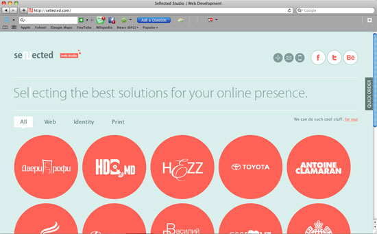
For example, on the Sellected site, you are able to filter the content you wish to see in a way that doesn’t require you to refresh and reload the page. Everything aesthetically transforms in front of you. The roll-overs on this page are also magnificent because they are smooth, make sense and again, are aesthetically pleasing.

If you are interested in more Javascript and jQuery types of transitions and tricks, check out 150+ Best jQuery Effects for Designers and Developers. Mastering CSS3 and HTML5 can also really get things moving on a page–positioning, fluidity, and other techniques contribute to this.

Cleverly Coded Sites

In terms of development and coding there are details as well as tricks that can be used that really take a website from 0 to 60 in seconds. We could never list them all here, but we will give you a short list of websites that really paid a lot of attention to the details in the development or either made their coding a central piece of the web site.

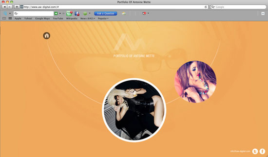
Awdigital-dev in The Keys to Making Fresh, Forwardly Aesthetic Web Designs
The screen shot of this website does it no justice. It isn’t heavily designed and it could be argued that it’s not even necessary. The negative space shows you exactly what you are supposed to look at. The way in which this whole thing is animates and transforms is amazing and something several of us have never seen before. Very neat

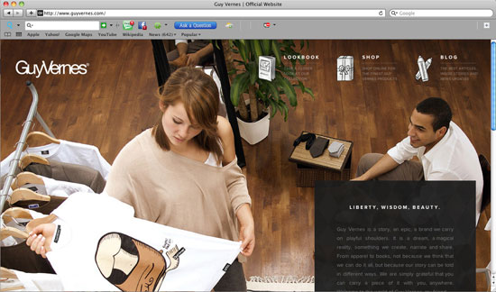
Guyvernes-dev in The Keys to Making Fresh, Forwardly Aesthetic Web Designs
Once again, not a very heavily designed website–the focus here is on the clothing. Viewing this site on a huge monitor is definitely fulfilling especially when you play around with the window. The page transitions are exceptional as well.

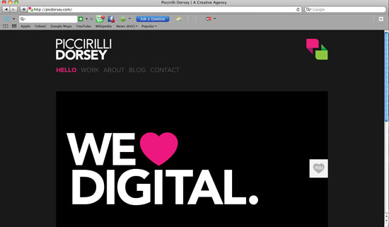
Piccirilli-dev in The Keys to Making Fresh, Forwardly Aesthetic Web Designs
It looks like a pretty static website, but the attention to the details, especially when you view the ‘Work’ page really shows they were particular about their content. This is a design agency and obviously they wanted to strip away as much crap as possible and get you to look at what they can do. Super clean and powerful

Sellected-dev in The Keys to Making Fresh, Forwardly Aesthetic Web Designs
This is another fun site where the attention to detail will keep you on the site forever. Go to this website and play around with the window size as well as with the filter on the site. This is like a living, breathing, intuitive person!

Freeassoc-dev in The Keys to Making Fresh, Forwardly Aesthetic Web Designs
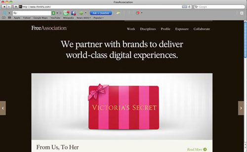
The development as well as layout of this site really work together in helping this site look like it’s not as content rich as it actually is. Simple. Not overwhelming.

Adam-dev in The Keys to Making Fresh, Forwardly Aesthetic Web Designs
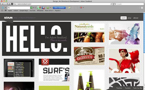
More great coding and a pretty solid design. If you fool around with the window size, you’ll notice the great detail taken in the development of this website.

Unorthodox Design & Layout

Have you ever gone to a website, looked at it, and just got a tingly feeling? Or has a website ever been so overwhelmingly good to you that you just stare at it or look at every single element and say “That’s crazy”? An extremely fresh design really can make your website standout from the crowd, but how do you know when you’ve got the right design?

Painting1 in The Keys to Making Fresh, Forwardly Aesthetic Web Designs
Web design is subjective, much like Fine Art, but there’s no denying when something’s good Image Credit

There are a lot of things that go into designing websites. The most important thing you must do as a designer is figure out your target audience and figure out what the purpose of the website is (I,e., is it to sell or is it to inform?). Once you’ve got those two things, you’ve got to figure out how to combine the two in a way that the audience enjoys and that is effective towards the purpose of the site. Then you really have to build around that as far as the design and layout is concerned.

Let’s be honest, a large header and a right sidebar are right for some websites, but not all websites. The way a website’s design becomes stunning or breath taking is when the designer really steps outside the box. The trick though, is to not get SO outside the box that the website fails to make sense or lose sight of it’s purpose.

There’s no strict code to figuring out how to create super fresh designs. Many like to stay fresh, of course by looking at design inspiration (use it as an influence, not a rubric) and practicing their program of choice. Personally, practicing without any type of outside product (no brushes, custom shapes, etc.) really helps you think of different solutions to different problems without looking like something that’s already out.

Now understand, this will not work for everyone but the idea here is just to be as creative as possible and not to be afraid of being creative. We sometimes fear creativity because we’re not sure how an audience will accept something different, but challenge yourself to be bold and forward thinking when it comes to design.

After all, at some point, all the current trends have to be pushed aside for new ones, don’t you want to be ‘cutting edge’?

Stunning Sites

Design and Art are relative and really depend on personal taste. Now, do understand these exemplified websites are personal preference, but we plan on really pointing out why these designs aren’t just pretty, but why they work. Visit the sites and really look around to see how the design and layouts really interact with everything. Also, notice how many of these sites stepped outside the box and created something super fresh.

Bigeye-des in The Keys to Making Fresh, Forwardly Aesthetic Web Designs
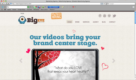
This website’s design is a little lacking, but the layout WORKS for them, as they are a bit more content rich than other websites. They have an obvious working hierarchy for their site, which is complimented by a pretty standard, but effective layout

Rapture-des in The Keys to Making Fresh, Forwardly Aesthetic Web Designs
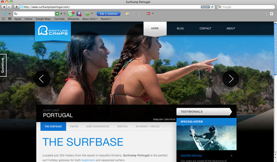
Movement and good clean, effect design all in one place. Again, this isn’t a life changing design but it works for their service and you know exactly what’s going on. Interesting Navbar, too.

Skittles-des in The Keys to Making Fresh, Forwardly Aesthetic Web Designs
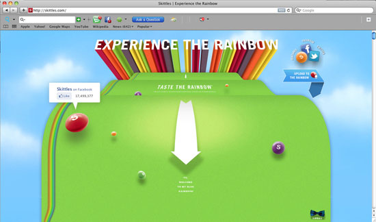
An extremely unorthodox layout as well as an unorthodox design. The message is simple–have fun and eat Skittles, along with some social media implementation. Very fun design here. Very playful and fresh!

Ideage-des in The Keys to Making Fresh, Forwardly Aesthetic Web Designs
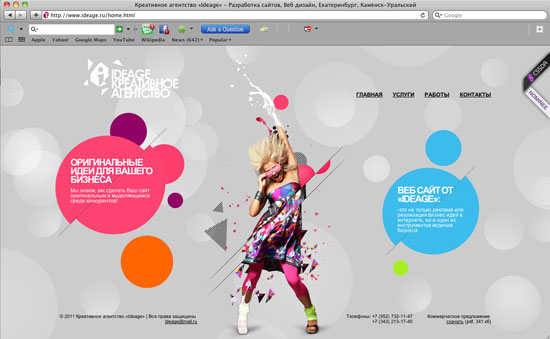
This is one of the freshest sites to hit the screen in a while with a good combination of design and detailed coding. Very unorthodox but it works–while you might have no idea what it says, not sure that really matters too much. This site is GREAT

Meister-des in The Keys to Making Fresh, Forwardly Aesthetic Web Designs
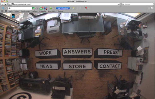
This an extremely different type of thing here…the navigation is actually on a live web camera. That’s really different. The inside pages aren’t too shabby either.

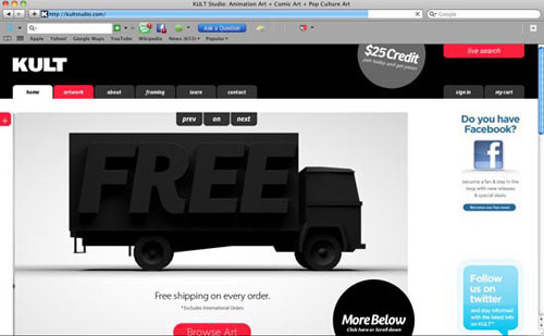
Kult-des in The Keys to Making Fresh, Forwardly Aesthetic Web Designs
This is a pretty standard layout, but the design elements used are really magnificent. There are alot of unexpected things about this site and it’s design. More proof you can really expand on a standard layout.

Stay Inspired

Always be on the lookout for fresh new ideas and see what people are doing. Again, don’t use these sites as rubrics, but be creative and use them as influences to help you think outside the box and see different techniques in action. Here’s a list of some of the best web design showcases the Internet has to offer:

  • Make Better Websites – Dedicated to absolutely the freshest web sites I’ve ever seen. More portfolio sites.
  • WebCreme – Pretty good stuff here, too. Lot’s of different types of websites.
  • DesignShack Gallery – A one stop shop gallery of all things good.
  • The Best Designs – Another good one for fresh ideas

(rb)

  •   
  • Copyright © 1996-2010 BlogmyQuery - BMQ. All rights reserved.
    iDream theme by Templates Next | Powered by WordPress