Tag: kranthi

Comprehensive Review Of Usability And User Experience Testing Tools


Usability and user experience testing is vital to creating a successful website, and only more so if it’s an e-commerce website, a complex app or another website for which there’s a definite ROI. And running your own user tests to find out how users are interacting with your website and where problems might arise is completely possible.

But using one of the many existing tools and services for user testing is a lot easier than creating your own. Free, freemium and premium tools are out there, with options for most budgets. The important thing is to find a tool or service that works for your website and then use it to gather real-world data on what works and what doesn’t, rather than relying purely on instinct or abstract theories.

Free And Freemium Tools

A ton of free and freemium tools are out there to test your website’s usability and user experience. Many of them get you to use your existing visitors as a testing base, which can give you a very accurate picture of what users are experiencing when they use you website.

Ethnio
Ethnio enables you to intercept visitors on your website and recruit them to help you with research (you can offer incentives to make participation more enticing). Ethnio acts as a hub for your various UX tools, including Usabilla, Optimal Workshop and UserTesting.com. It even works with GoToMeeting for screen-sharing. You’ll get detailed reports on the people who respond to your recruitment efforts. Ethnio has a free plan that allows for up to 10,000 page views per month and up to 250 responses. Paid packages start at $49 per month (for up to 100,000 page views and 500 responses) and go up to $299 per month (for over 1 million page views per month and unlimited responses plus other features).

Simple Mouse Tracking
Mouse tracking is a great way to see how visitors are actually interacting with your website. This plugin lets you record mouse activity on your Web pages and then replay that activity in real time. It works in virtually all modern and not-so-modern browsers, it works with static and liquid layouts, and it is customizable by the end user.

xSort
xSort is a card-sorting application for Mac OS X. It gives you full control over the exercise, supports sub-groups, gives statistical results in real time, and lets you create, read, print and export reports easily. The visual environment of the app resembles a table with cards (and you also get an outline view).

KISSinsights
KISSinsights lets you embed surveys directly on your website. The free plan offers an unlimited number of surveys, with up to 30 responses for each one. The premium plan, at $29 per month, allows you to customize the surveys and thank-you messages, removes KISSinsights’ branding, and allows for unlimited responses.

FiveSecondTest
FiveSecondTest helps you better design your landing pages and calls to action by analyzing which elements of your design are most prominent. Just upload a screenshot or mockup, set the questions that you want answered, and then wait for users to complete the test. FiveSecondTest collects the responses for you and analyzes them for common keywords, which it then represents visually. The free community plan lets you earn tests by participating in tests run by others. Paid plans start at $20 per month with more features, including private tests.

AddUse
AddUse enables you to conduct user surveys and user tests. You get one of each for free, and then can purchase additional surveys and tests from there. Signing up is quick and easy and doesn’t require a credit card. AddUse offers real-time results and analysis, and also includes ready-to-use usability questions that you can incorporate in your surveys for faster set-up.

UserEcho
UserEcho is a simple widget for collecting customer responses and ideas. Just copy and paste a few lines of code onto your website and then wait for visitors to respond. The free plan offers one forum and one official representative, as well as simple moderation, admin control, rich-content editing and YouTube embedding. Paid plans start at $15 per month and include more forums, more representatives and more features.

Usabilla
Usabilla lets you run micro-usability tests to get a better picture of how well your website performs with visitors. You can collect feedback, discover usability issues, measure how various tasks perform, and then get visual results. The free plan lets you run one public, active test at a time with up to 10 participants. Paid plans start at $49 per month, allowing you to create private tests with up to 50 participants, and go up to $199 a month (allowing up to 10 active tests at a time and up to 250 participants).

Google Website Optimizer
Google’s free Website Optimizer lets you run A/B and multivariate tests on your website. Just sign up with your Google account and create an experiment. You can specify which page you’d like to test and which sections of the page, and then identify your conversion and success targets. Setting up experiments is a straightforward process.

Google Website Optimizer

Userfly
Userfly lets you watch videos of users interacting with your website. Just install a single line of code, and it will record every mouse movement and click that users make. The free plan allows up to 10 captures per month and stores recordings for 30 days, while premium plans (ranging in price from $10 to $200 per month) allow for more captures and downloadable recordings.

Clickdensity
Clickdensity is a heat-map analytics tool that installs in under five minutes. It provides heat maps, click maps and hover maps and gives you real-time results. The trial version can be installed on a single page and stores up to 5,000 clicks. Premium plans start at £2.50 per month, and all include an unlimited number of pages.

Navflow
Navflow is a tool for analyzing the conversion paths for your mockups and wireframes. Just upload the designs that you would like to test, run a private or public test, and then view the results. The free plan allows you to earn public tests by participating in tests run by others. Paid plans start at $20 a month and allow you to run unlimited private and public tests.

User Plus
User Plus offers two tools for testing your website’s usability: Tester and Advisor. Tester lets you test the important tasks on your website with real people. Just create a test, invite users and then measure and see what they do. Advisor evaluates your website’s usability based on ISO standards and gives you a usability score. Tester is currently in private beta, and for a limited time you can try it for free. Advisor offers both free and paid plans.

Chalkmark
Chalkmark is for first-click testing, to see what visitors click on first on your website. It’s a simple concept, but vital to ensuring that your website is converting well. A free plan is available for running short surveys on a trial basis before you buy. The free plan lets you survey 10 people, with 3 tasks each. Paid plans include unlimited studies, unlimited tasks, unlimited questionnaires and unlimited participant responses.

4Q
4Q is an online survey tool for evaluating user experience and customer satisfaction. Setting it up takes less than five minutes, and the intuitive suite of online tools gives you valuable insight into how visitors are interacting with your website with only a few mouse clicks. A free plan is available that lets you collect responses from up to 100 participants. Paid plans start at $19 per month and include more features and more responses.

WebSort.net
WebSort.net is a remote card-sorting application. Just create a study, send the link to participants, and wait for the results. You can create a free study with up to 10 participants. Then upgrade whenever you want to include 100 participants or more (starting at $149 per test). You can also buy a three-pack of studies for $299; or buy an enterprise license, with unlimited tests in a 12-month period for $2,499.

Concept Feedback
Concept Feedback lets you get feedback on your website so that you can increase conversion rates. Just post your website, get expert feedback from experienced design, usability and strategy pros, and then share the evaluation with your team or client. You can pay to have experts review your website ($99 per expert), or just get feedback from the community for free.

Premium Tools

Vendors of premium testing tools generally recruit users specifically to offer feedback on your website. Many of the tools come with videos of users interacting with your website, and some offer both remote and local testing.

WhatUsersDo
WhatUsersDo lets you test the user experience of virtually any part of your website. Just set tasks for users to carry out on your website, and then watch and listen to recordings of everything they do and say. Setting up a test takes less than five minutes, and results are available within 48 hours. Pricing is a flat fee of £30 per user, and five users are recommended for each test.

TryMyUI
TryMyUI lets you test your website with real users and watch videos of them using your website. You get to see all of their mouse movements and keystrokes and hear everything they say about your website. Users also provide written answers to your questions. A free trial is available, and the regular price is $35 per test.

Userlytics
Userlytics is a full-featured testing service that guides you through the entire testing process, from designing the study to scheduling tests, managing logistics and incentivizing participation. Pricing starts as low as $59 per participant but goes lower with volume discounts. You’ll also get videos of participants interacting with your website for accurate results.

OpenHallway
With OpenHallway, you create test scenarios, record users either remotely or locally, and then watch video results from your browser. You can share videos with clients or team members, and an unlimited number of projects and test scenarios are allowed within your storage limit. You can try OpenHallway for free, with a test scenario and up to three 10-minute user videos. Regular plans start at $49 per month, which allows for up to 1 GB of storage (3 hours of video), and go up to $199 per month for 9 GB of storage (30 hours of video) and downloadable test results.

GazeHawk
GazeHawk runs eye-tracking studies on any image or website. It offers targeted or general user studies, depending on your needs. The starter plan, which includes a 10-participant study with heat maps and gaze replays, is $495. GazeHawk also offer A/B testing packages ($995 for two 10-participant studies), a professional package with 20 participants for $995, and enterprise solutions for bigger tests.

Silverback
Silverback is downloadable software for your Mac for running user tests. You can capture screen activity, record video of testers’ faces, record their voices, and control recording with the built-in remote. And it’s all exportable to Quicktime. The app is free for the first 30 days, and the full license is $69.95.

Verify
Verify, from Zurb, includes nine different test types: click, memory, mood, preference, annotate, label, multi-page click, and linked. New user tests can be set up in less than three minutes. You can share tests with team members or make them public, and visual reports are included to make decision-making easier. The “Plus� plan is $9 per month and includes unlimited tests, while the “Premium� plan includes demographics reports, linked tests and PDF export. A 30-day free trial is available on all accounts.

Feedback Army
Feedback Army offers cheap and simple usability testing for your website. You can set up a new test in two minutes, submit a question about your website, and get 10 responses from Feedback Army reviewers. And it all costs only $15.

UserTesting.com
For $39, UserTesting.com provides you with video of a visitor as they use your website, speaking their thoughts about their experience. You also get a written summary of the problems they encountered while on the website. Videos are generally about 15 minutes long and can be downloaded for archiving and editing (even embedded on a Web page).

IntuitionHQ
IntuitionHQ lets you sign up and start creating tests for free. Pay only once you start actually running tests (and then it’s only $9 per test). Creating a test simply requires that you upload screenshots and then write tasks for users to complete. Once the test is created and published, you get a URL to share with whoever you want to perform the tests.

Mechanical Turk
While not strictly a usability testing app, Amazon’s Mechanical Turk service can be used to gather usability data or feedback from real users. Just set up a “HIT� (human-intelligence task), and then set how much you’re willing to pay people to perform it. You pay only when you’re satisfied with the results.

UserFeel.com
UserFeel.com performs remote usability tests for you, providing videos of users testing your website. Just specify the website that you want to test, set the scenario and tasks, and then watch the videos. Pricing is $39 or less per test, with a 90-day money-back guarantee.

Loop11
Loop11 offers user testing for up to 1000 participants at a time, with an unlimited number of tasks and questions. There’s no time limit and no limit on the number of websites or wireframes you can test. Try Loop11 for free (with a maximum of five tasks and two questions, with data stored for only seven days); after that, tests are $350 each. Tests don’t require any code to be added to the website being tested, which means you can even test competitors’ websites.

ClickTale
ClickTale offers a number of usability testing services, including visitor recordings, click heat maps, mouse movement heat maps, and conversion funnel visualizations. Premium plans start at $99 per month, with full playback and a choice of three out of the four heat maps offered, while other plans (at $290 and $990 per month) include more features. A limited free plan is available to try out the service, as well as enterprise options.

CrazyEgg
CrazyEgg offers heat maps so that you can see exactly how users interact with your website and so increase your sales or leads. In addition to standard heat maps, CrazyEgg also offers scroll maps, confetti (which allows you to distinguish between all of the clicks your website gets, broken down by referral source, search term and other variables), and overlay reports. The basic plan is only $9 a month and includes 10,000 visits per month, up to 10 active pages, and daily reporting. Starting with the “Plus� plan, which is $49 a month, you get hourly reporting.

Webnographer
Webnographer provides remote usability testing services. You can test websites, Web apps, prototypes and intranets with a large number of users anywhere in the world. The tests are unmoderated, so you get honest feedback. And no downloads or website modifications are required to run tests. Pricing is available on request.

Regardless of which tool you choose, the important thing is to recognize the value of user testing. Getting real feedback is an invaluable way to determine which parts of your design work and which don’t. With that information, creating a more user-friendly website that converts better is possible. Usability and user experience testing should be a part of any website redesign project, to ensure that the changes being made will actually have a positive effect.

To streamline the selection process, below is a chart with the key features of each tool, as well as pricing information.

Service Cost Tests existing or new users? Type of testing Visual reporting?
Ethnio $0 – $299 per month Existing Surveys (a hub for other testing services) Detailed reports
Simple Mouse Tracking Free Existing Mouse tracking Yes
xSort Free Both Card-sorting Yes
KISSinsights $0 – $29 per month Existing Surveys No
FiveSecondTest $0 – $200 per month New Visual questionnaires No
AddUse $0 – $99, depending on number of tests Existing Surveys and user tests Somewhat
UserEcho $0 – $256 per month Existing Surveys Somewhat
Usabilla $0 – $199 per month Existing Micro-usability Yes
Google Website Optimizer Free Existing A/B and multivariate tests No
Userfly $0 – $200 per month Existing Mouse clicks and movement recording Yes (video)
Clickdensity $0 – $400 per month Existing Heat maps Yes
Navflow $0 – $200 per month New User paths Yes
User Plus $0 – $35+ per month Both User testing and usability scoring Yes
Chalkmark $0 – $109 per month Existing First clicks Yes
4Q $0 – $399 per month Existing Surveys Yes
WebSort.net $0 – $2,499 per year Both Card-sorting Yes
Concept Feedback Free for community feedback, $99 per expert New Expert and community feedback Yes
WhatUsersDo £30 per user New General usability Yes
TryMyUI $35 per test New General usability Yes
Userlytics $59 per participant New General usability Yes
OpenHallway $49 – $199 per month Both General usability Yes
GazeHawk $495 – $995+ per test New General usability, including heat maps Yes
Silverback $69.95 Both General usability Yes
Verify $9 – $29 per month Existing Nine types of usability tests Yes
Feedback Army $20 per test New Surveys No
UserTesting.com $39 per user New General usability Yes
IntuitionHQ $9 per test Both Screenshot surveys, including A/B tests Yes
Mechanical Turk Varies New Surveys No
UserFeel.com $39 per test New General usability Yes
Loop11 $350 per project Both General usability Yes
ClickTale $99 – $990 per month Existing Heat maps Yes
Crazy Egg $9 – $99 per month Existing Heat maps Yes
Webnographer Unknown New General usability Unknown

(al)


© Cameron Chapman for Smashing Magazine, 2011.


Optimizing Long Lists Of Yes/No Values With JavaScript


Very frequently in Web development (and programming in general), you need to store a long list of boolean values (yes/no, true/false, checked/unchecked… you get the idea) into something that accepts only strings. Maybe it’s because you want to store them in localStorage or in a cookie, or send them through the body of an HTTP request. I’ve needed to do this countless times.

The last time I stumbled on such a case wasn’t with my own code. It was when Christian Heilmann showed me his then new slide deck, with a cool feature where you could toggle the visibility of individual slides in and out of the presentation. On seeing it, I was impressed. Looking more closely, though, I realized that the checkbox states did not persist after the page reloaded. So, someone could spend a long time carefully tweaking their slides, only to accidentally hit F5 or crash their browser, and then — boom! — all their work would be lost. Christian told me that he was already working on storing the checkbox states in localStorage. Then, naturally, we endlessly debated the storage format. That debate inspired me to write this article, to explore the various approaches in depth.

Using An Array

We have two (reasonable) ways to model our data in an array. One is to store true/false values, like so:

[false, true, true, false, false, true, true]

The other is to store an array of 0s and 1s, like so:

[0, 1, 1, 0, 0, 1, 1]

Whichever solution we go with, we will ultimately have to convert it to a string, and then convert it back to an array when it is read. We have two ways to proceed: either with the old Array#join() (or Array#toString()) and String#split(), or with the fancier JSON.stringify() and JSON.parse().

With the JSON way, the code will be somewhat shorter, although it is the JavaScript equivalent of slicing bread with a chainsaw. Not only there is a performance impact in most browsers, but you’re also cutting down browser support quite a bit.

The main drawback of using array-based strings is their size in bytes. If you go with the number method, you would use almost 2 characters per number (or, more precisely, 2N − 1, since you’d need one delimiter per number, except for the last one):

[0, 1, 1, 0, 0, 1, 1].toString().length // 13, for 7 values

So, for 512 numbers, that would be 1023 characters or 2 KB, since JavaScript uses UTF-16. If you go with the boolean method, it’s even worse:

[false, true, true, false, false, true, true].toString().length // 37, also for 7 values

That’s around 5 to 6 characters per value, so 2560 to 3072 characters for 512 numbers (which is 5 to 6 KB). JSON.stringify() even wastes 2 more characters in each case, for the opening and closing brackets, but its advantage is that you get your original value types back with JSON.parse() instead of strings.

Using A String

Using a string saves some space, because no delimiters are involved. For example, if you go with the number approach and store strings like '01001101010111', you are essentially storing one character per value, which is 100% better than the better of the two previous approaches. You can then get the values into an array by using String#split:

'01001101010111'.split(''); // ['0','1','0','0','1','1','0','1','0','1','0','1','1','1']

Or you could just loop over the string using string.charAt(i) — or even the string indexes (string[i]), if you don’t care about older browsers.

Using Bitfields

Did the previous method make you think of binary numbers? It’s not just you. The concept of bitfields is quite popular in other programming languages, but not so much in JavaScript. In a nutshell, bitfields are used to pack a lot of boolean values into the bits of the boolean representation of a number. For example, if you have eight values (true, false, false, true, false, true, true, false), the number would be 10010110 in binary; so, 150 in decimal and 96 in hex. That’s 2 characters instead of 8, so 75% saved. In general, 1 digit in the hex representation corresponds to exactly 4 bits. (That’s because 16 = 24. In general, in a base2n system, you can pack n bits into every base2n digit.) So, we weren’t lucky with that 75%; it’s always that much.

Thus, instead of storing that string as a string and using 1 character per value, we can be smarter and convert it to a (hex) number first. How do we do that? It’s no more than a line of code:

parseInt('10010110', 2).toString(16); // returns '96'

And how do we read it back? That’s just as simple:

parseInt('96', 16).toString(2); // returns  '10010110'

From this point on, we can follow the same process as the previous method to loop over the values and do something useful with them.

Can We Do Better?

In fact, we can! Why convert it to a hex (base 16) number, which uses only 6 of the 26 alphabet letters? The Number#toString() method allows us to go up to base 36 (throwing a RangeError for >= 37), which effectively uses all letters in the alphabet, all the way up to z! This way, we can have a compression of up to 6 characters for 32 values, which means saving up to 81.25% compared to the plain string method! And the code is just as simple:

parseInt( '1001011000', 2).toString(36); // returns 'go' (instead of '258', which would be the hex version)
parseInt('go', 36).toString(2); // returns  '1001011000'

For some of you, this will be enough. But I can almost hear the more inquisitive minds out there shouting, “But we have capital letters, we have other symbols, we are still not using strings to their full potential!� And you’d be right. There is a reason why every time you open a binary file in a text editor, you get weird symbols mixed with numbers, uppercase letters, lowercase letters and whatnot. Every character in an UTF-16 string is a 2 bytes (16 bits), which means that if we use the right compression algorithm, we should be able to store 16 yes/no values in it (saving 93.75% from the string method).

The problem is that JavaScript doesn’t offer a built-in way to do that, so the code becomes a bit more complicated.

Packing 8 Values Into One Character

You can use String.fromCharCode to get the individual characters. It accepts a numerical value of up to 65,535 and returns a character (and for values greater than that, it returns an empty string).

So, we have to split our string into chunks of 16 characters in size. We can do that through .match(/.{1,16}/g). To sum up, the full solution would look like this:

function pack(/* string */ values) {
    var chunks = values.match(/.{1,16}/g), packed = '';
    for (var i=0; i < chunks.length; i++) {
        packed += String.fromCharCode(parseInt(chunks[i], 2));
    }
    return packed;
}

function unpack(/* string */ packed) {
    var values = '';
    for (var i=0; i < packed.length; i++) {
        values += packed.charCodeAt(i).toString(2);
    }
    return values;
}

It wasn’t that hard, was it?

With these few lines of code, you can pack the aforementioned 512 values into — drum roll, please — 32 characters (64 bytes)!

Quite an improvement over our original 2 KB (with the array method), isn’t it?

Limitations

Numbers in JavaScript have limits. For the methods discussed here that involve an intermediate state of converting to a number, the limit appears to be 1023 yes/no values, because parseInt('1111…1111', 2) returns Infinity when the number of aces is bigger than 1023. This limit does not apply to the last method, because we’re only converting blocks of bits instead of the whole thing. And, of course, it doesn’t apply to the first two methods (array and string) because they don’t involve packing the values into an integer.

“I Think You Took It A Bit Too Far�

This might be overkill for some cases. But it will definitely come in handy when you want to store a lot of boolean values in any limited space that can only store strings. And no optimization is overkill for things that go through the wire frequently. For example, cookies are sent on every single request, so they should be as tiny as possible. Another use case would be online multiplayer games, for which response times should be lightning-fast, otherwise the games wouldn’t be fun.

And even if this kind of optimization isn’t your thing, I hope you’ve found the thought process and the code involved educational.

(al)

Thanks to Eli Grey and Jonas Wagner for their advice and corrections

Image on front page created by Ruiwen Chua.


© Lea Verou for Smashing Magazine, 2011.


Free E-Commerce WordPress Theme: Balita


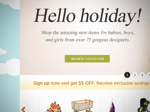
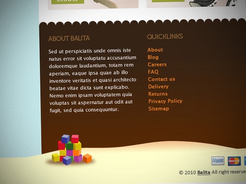
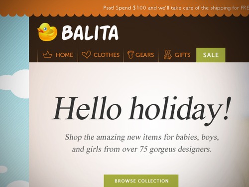
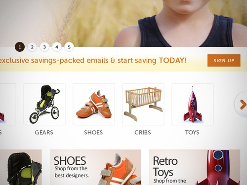
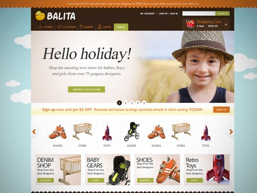
In this post we release yet another freebie: the Balita WordPress theme, a theme dedicated to shops that sell products for children. The theme was designed by Tokokoo and released exclusively for Smashing Magazine and its readers. As usual, the theme is absolutely free to use for both private and commerical projects.

Not many theme providers have produced e-commerce themes for baby and toddler products. For you who have been working in this particular market niche for some time or are about to start, this Balita e-commerce theme is a great opportunity for you. Using such bright and cheerful pantone colors that suit this clothes department (baby/toddler products), this Balita e-commerce theme will surely attract more and more customers to your online store.

Download the Theme for Free!

The theme is released under GPL. You can use it for all your projects for free and without any restrictions. Please link to this article if you want to spread the word. You may modify the theme as you wish.

Screenshot
Large Preview

Balita Theme: Features

  • WordPress E-Commerce Plugin:
    It will help you generate your e-commerce store on a WordPress platform. The Balita WordPress theme uses a powerful plugin to encourage the functionality of WordPress used.
  • jQuery Slider:
    It helps potential customers to generate general information about your online store and its products at a quick glance.
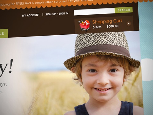
  • Custom Shopping Cart:
    The custom shopping cart notifies customers about the total amount of items and pricing within their shopping carts.
  • Product List With Grid View:
    Customers can easily compare the general overview and price of the products.
  • HTML5 + CSS3 Optimized:
    Latest tech weapons for the prime look of your online store.
  • Ads Banner:
    Show off, promote, sell ads… anything! Each inch on your website is worth the attention.
  • Product Slider:
    Our aim is to make e-Commerce as interesting and as profitable for you as possible. If you wish to have a vivid description for your product showcases, product slider will be a good match.
  • Zoomable Product Images:
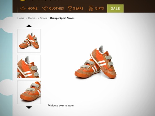
    Allow your customers to get a closer look at your product. Your customers want to see high-detailed pictures of your product when making purchase decisions.
  • Search Products:
    It helps shoppers to find and buy products on your site without having to browse each and every page. You can place an input text form on the sidebar that allows shoppers to quickly and easily find your site.
  • Blog Integration:
    This is a powerful tool on the Web to help build trust and provide updates for people who could be your potential clients. The theme already provides you with this feature — all you have to so is prepare the contents.
  • Related Products:
    The idea of cross-selling basically means offering alternatives and additions to the current product which are considered. The most common way of doing this is by presenting within the site’s product details page, which is usually manually assigned. This may be known as the “Related Products” or “Similar Products” page, but might also be a manually assigned “Accessories” page or even more generic recommendations using the titles “May We Suggest” or “You May Also Like”.
  • Multiple Product Images:
    Do you happen to have a lot images for particular products which you sell on your online store? No problem. This theme and its functions will help and let you upload multiple images at once for the products you sell.
  • Multiple Widget Areas:
    You can place widgets on any suggested area. Otherwise, all of our themes support widget allocation almost anywhere, but not limited to the sidebar.
  • Facebook Page Integration:
    This feature enables you to market your products through one of the biggest social networks around the world. Reach the highest sales potential with this Facebook integration feature.

Screenshot
Large Preview

Screenshot
Large Preview

capture-left-side
Capture Left Side (Large Preview)

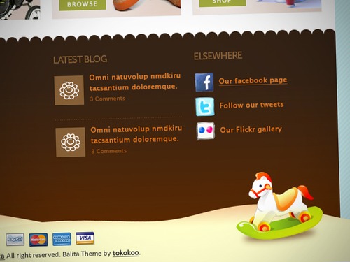
footer-left
Footer Left (Large Preview)

footer-widget
Footer Widget (Large Preview)

logo-nav
Logo Nav (Large Preview)

right-nav-cart
Right Nav Cart (Large Preview)

single-add-to-cart
Single Add to Cart (Large Preview)

single-full
Single Full (Large Preview)

single-preview
Single Preview (Large Preview)

single-sidebar
Single Sidebar (Large Preview)

slider-nav
Slider Nav (Large Preview)

visible-area
Visible Area (Large Preview)

Behind the Design

As always, here are some insights from the designers:

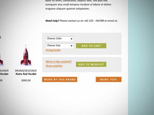
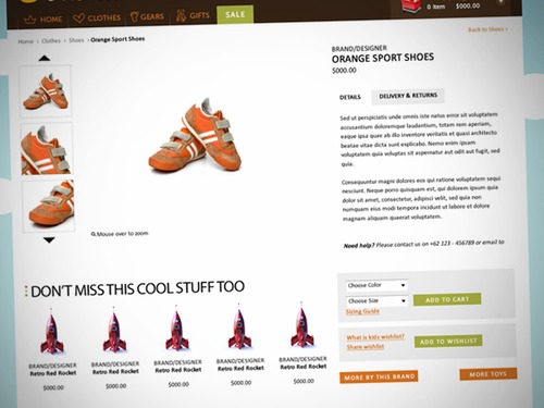
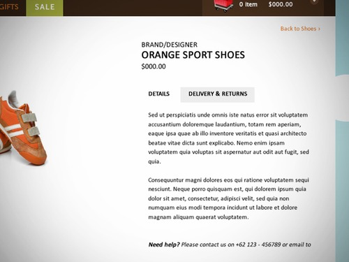
“We designed the brand logo section as well as the navigation below to be very clear so that this theme looks neat and attractive. We made the single product page to look clean so users would concentrate more on products and thus is free of distractions. Contents are on the left side, while the add-to-cart button are on the right side, beside the contents.

Don’t miss the opportunity to get this free Balita Theme because there are not many ways you can get a free premium theme everyday. Last but not least, once again, thank you Smashing Magazine for the opportunity.”

Thank you, Tokokoo. We appreciate your work and your good intentions!


© Smashing Editorial for Smashing Magazine, 2011.


How To Build An Agile UX Team: The Culture


This is the first in a three-part series on how to build and grow successful user experience teams in agile environments. It covers challenges related to organization, hiring and integration that plague UX teams in these situations. The perspective is that of a team leader, but the tactics described can be applied to multiple levels in an organization.

Building any kind of agile team is a lengthy and challenging process. Building a user experience team within an agile organization challenges not only traditional design practices but typical design team dynamics. In this first part, we’ll look at the type of culture that would support a strong UX component in the agile process and how to structure the organization so that designers are most effective and are able to thrive.

Organizations Become Supportive Through Dialogue

Agile Culture
Teams work together to celebrate their wins at weekly team-wide demos.

Critical to the success of any user experience team is an organization that values its contribution. This is not unique to agile shops, but it becomes even more critical given agile’s rapid cycle and participatory rituals. In a typical resource-allocation scenario, no more than one UX designer is assigned to a cross-functional (i.e. scrum) team. In fact, this scenario is usually optimistic. In some cases, a UX designer will be straddling more than one team. “Team� is the core concept of the agile philosophy, and as such it must include the designer as a core member.

Development managers need to set the expectation with their staff that design is critical to the team’s success. As you begin to build your UX practice in this environment, ensure that you have frequent conversations with these managers to review how their staffs are reacting to the addition of designers to their teams. These conversations will help anticipate issues that may hinder the cohesion of the scrum team. In addition, lessons from fixing one of these issues can be applied pre-emptively on other teams.

By the same token, it is incumbent on the UX designer, their corporate champion and team leader or builder to promote the values of the craft in the organization. Again, this is not unique to agile environments, but it is critical to keeping the team focused on core UX and design issues. Key to this promotion is transparency. Let the team into the designer’s world. Let them see what they do and how they do it, and let them experience the benefits that come from doing UX and design work. When all members of a cross-functional team can articulate the benefits of design activities such as,

  • speaking with customers,
  • understanding the business and competitive landscapes,
  • constructing the information hierarchy,
  • assessing visual communication,

then they will be far more inclined to carve out time for those activities in each iteration. Include the team in the actual design exercises. By practicing participatory design, the designer’s contribution will become evident, building their credibility and crystallizing team cohesion.

How To Structure The UX Team

Organizationally, there are essentially two ways to structure the UX team: as an internal agency of shared resources or by using a hub and spoke approach, with designers dedicated to specific teams.

Internal Agency Approach

Using the internal agency approach, incoming work is routed through a central point of contact (typically the UX manager) and then assigned to the designer who is best suited to the work and who has the bandwidth to take it on. The challenge with this approach is two-fold.

First, it promotes a culture of specialization in which designers limit their contribution to particular segments of the craft (for example, mobile, e-commerce, social experience design, etc.). Secondly, with no loyalty to the scrum team, priorities become driven by which product owner can yell the loudest, typically leaving the designer in the middle, awaiting the outcome to know where to focus. Additionally, this approach taxes the UX manager heavily by forcing them to constantly assess bandwidth, availability and applicability of skills to the required tasks, all while helping the product owners manage competing needs among the design staff.

Hub and Spoke Model

The hub and spoke model, on the other hand, is the better practice. Dedicate each designer exclusively to one particular scrum team. They should feel like they are a part of their scrum team and feel connected to that team’s focus. In doing so, the designer’s priorities become clear. Their priorities are synonymous with the team’s, thus enabling them to clearly understand where to expend their energy.

Asking for a designer’s input or effort on a “quick� project or “internal need� is a fairly common occurrence in many companies. It is incumbent on your organization’s leadership to protect the one designer or team structure, so that each team’s designer isn’t peppered with these ad hoc requests. Such requests distract the designer from their team’s mission and inevitably consume already limited capacity. In the eyes of the designer’s teammates, these efforts erode any progress that has been made in confirming the designer’s permanence on the team.

Working With The New Teams

New ways of working for designers will, at first, be uncomfortable. For many design managers, assigning their staff to particular teams brings a new challenge. No longer does the design manager dole out specific work to each person on the team. Instead, the designer’s daily agenda is driven by the prioritized backlog of the scrum team. This is a duty that managers were likely used to doing in the past, and its removal may feel like a reduction in responsibility and authority. To fill this potential void, design managers should work with their staff to understand their team’s priorities and suggest methods of structuring the work in a way that allows the best user experience to get built.

Weekly one-on-one meetings with each designer should reveal any challenges unique to their situation. In addition, regular touch points with each team’s product owner will provide insight into any design challenges on the horizon. And monthly high-level retrospective meetings become a forum for managers to share successful and failed tactics across the organization. With all of these tactics in place, the driving goal should be to solidify the designer’s place on each team.

Dedicating your staff to other teams does not portend the doom of the centralized user experience team. The centralized team is still very much needed for mentorship, professional development and general design support (such as critiques). In addition, a centralized UX practice can bring learning from the individual scrum teams back to the broader group, disseminating lessons that improve the process elsewhere.

The centralized UX team also serves as a “safe haven� for designers to vent their frustrations with the agile process, commiserate a bit with their colleagues and reassure themselves that they’re not alone in their agile UX challenges. Weekly UX team meetings are the building blocks of this community. Outings to design events, talks and recreational events help solidify the bond between distributed designers. A UX-only email distribution list or other forum could also provide this safe haven on an as-needed basis and supplement discussion outside of the regular meetings.

Conclusion

Company culture and staff organization are the two fundamental building blocks of agile and UX integration. By creating an environment that values design, promotes its benefits and spreads this gospel through the allocation of UX resources across individual teams, companies will lay the foundation for successful team-building and adoption of the agile process down the road.

In part 2 of the series, we’ll discuss why hiring is such a critical part of the agile UX team’s success and how to maximize your chances of hiring the most appropriate staff.

(al)


© Jeff Gothelf for Smashing Magazine, 2011.


Organizing Mobile

When organizing content and actions on mobile, solid information architecture principles like clear labeling, balanced breadth and depth, and appropriate mental models remain important. But the organization of mobile web experiences must also align with how people use their mobile devices and why; emphasize content over navigation; provide relevant options for exploration and pivoting; maintain clarity and focus; and align with mobile behaviors. In this exclusive excerpt from his new book, Mobile First!, Luke Wroblewski explains how to do all that.
  •   
  • Copyright © 1996-2010 BlogmyQuery - BMQ. All rights reserved.
    iDream theme by Templates Next | Powered by WordPress