Archive for June, 2011

Setup A Ubuntu VPS For Hosting Ruby On Rails Applications

Advertisement in Setup A Ubuntu VPS For Hosting Ruby On Rails Applications
 in Setup A Ubuntu VPS For Hosting Ruby On Rails Applications  in Setup A Ubuntu VPS For Hosting Ruby On Rails Applications  in Setup A Ubuntu VPS For Hosting Ruby On Rails Applications

Let’s assume you have built a nice little Ruby on Rails application on your local development machine. Now it’s time for the application to go live. But where should you host this application? You know that you (or your client) do not have much money to spend, and so you look at the options. You notice right away that managed hosting of applications tends to be relatively expensive. Heroku is a good option, but it doesn’t give you storage space, and more importantly, it lacks full control. Luckily, you have a suitable alternative: a VPS.

This tutorial will help you get through the steps required to set up an Ubuntu VPS that is capable of hosting (multiple) Ruby on Rails applications. This tutorial builds on part 1, “Set Up An Ubuntu Local Development Machine For Ruby On Rails.� We recommend that you follow that part first and use the same Ubuntu local development machine that you set up there to walk through this part.

Ruby-mainpage in Setup A Ubuntu VPS For Hosting Ruby On Rails Applications

Wait… A VPS?

VPS stands for virtual private server. It is a virtual machine offered by Internet hosting companies. With a VPS, you get your own virtual slice of real estate that lives with other virtual slices on one physical server. This virtual machine is capable of running an operating system, a Web server and database software. A VPS comes with full control (or root access) and, with most hosting companies, at a very reasonable price. And because a VPS is capable of running multiple Ruby on Rails applications, the costs of the VPS can be spread.

Quick Overview

In this tutorial, we’ll log into the VPS, add a new user and configure SSH connections so that the VPS is more secure. Then, we’ll install Ruby and RubyGems using the Ruby Version Manager (RVM) script. In turn, we’ll install Rails and Capistrano using RubyGems. And then we’ll install Passenger and take care of the Nginx Web server installation. The VPS will also feature a PostgreSQL database.

At the time of writing, the latest versions are Ubuntu Server 10.10, Ruby 1.9.2 and Rails 3.0.7. These steps were also tested on Ubuntu Server 10.04 and the upcoming Ubuntu Server 11.04 release.

During this tutorial, we will make extensive use of the Linux command line. A short glossary at the end of this tutorial describes the relevant Linux commands.

Up And Running

First, find a suitable host and purchase your VPS (if you don’t have one already). Make sure the host allows you to install Ubuntu on a VPS; most hosting companies will because it is a popular choice for VPS’. I chose a 512 MB VPS, which should be sufficient to run multiple small Ruby on Rails applications.

For those without a VPS, you can still follow along using virtualization software like VirtualBox. VirtualBox is open-source software and available in the Ubuntu Software Center or via the official website. Make sure when setting up your virtual machine that your network adapter is set to “Bridged� (Right clickSettingsNetworkAttached to: Bridged Adapter). This way, your virtual machine will get its own IP address on your local network. Just install a fresh copy of Ubuntu Server, select “OpenSSH server� during installation, and skip the next two steps. You can log in directly via the VirtualBox window or, if you know the IP address of the server, via SSH.

Log into your VPS host’s control panel, and install a fresh copy of Ubuntu Server. Make sure to submit a safe “root� password, and boot the VPS.

Log Into Your VPS

We’ll log into our VPS using SSH. SSH stands for secure shell and is a network protocol. It enables computers to communicate via an encrypted connection.

I assume you know the IP address of your VPS (if not, look it up in your host’s control panel), and that “root� is the default user, and that you know the “root� password, and that SSH is installed.

While using the domain name of the VPS is technically possible, we will log in using the VPS’ IP address. Setting up the domain name of your VPS is very context-specific and beyond the scope of this tutorial.

Now open up a terminal window on your Ubuntu local development machine, and log into your VPS:

$ ssh default-user@vps-ip-address

For example:

$ ssh root@123.456.7.890

You might have to type yes and then provide the “root� password. In about a second, you should be logged in.

Secure Your VPS

For security reasons, you should do as little as possible as “root.� So, we’ll create a new user and assign administrative rights to it. To make use of its administrative rights, the user needs to explicitly invoke the “sudo� command, which adds a security layer to the system administration. First, create a new user:

$ adduser your-user-name

For example:

$ adduser johndoe

Provide a safe password (filling in the user details is optional). Now, make the new user a member of the “admin� group, which grants the user administrative rights (by invoking the sudo command).

$ adduser your-user-name group-name

For example:

$ adduser johndoe admin

Securing your SSH (server) configuration is the next step. Because every Unix system has a “root� user by default, you should disable “root� from logging in using SSH. This makes your system less vulnerable to brute force attacks.

$ nano /etc/ssh/sshd_config

Set PermitRootLogin to no, and reload the SSH configuration so that the changes take effect. Although “root� will be disabled from logging in in future, the current “root� user connection will be maintained.

$ /etc/init.d/ssh reload

Now, log out of your VPS as “root,� and log back in as the new user.

$ logout
$ ssh your-user-name@vps-ip-address

For example:

$ ssh johndoe@123.456.7.890

The system is more secure now that a new user has been created and “root� has been disabled from logging in via SSH. Some of the upcoming steps repeat the steps we took in part 1 of this tutorial, while also getting us up to date and installing RVM, Ruby, RubyGems and Rails.

Get Up To Date

Now, let’s get up to date. The first three commands below will, in turn, update the package lists, upgrade currently installed packages, and install new packages and delete obsolete packages. You’ll end up with a VPS that is fully up to date. The final command will reboot the VPS, which is good practice after updating a lot of packages.

$ sudo apt-get update
$ sudo apt-get upgrade
$ sudo apt-get dist-upgrade
$ sudo reboot

Prepare Your VPS For RVM

Wait a minute or so for the VPS to reboot. Once it has, log back into the VPS from a terminal window.

$ ssh your-user-name@vps-ip-address

For example:

$ ssh johndoe@123.456.7.890

The RVM script needs some packages in order to be installed, namely Curl and Git. Curl is a tool to transfer data using a range of protocols (such as HTTP and FTP). And Git is “a free and open-source, distributed version control system designed to handle everything from small to very large projects with speed and efficiency.� Git is the choice for version control among most Ruby on Rails developers.

$ sudo apt-get install curl
$ sudo apt-get install git-core

Install RVM

Now we can install RVM. RVM stands for Ruby Version Manager and is “a command line tool that allows you to easily install, manage and work with multiple Ruby environments, from interpreters to sets of Gems.� The following command takes care of installing the script. RVM will be installed in the home directory of the currently logged-in user:

$ bash < <(curl -s https://rvm.beginrescueend.com/install/rvm)

Bf Rvm Installation in Setup A Ubuntu VPS For Hosting Ruby On Rails Applications

Navigate to the home directory, and edit the user’s bash profile. This ensures that the RVM script is loaded every time the corresponding user logs in. To edit the bash profile, we use Nano. Nano is a simple command line text editor, and we will use it again in this tutorial.

$ cd
$ nano .bashrc

Add the following line to the end of the user’s bash profile.

[[ -s "$HOME/.rvm/scripts/rvm" ]] && . "$HOME/.rvm/scripts/rvm"

Load the script into the current shell session by reloading the user’s bash profile. This way, the rvm command will be made available.

$ source .bashrc

You can verify whether the RVM script is working by entering the following command:

$ type rvm | head -1

If everything is set up correctly, the shell should return that “rvm is a function.� If it doesn’t, please go over to the RVM website and look under “Troubleshooting Your Install� to see how to make it work.

Prepare Your VPS For Ruby And RubyGems

RVM comes with a handy tool for seeing the dependencies needed to compile and install Ruby and RubyGems from source.

$ rvm notes

Look at the dependencies listed under the regular version of Ruby, and install these. Some packages might already be installed.

$ sudo apt-get install build-essential bison openssl
libreadline6 libreadline6-dev curl git-core zlib1g zlib1g-dev
libssl-dev libyaml-dev libsqlite3-0 libsqlite3-dev sqlite3
libxml2-dev libxslt-dev autoconf libc6-dev ncurses-dev

Install Ruby And RubyGems Using RVM

On the one hand, we have Ruby. It is “a dynamic, open-source programming language with a focus on simplicity and productivity. It has an elegant syntax that is natural to read and easy to write.�

On the other hand, we have RubyGems. It is “the premier Ruby packaging system. It provides a standard format for distributing Ruby programs and libraries, an easy to use tool for managing the installation of Gem packages, a Gem server utility for serving Gems from any machine where RubyGems is installed, and a standard way of publishing Gem packages.�

Like the RVM command described above, there is also a command to see what versions of Ruby are available to install using RVM. Have a look at the available Ruby versions.

$ rvm list known

Install a regular version of Ruby. Because Ruby gets compiled from source, this might take a while.

$ rvm install 1.9.2

Bf Compiling Ruby in Setup A Ubuntu VPS For Hosting Ruby On Rails Applications

Start using the installed Ruby, and set this version as the default.

$ rvm --default use 1.9.2

Check the Ruby and RubyGems versions to see whether they have been properly installed.

$ ruby -v
$ gem -v

If necessary, manually updating RubyGems and the Gems is possible.

$ gem update --system
$ gem update

Install Rails Using RubyGems

Rails Gem itself is the only thing left to put on Ruby on Rails. Installing this is one of the easiest parts of this tutorial. It is installed using RubyGems, invoked by the gem command. When the installation finishes, check the Rails version to see whether Rails has been properly installed.

$ gem install rails
$ rails -v

Bf Versions in Setup A Ubuntu VPS For Hosting Ruby On Rails Applications

Install Passenger Using RubyGems

Phusion Passenger “makes deployment of Ruby Web applications, such as those built on the revolutionary Ruby on Rails Web framework, a breeze.� It is a module for running Ruby on Rails applications in conjunction with a Web server such as Nginx.

You can install Passenger using RubyGems and then check the Passenger version to see whether Passenger has been properly installed.

$ gem install passenger
$ passenger -v

Install Nginx, And Configure The Passenger Module

Nginx, pronounced “engine x�, is “an HTTP and reverse proxy server, as well as a mail proxy server.� To put it simply, it is a versatile Web server that is low on resources.

Bf Nginxpassenger-300x120 in Setup A Ubuntu VPS For Hosting Ruby On Rails Applications

In order to let Passenger install Nginx, you need to install a dependency first.

$ sudo apt-get install libcurl4-openssl-dev

You can start installing Nginx and configuring the Passenger module by using the following command. Notice that we use rvmsudo instead of sudo, because the regular sudo does not work on this little program.

$ rvmsudo passenger-install-nginx-module

The program will check the dependencies first and then ask whether you want the program to download the Nginx source code or to download it yourself. Choose option 1 (have the program download the Nginx source code for you), and hit “Enter.� You can leave everything in the default settings, so just make your way through the installation process.

In the end, you will be presented with two screens. The first shows how to configure Nginx to work with Passenger; this was already done by the program. The second shows how to configure Nginx to deploy an application. We will come back to this example later in the tutorial.

You could start Nginx by hand…

$ sudo /opt/nginx/sbin/nginx

… but using a start-up script is preferable. (Because Nginx gets compiled from source, it does not come with a start-up script.) With a start-up script, we can not only start Nginx, but also stop, reload and restart it. In addition, Nginx will be started automatically if the VPS reboots unexpectedly. Therefore, we need to download a little start-up script for Nginx to the home directory using Wget. Wget is a simple command line program that enables us to download files from the Internet. You do not need to understand the rest of the commands. They simply move the script to the right location, make it executable and make sure that Nginx starts when the system boots.

$ cd
$ wget http://www.smashingmagazine.com/files/nginx
$ sudo mv nginx /etc/init.d/nginx
$ sudo chmod +x /etc/init.d/nginx
$ sudo /usr/sbin/update-rc.d -f nginx defaults

From now on, the following commands can be used to start, stop, reload and restart Nginx.

$ sudo /etc/init.d/nginx start
$ sudo /etc/init.d/nginx stop
$ sudo /etc/init.d/nginx reload
$ sudo /etc/init.d/nginx restart

Install PostgreSQL

PostgreSQL is “a sophisticated object-relational DBMS, supporting almost all SQL constructs, including subselects, transactions and user-defined types and functions.�

Install PostgreSQL together with a dependency. This dependency will be needed to install the “pg� Gem later on, which is responsible for the connection between PostgreSQL and Ruby on Rails.

$ sudo apt-get install postgresql libpq-dev

Configure PostgreSQL

When the packages have been installed, move on to configuring PostgreSQL by securing psql. psql is the PostgreSQL interactive terminal, and it is used for administrative database tasks.

By default, you do not need a password to log into psql. We’ll change this by editing the authentication method and then reloading the PostgreSQL configuration. But first, assign a password to superuser “postgres�. Log into psql, assign a safe password to “postgres,� and then log out of psql.

$ sudo -u postgres psql
# \password postgres
# \q

Now change the authentication configuration by changing ident to md5. This ensures that a password is needed to log into psql and that the password is encrypted. The two relevant lines, which need to be edited, can be found near the end of the configuration file. After that, reload the changed configuration into PostgreSQL.

$ sudo nano /etc/postgresql/8.4/main/pg_hba.conf
$ sudo /etc/init.d/postgresql reload

Most other PostgreSQL settings are stored in another configuration file. These settings can also be optimized, but that is beyond the scope of this tutorial. Keep in mind that the PostgreSQL configuration needs to be reloaded in order for the changes to take effect.

$ sudo nano /etc/postgresql/8.4/main/postgresql.conf

The VPS is now installed. You can log out.

$ logout

Testing The VPS

To make sure everything works, we’ll develop a very small application on the local development machine and deploy it to the VPS using Capistrano. This process consists of the following steps:

  1. Open two terminal windows, one for the local development machine and one for the VPS.
  2. Log into the VPS using SSH (VPS).
  3. Create a database user for the test application (VPS).
  4. Create a database for the test application (VPS).
  5. Create a test application using PostgreSQL as the database (local).
  6. Configure the database connections for the test application (local).
  7. Generate a simple scaffold for the test application (local).
  8. Initialize Git as version control for the test application (local).
  9. Add all the files of the test application to the Git version control list (local).
  10. Take a version snapshot of the current application using Git (local).
  11. Initialize Capistrano as a deployment tool for the test application (local).
  12. Remove the default Capistrano deployment configuration file, and create a new one (local).
  13. Set up the VPS to deploy the test application using Capistrano (local).
  14. Check the VPS set-up for deploying the test application using Capistrano (local).
  15. Deploy the test application with Capistrano (local).
  16. Edit the Nginx configuration to work with the test application (VPS).
  17. Reload Nginx (VPS).
  18. Check the test application in a Web browser (local).

Once we have verified that everything works, we’ll go through the following steps:

  1. Delete the database for the test application (VPS).
  2. Delete the database user for the test application (VPS).
  3. Restore the default Nginx configuration (VPS).
  4. Reload Nginx (VPS).
  5. Remove the test application (VPS).
  6. Log out of the VPS (VPS).
  7. Remove the test application (local).
  8. Close both terminal windows.

Unlike part 1 of this tutorial, some of these steps have to be performed on the local development machine, and other steps have to be performed on the VPS. Therefore, we will open two terminal windows on our local development machine: one for the local development machine itself, and one with a connection to the VPS. The conventions used to test the VPS are shown below in Box 2.1. The database user name and the database name are derived from the name of the application.

Box 2.1

Name of the application: test_app

Name of the VPS database user: test_app

Password of the VPS database user: banana

Name of the VPS database: test_app_production

Name of the VPS system user: johndoe

VPS IP address: 123.456.7.890

Now open two terminal windows, one for the local development machine and one for the VPS. Log into the VPS using SSH:

$ ssh johndoe@123.456.7.890 (VPS)

When applications are deployed to a (publicly accessible) VPS, creating a new database user for every single application is good practice. This way, you will prevent multiple applications from viewing, inserting, editing and deleting data from and to each other’s databases, and thus increase security.

Let’s create a database user for the test application using the createuser command. We are using “postgres� as administrator (or superuser) for PostgreSQL. The P flag enables us to provide a password. The > sign stands for the questions that will be prompted.

$ sudo -u postgres createuser -P (VPS)
> Enter name of role to add: test_app
> Enter password for new role: banana
> Enter it again: banana
> Shall the new role be a superuser? (y/n) n
> Shall the new role be allowed to create databases? (y/n) n
> Shall the new role be allowed to create more new roles? (y/n) n
> Password: your-postgres-user-password

Then, create a database for the test application that is owned by the test application user. While you can use Rake to create a database, we will use PostgreSQL so that we can learn some basic PostgreSQL administration.

You can create a new database by invoking the createdb command in conjunction with the O flag, the database user name and the new database name itself. The production that we append to the end of the database name is the default name. Here, you will be prompted for the PostgreSQL superuser password again.

$ sudo -u postgres createdb -O test_app test_app_production (VPS)
> Password: your-postgres-user-password

Now that the database has been set up, it is time to create the actual Ruby on Rails application on your local development machine.

Navigate to your home directory, and create a new Rails application, named test_app and using PostgreSQL as the database back end. The d flag enables you to specify your preferred database software.

$ cd (LOCAL)
$ rails new test_app -d postgresql (LOCAL)

Go into the Rails application directory. Use Nano to edit the database configuration file by adding banana as a password in the production database configuration. Because we have followed the conventions described in Box 2.1, the database user name and the database name have already been taken care of.

$ cd test_app (LOCAL)
$ nano config/database.yml (LOCAL)

Now, generate a basic scaffold. Programming in Rails is beyond the scope of this tutorial, but this command will create a “User� model and a “users� controller. The inputs will consist of a name and an email address, which are both strings in the PostgreSQL database.

$ rails generate scaffold User name:string email:string (LOCAL)

Remember when we set up Git in part 1 of this tutorial? Now we’re finally going to use it. We will initialize Git as version control for the test application, add all of the files from the test application to the Git version control list (recursively), and take a version snapshot of the current application using Git. The m flag lets us add a short description of the snapshot.

$ git init (LOCAL)
$ git add . (LOCAL)
$ git commit -m “First commit� (LOCAL)

By now, it is time to deploy the application to the VPS, which we will do using Capistrano.

Initialize Capistrano as a deployment tool for the test application. This will create several files in your Ruby on Rails application directory. Remove the default Capistrano deployment configuration file, and create a new one. The contents of the new Capistrano configuration file can be found in Box 2.2 below.

$ capify . (LOCAL)
$ rm config/deploy.rb (LOCAL)
$ nano config/deploy.rb (LOCAL)

Box 2.2

# RVM

$:.unshift(File.expand_path('./lib', ENV['rvm_path']))
require "rvm/capistrano"
set :rvm_ruby_string, 'default'
set :rvm_type, :user

# Bundler

require "bundler/capistrano"

# General

set :application, "test_app"
set :user, "johndoe"

set :deploy_to, "/home/#{user}/#{application}"
set :deploy_via, :copy

set :use_sudo, false

# Git

set :scm, :git
set :repository,  "~/#{application}/.git"
set :branch, "master"

# VPS

role :web, "123.456.7.890"
role :app, "123.456.7.890"
role :db,  "123.456.7.890", :primary => true
role :db,  "123.456.7.890"

# Passenger

namespace :deploy do
 task :start do ; end
 task :stop do ; end
 task :restart, :roles => :app, :except => { :no_release => true } do
   run "#{try_sudo} touch #{File.join(current_path,'tmp','restart.txt')}"
 end
end

Use the cap command to set up the VPS in order to deploy the test application using Capistrano. This will set up some directory structures on your VPS.

When using the cap command, you will need to provide a password when prompted. This is the password of the VPS user that you created at the very beginning of this tutorial. Check the VPS set-up for deploying the test application using Capistrano, and finally, deploy the test application.

Executing the last command might take a while because it installs the required Gems on the VPS and takes care of the database migrations (if there are any). Here you really see the benefit of Capistrano, because it automates tasks such as uploading the latest version of your application, installing the required Gems and performing the database migrations.

$ cap deploy:setup (LOCAL)
$ cap deploy:check (LOCAL)
$ cap deploy:cold (LOCAL)

The last thing to do is tell Nginx where the Ruby on Rails test application is located. So, we need to edit the Nginx configuration file.

An example of the changes you have to make to that file are shown in Box 2.3 below. Only an excerpt of the relevant lines is printed here. Make sure to comment out the last four lines of the excerpt using #. Once you have made the changes, reload the new configuration into Nginx.

$ sudo nano /opt/nginx/conf/nginx.conf (VPS)
$ sudo /etc/init.d/nginx reload (VPS)

Box 2.3

(…)

server {
   listen 80;
   server_name www.yourdomain.com;
   root /home/johndoe/test_app/current/public;
   passenger_enabled on;

   #charset koi8-r;

   #access_log  logs/host.access.log  main;

   #location / {
   #    root   html;
   #    index  index.html index.htm;
   #}

(…)

When the deployment and Nginx configuration are done, check the application in a Web browser. Navigate to http://your-vps-ip-address/. The link to the application’s environment will not work in production mode.

Screenshot1-ror in Setup A Ubuntu VPS For Hosting Ruby On Rails Applications

After that, look at http://your-vps-ip-address/users. Create, edit, view and delete some users:

Screenshot2-ror in Setup A Ubuntu VPS For Hosting Ruby On Rails Applications

If everything has worked, then the test application database and the test application database user can be removed. The dropdb command removes a PostgreSQL database.

$ sudo -u postgres dropdb test_app_production (VPS)
> Password: your-postgres-user-password

The dropuser command removes a PostgreSQL user.

$ sudo -u postgres dropuser (VPS)
> Enter name of role to drop: test_app
> Password: your-postgres-user-password

Restore the Nginx configuration by copying an example of the (default) Nginx configuration file, overwriting the modified one, and then reload Nginx.

$ sudo cp /opt/nginx/conf/nginx.conf.default /opt/nginx/conf/nginx.conf (VPS)
$ sudo /etc/init.d/nginx reload (VPS)

When that is done, navigate to your home directory on the VPS, and recursively remove the test application.

$ cd (VPS)
$ rm -rf test_app (VPS)

Finally, log out of the VPS.

$ logout (VPS)

For the local development machine, we also need to navigate to the home directory and recursively remove the test application. When all of the commands below are entered, you can close both terminal windows. This leaves you with a fresh VPS and local development machine ready for developing and deploying Ruby on Rails applications.

$ cd (LOCAL)
$ rm -rf test_app (LOCAL)

Appendix

Linux Command Line Glossary

The Linux commands used in this tutorial are described here. The list is in alphabetical order and features only the relevant Linux commands. A Linux command usually takes the form of command -option(s) argument(s). For example, rm -r test_app. For a more detailed description, use the manual, which can be accessed using man [command].

  • sudo [command]
    Executes a command as an administrative user.
  • adduser [username]
    Adds a user to the system.
  • adduser [username] [groupname]
    Adds a user to a specific group.
  • apt-get dist-upgrade
    In addition to performing upgrades, this is used to intelligently handle dependencies.
  • apt-get install [package]
    Installs (or upgrades) packages.
  • apt-get update
    Resynchronize the package index files from their sources.
  • apt-get upgrade
    Installs the newest versions of all packages currently installed.
  • bash < <( curl [location] )
    A combination of commands used to both obtain and execute a script (from the Internet).
  • cd [location]
    Changes the current working directory. Without an argument, it goes to the user’s home.
  • cp [file] [location]
    Copies a file to the specified location (overwriting the existing file silently).
  • chmod +x [file]
    Makes a file exexutable.
  • logout
    Logs out of a shell or SSH session.
  • mv [file] [location]
    Moves a file to another location.
  • nano [file]
    Used to edit configuration files.
  • reboot
    Reboots the system.
  • rm [file]
    Removes a file.
  • rm -rf [directory]
    Removes a directory (recursively and forced, so it will not prompt).
  • source [script]
    Forces bash to read the specified script.
  • ssh [username@ipaddress]
    Logs into a secure shell session.
  • type [command]
    Displays the kind of command that the shell will execute.
  • wget [location]
    Obtains a file from the Internet.

Resources

Further Learning

(al) (kw)


© David Boot for Smashing Magazine, 2011.


The Keys to Making Fresh, Forwardly Aesthetic Web Designs

Advertisement in The Keys to Making Fresh, Forwardly Aesthetic Web Designs
 in The Keys to Making Fresh, Forwardly Aesthetic Web Designs  in The Keys to Making Fresh, Forwardly Aesthetic Web Designs  in The Keys to Making Fresh, Forwardly Aesthetic Web Designs

Great graphics. Beautiful typography. Clean design. These are all things designers typically think of when creating stunning websites. But is it really just that combination of elements that produces something that can take your breath away? Of course it’s much more than that; but what?

Far too often, web designers like to blame the breath taking factor of websites on the genius of another designer. Not to take away from any designer, but creating a stunning website is absolutely do-able for any designer with a good set of skills (or the ability to outsource). So, how can you do it?

Detailed Development

Coding and development is an extremely important portion of the website building process. Sometimes web designers get so caught up designing as best as possible, we can sometimes forget that great development will take your design to a different level. Clean coding that pays attention to the smallest details of the design and even the web browser will create an excellent experience.

Construction1 in The Keys to Making Fresh, Forwardly Aesthetic Web Designs
Constructing a website can be tedious, but it’s worth it to create fresh websites. Image Credit

HTML5 and CSS3 are fairly new technologies that have come about to really help developers do their work as best and as easily as possible. While there are some kinks in it, we would strongly suggest that coders really get into learning it and making it work for them. The purpose of updating the HTML and CSS libraries was and is to make things a bit more intuitive and more consistent among different coding languages (i.e., javascript, php, etc.).

HTML5 + CSS3

There are tons of articles about the pair of these and how they are really changing the way of development. Take a peak at some of these articles to help you out.

Movement is absolutely required on stunning websites. Pages don’t have to jump and bounce around but noticing fine details to make the website look like it’s living and breathing really helps. Javascript and it’s various libraries really help make web sites live, especially when we are talking about the interaction of elements in browser windows as well as loading images.

For example, on the Sellected site, you are able to filter the content you wish to see in a way that doesn’t require you to refresh and reload the page. Everything aesthetically transforms in front of you. The roll-overs on this page are also magnificent because they are smooth, make sense and again, are aesthetically pleasing.

If you are interested in more Javascript and jQuery types of transitions and tricks, check out 150+ Best jQuery Effects for Designers and Developers. Mastering CSS3 and HTML5 can also really get things moving on a page–positioning, fluidity, and other techniques contribute to this.

Cleverly Coded Sites

In terms of development and coding there are details as well as tricks that can be used that really take a website from 0 to 60 in seconds. We could never list them all here, but we will give you a short list of websites that really paid a lot of attention to the details in the development or either made their coding a central piece of the web site.

Awdigital-dev in The Keys to Making Fresh, Forwardly Aesthetic Web Designs
The screen shot of this website does it no justice. It isn’t heavily designed and it could be argued that it’s not even necessary. The negative space shows you exactly what you are supposed to look at. The way in which this whole thing is animates and transforms is amazing and something several of us have never seen before. Very neat

Guyvernes-dev in The Keys to Making Fresh, Forwardly Aesthetic Web Designs
Once again, not a very heavily designed website–the focus here is on the clothing. Viewing this site on a huge monitor is definitely fulfilling especially when you play around with the window. The page transitions are exceptional as well.

Piccirilli-dev in The Keys to Making Fresh, Forwardly Aesthetic Web Designs
It looks like a pretty static website, but the attention to the details, especially when you view the ‘Work’ page really shows they were particular about their content. This is a design agency and obviously they wanted to strip away as much crap as possible and get you to look at what they can do. Super clean and powerful

Sellected-dev in The Keys to Making Fresh, Forwardly Aesthetic Web Designs
This is another fun site where the attention to detail will keep you on the site forever. Go to this website and play around with the window size as well as with the filter on the site. This is like a living, breathing, intuitive person!

Freeassoc-dev in The Keys to Making Fresh, Forwardly Aesthetic Web Designs
The development as well as layout of this site really work together in helping this site look like it’s not as content rich as it actually is. Simple. Not overwhelming.

Adam-dev in The Keys to Making Fresh, Forwardly Aesthetic Web Designs
More great coding and a pretty solid design. If you fool around with the window size, you’ll notice the great detail taken in the development of this website.

Unorthodox Design & Layout

Have you ever gone to a website, looked at it, and just got a tingly feeling? Or has a website ever been so overwhelmingly good to you that you just stare at it or look at every single element and say “That’s crazy”? An extremely fresh design really can make your website standout from the crowd, but how do you know when you’ve got the right design?

Painting1 in The Keys to Making Fresh, Forwardly Aesthetic Web Designs
Web design is subjective, much like Fine Art, but there’s no denying when something’s good Image Credit

There are a lot of things that go into designing websites. The most important thing you must do as a designer is figure out your target audience and figure out what the purpose of the website is (I,e., is it to sell or is it to inform?). Once you’ve got those two things, you’ve got to figure out how to combine the two in a way that the audience enjoys and that is effective towards the purpose of the site. Then you really have to build around that as far as the design and layout is concerned.

Let’s be honest, a large header and a right sidebar are right for some websites, but not all websites. The way a website’s design becomes stunning or breath taking is when the designer really steps outside the box. The trick though, is to not get SO outside the box that the website fails to make sense or lose sight of it’s purpose.

There’s no strict code to figuring out how to create super fresh designs. Many like to stay fresh, of course by looking at design inspiration (use it as an influence, not a rubric) and practicing their program of choice. Personally, practicing without any type of outside product (no brushes, custom shapes, etc.) really helps you think of different solutions to different problems without looking like something that’s already out.

Now understand, this will not work for everyone but the idea here is just to be as creative as possible and not to be afraid of being creative. We sometimes fear creativity because we’re not sure how an audience will accept something different, but challenge yourself to be bold and forward thinking when it comes to design.

After all, at some point, all the current trends have to be pushed aside for new ones, don’t you want to be ‘cutting edge’?

Stunning Sites

Design and Art are relative and really depend on personal taste. Now, do understand these exemplified websites are personal preference, but we plan on really pointing out why these designs aren’t just pretty, but why they work. Visit the sites and really look around to see how the design and layouts really interact with everything. Also, notice how many of these sites stepped outside the box and created something super fresh.

Bigeye-des in The Keys to Making Fresh, Forwardly Aesthetic Web Designs
This website’s design is a little lacking, but the layout WORKS for them, as they are a bit more content rich than other websites. They have an obvious working hierarchy for their site, which is complimented by a pretty standard, but effective layout

Rapture-des in The Keys to Making Fresh, Forwardly Aesthetic Web Designs
Movement and good clean, effect design all in one place. Again, this isn’t a life changing design but it works for their service and you know exactly what’s going on. Interesting Navbar, too.

Skittles-des in The Keys to Making Fresh, Forwardly Aesthetic Web Designs
An extremely unorthodox layout as well as an unorthodox design. The message is simple–have fun and eat Skittles, along with some social media implementation. Very fun design here. Very playful and fresh!

Ideage-des in The Keys to Making Fresh, Forwardly Aesthetic Web Designs
This is one of the freshest sites to hit the screen in a while with a good combination of design and detailed coding. Very unorthodox but it works–while you might have no idea what it says, not sure that really matters too much. This site is GREAT

Meister-des in The Keys to Making Fresh, Forwardly Aesthetic Web Designs
This an extremely different type of thing here…the navigation is actually on a live web camera. That’s really different. The inside pages aren’t too shabby either.

Kult-des in The Keys to Making Fresh, Forwardly Aesthetic Web Designs
This is a pretty standard layout, but the design elements used are really magnificent. There are alot of unexpected things about this site and it’s design. More proof you can really expand on a standard layout.

Stay Inspired

Always be on the lookout for fresh new ideas and see what people are doing. Again, don’t use these sites as rubrics, but be creative and use them as influences to help you think outside the box and see different techniques in action. Here’s a list of some of the best web design showcases the Internet has to offer:

  • Make Better Websites – Dedicated to absolutely the freshest web sites I’ve ever seen. More portfolio sites.
  • WebCreme – Pretty good stuff here, too. Lot’s of different types of websites.
  • DesignShack Gallery – A one stop shop gallery of all things good.
  • The Best Designs – Another good one for fresh ideas

(rb)


Designing GitHub for Mac

A few days ago we lifted the curtains on a project I’ve been deep into for a long time now: GitHub for Mac. This is the first OS X app I’ve designed and thought it might be interesting to share some of the process and things I learned throughout development.

Why should we build it?

For a long time I assumed OS X developers would see the immense market for an awesome Git application. Unfortunately for everyone involved, every OS X application that’s showed up over the years gave up and tried to turn CLI commands into buttons.

Screenshot of Git Tower

Clients claiming to be “simple” choose to redefine “simple” as fewer supported Git commands rather than simplifying the interaction with Git.

It blows my mind that no one tried to do anything special. Git (and its DVCS cousins like Mercurial & Bazaar) provide an amazing platform to build next generation clients — and it’s like the entire OS X ecosystem left their imagination at home.

Eventually, I (well, many of us) decided that better native clients (OSX, Windows, Linux, Eclipse, Visual Studio, etc) was the best way to grow GitHub. And since we all use Macs — we should start off with an OS X application. Build what you know/use, expand from there.

What are we building?

Personally, I had some big goals:

  • Death of the SSH key. People should be able to connect to GitHub with their GitHub username and password.

  • Make it obvious that there is a distinction between remote and local. Make it clear what commits need to be pushed before others can see them.

  • Simplify the git fetch, pull (--rebase), push interaction. Synchronize — don’t make the user figure out what they need to do to get their local commits remote and remote commits local.

  • Fix the local/remote branching problem. Get rid of this tracking idea — interact with local or remote branches as if they were no distinction between the two.

I didn’t want to replace the command line. I wanted to build an awesome version control client. As it happens, Git is the perfect backend to do that — and GitHub is the perfect central server to collaborate.

Sketches & early ideas

The first thing we did was to start populating an internal wiki full of ideas. Lots of words, lots of sketches.

My beloved sketchbook Incomprehensible pages from my Moleskine
Scott's mockups Scott created a bunch of mockups with Balsamiq

Let’s get some designers on this

I’d been using OS X for years, but I didn’t feel comfortable designing a native app. My previous attempts at OS X design weren’t too fantastic…

An abandoned design direction.

In the end, we hired Eddie Wilson to come up with some wireframes and some comps while Joe and Josh cranked away at the Cocoa backend. His first comps were a great start, and influenced the end product tremendously.

Eddie's mockup
Eddie's mockup

Unfortunately right about this time is when we learned how much we suck at working with contractors. We’re extremely opinionated, really bad at expressing our opinions, and change our minds all the time. We asked Eddie to hold off while we re-grouped and figured out what we wanted from the app.

We sat down and had a lot of discussions about how we wanted this thing to work. Brandon Walkin helped out quite a bit, and even sketched up some wireframes & notes for us.

Eventually we figured out what we wanted to design — but now we didn’t have anyone to design it. Eddie had since taken up other work and pretty much every Cocoa designer on the planet was inundated with work.

In the end, I decided that GitHub for Mac was the thing I wanted out of GitHub, and if I wanted it to happen I’d have to take the design reins. I picked up Eddie’s comps and ran with it.

A slow process

I tried my best to combine Eddie’s original comps with our internal feedback and match it up with a modern OS X look & feel. All in all I created 45 comps for 1.0 — each with about 5-10 unique states (with layer groups).

All my mockups

After the first round of comps, I started writing down how I imagined everything to work.

The styleguide

My plan was to fully flesh out this styleguide — but as it happened, Josh was able to implement my designs faster than I could explain them. Still, I think it was a good exercise to explain my thinking for the designs — if anything for my own personal benefit.

The aesthetic

Learning the OS X aesthetic wasn’t easy. And it probably didn’t help that I started to get serious about OS X design about the same time Lion screenshots started showing up. Like it or not, OS X app design is changing in drastic ways right now.

Lion screenshot

Scrollbars are a thing of the past. Titlebars full of clickable areas. Buttons shedding themselves of borders. Custom graphics / buttons for every app. And Helvetica everywhere!

I tried my best to weigh this new direction with a lot of my favorite designed apps — Twitter, Espresso, Sparrow, and Transmit to name a few.

1.0 Tweetie style side-tabs. No title in the window, instead a breadcrumb — always promoting a one-window experience.
Popover 
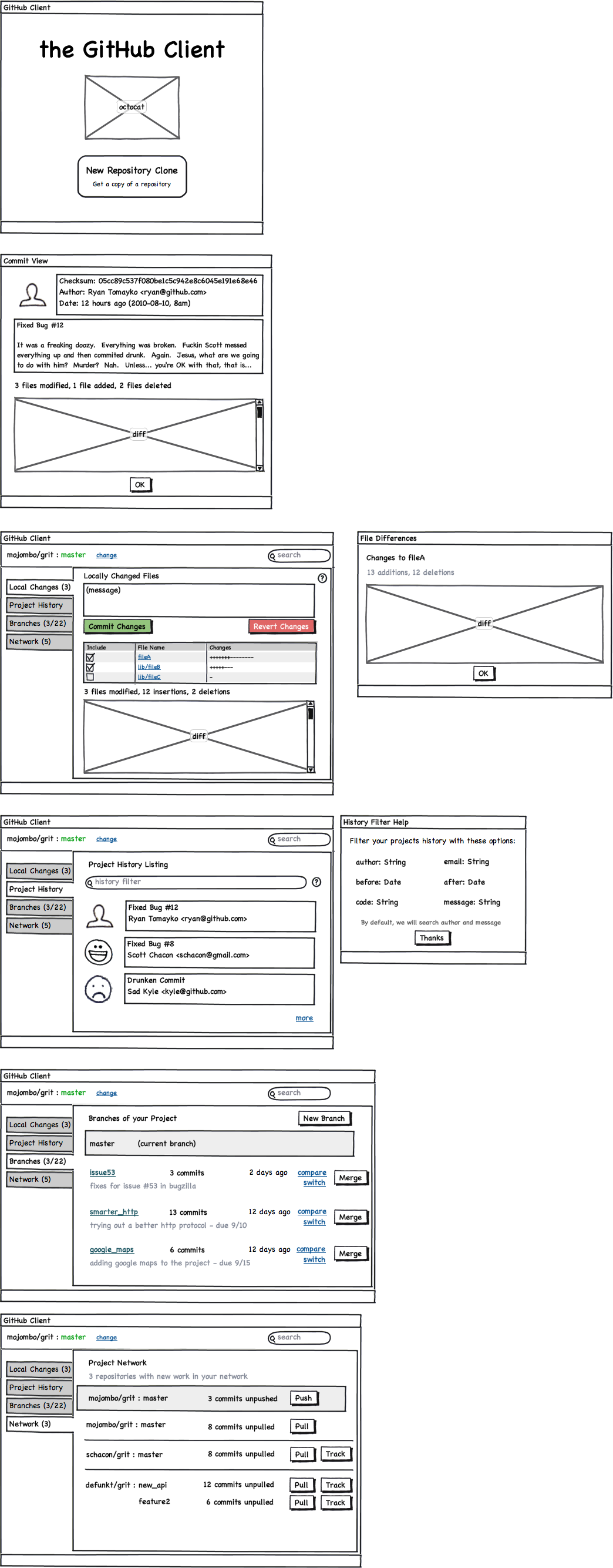
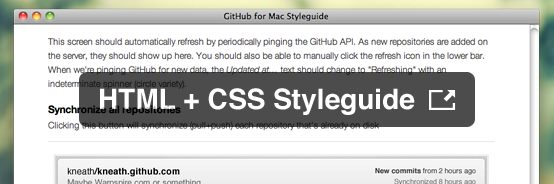
We use a lot of popovers (borrowed from iOS / XCode) rather than modal windows throughout the app.
Sync button Subtle buttons in the title bar.

Lessons learned

Designing a native OS X app was definitely full of surprises. I’ve actually done quite a bit of native development before with WPF & Flex — but Cocoa is quite different.

Welcome to 2004 — everything is a sliced image

Remember web development in 2004? When you had to create pixel-perfect comps because every element on screen was an image? That’s what developing for Cocoa is. Drawing in code is slow and painful. Images are easier to work with and result in more performant code.

All of the slices Remember these days?

This meant my Photoshop files had to be a lot more fleshed out than I’ve been accustomed to in recent years. I usually get about 80% complete in Photoshop (using tons of screenshotting & layer flattening), then jump into code and tweak to completion. But with Cocoa, I ended up fleshing out that last 20% in Photoshop.

Change is painful

Want to move an element from the bottom of the screen to the top? A lot of times with Cocoa this involves rewriting your entire view. There is no layout engine for Cocoa. If you want two elements to rest side to side, you’ll need to calculate the pixel size of the text, padding, borders, margins — then manually position the next element.

A typical xib file 
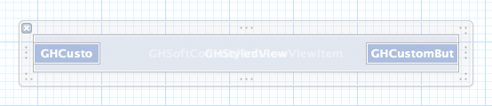
What about Interface Builder? Pretty useless. Everything is a blue box on complex projects.

Want to change the background color of a button? You’re probably going to have to rewrite all of the drawing code for the button. There is no styling engine in Cocoa.

This sucks. And it means that change is insanely painful in code. It’s much easier to prototype with HTML / CSS and see if the design is going to hold up.

This proposed changes redesign is a good example of what I mean. I spent a long time creating a “clickable” prototype with animations. In the end, we decided a lot of the core ideas were wrong and decided not to go down that path. Creating this HTML/CSS/JS prototype took a couple days. Doing the same in code would have taken a lot longer — and been much harder to throw away (due to the way project files work in Xcode, branching is not simple).

Objective-C is easy, Cocoa is hard

This was the first serious Cocoa project I’ve been involved with. I had dozens of little example projects, but never pushed through to ship anything. As I went on and talked to people about my frustrations, they inevitably came up with the same response:

Why don’t you just use MacRuby?

Why? Because Objective-C is really easy. The language was never a problem. You know what was? Cocoa. Learning the differences between layer-backed views, layer-hosted views — understanding that you have to subclass everything — balancing delegates, weak connections, strong connections, KVC, view controllers, and notifications — understanding little intricacies like how AppKit flips .xibs when it load them up or how hard it is to make one word in a sentence bold. I’m not going to lie: Cocoa (that is: AppKit, UIKit, Core Text, Core Animation, etc) is extremely difficult. The gap between simple example apps and a fully functional application is huge.

Projects like Chameleon that give you a purely layer-backed environment to work with using a modern API (UIKit) matter far more than the language you’re using. This isn’t to say MacRuby isn’t awesome — it just means that it doesn’t make AppKit development any easier; you still have to learn Cocoa.

Along those same lines, I think that Cocoa is dying for a framework. Something that weighs on the simple defaults side rather than complex code generation side.

Secrecy is overrated

GitHub for Mac was in development for just under a year and there was never any leaked screenshots or blog posts. In fact, there were dozens of public screenshots of the app on dribbble — but for the most part, people were surprised when we launched.

We didn’t have beta testers sign NDAs or demand first-borns to get access to the early builds. How on earth did we keep something under wraps for so long?

We asked people politely not to share it with the world. It’s really not that hard. Don’t send betas to douchebags. Politely ask people not to blog about it. Done.

Here’s to a bright future

I’m hoping that GitHub for Mac (and supporting projects, like libgit2) spurs a new round of creativity in source control clients. I’ve already seen some progress — like legit — but I’m hoping to see a new generation of source control clients in the future. Git is immensely powerful, and it’s up to us to leverage that power into something awesome.


Useful Ideas And Guidelines For Good Web Form Design

Advertisement in Useful Ideas And Guidelines For Good Web Form Design
 in Useful Ideas And Guidelines For Good Web Form Design  in Useful Ideas And Guidelines For Good Web Form Design  in Useful Ideas And Guidelines For Good Web Form Design

The input form is an essential element of almost any website or application these days. Input is a core method of interaction, and in many cases it represents the hard conversion point between success and failure. With the amount time and effort we put into bringing users to our sign-up and contact forms, it’s surprising that we tend not to spend a proportional amount of time on the forms themselves.

A number of techniques and elements can be used in Web forms to turn them from abject failures into successful conversion points. In this article, we’ll present some interesting examples and useful guidelines for Web form design.

A Dash Of Quirkiness

Part of Web design is about communicating personality and being relatable, because people enjoy dealing with other people. One quality that almost always helps is a bit of quirkiness and fun. A small dose of friendliness and personality will make the input process a bit more enjoyable and human.

Jarad Johnson

Jarad Johnson‘s contact form has a flavor of good ol’ post card. The visual appearance of the form makes it stand out from the usual generic forms found elsewhere. A very nice touch to an often forgotten element of Web designs. By the way, the Postage for the email postal service was already paid. Good to know. Very well done.

11jarad in Useful Ideas And Guidelines For Good Web Form Design

Red Tiki

Red Tiki’s quirkiness is tied to the company’s brand and identity, but is powerful here nonetheless. From the frame motif to the wooden character peeking out, this form feels fun and approachable. Little colloquial phrases like “This lovely form� and “We’re always keen to lend an ear� are fantastic ways to make the company more relatable. The form is bursting with personality and flare, which helps the user complete the form and click the “Submit� button.

3red in Useful Ideas And Guidelines For Good Web Form Design

Applicom

Applicom’s form is a great example of how to be clean and professional without being sterile. Styling the form like a letter — with a stamp, subtle paper texture, striped edge and handwritten addressee name — may seem cliche, but it demonstrates a certain level of personality and care. Language such as the “Do: Be fine, use your real address. Don’t: Be negative, spamâ€� may seem trivial, but it’s important. At the end of the day, it makes users feel like they are dealing with people who aren’t afraid to speak to them. Craftsmanship always indicates care and professionalism. People like that.

5applic in Useful Ideas And Guidelines For Good Web Form Design

Sophie Hardach

Sophie Hardach‘s form is another example of a post card idea implemented in a contact form. The input fields are a bit clearer than one would think, yet the “Submit”-button is a bit more difficult to find. In order to send the message, a stamp in the right upper corner needs to be dragged to the Stamp area of the form. In fact, the form is not only very original, but also accessible. Excellent work.

20sophie in Useful Ideas And Guidelines For Good Web Form Design

Two Paperdolls

Two Paperdolls has probably the busiest contact form of all the forms featured in this article. However, the form fits wonderfully to the overall design of the page which is a “We Are Hiring” page for designers with strong focus on typography. Notice the clean real-time validation for the form: the error indicator is diplayed in the right upper corner of each input field. Too bad that the navigation through form fields doesn’t work properly with “Tab”.

10twopaper in Useful Ideas And Guidelines For Good Web Form Design

Kontain

Kontain uses a different kind of a date picker for letting users pick the date for the form. The designers have arranged the dates in four rows rather than displaying them all vertically. A nice idea for reducing the horizontal scrolling for the users.

16-1kontain in Useful Ideas And Guidelines For Good Web Form Design

Wopata

Wopata‘s slider for the timeframe in their contact form is much different from the generic sliders, select-menus and radio buttons. This is a proof that filling in Web forms can be fun.

17wopata in Useful Ideas And Guidelines For Good Web Form Design

Fi

The language used on Fi is more friendly than formal. The inviting nature is reinforced by the short colloquialism for each form field that illustrates why the information is being requested. The language of labels should give off a little charm, without being insincere or overbearing. Isn’t everyone more engaged in a conversation if the other person is pleasant and approachable?

2fi in Useful Ideas And Guidelines For Good Web Form Design

egopop

egopop has a very simple, perhaps oversimplified contact form which however has a nice touch. The weird character on the right side plays wonderfully together with the other characters on the site and makes the contact form less boring than it would be otherwise. The contact form opens in a lightbox.

6egopop in Useful Ideas And Guidelines For Good Web Form Design

Idyllic Creative

Some forms are boring, while some are beautiful. Idyllic Creative‘s contact form is remarkably simple yet beautiful. Another example of a design agency which integrated a character from their work in their contact form.

8idyl in Useful Ideas And Guidelines For Good Web Form Design

Tinkering Monkey

Tinkering Monkey‘s character on their contact page is another interesting example of how the contact form page can be made a bit less boring. Notice the FAQ area on the right side of the contact form. An excellent idea for helping customers quickly find answers to their questions once they feel lost and can’t find a solution to their problem.

25tinkering in Useful Ideas And Guidelines For Good Web Form Design

Ditio

Ditio‘s designers have decided to combine their sign up form and a contact form in a hidden sidebar box, very much like it’s often done with the fixed “Give feedback” buttons on the left or right side. Once a trigger button “Inschrijven” is clicked, users can sign-up for their account and even upload a CV. Notice that there is no textarea available for lengthy details.

3ditio in Useful Ideas And Guidelines For Good Web Form Design

Treehouse Editing

Treehouse Editing’s contact form is another example of a quirky design with a clean and lean layout. When the user navigates to the page, the background changes to a spring theme, which is itself associated with making contact, thus encouraging them to fill out and send off the form. Notice that all that is necessary for initial contact fits into a couple of fields; further information can be collected in subsequent correspondence. Ask yourself whether a minimal layout would do the trick on your website as well.

4treehouse in Useful Ideas And Guidelines For Good Web Form Design

Amazee Labs

Amazee Labs doesn’t have to do much to make its form usable and inviting. The form has only a few quirks, namely the texture, the “Hi there, let’s get in touch!� line, and the “Send It!� button. It may not seem like much, but the casual language, careful color choice and overall texture help Amazee Labs instantly feel like a friendly and easygoing bunch.

6amazi in Useful Ideas And Guidelines For Good Web Form Design

Wing Cheng

The motif of Wing Cheng’s website is an open sketchbook, with most of the sections designed as sketches and thumbnail drawings. The contact form maintains this personality and coherency by following the motif. The form is simple and appropriate. The thought diagram with the email address adds visual interest. Maintaining the hand-drawn style is what brings out the quirkiness. Imagine how jarring and uninviting this form would be if it was a default HTML field set stuck on top of a beautiful paper texture.

7wing in Useful Ideas And Guidelines For Good Web Form Design

Break It Down

No one likes a humongous unending list, especially a list of elements to fill in or interact with. Just as a giant paragraph of text is daunting to the user, so is a giant block of empty fields. To coax the user to the finish line, the designer should make them feel like they are completing steps, or bite-sized chunks. Take a giant web project: trying to wrap your head around it all at once is almost impossible. But if you break it down into goals, and then stages, and then sets of tasks, it becomes much more manageable. This is what we want in a Web form, especially if you’re asking for a sizeable amount of information. Keep in mind that you can organize a form simply by sectioning off parts of it or by arranging the content into columns.

CollisonLabs

CollisonLabs‘s contact form might appear to be a bit too complicated at the first glance, but it’s quite straightforward. The left side of the contact page contains alternative contact information as well as a map which is designed with the overall design of the website in mind. On the right side, each input field is clearly represented and highlighted when the user fills out the form. Nice, clean work.

14collision in Useful Ideas And Guidelines For Good Web Form Design

Visual Republic

Visual Republic‘s choice of design for input field labels is similar to the solution by guys over the CollisonLabs. Giving the field label a solid background with an arrow to indicate where the text would need to be typed is a nice technique that could be used more often.

26visualrepublic in Useful Ideas And Guidelines For Good Web Form Design

CSS Tricks

CSS Tricks‘s comment area is a great example of a well-organized, helpful and clean comments area. Notice how the “star” image in the text area fades away as the user types in some text in the form.

22csstricks in Useful Ideas And Guidelines For Good Web Form Design

Barley’s Greenville

Barley’s Greenville‘s form for beer rating is an interesting example of how multiple sections can be combined to make the form intuitive and easy to use. Notice the arrow-like symbol between the first and the second section as well as various shades of the brown color within the form.

23barley in Useful Ideas And Guidelines For Good Web Form Design

Blue Sky Resumes

Blue Sky Resumes uses sections to make its extremely long form much more manageable. Standard headings and horizontal rules are used to divide sections. The designer was also careful to visually distinguish the different sections so that the form doesn’t look like a long list of fields.

 in Useful Ideas And Guidelines For Good Web Form Design

Validate Clearly

Users will not spend extra time making sure they have given you all of the information you need. Many designers believe that form validation detracts from the user experience, but its effects are adverse only when done poorly. When validation is simple and clear, it merely offers alerts and guidance to the user.

Make sure that you clearly mark the problem and tell the user exactly what is wrong. The fastest way to kill the user experience is with generic error alerts that mean nothing to the user. People are more than happy to quickly fix an issue if it is pointed out to them plainly.

Moody International

Moody International provides an excellent example for a contact form that nicely combines different types of contact information in one place. On the left, you’ll find a postal address along with a map, a phone number as well as the company’s email address. The right side is dedicated for more detailed inquiries and consulation requests. The form’s labels disappear once the user has provided their data. Unfortunately, the form doesn’t have an instant real-time validation and uses JavaScript pop-ups to inform the users about their input mistakes. Besides, the map on the left side could be integrated a bit better by using zoom controls as well as search functionality provided by Google Maps.

1moody in Useful Ideas And Guidelines For Good Web Form Design

El Passion

El Passion is another example of a contact form that combines various types of contact information in a very compact and meaningful way. Real-time validation in use. The map on the left side could be zoomable, though.

5elpassion in Useful Ideas And Guidelines For Good Web Form Design

Orlando Advertising

Orlando Advertising‘s form beautifully integrates its branding colors in a clean and attractive Web form. The red borders might be misunderstood and could be used to visually highlight errors in the form, but instead validation errors are displayed once the “Submit” button is clicked.

28soap in Useful Ideas And Guidelines For Good Web Form Design

Reinvigorate

There are usually two essential elements to effective form validation: identifying the specific problem, and clearly marking how and where to fix it. Reinvigorate uses an alert icon and a loud red outline to indicate the problem, and then it uses the side column to tell the user what’s wrong with the information. Moreover, the user gets a visual indication when the information is corrected. Being clear about the problem and not leaving the user in the dark make for a smooth experience.

Reinvigorate in Useful Ideas And Guidelines For Good Web Form Design

GitHub

GitHub‘s sign up form is as simple as its overall design, yet its beauty lies not in aesthetics, but in its functionality. When you enter your credit card details, GitHub automatically recognizes the credit card provider and visually highlights it in the form, thus providing instant feedback to the user. A wonderful example of invisible design.

15-1-github1 in Useful Ideas And Guidelines For Good Web Form Design

15-2-github2 in Useful Ideas And Guidelines For Good Web Form Design

Blue Sky Resumes (revisited)

I would like to point out another great part of Blue Sky Resumes’ form. The error alert is clear and specific. By specifically telling the user that their name is missing, the user is spared confusion and is able to find their bearings quickly. To reinforce this message, the name field is clearly highlighted and marked as required.

 in Useful Ideas And Guidelines For Good Web Form Design

Interactivity

A form is an interactive part of a website or application. In general, people want to interact with elements that feel alive and that follow convention. Many forms have a slight indent, creating a slight 3-D effect, whereas other forms simply show a box outline to delineate form fields. The key to any interaction is expectation and feedback. Make sure your forms react to user input, mainly by specifying the focus and hover states of input elements.

Grooveshark VIP

On Grooveshark, its styling of the focus and active element makes it clear which field is being interacted with. Besides, erors are displayed in a nice, helpful way while error messages are displayed at the top of the “window” using Ajax.

12grooveshark in Useful Ideas And Guidelines For Good Web Form Design

The design helps the user to maintain focus and to breeze through the form. It even makes it kind of fun, because the user wants to see a response when they click on or interact with an element.

Unlocking

Unlocking‘s checkout form is a nice example of how simple design can work very well with appropriate level of responsiveness. The input fields look nice, the hover state is very clear and the hints on the right side are helpful and unobtrusive. The contact form shows a subtle blue background when the user focuses on a field.
The form uses an additional color to highlight fields. As long as the interaction creates a noticeable effect, the form will be more usable.
The highlighting is not as bold as on some other sites featured above, but still effective and interactive and perhaps even more usable.

18unlocking in Useful Ideas And Guidelines For Good Web Form Design

Jason Long

Jason Long‘s form silently sits on the page, doing nothing, unless… well, unless you send it out. Jason uses an animated contact form which flips and changes as the message is being sent. An interesting, memorable tweak that makes the user experience just a tiny bit more interesting.

38-1-black in Useful Ideas And Guidelines For Good Web Form Design

38-2-black in Useful Ideas And Guidelines For Good Web Form Design

38-3-black in Useful Ideas And Guidelines For Good Web Form Design

The Finish Line

An effective Web form should get the user to cross the finish line. It might be a “Submit� button, an order confirmation button or a sign-up button. At the end of the day, the designer wants the user to hit that conversion point and be reasonably happy with their decision.

Make sure that the way of submitting the form is bold and specific. Where possible, use language like “Send email� or “Finish signing up,� so that the user understands exactly what the button will do.

Squarespace

On Squarespace, the designer has gone as far as to label the button “Finish & Create Site� and has also made note of its function just below. This page is especially effective because of the contrast: the layout is completely monochromatic, so making the button green puts more focus on completing the process.

1sqr in Useful Ideas And Guidelines For Good Web Form Design

BLITZ

BLITZ has come up with an interesting solution for their contact form. A content block appears in a lightbox and presents three different types of contact forms: inquiry about business, jus saying “Hi” and CV submission. The forms have a similar appearance but have a different structure. In all cases, the user has a checkbox for email updates at the bottom as well as postal address under the form. One confusing bit is that the form fields get a red border when you type in your data. Some users might confuse it with error notifications.

12blitz in Useful Ideas And Guidelines For Good Web Form Design

Custom Bags HQ

Custom Bags HQ has tried to combine various content blocks within one context. The “Contact” link in the upper navigation leads to a page which contains both the contact form and the “About us” information. In our opinion, “About us” doesn’t really detract from the user experience, but it doesn’t enhance it either. The link doesn’t feel right here, at least at the first glance. Interesting idea: the form contains a checkbox asking users if they are interesting in receiving an email newsletter. A smart handle to keep customers close to you and keep them informed about your updates and news in the future.

7custombag in Useful Ideas And Guidelines For Good Web Form Design

Clear Labels

Any interaction that we encourage must be as non-threatening as possible. After all, we are asking for personal information of the user. They are under no obligation to provide it. The first step to avoiding frustration and confusion is to use plain and simple language. Make it to the point and not flowery.

Foundation Six

Foundation Six’s labeling is effective because it streamlines the process and simplifies commitment for the user. The company boils each category of information down to one word. The “Submit� button is also clear and straightforward. There is no confusion in the user’s mind. Another strength here is the balance between multiple choice and fill in the blank (which we’ll get to below).

Foundationsix 01 in Useful Ideas And Guidelines For Good Web Form Design

Bärnt&Ärnst

Bärnt&Ärnst‘s designers follow their minimalistic approach to design and provide all contact information such as postal address, phone numbers, email as well as a short form for user’s convenience. Often you really don’t need to require more information than that for the initial email.

2born in Useful Ideas And Guidelines For Good Web Form Design

Zoltan Hosszu

Zoltan Hosszu‘s contact page illustrates how icons can be used effectively to indicate the purpose of input fields. The form itself is very simple and quite unspectacular, but icons as well as some subtle textures make it a bit more distinctive and interesting.

33zoltan in Useful Ideas And Guidelines For Good Web Form Design

Stuck Axiom

The labels in Stuck Axiom’s “New business� contact form are short and concise. The simple language and clear labeling make the form non-threatening and easy for the user to fill out. Contrasting with the gray of the form fields, the “Submit� button is set off and accented in red, making it clear where to click.

8struck in Useful Ideas And Guidelines For Good Web Form Design

Solid Giant

With clear labeling, not too many check box options and predefined budget ranges, Solid Giant can get back to a potential client with a precise offer. The “Submit� button is clear and straightforward, marking the end of an intuitive path through the form. All elements are described carefully, and there is no room for the user to misinterpret what information to enter where.

9solid in Useful Ideas And Guidelines For Good Web Form Design

Joey Rabbitt

Joey Rabbitt isn’t a fan of lengty emails. The message of the textarea can contain at most 500 characters. However, if the user would like to email Joey directly, he can use an email on the right side of the page. Joey also showcases the networks he is a member of as well as his current location. Notice how beautifully the content is designed by using icons and various colors of grey throughout the page.

4joey in Useful Ideas And Guidelines For Good Web Form Design

Multiple Choice Vs. Fill In The Blank

Selecting items from a list is naturally easier than filling in a blank. A blank sometimes raises more questions than it answers, especially if the labeling is not clear or there are too many empty fields. The user may be confused by the format, the type of information being requested or how exactly to answer a question. In general, a choice is better than a blank, especially with information that could be confusing, such as scope, budget, project type, etc. This is why most order forms do not require you to fill out every piece of information.

Pieoneers

Pieoneers uses the fill-in-the-blank format in the left column for generic information, with established conventions for format and type. On the right, more complicated questions are in the form of drop-down boxes, letting you choose between broad options, so that there is no confusion or hesitation.

10pie in Useful Ideas And Guidelines For Good Web Form Design

Information Highwayman

Information Highwayman cleverly combines multiple choice and fill in the blank. The empty fields are for simple bits of information specific to the user: name, email address, comment. These are all non-threatening and could not be formatted as multiple choice. Questions related to services sought and budget tend to be more complicated. Giving user some options here simplifies the process of explaining what you’re asking for.

Information-highwayman in Useful Ideas And Guidelines For Good Web Form Design

Facio Design

Facio Design‘s contact form is probably the most difficult contact form featured in this article, and rightly so. The choice of typeface and the font size is suboptimal as it is very difficult to read, especially on Windows. The designers have tried to mimic the appearance of a letter, but it doesn’t quite work here. Perhaps a very simple, basic form would work better here. Please notice that according to some studies, using this Madlib style form design could increase conversion (thanks, Larry from the comments), but we believe that in this specific case aesthetics doesn’t aid the functionality of the form.

37facio in Useful Ideas And Guidelines For Good Web Form Design

Conclusion

This overview covers a few simple best practices that you can apply to Web forms. Just remember to spend the extra time on your next website; many of these approaches are not hard to implement and will lead to much higher conversion rates, but they are often overlooked. We spend so much time getting people to the door that we forget to make the door as inviting and useful as the path to it.

Useful Sources

(al) (il) (vf) (sp)


© Shawn Borsky for Smashing Magazine, 2011.


A Graphic Design Primer, Part 3: Basics of Composition

Advertisement in A Graphic Design Primer, Part 3: Basics of Composition
 in A Graphic Design Primer, Part 3: Basics of Composition  in A Graphic Design Primer, Part 3: Basics of Composition  in A Graphic Design Primer, Part 3: Basics of Composition

In the first two sections of this primer, we covered the basic elements of design, and the basic principles of design. In this section, we’ll cover the basic principles of composition.

There are a variety of different composition theories you should familiarize yourself with. Since this is just a primer, there’s a brief overview of the most common and important theories. You’ll want to study each in more depth before putting them to use, so we’ve included some additional resources for each.

Single Visual

The single visual method of composition is where a single, generally striking, visual image is used as the basis of the design. This is sometimes seen on single-page websites, or more commonly in print design.

The single visual pattern is the easiest composition to successfully achieve. Pick a strong image and let it do the bulk of the work for you. The key here is to make sure that other elements of your design (in most cases, the typography is the other major element of the design) support and reinforce the main visual, and don’t try to compete with it.

Sites like those created on About.me are a great example of the single-visual composition pattern.

Veen in A Graphic Design Primer, Part 3: Basics of Composition

Jamie Brown’s website has a similar single visual design:

Jamiebrown in A Graphic Design Primer, Part 3: Basics of Composition

The Divine Proportion

The Divine Proportion (also known as the Golden Ratio, Golden Spiral, Fibonacci Spiral, Golden Rectangle, or Phi) is approximately 1:1.618. It’s a ratio that is found throughout the natural world in the proportion of various things to one another. Placing elements along the lines created by the Divine Proportion

Fibonaccispiral in A Graphic Design Primer, Part 3: Basics of Composition

If you’re interested in designing websites according to the Golden Ratio, you may want to check out The Golden Grid, which was built with the ratio in mind.

The Rule of Thirds

The Rule of Thirds is sometimes confused with the Divine Proportion, but they are not the same. The ratio present in the Rule of Thirds is 1:1.667. In effect, though, it can serve as a sort of “lazy man’s” Divine Proportion. Most commonly, the Rule of Thirds is seen in photography (many cameras have built-in composition grids that follow this rule) and fine art, though it’s also regularly seen in graphic and web design.

Resources:

Focal Point

A focal point gives viewers of a design something to look at. It adds a sense of direction to the design, and can act as a grounding point for visitors. Every design should have a focal point of some kind. This could be an image, a bit of typography, a button, or something else entirely.

Think carefully about what your focal point will be. It should directly relate to the purpose of your design. If your site’s goal is to sell something, then you may want to make sure your call to action is the design’s focal point. If the goal of the site is something else, think about what makes sense as the focal point in relation to that goal.

The large typography is the obvious focal point here:

Girlfriendnyc in A Graphic Design Primer, Part 3: Basics of Composition

Grid Theory

Grid design is probably one of the most familiar design patterns for many graphic and web designers. Grids add structure and order to designs, and can be a useful method for achieving good proportion among elements in your work.

There are a huge number of grid frameworks out there (including both fixed and fluid grids). Some sites designed within a grid framework are obviously grid-based, while others are more subtle. In either case, though, a pre-defined grid can add a sense of pre-meditation to your designs that makes them cleaner and more refined.

The Oi Polloi site is a great example of an obvious grid design:

Oipolloi in A Graphic Design Primer, Part 3: Basics of Composition

Artworklove is another example of a grid-based design, with very specific vertical alignment:

Artworklove in A Graphic Design Primer, Part 3: Basics of Composition

Resources

Gestalt Principles

Gestalt is a German word meaning “whole”. In relation to design, it’s a study of the behavioral and psychological processes of people, and their visual perceptions of things. In other words, it’s a set of scientific principles for how the visual design of something has a direct psychological impact on the viewer.

Gestalt can be broken down into five distinct principles: closure, similarity, proximity, continuance, and alignment. Understanding and using these principles can help you more effectively control the emtional and intellectual reactions people have to your design.

Closure

Closure is the idea that your brain will fill in missing pieces in an image. For example, with a dotted line forming a circle, your brain recognizes it’s a circle, even with big chunks of the line missing. Simple shapes and images are the most easily recognized, but more complex images can also benefit from closure if they’re familiar (faces are one such example).

Closure in A Graphic Design Primer, Part 3: Basics of Composition

Effective use of closure leaves the viewer feeling more involved with the design, as they become an active participant, rather than just an observer.

Similarity

When too much visual information is presented, the brain naturally tries to group that information to make sense of it. Similarity is the idea that these groupings are often done based on what something looks like, regardless of any similarity beyond superficial appearance.

Similarity in A Graphic Design Primer, Part 3: Basics of Composition

There are a few visual cues that help indicate similarity between items: size, shape, and color are the three most common.

Proximity

The proximity of items—how close they are to one another—is an important psychological indicator of relationships. Items in close proximity are going to be perceived as related more closely than items that are further apart.

Proximity in A Graphic Design Primer, Part 3: Basics of Composition

Proximity can either reinforce or counteract similarity among items.

Continuance

Continuance is the principle that once you start looking in a direction, you’ll continue to look in that direction until something significant catches your eye. There are a few different ways to achieve continuance. First, if a person in an image in your design is looking in a particular direction, visitors to your site will be drawn to look in the same direction.

Paths in an image can also direct the eye in a particular direction. Things like roads, lines of trees, or other similar paths all direct the eye. Perspective does a similar thing, directing your eye toward a focal point.

Continuance can be used to direct a visitor’s attention to a specific element on your website.

Alignment

Alignment is such an obvious composition principle that it’s often overlooked. But there are different types of alignment, and each can be used for different effects.

Edge alignment is when shapes or elements are aligned based on their edges. Edge alignment is most commonly seen among simple geometric shapes like rectangles or triangles.

Center alignment is when elements are lined up based on their centerlines. This type of alignment works better with irregular shapes, though it can be used with simple geometric shapes, too.

Overlapping or inserted elements are another method of alignment, and are often seen in design (think of photo layouts where the images overlap one another for the most obvious example).

The Saga website is a great exmaple of edge alignment:

Saga in A Graphic Design Primer, Part 3: Basics of Composition

Veronika Goldberg’s site offers a great example of centered alignment:

Veronikagoldberg in A Graphic Design Primer, Part 3: Basics of Composition

The Giraffe website has overlapping elements in their grid-based design:

Giraffe in A Graphic Design Primer, Part 3: Basics of Composition

Resources

Z Layout

The “Z” Layout is based on common eye movement patterns. Eye-tracking studies have shown that people generally look at a website or other design in a roughly Z-shaped pattern (starting at the upper left, moving across the screen, scanning to the bottom left, and then reading across to the right again). Since this is a natural pattern, it makes sense to align important elements of your design along these lines.

A similar pattern is the F-shaped layout. It’s a similar concept, that people read the top line first, and then work their way down the page, scanning less of the content to the right as they go.

A great example of a Z-shaped layout:

Miguelbuckenmeyer in A Graphic Design Primer, Part 3: Basics of Composition

Another example of a Z-shape:

Thebrander in A Graphic Design Primer, Part 3: Basics of Composition

The Backpage Football site is a good example of an F-shaped design pattern:

Backpagefootball in A Graphic Design Primer, Part 3: Basics of Composition

Resources

Conclusion

By building a solid foundation in graphic design, including a thorough understanding of the elements and principles of graphic design, as well as the compositional patterns most common, you’ll have a stronger grasp of what makes a good design. The resources and points discussed in this series are only a starting point, but should give you a sense of where your current knowledge is lacking, and what you should spend time learning more about.

(rb)


  •   
  • Copyright © 1996-2010 BlogmyQuery - BMQ. All rights reserved.
    iDream theme by Templates Next | Powered by WordPress