 |
Within web design ‘calls to action‘ can be defined as any element of the page that prompt an action of the user. However, clearly some actions are more desirable than others. For example, any site owner would prefer users to click on a ‘buy now’ link than a ‘twitter’ link.
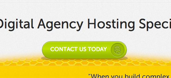
For the most important calls to action a designer will often employ a call to action button. Buttons traditionally entice users to click them, and so generally result in much higher click through rates than standard links. Like this example from the showcase below:

How To Get Your Call To Action Button Right!
It’s important to realize that not all call to action buttons are the same. As your call to action button could drastically impact your user’s/customer’s behavior it’s essential to get it right!
Below I’ve laid out a hypothetic example of a call to action and how to improve it. Here are some pointers to improve your click through rate:
To illustrate these tips I’ve laid out an example below:
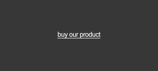
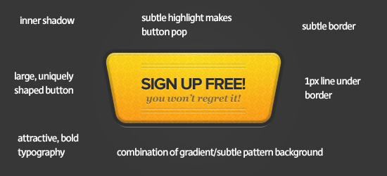
Remember to keep it subtle!
Obviously the example above is fairly extreme just to demonstrate how some of the techniques I’ve mentioned can make a button have more impact. The idea is not necessarily to implement all of them, but to create an attractive, effective call to action button that makes your users take notice. You don’t want to over do things and end up with a tacky, overwhelming call to action that will dissuade your users. Instead, tweak your buttons styles until you’re happy with the result.
It’s not all about looks…
Whilst you don’t want to overwhelm your users, it’s equally important not to get hung up on how beautiful your calls to action are. Some of the ugliest calls to action have the best click through rates. If you’re trying to run a business then really you should value sales/conversions over aesthetics. A great solution is A/B testing. Perhaps design a few variations on your button and see which perform better, and which get the best feedback from your users.
Inspiring Call To Action Buttons
Here are 40 inspiring examples of effective and well designed call to action buttons. Hopefully these will inspire your own designs!
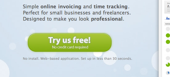
Ronin App
Ronin use a large, bright call to action button that really pops against the relatively subdued background color. The 1px highlight at the top of the button and subtle outer glow make the button appear more 3D and ‘clickable’, thus encouraging action on the part of the user. The tagline ‘No credit card required’ provides a subtle extra incentive to click the button.
Ehab Aref
This is a great example of how contrast can lead to an effective call to action button. In this case the simplicity of the button is what helps it stand out. The background is bright and integrates a woven pattern design. Therefore the lighter, simpler call to action button contrasts this and draws the eye. Notice also how the button text is darker than the surrounding headline text, which helps attract clicks.
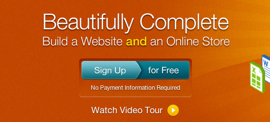
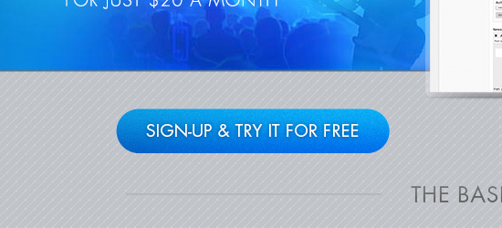
Light CMS
One of the more effective call to action buttons in this article. There is a whole lot going on with this button! First of all, look at the backdrop – there is a kind of indented area in which the button sits, which instantly adds depth and creates intrigue in the viewer. Then the button itself stands out, using a teal color in the midst of a large block of orange background. Subtle inner glows, drop shadows etc… are applied to really make the button pop. Finally, the button is divided into two halfs ‘sign up’ and ‘for free’. This creates the illusion of two call to action buttons, despite there only being one. This seems to create double the attention from a users perspective, surely resulting in more click throughs.
Shane Guymon
Shane Guymon uses two prominent call to action buttons on his homepage. These buttons work really well, as they both stand out from, and fit in with the overall design. The red and blue buttons fit with the main colors of his logo/slogan, yet really stand out against the plain white background of the main content area. There is a clear visual hierarchy at work, as the red button is given more visual precedence. This is achieved through it’s slightly larger size, more apparent gloss style, and preferential positioning (as we read left to right we encounter this button first).

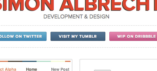
Simon Albrecht
The call to action buttons at Simon Albrecht’s page are really well designed. Interestingly each button mimics the color-scheme of the social networking site that it links to. This helps establish instant brand recognition, and should boost click throughs. One point to note is that whilst these buttons may be effective, they are in fact navigating away from his main portfolio site. If this is the aim fine, otherwise they may be hindering more than helping.
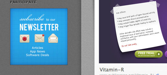
Web App Heaven
Really interesting call to action button, as it promotes a newsletter, rather than a product sale. The square button shape makes the button appear almost more like a banner ad than a call to action button. However, the intricate icons and masterful typography are very enticing. Overall this is a very nicely designed button, but perhaps the site owner should consider a more traditional button shape.
Resume Baking
Easily one of my favorite buttons from this collection. In a world dominated by traditional rectangular or rounded rectangular buttons, this retro shaped button is incredibly eye catching. The shape and side lines make this button almost resemble a car logo. The bold red color helps the button pop, whilst the indented background design, drop shadow and gradient fill all help give the button depth and purpose.
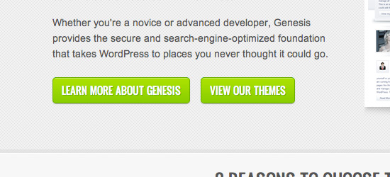
Studio Press
The two main call to action buttons at Studio Press are effective for a number of reasons. Their 1px stroke effect and drop shadows help make them stand out from the background. The typography is also consistent with the main navigation at the site, implying that the buttons should be clicked. The copy is simple and straight to the point. ‘View Our Themes’ could not be clearer, so the users know exactly what to expect.
Snoack Studios
Snoack Studios is a great example of how call to action buttons don’t need to do anything too revolutionary. Sometimes simple is best. The traditional button shape, bold blue design and contrasting text work well. A little extra impact is provided by the button’s inner glow and subtle arrow.
Concept Engine
Concept Engine has a great call to action button. Not only does it contrast well against the main page background but it feels very clickable due to a heavy bevel/drop shadow effect. Finally, the unusual arrow shape makes the button feel somewhat like a sign post directing the site’s users further into the website.
Code my Concept
Code my Concept use a pretty unique call to action button, which integrates into the pricing box directly above it. This indented design feature creates a direct link between the prices/services offered and the option to place an order. The low opacity stroke effect really helps to define the button, and the arrow icon should help boost click through rates.
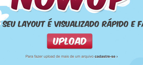
Now Up
Now Up uses quite a cartoony style call to action button, which really fits with the surrounding aesthetic. The subtle metallic gloss on the text and gloss on the button make the button stand out against the plain, vector style page background.
Vision 18
Vision 18 is one of the most creative examples in this post. The designer has photo manipulated the sofa image that acts as a welcome graphic, making one of the cushions red. This red cushion then acts as a bold call to action button, that creatively integrates with the surrounding graphics. It’s both artistic and functional.
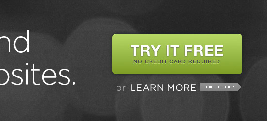
Square Space
Square Space use a really large call to action button that grabs plenty of attention. The bright green button design really pops against the dark gray backdrop and the text is clear and direct. The additional text ‘no credit card required’ is indicative of a growing trend I’m seeing, where important extra details are displayed as part of the call to action button, in a tagline format.
Reynolds Digital
This is another example of a simple but effective call to action button. Nothing fancy going on, but the call to action works. The user is not distracted by unnecessary bells and whistles, but instead views the button as having an obvious purpose (in this case as represented by the copy ‘submit design brief’).

Site Plan
Couldn’t analyze the copy in this example (my language skills are that bad!). However, the design for this button is solid. Fairly simple, yet the rounded edges, bright gradient and Museo typeface all combine to create a modern, elegant call to action.
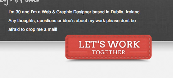
Alan Power
One of my favorite call to action button designs. The details are really inspiring, such as the subtle stitching and indented lines. The creative drop shadow style helps at depth and draws the users eye towards the button. The text is given a subtle outer glow to make it pop against the button backdrop.
Bomb Plates
This simple call to action button works well by following the wider site color-scheme. It’s position on the page works well as your eye is drawn down the left of page towards the button. The subtle noise effect for the button background adds a nice design touch.
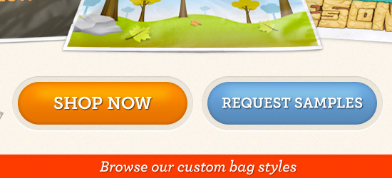
Custom Bags HQ
A lovely pair of call to action buttons, using nice complimentary colors. The inner glow and button highlights give them an appealing glossy appearance, whilst the outer border effect gives a really professional touch. A great example of how the details can make or break an effective call to action button!
DFied
Another great example of a call to action button being integrated into content areas. This button straddles the main welcome area and area underneath, and appears to be indented due to a semi-transpareant border effect. The indented text adds depth and the bright orange color-palette really helps the button pop.
Pierre Saikali
These call to action buttons are simple but effective. Perhaps one of their main draws is the huge amount of white space around them. They comprise most of the content in a vast header area, and therefore the eye is naturally drawn towards them.

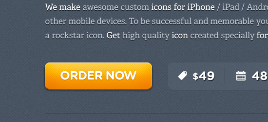
Iphone Icon
The ‘order now’ button on this page is practically the only colorful element on the page, which is otherwise gray/white. Therefore it really stands out. Additionally the call to action button uses bold typography, a fairly heavy drop shadow, and a highlight effect to grab attention.
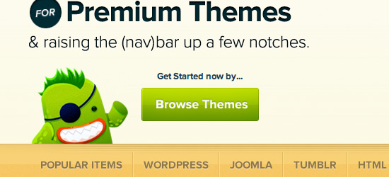
Mojo Themes
Mojo Themes have a great call to action button. Apart from the obvious great design of the button itself, it’s the surrounding elements that really make this button work. The site’s mascot is gesturing towards the button, whilst the tagline ‘get started now by…’ leads the users eye down to the button.
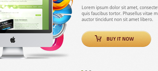
Platinoom
The call to action button here is effective for a number of reasons. The button is large and prominent, with subtle design touches such as an inner shadow, 1px border etc… The shopping cart icon instantly creates a visual link for the purpose of the button (buying the theme).
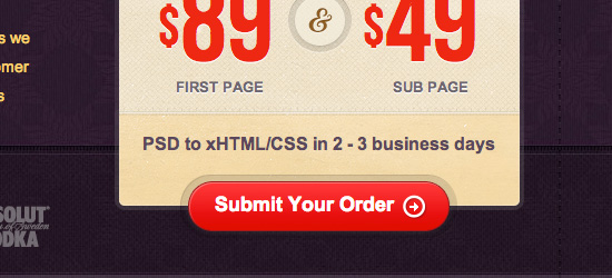
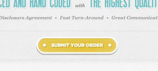
Pixel2Html
This call to action button has a great retro design that fits with the overall design of the site. The subtle patterned background, chunky border and large drop shadow all make it jump off the page and the copy ‘submit your order’ couldn’t be clearer.
Make It Bead
Make It Bead use a nice clean, bold set of call to action buttons. The designer has used a classic technique of visual precedence to encourage people to click on the brighter red button, whilst offering a secondary option (the yellow button). The indented style for each button just makes you want to push them as they look almost real!
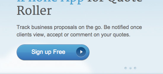
Quote Roller
Quote Roller’s call to action button would be fairly plain, but the heavily rounded shape and indented button add a lot to quite a simple design. The arrow icon is a great visual element to suggest additional content – we wonder ‘what is that arrow leading to?’.
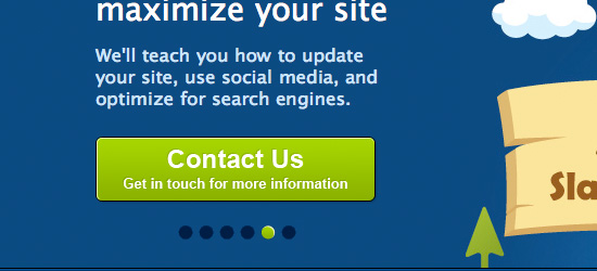
Slamdot
The bright neon green color of this call to action button really pops against the blue backdrop. Importantly the tagline underneath the primary text helps explain where the user is clicking.
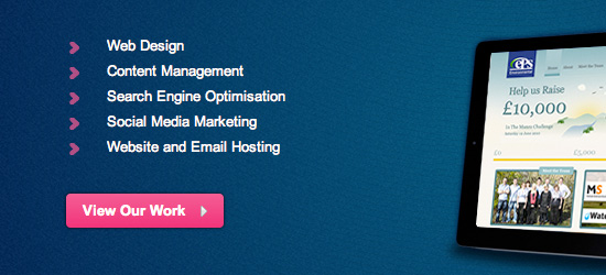
Reflex Studios
The only other elements on the homepage using the pink of call to action button are the bullet points leading down to it. Therefore a clear visual flow is established scanning down the bullet points (which highlight services provided) to the call to action (‘view our work’). As the brightest element on the page, this is where users are most likely to click.
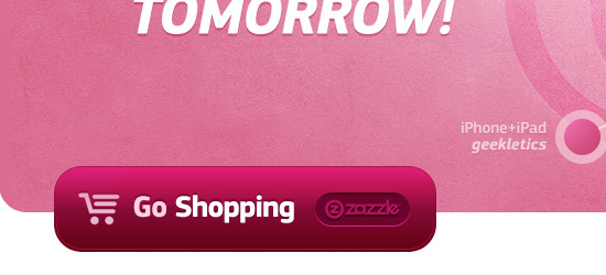
Geekletics
Geekletics use one of my favorite call to action buttons in this collection. The button is really prominent and large, so instantly grabs people’s attention. The real selling points for this button are the details. The subtle border, inner glow and gradient work beautifully together. Combine this with excellent typography (notice the subtle color difference on the word ‘Go’), and the simplistic but effective icon. The Zazzle logo adds a lot of credibility to the shop which the button links to.
Wire Hive
Wire Hive mount their call to action button on top of a curved graphical area. This positions the button totally central, so is really eye catching. The indented graphic on the button helps make it stand out, and the sharp drop shadow adds depth and perspective.
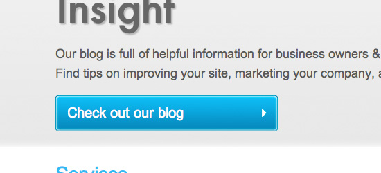
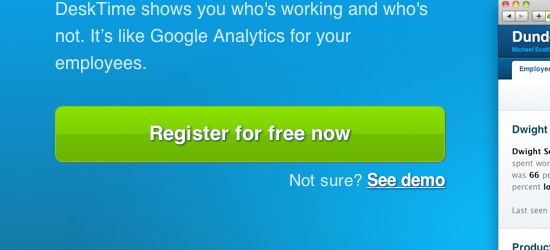
Desk Time
DeskTime uses a fairly standard call to action button, but it’s very effective. Another example of how simplicity can work wonders! The green on blue combination helps the button stand out, and the subtle drop shadow and gloss effect add impact.
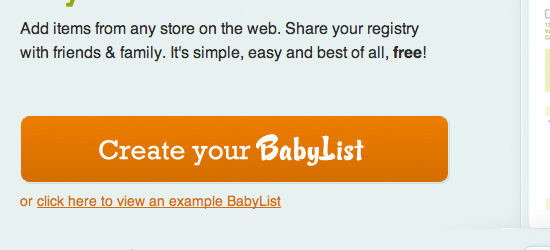
Baby Li.st
One of the simpler call to action buttons in this compilation, yet one of the more artistic. This is a great example of how typography can make a button much more interesting. The word ‘BabyList’ uses the site’s logo text, rather than the font used elsewhere on the button. This subtle variation is really eye-catching and helps maintain the company’s brand.
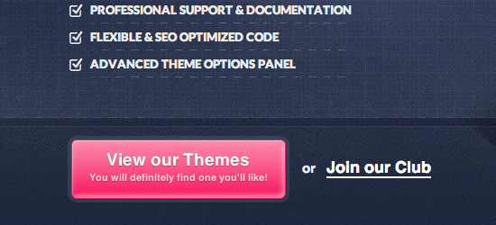
WP Zoom
A super bright call to action button which starkly contrasts the dark blue background. The main button text is accompanied by a cheeky subtext ‘You will definitely find one you’ll like!’. This helps establish a personal/emotional connection with the viewer, who is most likely used to plain/boring copy buttons they encounter.
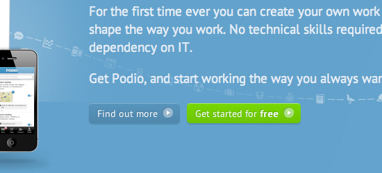
Podio
Podio’s call to action buttons are understated, but work well with the page design. By staying small and sleek they support the quietly professional brand of the website. There is a visual hierarchy established by the colors of each button, whereby the ‘get started for free’ button is given more precedence than the ‘find out more’ button. Clearly the brighter button is encouraging users to sign up, as the primary call to action on the page.
FanExtra
FanExtra uses a large call to action button that has adopted some of the graphical elements of a banner to help draw plenty of attention. The button includes a professional icon design, as well as copy that clearly states what is offered by signing up. The ‘sign up today!’ text is styled bright yellow in order to stand out the most.
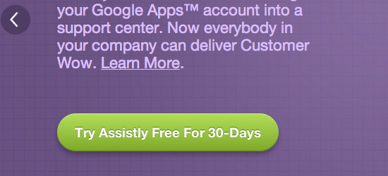
Assistly
Assistly uses a simple, elegant call to action button to encourage users to sign up for their service. The green button compliments the purple background well, yet the button stands out partly through use of a drop shadow effect.
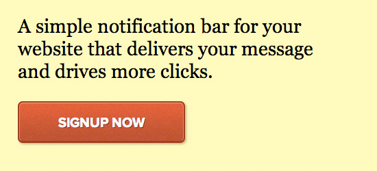
Hello Bar
Hello Bar has a great call to action button. The button is one of the most colorful elements on the page, and uses a bold outline/inner glow effect to stand out. The ‘signup now’ text uses a very bold font, which helps it have the impact of a headline or title area. This is a great example of subtle design aspects making a button more ‘clickable’. The very subtle texture used on the button design makes it feel more real/palpable and jumps out more to users.
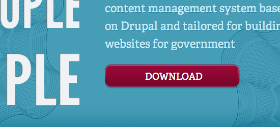
Open Public App
Open Public use maroon for highlights against a largely blue/gray web design. The bold maroon ‘DOWNLOAD’ button is really bold, and the white text provides a great contrast. The subtle drop shadow adds depth to this button.
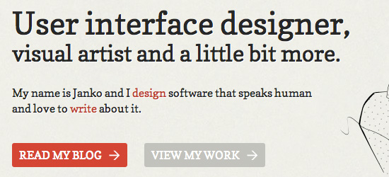
Janko at Warp Speed
Another great example of a layout with two call to action buttons and a clear visual hierarchy. The bolder ‘read my blog’ button is clearly given more precedence than ‘view my work’. Both buttons are enticing though. Whilst they fit with the subdued color-scheme of the website the arrows help draw attention, and the large amount of padding given to the buttons helps them stand out against a plain backdrop.
(rb)