Typefaces come in all shapes and sizes, and much like smells and sounds, have the power to conjure emotions, meanings, and correlations. But instead of being paralyzed by the overwhelming number of typefaces in your drop-down menu — or worse, inadvertently misrepresenting the information with an uninformed typeface choice — peruse the following guide to help navigate these sometimes confusing waters.
CLASSIFICATIONS
The contents of a typography library can be broken down into four primary classifications: serifs, sans serifs, scripts, and decorative typefaces. Before delving into the sea of available typefaces, start by understanding the types and generally accepted uses of each classification.
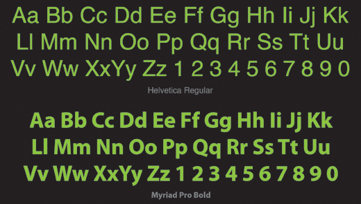
- Sans Serifs are best recognized by their lack of ornamentation. With the advent of the internet and ever-evolving printing techniques, sans serifs are used consistently in almost every capacity due to their easy legibility at nearly every size. Sans serifs are most effective at quickly and concisely displaying information to the reader without any underlying emotional or visual triggers. Designers have also adopted the sans serifs’ simplicity to create a modern or minimalist feel when relevant to the design of their project. On the flipside, take extra care when using a sans serif for identity or branding efforts. The lack of decoration leaves little to brand as specific to one company or a visual identity. Common Sans Serifs: Helvetica, Arial, Verdana, Tahoma, Futura, Franklin Gothic, Gill Sans, and Univers

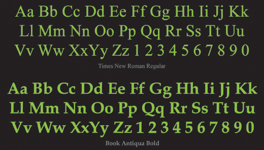
- Serifs, in the most basic form, are a sans serif typeface with small finishing strokes at the beginning and end of each letter stroke. Serifs are commonly used as the default typeface by nearly everybody from the average email user to professional designers. From the design perspective, serif typefaces are often used for body copy because it is widely believe that the smooth arcs help lead the eye easily through large amounts of text. They are also a good choice for business and formal correspondence, marketing materials, and myriad media due to the under current of credibility and professionalism they project. Within this classification, there is a subset know as slab serifs, which feature block-like, heavy serifs that do not naturally run into or join to the next letter. Due to their weight, slab serifs should predominantly be used for headlines. Common Serifs: Times New Roman, Georgia, Book Antiqua, Garamond, Century Schoolbook, and Bookman (Common Slab Serifs: Courier and Rockwell)

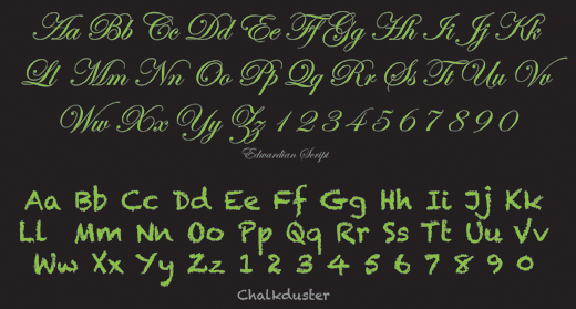
- Script typefaces are modeled after handwriting, and are often used to introduce a human feeling or connection to the reader. Varying from child-like scribbles and chalk letters to elegant calligraphy, script typefaces are effective at introducing fun or sophistication to a computer-generated piece. Scripts are most often used in formal, or decidedly informal projects (see the example below). Scripts rule the world of personal design from invitations to announcements. However, the use of scripts in corporate design should be minimal, as they do not project authority and reliability. Common Scripts: Comic Sans, Monotype Corsiva, Mistral, Lucinda Handwriting, and Brush Script

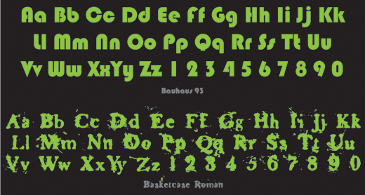
- Decorative (also known as ornamental or display) typefaces typically fall into the serif category due to their highly ornamental nature. As their name indicates, they are highly decorative and best used to create or reinforce design styles and themes in large sizes (such as headlines). Their otherwise unique letter shape can be refreshing and attention getting. They can also be used to mimic the emotions and aesthetic of a specific genre or time frame. However, the intricate strokes often used to create these typefaces make them undesirable for use in large amounts of text or at smaller sizes, and therefore are not ideal for body copy. Avoid using highly decorative typefaces in news or business reports, as they tend to detract from the neutrality for which most organizations strive. Be wary of over using a decorative typeface, or choosing a one inappropriate to the subject matter.

CONVENTIONS
When choosing typefaces its important to keep in mind the established conventions for the medium at hand. This is not to say that conventions cannot be broken — after all, design s all about breaking rules — but its important to know what the rules are before breaking them.
Websites and online projects require a typeface’s compatibility with the largest common denominator of computers, which usually necessitates the use of otherwise familiar or commonly used typefaces. As such, web standards have been quickly been defined with the use of a sans serif for body copy paired with a serif, script, or decorative typeface for headlines and subheads.
The opposite can be said for print pieces. It has become the collective opinion of most designers that the smooth arc and small leading lines of serifs helps the eye move comfortably through large amounts of text, and as a result, the serif has become the champion of body copy. In recent years, studies have proven that though serifs are not necessarily easier to read, rather our eyes are trained early on to believe they are. From this point the classic nature versus nurture paradox exists. Whatever the case, serifs remain the universal choice for body copy.
Â
CUSTOMIZATION AND STYLING
To further customize or illustrate your intent, try playing with variations of weight (regular, medium, bold, heavy), width (narrow, condensed, extended), italics, outline stroke, and color. The adjustment of any of these components can severely alter the visual cues your typeface relays to the reader.
AVOID OVERUSE
Finally, and this can never be said enough — think twice before using the following typefaces: Comic Sans, Curlz, Papyrus, and Times New Roman. This is not an editorial on their quality or usefulness in the proper context. When observed in a vacuum, each font has its merits. Unfortunately, the designer needs to account for all external influences and these fonts have been overused to the point that even the most unobservant passerby can probably identify them by name. The last thing a designer wants when presenting information is to allow the message to be obscured by the typeface.
When choosing typefaces, classifications and best practices should merely be a guide to jumpstart the creative process. Good Luck!
The post Choosing Fonts & Typefaces appeared first on Design Reviver.