Archive for September, 2011

Useful Node.js Tools, Tutorials And Resources


Created by Ryan Dahl in 2009, Node.js is a relatively new technology which has gained a lot of popularity among Web developers recently. However, not everyone knows what it really is. Node.js is essentially a server-side JavaScript environment that uses an asynchronous event-driven model. What this means is simple: it’s an environment which is intended for writing scalable, high performance network applications. It’s like Ruby’s Event Machine or Python’s Twisted, but it takes the event model a bit further—it presents the event loop as a language construct instead of as a library.

And that’s not all: what’s really great about Node.js is the thousands of modules available for any purpose, as well as the vibrant community behind this young project. In this round-up, you will find the most useful resources for Node.js, from handy tools to detailed tutorials, not to mention in-depth articles and resources on this promising technology. Do you use Node.js already? Let us know in the comments to this post!

Useful Node.js Tools

Node Express Boilerplate
Node Express Boilerplate gives the developer a clean slate, while bundling enough useful features to remove all of those redundant tasks that can derail a project before it even gets started.

Node Express Boilerplate

Socket.IO
Socket.IO is a cross-browser Web socket that aims to make real-time apps possible in every browser and mobile device, blurring the distinctions between the various transport mechanisms. It’s care-free real time, in JavaScript.

Socket.IO: Cross-browser WebSocket for realtime apps.

Mastering Node
With Mastering Node, you can write high-concurrency Web servers, using the CommonJS module system, Node.js’s core libraries, third-party modules, high-level Web development and more.

Mastering Node

Log.io
Your infrastructure may have hundreds of log files spread across dozens of machines. To help you monitor deployments and troubleshoot, Log.io lets you instantly see composite streams of log messages in a single user interface.

Log.io

Formaline
Formaline is a low-level, full-featured (Node.js) module for handling form requests (HTTP POSTs and PUTs) and for parsing uploaded files quickly. It is also ready to use with, for example, middleware such as Connect.

Formaline

LDAPjs
LDAPjs is a pure-JavaScript, from-scratch framework for implementing LDAP clients and servers in Node.js. It is intended for developers who are used to interacting with HTTP services in Node.js and Express.

ldapjs

Node Supervisor
This is a little supervisor script for Node.js. It runs your program and watches for code changes, so you can have hot-code reloading-ish behavior without worrying about memory leaks or having to clean up all of the inter-module references, and without a whole new require system.

Node Supervisor

Jade – Template Engine
Jade is a template engine for Node.js applications. It combines great power and flexibility with a nice and clean syntax.

Jade - Template Engine

Express
This is a Sinatra-inspired Web development framework for Node.js: fast, flexible and sexy.

Express - Node web framework

Hook.io
hook.io creates a distributed node.js EventEmitter that works cross-process / cross-platform / cross-browser. Think of it like a real-time event bus that works anywhere JavaScript is supported.

Hook.io

Node Package Manager
NPM is a package manager for node. You can use it to install and publish your node programs. It manages dependencies and does other cool stuff.

Node Package Manager

Node-QRcode
Despite being quite young, Node.js already has a huge number of libraries for every possible application. This one is a QR code generator.

Node QRCode Generator

NWM
NWM is a dynamic window manager for X that was written at NodeKO 2011. It uses libev to interface with X11, and it allows you to lay out windows in Node.js.

NWM - Node Window Manager

Bricks.js
Bricks.js is an advanced modular Web framework built on Node.js. It is highly flexible. Bricks.js can be used as a standalone static Web server, a basic routing framework or a multi-level Apache-like routing system; and it is modular enough to have the capability to completely switch out its routing engine.

Bricks.js

Node.js Modules
A list of almost all the Node.js most famous modules organized by category. This list definitively is worth a look.

Node.js Modules

90 open-source Node.js modules
Recently, Browserling released over 90 Node.js modules to the open-source community. Some of them are small and strange modules, others might be pretty useful for your next Node.js project.

90 Opensource Node.js modules

Calipso
Calipso is a content management system (CMS) based on the NodeJS server.

Calipso - A NodeJS CMS

PDFKit
PDFKit is a PDF document-generation library for Node.js that makes it easy to create complex, multi-page, printable documents. It is written in pure CoffeeScript, but you can use the API in plain ’ol JavaScript if you like. The API embraces chain-ability, and it includes both low-level functions as well as abstractions for higher-level functionality.

PDFKit - A PDF Generation Library for Node

Forever
A simple CLI tool to ensure that a given script runs continuously (i.e. forever).

Forever - Make Scripts run Forever

Introducing Node.js

Node.js Step by Step
Node.js is an amazing new technology, but unless you’re a JavaScript developer, the process of becoming acquainted with it can quickly become a bit overwhelming. If you want to learn how to use Node.js, this set of articles and screencasts might do the trick.

Node.js Step by Step

What Is Node.js?
Another interesting discussion on StackOverflow about what Node.js is and is not. Recommended for those who are approaching Node.js for the first time.

What is node.js? - Stack Overflow

Learning Server-Side JavaScript
Node.js is all the buzz at the moment, and it makes creating high-performance, real-time Web applications easy. It allows JavaScript to be used end to end, on both the server and client. This tutorial walks you through from installing Node.js and writing your first “Hello World� program to building a scalable streaming Twitter server.

Learning Server-Side JavaScript

Node.js Is Important: An Introduction
“Once in a while, you come across a technology and are blown away by it. You feel that something like this should have been around much earlier and that it will be a significant milestone, not just in your own life as a developer but in general.

Node.js is Important. An Introduction

The Secrets of Node’s Success
In the short time since its initial release in late 2009, Node.js has captured the interest of thousands of experienced developers, grown a package manager and a corpus of interesting modules and applications, and even spawned a number of start-ups. What is it about this technology that makes it interesting to developers? And why has it succeeded while other server-side JavaScript implementations linger in obscurity or fail altogether?

The secrets of Node’s success

Asynchronous Code Design with Node.js
The asynchronous event-driven I/O of Node.js is currently evaluated by many enterprises as a high-performance alternative to the traditional synchronous I/O of multi-threaded enterprise application server. The asynchronous nature means that enterprise developers have to learn new programming patterns, and unlearn old ones

Asynchronous Code Design with Node.js

A Giant Step Backwards?
In this article, Fenn Bailey expresses his opinion of Node.js and why he sometimes thinks Node.js is a step backward compared to other solutions.

A giant step backwards?

Node.js Is Backwards
A hot topic in computing is parallel programming in languages such as Erlang. Will JavaScript join the party?

Node.js is backwards

Videos And Screencasts On Node.js

Node.js Meetup: Distributed Web Architectures
A series of videos from the Node.js Meetup at Joyent headquarters, discussing how to build distributed Web architectures with Node.js.

Node.js Meetup: Distributed Web Architectures

Introduction to Node.js with Ryan Dahl
In this presentation Ryan Dahl, the man behind Node.js will introduce you to this event-driven I/O framework with a few examples showing Node.js in action.

Introduction to Node.js with Ryan Dahl

SenchaCon 2010: Server-side JavaScript with Node, Connect & Express on Vimeo
Node.js has unleashed a new wave of interest in server side Javascript. In this session, you’ll learn how to get productive with node.js by leveraging Connect and Express node middleware.

SenchaCon 2010: Server-side JavaScript with Node, Connect & Express on Vimeo

Technical Articles And Tutorials On Node.js

Proxying HTTP and Web Sockets in Node
This guide is geared to beginners and people who are unfamiliar with reverse HTTP proxying, Web socket proxying, load balancing, virtual host configuration, request forwarding and other Web proxying concepts.

Proxying HTTP and Websockets in Node

Bulletproof Node.js Coding
“Right around the time that I started the third refactoring/rewrite of the code, I felt like I had gotten a feel for how to write bulletproof code, and I thought it would be worth sharing some of the style and conventions I came to adopt.�

Bulletproof Node.js Coding

How to Write a Native Node.js Extension
In this tutorial, you will learn how to write a native Node.js extension the right way, from the very basics to packaging the extension for NPM.

How to write a native Node.js extension

Let’s Make a Web App: Nodepad
This series will walk you through building a Web app with Node.js, covering all of the major areas you’ll face when building your own applications.

Let’s Make a Web App: Nodepad

HTML5 Canvas Drawing with Web Sockets, Node.JS and Socket.io
Web sockets and canvas are two really cool features that are currently being implemented in browsers. This tutorial gives you a quick rundown of how they both work, and you’ll create a real-time drawing canvas that is powered by Node.js and Web sockets.

HTML5 Canvas Drawing with WebSockets, Node.JS & Socket.io

Developing Multiplayer HTML5 Games with Node.js
Inspired by the famous iOS game Osmos, developer Boris Smus has created an alternative version of the game using HTML5 canvas and Node.js. This article explains the main phases of the project.

Developing Multiplayer HTML5 Games with Node.js

Deploying Node.js on Amazon EC2
Amazon’s EC2 is a popular choice for cloud applications. This tutorial shows how Node.js can be deployed on an EC2 instance.

Deploying node.js on Amazon EC2

A Simple Node.js + CouchDB Calendar
In this tutorial by Chris Storm, you will learn how to build a Web calendar with Node.js and CouchDB.

A Simple Node.js + CouchDB Calendar

IIS7
The IISnode project provides a native IIS 7.x module that enables hosting of Node.js applications on IIS. The project uses the Windows build of node.exe, which has recently seen major improvements.

Hosting node.js applications on IIS

Node.js + Phone to Control a Browser Game
Someone wondered how easily a smart phone – specifically using its gyroscopes and accelerometers – could be used as a controller for a multi-player game on a larger screen. With a bit of Node.js and HTML5 magic, it turned out to be pretty simple.

Node.js + Phone to Control a Browser Game

Is There a Template Engine for Node.js?
An engaging discussion appeared on StackOverflow about the template engines that are available for Node.js. Really useful arguments came out of this discussion.

Blogs, Podcasts, Resources On Node.js

How to Node
How to Node is a community-supported blog created by Tim Caswell. Its purpose is to teach how to do various tasks in Node.js and the fundamental concepts needed to write effective code.

How To Node

Nodejitsu
A really interesting blog about scaling Node.js apps in the cloud and about the Node.js events in general.

Nodejitsu Blog

Node Up
A podcast that reviews Node.js, explains its philosophy and goes over many of its popular libraries.

Node Up: Node.js Podcast

Node Tuts
Free screencast tutorials.

Node Tuts - Node.js Free screencast tutorials

Minute With Node.js
Node.js is constantly changing and growing with each new version. New libraries and frameworks are coming out daily that allow you to write JavaScript for new and exciting projects that were previously impossible. This is a one-stop shop for news updates on the entire Node.js eco-system, with a heavy slant on hardcore nerdery.

Minute With Node.js

Felix’s Node.js Guide
Over the past few months, Felix have given a lot of talks and done a lot of consulting on Node.js. He found himself repeating a lot of things over and over, so he used some of his recent vacation to start this opinionated and unofficial guide to help people getting started in Node.js.

Felix’s Node.js Guide

Node.js Knockout
Node.js Knockout is a 48-hour hackathon for Node.js. It’s an online virtual competition, with contestants worldwide.

Node.js Knockout

References And Books

Node.JS Help Sheet
“Node.JS is an evented I/O framework for the V8 JavaScript engine. It’s ideal for writing scalable network programs, such as Web servers. We’ve been working on some exciting things with Node.js, and we felt it was only fair to share our knowledge in the form of an easy-to-read Help Sheet.�

Node.JS Help Sheet

The Node Beginner Book
The aim of this document is to get you started with developing applications for Node.js. It teaches you everything you need to know about advanced JavaScript along the way. It goes way beyond your typical “Hello World� tutorial.

The Node Beginner Book

Up and Running With Node.js
“Many people use the JavaScript programming languages extensively for programming the interfaces of websites. Node.js allows this popular programming language to be applied in many more contexts, in particular on Web servers. There are several notable features about Node.js that make it worthy of interest.�

Up and Running with Node.js

Poll: Do You Use Node.js In Your Projects?

How often have you used Node.js in your projects? Have you found some particular tools or articles useful? Share your experience in the comments to this post. Thank you.


Related Posts

You might be interested in the following related posts:

(al)


© Luca Degasperi for Smashing Magazine, 2011.


Improving The Online Shopping Experience, Part 1: Getting Customers To Your Products


Amazon turned sweet sixteen this year, and, by extension, so did online shopping as we know it. As online shopping has grown over the past 16 years, so have user needs and expectations related to the online shopping experience. Setting up shop online is easy, but creating an experience that satisfies target users is a different story altogether.

In the traditional journey of a purchase, commonly depicted as a funnel, a business loses potential customers as they move closer to the purchasing stage. While this is natural and expected, improving the user experience can reduce this loss by removing unnecessary barriers to shopping online.

The purchase funnel and ways to improve the online experience
Ways to improve the online shopping experience and reduce the drop in the purchase funnel.

The guidelines, techniques and best practices in this two-part series address common user experience issues on e-commerce websites. They are intended as a starting point; books have been written on many of these topics, and a few are recommended at the end. Improving the user experience requires a good understanding of your users and their goals on your website. Use that lens as you read through, to see which of the techniques will improve the online shopping experience for your users.

This first part covers the upper part of the funnel: getting customers to your website and helping them find your products. Part 2 will address the lower part of the funnel: guiding customers through the decision-making process and check-out.

Promote Your Online Presence

Make it easy for customers to find your website by using a combination of online and offline marketing tactics. Analytics will show you how users are coming to your website — for most websites, search engines and other online referrals, including social media, play a big role. What these reports will not show you are missed opportunities, such as customers ending up on your competitors’ websites instead of yours because of their search keywords.

  • Analyze your website and the websites of key competitors to compare how you rank on the search terms used by your target users and to identify areas for optimization. Personas, which are representative profiles of target users, can be used as a tool for search marketing efforts, helping you to identify and prioritize keywords, offers and features and to create targeted landing pages. Digital consultancy Roundarch has an example of a keyword persona that it uses when working on search engine optimization (SEO) for Avis.
  • If your business is selling in a competitive market, supplement your SEO efforts by buying relevant keywords for paid placement alongside search results, using services like Google AdWords and Microsoft adCenter.
  • Create business profile pages on services such as Google Places, Bing Business Portal and Yahoo Local: these will be highlighted in search results and on location-based social networking services. In addition to your business name, include your physical address, phone number, URL and hours of operation.
  • Use email campaigns to attract new customers and draw previous customers back to your website. In a recent Forrester study, retailers ranked email as having the highest return on investment (ROI) among their marketing efforts, including paid search, affiliate marketing and Facebook marketing.
  • Create, join or support communities and social networks related to your products or related to issues that your product addresses. An example is Aspirin manufacturer Bayer’s involvement in and sponsorship of the Strong @Heart community on Facebook.
  • Go where your customers are; these days, that includes social networks. Companies are experimenting with Facebook ads and check-in coupons, offering promotions on their Facebook walls, and tweeting time-limited deals to their followers. Although companies such as JCPenney and 1-800-Flowers.com have set up Facebook storefronts, their ROI is questionable in value.

    JCPenney’s storefront on Facebook
    JCPenney’s Facebook storefront allows users to shop on the social network.

  • Use a short, simple, intuitive and memorable Web address, and secure alternate spellings (walmart and wal-mart) so that users can get to your website even if they misspell your name (jcpenny, jcpenney, jcp).
  • Increase visibility in search engine results using SEO techniques, including picking the right keywords and creating keyword-rich and search-friendly page URLs, titles, headings, tags and content. SEO is not a dirty acronym if done the right way. Trying to fool search engines may work for a while, but you will eventually be penalized, as JCPenney and Overstock recently discovered.
  • Feature the URL prominently offline: in printed material, while people are on hold on the phone waiting for service or support, in offline advertising and promotion, and in brick-and-mortar stores where appropriate. Quick Response (QR) codes give smartphone users quick access to a website, a sub-section or a particular page without having to type in a long address.

Instill Confidence In Customers

Instill confidence and trust in customers by prominently displaying clear policies, trust certificates, security badges and contact information. Customers are cautious when asked for personal information, and rightly so, with news of hacked websites being so common. Even established brands that customers recognize and trust can use these techniques to reinforce confidence.

  • Looks matter, and your website’s design is often the first impression that a customer will get of your business. Creating a professional-looking website is easy and inexpensive, so get the basics right and make a good first impression. This includes designing for accessibility and especially ensuring that your website renders well on mobile devices.
  • Highlight security on secure areas of the website to remind customers that their information is safe; even though browsers have small built-in indicators to show secure areas, reiterate it on the page. Amazon does this through its sign-in button; other websites display a padlock icon near the log-in area.
    Amazon’s sign-in button reinforces security
    Amazon’s sign-in button reinforces a sense of security.
  • Clearly state your business practices (including privacy, security and return policies), and make them accessible from every page. Don’t make users hunt for this information; rather, present these links contextually where appropriate (for example, display a link to your privacy policy near the email-address field).
  • Visible contact information instills confidence, even if the customer does not have to use it. Offer contact options and alternatives: even though Amazon does not publicize its customer-service phone number, it makes up for it by offering excellent support via email, chat and call-backs.
  • Lesser-known brands should do all of the above, as well as instill confidence by displaying trusted third-party certification and affiliations. These include trust certificates (e.g. TRUSTe), security badges (e.g. VeriSign), accreditation (e.g. BBB) and ratings (e.g. Bizrate).

    Build confidence using trusted third-party certifications and affiliations
    Instill confidence with trusted third-party certification and affiliations.

Enhance Product Findability

Enable customers to quickly find and discover products by offering robust search and navigation. Customers will not always start on your home page — a search engine or QR code could drop them many levels deep on your website — but good navigation and search should help them find their bearings.

  • Create a strong foundation through distinct product categories and user-centric labels that help users explore other areas of the website. Involve users in the design process by conducting exercises such as card-sorting to understand their mental model and to create an architecture that is intuitive to them.
  • Mega-menus can be used to expose multiple category levels without making users drill down. See Econsultancy’s article “25 E-Commerce Mega-Menus Dissectedâ€� for more examples. Keep in mind, though, that mega menus aren’t a panacea, they also require profound usability considerations.

    Officemax mega-menus facilitate category scanning
    OfficeMax’s mega-menus facilitate the scanning of categories.

  • Breadcrumb navigation enables customers to identify where they are on your website and helps them backtrack or broaden their search results if needed.
  • Keep the search box consistently in the same location across the website. Customers expect it to include a text field, followed by a button labeled “Search,â€� usually in the top right of the screen.
  • Accept colloquial synonyms and common misspellings as search keywords, and match results accordingly. On Amazon, a search for “iTouchâ€� brings up the iPod Touch, and a search for “polar bear bookâ€� (as information architects so lovingly call it) brings up Information Architecture for the World Wide Web (which happens to be a great resource that looks closely at many concepts mentioned in this section).
  • Help users get faster and more relevant search results. Predictive type-ahead options help users select the appropriate term before running a search. Providing related search terms helps with typos and more common alternatives.
  • Display results based on relevance, but give users the options to refine, filter, compare and sort results based on various criteria and to control the number of results displayed at a time.
  • Display a summary of key product information in the search results to speed up identification and selection. In addition to the name and image that the user expects, provide pricing, availability, ratings, shipping details and other relevant information.

    Best practices in Amazon’s search results
    The search results for “polar bear book� on Amazon, which include: (1) predictive type-ahead; (2) tolerance for synonyms; (3) sorting options; (4) filtering options; (5) summary of key product information (ratings, reviews, formats, pricing, availability).

Stay tuned for the second part, which will focus on guidelines and techniques to help customers make purchasing decisions and to guide them through the check-out process.

Further Reading

(al) (vf)


© Lyndon Cerejo for Smashing Magazine, 2011.


45+ Free Lessons In Graphic Design Theory


Considering how many designers are self-taught, either in whole or in part, the importance of a solid foundation in graphic design theory is often overlooked. New designers often want to jump right into creating websites, rather than learning the basics of why some designs work and some don’t. But they’re putting themselves at a disadvantage to designers who do have formal training or have taken the time to learn the principles behind good design.

Below are more than 45 recent lessons in graphic design theory. Included are general theories, theories about user experience and usability, typographic theory, layout and grid theory, and color theory.

General Design Theory

The Lost Principles of Design
Covers a number of basic graphic design principles, including balance, contrast, emphasis and subordination, directional forces, proportion, scale, repetition and rhythm, and unity, all with illustrations.

Principles of Good Design: Balance
Discusses how important balance is to creating an effective design. It covers symmetrical and asymmetrical balance, as well as off-balance designs.

Web Design Tips: The Use of Balance
This covers how to create balance in your website designs. It’s a simple overview article, with a lot of practical advice in addition to theoretical discussion.

The 5 Primary Principles of Potent Web Design, Part 5: Balance
This article from The Pro Designer covers the principle of balance and how to apply it to your designs. It’s short and to the point. Be sure to check out the links at the end for the other principles in the series.

3 Graphic Design Principles for Instructional Design Success
While dealing specifically with instructional design, this article covers three important principles that can be applied regardless of the purpose of your design: using layouts to convey meaning and relationship, using pattern and repetition to organize content, and using just the right images and no more.

Elements and Principles of Design
A great primer on the basic theories of visual design. If you’re not sure where to start, this might be a good place.

In Search of Ethics in Graphic Design
Ethical considerations are all too often overlooked in the world of graphic design. This article aims to change that by discussing a designer’s responsibility to their users.

Want to Know How to Design? Learn the Basics
This article provides a great overview of basic graphic design principles, including color, line, shape, space and more. Additional resources are provided for each concept.

Elements and Principles of Design
This page offers a basic but useful overview of the elements and principles of design, with basic illustrations of each concept. It’s a great starting point and incredibly easy to understand, because it’s aimed at young students.

11 Principles of Interaction Design Explained
Veering away from strictly graphic design, this useful article covers theories related to interactive design. Included are concepts such as matching experience and expectations, consistency, and functional minimalism. Some of the concepts could be carried over to non-interactive design (such as for print media).

The Modern, No-Nonsense Guide to the Principles of Design
This covers all of the basics: balance, emphasis, movement, pattern, repetition and more, as well as six “new� principles of eBook design that are just as relevant to website and graphic design.

Grid and Layout Theory

Grid-Based Web Design, Simplified
This covers the theory of grid-based design and gives practical advice on how to create your own grids, without over-complicating things.

Grids in Modern Web Design
A slideshow that explains the theory behind using a grid for a layout. It’s a quick introduction to grid theory, with a few practical examples.

Grids: Order Out of Chaos
A short article from About.com that discusses the basics of grid systems, why you should use them and what goes into designing them. Most of the information is geared to magazine and other print media, but many of the principles apply to all types of design.

Rule of Thirds, Visual Center, Grids
Another About.com article that discusses the theories of balance in page layout. The principles could be applied to either web or print design, but the article focuses on print design.

Gestalt Principles Applied in Design
This Six Revisions post covers the six basic principles of Gestalt theory — proximity, similarity, figure-ground, symmetry, “common fateâ€� and closure — and how to apply them to your designs.

Understanding Visual Hierarchy in Web Design
This Webdesign Tuts+ post covers the basics of visual hierarchy from a very practical standpoint. By the time you finish the article, you’ll have a grasp of not only what hierarchy is and why it’s important, but also how to effectively incorporate it in your designs.

How to Use Visual Hierarchy in Web Design
This article from Design Shack covers the principles of visual hierarchy and how to achieve it, accounting for size, color, position and visual complexity.

Grid Theory
This article covers grid theory in relation to Phi, the Rule of Thirds, and the 960 Grid system. It’s excerpted from Jason Beaird’s The Principles of Beautiful Web Design book.

Applying Divine Proportion to Your Web Designs
Discusses how to apply Phi (a ratio of roughly 1:1.618) in order to achieve more attractive and visually balanced designs. It also discusses the Rule of Thirds and has some practical advice for implementing each theory.

Usability and User Experience

5 Timeless Usability Principles for Website Designers
This post from 1st Web Designer covers five established principles of usability, including designing with a target in mind and focusing on conventions.

10 Usability Principles to Guide You Through the Web Design Maze
A quick overview of 10 usability principles. It’s short and to the point and a great place to start learning about usability.

How Cognitive Biases Shape User Experience
This slightly more advanced article covers the psychology behind why users react to design elements the way they do. It also covers the cognitive biases of those involved in crafting the user experience and how they can negatively affect the result.

Principles for Usable Design
A quick overview of some important usability principles, including consistency, simplicity and communication. It offers a handful of tips for effectively implementing each principle.

8 Design and Usability Principles You Can Apply to Your Website
This article offers some great tips that, if followed, could really improve the usability and user experience of your designs. Included are topics like designing to demographics and writing for a Web audience.

11 Quick Tips for More Usable Content
This UX Booth article has some excellent ideas on how to make your website’s content more user-friendly. Some are directly related to design, while others are more related to the content itself (which should always be considered in context of the design).

What You Need to Know About Usability
Some solid background information on website usability, including why it’s important, some information on Jakob Nielsen’s heuristics, and some best practices for usability.

Typography

A 20 Minute Intro to Typography Basics
A quick, simple guide to good typography. This is a high-level overview that covers things like typeface classifications, the anatomy of type, kerning and tracking, alignment, and ligatures, among other topics.

8 Simple Ways to Improve Typography in Your Designs
This not only teaches you the theories behind the tips, but gives you practical examples and code to get you started using the theories.

The Elements of Typographic Style Applied to the Web
One of the most thorough guides to Web typography theory out there. It covers horizontal motion, vertical motion, blocks and paragraphs, the etiquette of hyphenation and pagination, and harmony and counterpoint, all in detail.

Designing for Seniors
If you ever have to create designs for older demographics, then this is a must read. It explains numerous ways to make type more seniors-friendly, including guidelines for typographic style and size, text length, white space and more.

Typography for Children
There are also guidelines for designing typography for children. This article covers things like legibility, readability and more, all related to how children perceive and respond to designs.

Typography Is the Backbone of Good Web Design
Brian Hoff covers the techniques that he uses in his own Web typography, discussing both why they work well and how to get good results.

How to Create Great Web Typography in 10 Minutes
This article is a mix of theory and practical advice, and it covers vertical rhythm, font families, visual hierarchy and font colors, all of which are important in typography, regardless of medium.

“What Font Should I Use?�: Five Principles for Choosing and Using Typefaces
Includes some excellent guidelines for choosing fonts for your designs, including contrast, font families and appropriateness.

Eight Tips for Type on the Web
A short article from Fonts.com that covers basic guidelines for creating good Web typography. Included are things like avoiding justified text, using smart punctuation and creating a typographic hierarchy.

Type and Color
Explains how to choose the proper colors for your typography, and the rationale behind using different colors when designing type.

Typography Tuesday: Hierarchy
Hierarchy is one of the most important concepts in typographic design, because it reinforces the priority of elements. Creating a sense of hierarchy is as simple as differentiating between such elements as headlines, body copy, headings and so on. This article covers a variety of ways to do that.

Type Study: Typographic Hierarchy
Here is a great lesson in typographic theory, walking you through the principles, with a fantastic example that evolves throughout the article.

The Typographic Scale
This covers another vital part of typography design: sizing your typography based on a pre-defined scale. This gives the text more order and reinforces relationships between the various typographic elements.

Color Theory

Color Theory for Designers, Part 1: The Meaning of Color
The first part in my own three-part series on color theory for designers. This article covers the meanings of different colors, including cultural differences in color meaning. Parts two and three go deeper into the concepts and terminology of color theory and into creating your own color schemes.

Color Theory Quick Reference Poster
While not strictly a theory lesson, this poster includes all of the basics you need to know about color theory, in an easy-to-reference format. It’s available as a print-ready PDF or as desktop wallpaper.

Color Theory in Graphic Design
Covers the basics of creating color schemes, based on traditional patterns. Helpful illustrations accompany each pattern.

Understanding Color and Color Theory in Graphic Design, Part 1
Here’s another series that introduces you to color theory relative to graphic design. It starts out with some basic terminology and color schemes, and then progresses to color meanings in part 2.

A Look Into Color Theory in Web Design
This Six Revisions article offers a great overview of color theory, including the color wheel, terminologies, relationships between colors, types of color in design, and color meanings.

How to Get a Professional Look With Color
This post from Webdesigner Depot covers all of the basics of using color to achieve a professional design. It goes into more advanced techniques for creating color schemes.

Creating Consistently Colorful User Experiences: Part 1, Theory
This article on UX Booth discusses color theory in terms of user experience design. It talks about how color helps define how users perceive information in a design, as well as the subconscious impact of color on user experience.

(al)(rb)


Screen readers, list items and list-style:none

It’s more or less common practice these days to use real HTML lists when what you’re marking up makes logical sense as a list. If you don’t want it to look like a standard ordered or unordered list, that’s easy to fix with a bit of CSS. The underlying semantics will still be there for people using browsers without CSS support or screen readers.

But will it? The short answer is no, not always.

Read full post

Posted in , .

Copyright © Roger Johansson


Choosing Fonts & Typefaces

Typefaces come in all shapes and sizes, and much like smells and sounds, have the power to conjure emotions, meanings, and correlations. But instead of being paralyzed by the overwhelming number of typefaces in your drop-down menu — or worse, inadvertently misrepresenting the information with an uninformed typeface choice — peruse the following guide to help navigate these sometimes confusing waters.


CLASSIFICATIONS

The contents of a typography library can be broken down into four primary classifications: serifs, sans serifs, scripts, and decorative typefaces. Before delving into the sea of available typefaces, start by understanding the types and generally accepted uses of each classification.

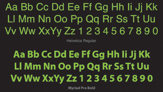
  • Sans Serifs are best recognized by their lack of ornamentation. With the advent of the internet and ever-evolving printing techniques, sans serifs are used consistently in almost every capacity due to their easy legibility at nearly every size. Sans serifs are most effective at quickly and concisely displaying information to the reader without any underlying emotional or visual triggers. Designers have also adopted the sans serifs’ simplicity to create a modern or minimalist feel when relevant to the design of their project. On the flipside, take extra care when using a sans serif for identity or branding efforts. The lack of decoration leaves little to brand as specific to one company or a visual identity. Common Sans Serifs: Helvetica, Arial, Verdana, Tahoma, Futura, Franklin Gothic, Gill Sans, and Univers
  • Sans Serif Typeface Example


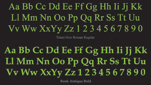
  • Serifs, in the most basic form, are a sans serif typeface with small finishing strokes at the beginning and end of each letter stroke. Serifs are commonly used as the default typeface by nearly everybody from the average email user to professional designers. From the design perspective, serif typefaces are often used for body copy because it is widely believe that the smooth arcs help lead the eye easily through large amounts of text. They are also a good choice for business and formal correspondence, marketing materials, and myriad media due to the under current of credibility and professionalism they project. Within this classification, there is a subset know as slab serifs, which feature block-like, heavy serifs that do not naturally run into or join to the next letter. Due to their weight, slab serifs should predominantly be used for headlines. Common Serifs: Times New Roman, Georgia, Book Antiqua, Garamond, Century Schoolbook, and Bookman (Common Slab Serifs: Courier and Rockwell)
    Serif Typeface Example


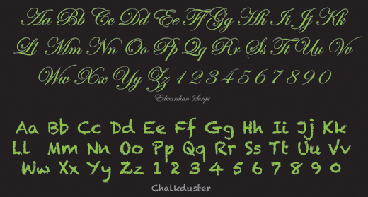
  • Script typefaces are modeled after handwriting, and are often used to introduce a human feeling or connection to the reader. Varying from child-like scribbles and chalk letters to elegant calligraphy, script typefaces are effective at introducing fun or sophistication to a computer-generated piece. Scripts are most often used in formal, or decidedly informal projects (see the example below). Scripts rule the world of personal design from invitations to announcements. However, the use of scripts in corporate design should be minimal, as they do not project authority and reliability. Common Scripts: Comic Sans, Monotype Corsiva, Mistral, Lucinda Handwriting, and Brush Script
    Script Typeface Example


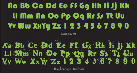
  • Decorative (also known as ornamental or display) typefaces typically fall into the serif category due to their highly ornamental nature. As their name indicates, they are highly decorative and best used to create or reinforce design styles and themes in large sizes (such as headlines). Their otherwise unique letter shape can be refreshing and attention getting. They can also be used to mimic the emotions and aesthetic of a specific genre or time frame. However, the intricate strokes often used to create these typefaces make them undesirable for use in large amounts of text or at smaller sizes, and therefore are not ideal for body copy.  Avoid using highly decorative typefaces in news or business reports, as they tend to detract from the neutrality for which most organizations strive. Be wary of over using a decorative typeface, or choosing a one inappropriate to the subject matter.
    Decorative Typeface Example


CONVENTIONS

When choosing typefaces its important to keep in mind the established conventions for the medium at hand. This is not to say that conventions cannot be broken — after all, design s all about breaking rules — but its important to know what the rules are before breaking them.

Websites and online projects require a typeface’s compatibility with the largest common denominator of computers, which usually necessitates the use of otherwise familiar or commonly used typefaces. As such, web standards have been quickly been defined with the use of a sans serif for body copy paired with a serif, script, or decorative typeface for headlines and subheads.

The opposite can be said for print pieces. It has become the collective opinion of most designers that the smooth arc and small leading lines of serifs helps the eye move comfortably through large amounts of text, and as a result, the serif has become the champion of body copy. In recent years, studies have proven that though serifs are not necessarily easier to read, rather our eyes are trained early on to believe they are. From this point the classic nature versus nurture paradox exists. Whatever the case, serifs remain the universal choice for body copy.


CUSTOMIZATION AND STYLING

To further customize or illustrate your intent, try playing with variations of weight (regular, medium, bold, heavy), width (narrow, condensed, extended), italics, outline stroke, and color. The adjustment of any of these components can severely alter the visual cues your typeface relays to the reader.

AVOID OVERUSE

Finally, and this can never be said enough — think twice before using the following typefaces: Comic Sans, Curlz, Papyrus, and Times New Roman. This is not an editorial on their quality or usefulness in the proper context. When observed in a vacuum, each font has its merits. Unfortunately, the designer needs to account for all external influences and these fonts have been overused to the point that even the most unobservant passerby can probably identify them by name. The last thing a designer wants when presenting information is to allow the message to be obscured by the typeface.

When choosing typefaces, classifications and best practices should merely be a guide to jumpstart the creative process. Good Luck!

The post Choosing Fonts & Typefaces appeared first on Design Reviver.


  •   
  • Copyright © 1996-2010 BlogmyQuery - BMQ. All rights reserved.
    iDream theme by Templates Next | Powered by WordPress