With bounce rate and time-on-site assumed to be the top trump cards in Google’s new algorithm; there is most certainly a push from Google — and subsequently advertisers — for websites to become more user, in addition to search engine, friendly. Read on to find our top ten tips for enhancing the user experience including everything from Search Engine Optimization (SEO) and rich media, to navigation and mobile device optimization.
1. Faster is always better.
It is not a newsflash that speed and load times rule the web. Every second a user has to wait, the more likely they are to leave your site. If you’re experiencing some lag time, try reducing the number of HTTP requests by simplifying the design, using CSS and CSS Sprites, combining images into a single file, and reusing elements — like page headers — which can reload from the cache. You can also create the illusion of speed by placing style sheets in the header. This will allow the header and navigation menus to load first thereby showing progress and pacifying user impatience.
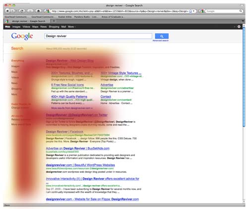
2. Simply site navigation.
The foundation to every webpage is the sitemap and navigation. Clear and concise menus are essential as well as a single page showing all links. Online reading patterns lend themselves to the typical “F” pattern (example below). To ensure that the user can easily interact with your content, keep a relatively short list of menu option down the left side and across the top. Be sure that all navigation info stays above the fold and that the logo links back to the homepage. Intuitive navigation outlasts number of clicks, so go ahead and forget about that 3-click rule. Not to imply that the user will stick out a lengthy path, but ultimately clicks don’t cause user frustration, poorly organized sites do.
3. Embed Rich Media
Tickers, videos, animation and other rich media options have changed the landscape of the web and help keep the user on your site for longer while they interact with more content options. Nowhere is this more valuable than on education, news and entertainment sites. The biggest hurtle to overcome with rich media embeds is software compatibility. Consider using a third-party hosting site like youtube.com and embedding the video directly on your site. This will level the compatibility playing field and remove the server-hosting burden from you.
4. Optimize for Mobile Devices
While designing (or redesigning) your site, the need to factor in mobile devices is pressing. There are several schools of thought regarding site optimization, but the most all-encompassing and user-friendly option is to simply use the same URLs as the standard website. Strip down the site content to only the bare essentials. Simplicity is of the name of this game. Avoid using scripting languages or Flash components, as most devices are not equipped to support them. Keep in mind the small screens and use small graphics or ads and content that are scalable.
5. Bookmarking
Listing your site on social bookmarking websites like Digg can drive quality traffic to your way and bump your page views. It can also have a cascade affect where a user will tag your site for yet another site where yet another user will tag it again, and so on. Bookmarking is a handy tool that is relatively easy and doesn’t require a ton of time to achieve.
6. Utilize Social Media links.
Social media sites have taken over the way users share information with one another. Give viewers an easy way to link content they like from your site to their profiles. Not only will it spread the word, it will also get the attention of like-minded users who will not only click out of curiosity, they will probably spend quality time on your site which will help bolster your chances in the search engine pool.

7. Clearly Identify and Brand.
Brand identity is essential in all forms of media, but is most important on a large and complex website. Be sure the company’s logo or name is clear in the header. Choose, colors, fonts and graphic treatments compliant with brand style guides and reinforce that look at every opportunity. The more comfortable the user is with the style, the more familiar they are with the brand and are more likely to come back time and time again.
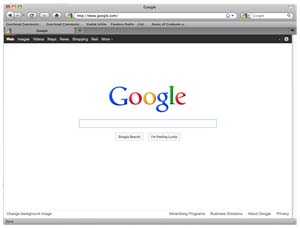
8. Search Bars are Essential
The more complex the site, the more essential the search bar . For user ease, stick to the tried and true method with an input field and a “submit” or “go” button located at the top, right of the page. Design the search bar cleanly with the font and color style already established for the overall look. In regards to search fields, less is more. Take Google for instance (see below), their entire brand is built upon the search bar and it remains simple and straightforward.
9. Strategically use Keywords and Titles
Be true to your content. Of late, Search Engine Optimization (SEO) has been all the rage, but don’t sell your digital soul for a few extra clicks. Google is working hard to filter and outsmart spammers who abuse the algorithm. Instead of getting caught up in the hype and fortifying your site with endless keywords, focus on how the user would look for your information and what words they might use. Be strategic in your keyword choices and get to the kernel of the matter to effectively garner the largest audience who will also spend the most time looking through your content.
10 Design. Design. Design.
Place big, attention-grabbing headlines above the fold, but don’t be overly concerned about making a user scroll. If you’ve successfully filled your site with quality content that is organized and clearly designed, scrolling won’t deter a user. The presentation of information requires a designer’s eye to ensure a site that is both aesthetically and functionally sound.
The post Web Usability: Top 10 Tips appeared first on Design Reviver.