Archive for March, 2022

Understanding & Optimizing the Buying Cycle for eCommerce Websites

No matter whatever the business is, the purpose of every business is to make a new customer.

And, in order to attract new customers, you must first better understand their requirements.

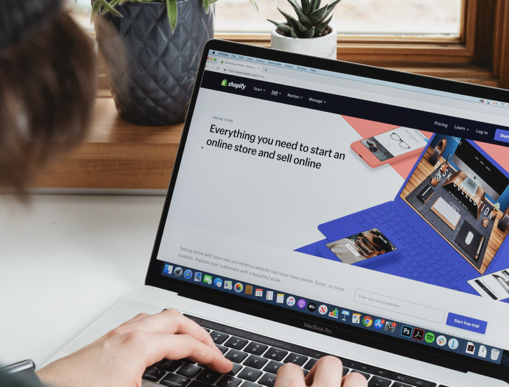
The shopping experience has changed dramatically in recent years, as we are increasingly using the Internet for all of our needs.

We surf the internet to find the solution for our every problem, not just to look for products.

Our constant research makes a fantastic business opportunity for entrepreneurs looking to acquire clients online.

To establish a successful customer affinity, businesses must shift their attention from promoting items to assisting prospects by giving them helpful information to facilitate the purchase process.

Businesses can have a good chance of converting a website visitor into a customer if they do so.

Recognizing how your consumers buy and aligning your eCommerce marketing strategies, pricing, and sales cycle can help you increase conversions & retention rates and decrease your selling expense.

One of the most common mistakes we see most SaaS organizations make is failing to coordinate their processes.

Let’s start with a simple explanation of the buying cycle to see how you may improve your sales process to meet your clients’ buying cycle.

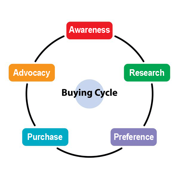
What is the eCommerce Buying Cycle?

The purchasing cycle describes the steps buyers take to make a purchase.

It begins with the client being aware of a problem and the need to solve it, followed by a search for and consideration of all available solutions, and finally, the purchase. 

Buying cycle evolves across multiple channels and platforms. Also, it can go for days and months, relying on your business type.

Because the Internet makes it so easy for customers to conduct their research before making a purchase, you must make it as simple as possible for them to do so. 

It is worth noticing that your business can’t control the customer journey with the company, but you can make it easy for them.

This blog article will go through the stages of the purchase cycle, as well as what you should do to guide your consumers through them.

How does the purchase cycle work for the eCommerce online store?

No matter how our shopping & research method is changed, we still follow a set of steps when it comes to purchasing important items.

Knowing these steps and also how they connect to your clients’ purchasing processes can assist you in focusing your efforts on giving them the content and information they require to move forward in the purchasing process.

Customers anticipate various interactions with you based on their steps; thus, each level necessitates a distinct set of tactics to push them to progress towards the next phase of the process. 

At each step, the aim isn’t to close the deal. Rather, concentrate on getting each consumer to the next level as quickly as possible.

Therefore, we should tailor our strategy and sales procedure to each customer’s stage of the buying process.

Let’s go through each stage of the cycle in further depth.

Knowing the needs

It’s the initial step of the buying cycle when potential buyers become aware of an issue and begin to look for a solution.

Also, this is the point at which a consumer understands who you are and what your business is all about.

This stage is crucial because it allows you to tailor your message to the target market niche.

This is the process of adapting different forms of marketing & advertising such as content marketing, paid advertisement, SEO for eCommerce sites, and many more to create a buzz.

Potential clients are more inclined to proceed in their purchasing journey with your site if they are aware of your products or services and how they would accomplish their goals.

Research & consideration stage

In this stage, customers are aware of what they want, and they will conduct research to obtain it. They will explore all solutions for resolving their problem.

You should put in more effort to showcase the advantages of your product and services.

This is also the time to give thorough information on how your product or service may help them attain their objective more simply than the competitors.

Some consumers are looking for scalability, while others are looking for a low-cost solution.

However, segmenting clients and establishing their most essential demands is critical at this phase.

Alternative Preference stage

This is the stage where prospects will compare all the alternatives which can solve their problem. 

They proceed to weigh their options and limit their options until they find the one thing that they are happy with and can afford.

It’s time to pamper your customers if they need some more info to choose you over your competitors.

Since your involvement throughout the evaluation stage is crucial, try to have customer contact details on hand so that you may gently give any further information the buyer/reader may want.

It’s now up to your sales force to convince clients that your service or product is the best option among the alternatives they’re evaluating.

Each consumer will ultimately be willing to hit the trigger on a purchase and go on to the next stage: buying.

Purchasing stage

You’ve succeeded in convincing prospects to this point. Don’t back out now they’ve chosen they would like you to sell to them!

Keep it as seamless as possible for customers to buy from your website. We frequently encounter websites that begin to add on fees, complicate delivery alternatives, or send out heaps of information.

Make every effort to guarantee a smooth transition from a decision to delivery.

Here are a few pointers to help you:

  • Provide all key data, such as the returns process, shipping cost, and warranty conditions, as quickly as possible, preferable on the product page.
  • On the checkout page, don’t add any extra fees.
  • If at all feasible, provide a free delivery option.
  • Make the checkout procedure as easy as possible for your customers.
  • Use discounts and special offers to attract customers to buy.

Post-purchase stage

Customer retention ought to be a big aspect of your entire business plan as an e-commerce organization. Consumers that have already purchased from you are familiar with and trust your shop. Therefore, they require less ‘convincing’ to do so.

Furthermore, as well as your business providing exceptional customer service, devoted clients will most likely recommend your business to their friends and family through word-of-mouth, which is, in my perspective, the most potent kind of branding.

You may establish a great client retention plan for your organization by utilizing loyalty reward programs, referral discount codes, and thank you coupons.

Why is the eCommerce customer buying cycle important?

It is noteworthy that even the most successful companies only convert a small fraction of their prospective clients. The remaining prospects, though, are still in the process of purchasing. They may or may not make a purchase.

You will wind up the customer journey with your store if you haven’t grasped the customer’s perspective while making a purchase. 

Your visitors’ decisions on whether or not to buy from your site are primarily influenced by their experience & interaction with it.

Adopting the client’s perspective and attempting to comprehend what your potential consumer expects from you with the first stage of the buying cycle to the final purchase may assist you in succeeding.

Understanding the purchase cycle also aids you in developing more successful marketing strategies.

How to improve for each stage of the purchasing process

The purchasing procedure can’t be sped up. Rather, tailor your sales and marketing efforts to each stage of the buying process. 

Let’s take a look at what you should do at each stage to help clients go through the buying process.

Optimize stage 1: Knowing the needs/ awareness

To optimize this stage, your customers should be aware of your products as well as the fact that your product can solve almost all problems.

To get more awareness about your product first, you need to find your prospect’s problems and what they are looking for.

Start publishing the targeted content at the places from where your target audience can find it easily and also get support in resolving certain difficulties.

Optimize stage 2: Research & consideration 

At this stage, customers look for the best solutions available for their problems.

Again targeted content can come to the rescue — articles, case studies, and videos all educate buyers about your solution and emphasize reasons to select your product over rivals.

However, you can also create multiple price tiers with product options tailored to certain consumer personas or price ranges.

Now your prospects know what they want and why to choose your product over your competitors.

Optimize stage 3: Alternative Preference 

In this buying cycle phase, you need to convince your potential customer to buy your product.

You can win by earning trust rather than educating prospects at this stage. Now it’s your product’s turn to speak about its quality. 

Customer reviews, product advantages, success stories, social proofs to your website, existing customers’ logos can increase their trust and push them toward making a purchase.

Optimize stage 4: Purchasing phase

Finally, your prospective consumer decides to buy. Your consumer is willing to invest in your solution.

Check whether your price is correct and what your clients expect to spend. To optimize your income, always choose value-based pricing.

Optimize stage 5: Post-purchase phase

Ensure that your consumer is happy with your service and goods in this final stage so that he will remain loyal to your company.

Request reviews or case studies from your satisfied clients as they get more experience with your business, or encourage them to suggest you to other potential consumers.

Loyalty and referral programs might help you boost your retention percentage.

Let’s wind it up

Finally, keep in mind that your eCommerce website is ultimately intended for your consumers.

Knowing each phase of the online purchasing process will assist you in structuring your marketing and advertising resources to fulfill your customers’ needs. 
Analyze what your consumer goes through while making a purchasing decision, and adjust your business appropriately. So you can better understand your customers and engage them in your business.

The post Understanding & Optimizing the Buying Cycle for eCommerce Websites appeared first on noupe.


Factors to Consider when E-commerce Replatforming?

Online retail is rapidly evolving, and with it comes new technologies that can be incorporated into e-commerce websites to enhance the platform and boost the functionality of existing systems. Changing an e-commerce platform is a cost-effective way to achieve this while getting a headstart on future innovations that are yet to be introduced to the e-commerce world. The process of re-platforming can be a difficult task for an online retailer, but in the long run, it can provide a business with the ability to offer new and improved functionality. 

But as with any successful e-commerce strategy, you must be well-informed before making any major changes to your existing business. Before re-platforming, it’s important to understand e-commerce replatforming, the benefits replatforming will have on your business, and what you need to consider. Nevertheless, e-commerce replatforming is by far one of the best decisions you could make for your business, as it can breathe new life into your brand and business model.

What is E-commerce Replatforming?

E-commerce replatforming refers to the process of choosing and migrating to a new e-commerce platform. Online retailers switch to new platforms to improve:

  • Functionality
  • Performance
  • Customer experience

Replatforming can mean building an in-house e-commerce solution or moving to a third-party platform. It could mean moving data from one online store to another at a basic level. For some businesses, this process includes:

  • Comparing platforms
  • Installing a new system
  • Transferring data
  • Setting up a new e-commerce site

Online retail will continue to evolve whether you choose to change with it or not. These advancements in technology provide online retailers with new features, design capabilities, improved performance, and functionality. You will need to replatform to keep up with customer demands, industry/market changes, etc.

What is the Importance of E-commerce Replatforming?

The first e-commerce site you operate usually offers basic performance that might seem slow, poorly designed, and incapable of meeting customer needs as your e-commerce site grows. Contrariwise, you can find that you’re paying for features you don’t use, or your costs are too high – in this case, you should downsize to save money. Maintenance and upkeep could potentially burden your team, whether the tool is provided through a built in-house or third-party solution.

When to Consider E-commerce Replatforming

Replatforming is a substantial task that will take effort and time but will improve design, functionality, admin navigation, performance, and more. However, replatforming should be done for the right reasons:

  • Poor User Experience: Customer experience is a priority for every kind of retail. When your user experience is compromised, you should consider replatforming
  • Admin Functions Poorly: A cumbersome admin panel results in poor navigation, resulting in less output. The solution would be switching to an intuitive and simple admin
  • Inadequate Performance: Intermittent and consistent performance issues translate to poor customer experience, which will affect your entire business.
  • Gaps in Your Existing System: When there are gaps in your existing system, migrating to an e-commerce platform with better features can lead to immediate improvements where you need them most
  • Repetitive Tasks: Replatforming can help you cut out repetitive, duplicate, manually performed tasks through improving interfacing and functionality
  • Site Speed and Responsiveness: A fast, responsive site is key to retaining customers. Replatforming enhances your website hosting service and limits your plugins keeping your site efficient and streamlined
  • Multiple, Easy-to-Use Integrations: Outdated systems don’t integrate with new plugins; replatforming offers you a platform that easily integrates with multiple plugins
  • Time-Consuming, Costly Maintenance: If your current site mandates time-consuming, costly, or regular maintenance, replatforming could offer you better performance
  • Streamlined, Accessible Analytics: Proper analytics allow you to make significant improvements and draw meaningful insights. Replatforming allows you to collect, measure and display accurate data

What You Need to Consider When E-commerce Replatforming

1. Impact on Your Business

When preparing for replatforming, you should consider its impact on your business in terms of efficiency, performance, and design. Replatforming is only valuable when it provides significant improvements to your e-commerce platform’s output, functionality, and performance. Before switching platforms, ensure that it’ll be worth the effort and additional costs.

2. Future Improvements and Needs

It’s important to look beyond the initial capabilities and features you can get from replatforming since it’s a long-term investment. Although you might want to settle for an immediate solution to your existing e-commerce tool problems, you need to ensure the tool you purchase will adapt to market changes and meet your needs even when a new, disruptive technology is introduced.

3. Total Costs

Costs aren’t limited to the cost of purchasing a new platform; there are also migration, down-time, and maintenance costs. You will also have to train your staff on operating the new platform, which means there’ll be a brief period of poor performance as they adjust. Assess the total costs to be incurred before proceeding.

4. Customer Service and Support

Despite how capable your team is, choosing a solution with adequate customer service and support is crucial. The right solution should help you solve errors properly and quickly when they arise. Building your own solution leaves your team accountable while purchasing a full-serviced platform offers you the support and assistance you need to operate your e-commerce store.

5. Skills and Ability of Your Team

Your team’s technical skills are key to determining whether you can re-platform and how fast you can adapt. This includes content creators using a new CMS for the first time and those migrating data and setting up the new platform. You need to choose a tool that saves you time and effort when setting up and adjusting.

6. Integrations With Future and Legacy Systems

Your legacy system probably uses plugins, extensions, and other integrations that improve your sales, marketing, project management efforts, and communication. Before replatforming, ensure the new platform will support the integration you use without reducing performance. It’s vital to do a complete technology audit of every extension and tool you are using to determine whether you’re compatible with the new platform.

7. Features and Capabilities

The main purpose of replatforming is to get enhanced functionality. Compare the features of your existing e-commerce platform with those of the new platform and choose a solution that offers the most important features for your business to improve, develop, and grow.

Make Sure You Are Ready for E-Commerce Replatforming

If you’re not satisfied with your existing platform, replatforming could help you realize your brand’s potential. Replatforming might seem like a daunting task, but it can prove extremely beneficial for your business. Still, e-commerce replatforming isn’t a decision to take lightly; you should do extensive research and prepare your team before going through with the migration.

The post Factors to Consider when E-commerce Replatforming? appeared first on noupe.


How Efficient Site Structure Can Boost SEO Ranking

Getting your website architecture correct is one of the most critical technical SEO fundamentals, yet it is sometimes disregarded.

A website should not be a collection of random pages and content. It should be a well-organized collection of material that is simple to explore and comprehend for both search engines and people.

What Is Website Architecture?

The architecture of a website refers to how information (pages and articles) is organised. This is also known as your website’s architecture and is concerned with how your information is connected together and shown to visitors and search engines. It’s the framework for your website.

A decent website architecture allows people to easily move between pages and allows search engines to scan your material and comprehend what your site is about.

Consider how your website’s pages connect to one another, especially how they branch off your homepage and are classified into deeper directories.

In addition, creating a website architecture entails taking into account your:

  • URL structures
  • Navigation menus
  • Categorization
  • Breadcrumbs
  • Internal linking

There are many different types of website structures, but the three most common site structures: 

Hierarchical: One of the most prevalent styles of site architecture is the hierarchical model. This model resembles a tree with a trunk. The trunk would be the homepage, and the branches would be all of the other categories and pages. Databox is an excellent example of a website with a hierarchical structure.

Sequential: When it comes to generating individual web pages, the sequential paradigm is more prevalent. The fundamental concept is to guide the user step by step through a procedure. The Databox help articles, for example, are all created with a sequence in mind.

For example, a sell courses online site or sales funnel. A sequential website structure will guarantee consumers follow the stages since you want the procedure to be as simple as possible.

Database: This method necessitates paying close attention to tagging and metadata in order to generate a searchable database that consumers may access. Site search is getting increasingly popular, and it may be a useful tool for driving conversions.

Site Structure and SEO

The site structure is one component that search engine algorithms consider when ranking web pages. The structure of your website refers to how it is set up or how its pages are appropriately linked to one another.

If your website is not properly configured, search engines may find it difficult to access and index it. That is why, while constructing and putting up material on your website, marketing, and content professionals may establish an SEO silo to guarantee the structure is constructed appropriately.

Web pages and material are arranged into silos based on subjects and hierarchy. As previously stated, this enhances site structure, resulting in more positive search engine results. Other particular aspects of your structure that influence SEO are explored further down.

Site Structure for Users

User experience (UX) relates to how visitors feel when visiting your website. It’s especially crucial in today’s society, where people’s attention spans are shrinking. This makes it difficult for site designers to captivate and retain their viewers’ attention. As a result, if you want to retain readers on your site, you need more than simply great information; you also need it to be correctly arranged.

Using headers for your site content is an easy way to do this. Clear and accurate headings can assist your readers in scanning through your material and swiftly understanding it. They would often include keywords and phrases to aid in the improvement of your website’s SEO rankings.

A well-designed website can have an impact on accessibility. Web accessibility implies that persons with disabilities, such as those with vision or hearing problems, can easily utilize your website. It’s seen to be a key influence in offering exceptional UX, which may lead to higher rankings.

An example of this is with sell courses websites that have high-level product categories (e.g., shirts) that flow into smaller categories (e.g., t-shirts, blouses, knits) that flow into individual product pages.

Speed and Site Performance

Another important element influencing UX is how effectively each page has been created and how it helps to the overall performance of your website. This section addresses your site’s loading speed and downtime.

A sluggish website not only irritates users, but it may also harm your rating. This is because many people consider page speed to be the most important user-experience satisfaction score for mobile searches. Furthermore, the number of users that bounce from your site might be determined by the downtime of your website, resulting in a less-than-desirable SEO effect. As a result, if you want to gain a competitive advantage in SEO, you should prioritize enhancing your website’s loading time and general performance.

Caching plugins and content delivery network (CDN) services are two options for accomplishing this. It’s also a good idea to keep your website’s plugins up to date. Finally, it might be beneficial to hire a web design business to restructure the structure of your site for faster loading times and other benefits.

Crawlability

“Crawlability” is a term used frequently in SEO. It relates to how readily search engines can access and index the material on your website. A well-structured website may improve your SEO rankings by allowing search spiders to index as many pages as possible in the least amount of time. Indexing pages is critical because it allows your information to be found on the Internet.

Mobile-Friendliness 

It is claimed that the majority of people nowadays use their cell phones to access the internet. This implies that you must guarantee that your website has a mobile-friendly structure.

The layout of mobile-friendly websites is streamlined, making it easier for visitors to browse. They also feature a responsive design, which allows the site to instantly alter its size and layout according to the device used by the visitor.

With the growing number of mobile users, well-structured websites make it simpler for them to access your site, increasing traffic and favorably impacting your online presence.

Security

Security is still seen as a major concern for site owners. Users and potential consumers can no longer trust a hacked website, thus resulting in income loss. It also implies that your site’s rating may suffer since search engines take security into account when deciding a website’s position. As a result, when designing the structure of your site, you must consider the user’s security.

Follow these guidelines to keep your website secure:

  • Use a current content management system (CMS).
  • Create strong passwords and update them on a frequent basis.
  • Install and maintain a security plugin on your website.
  • Back up your website on a regular basis.

Remember that a well-structured website is important for more than just your SEO ranking and user experience.

Content and Links

Many people are unaware that certain sorts of material might have a detrimental impact on your site’s score. This is especially true in situations of duplicate material, as users may interpret it as a symptom of a badly maintained website.

Furthermore, users may become perplexed if they encounter identical material on many sites. To avoid this, ensure that all of your website’s material is unique and of excellent quality. You may do this by developing original content and double-checking for duplicate material on various parts of your website. This will aid in the improvement of your SEO rankings as well as the overall user experience.

Internal link architectures are also important for both consumers and search engines. They assist people in navigating your website and supply data to search engine crawlers. Broken links, on the other hand, might cause your site to lose ranking. This is due to search engines seeing it as a symptom of poor website upkeep.

Furthermore, broken links might frustrate users by leading them to dead ends or irrelevant pages. To prevent this:

  • Using a link checker tool, examine your website for broken links and fix them right away.
  • Maintain the content of your website so that consumers do not discover broken links.

Format

URLs are another critical component of your website’s structure. They are the addresses that uniquely identify each online page. Use short, easy-to-remember URLs when constructing your website to make it easier for people to browse and remember your website’s address. Using relevant keywords in your URLs can also assist enhance your SEO rankings. If you are stuck, a URL shortener tool might assist you to come up with a URL.

Keywords

Keywords are a critical component of your website’s SEO. Choose relevant keywords that you may employ across the site to boost search engine exposure while developing your site layout. However, remember not to overdo it. Excessive keyword usage makes you appear spammy, which is poor for both SEO and user experience.

Images

High-quality photos are required for a well-structured website. This, however, does not end with high-resolution photos. You should also optimize your photos to reduce the time it takes for your website to load. As a general guideline, you should strive for an image size ratio of 1,200 px x 675 px and a 16:9 aspect ratio per file. If feasible, employ compressed pictures to further minimize the loading speed of your website.

Alt-text is an essential component of your website’s photos. This is because it assists search engines in comprehending the information of your image. Furthermore, it can be used as a ranking indication. To make the most of your photographs, you can also include informative alt text that appropriately characterizes the image.

Conclusion

Correctly structuring your website is critical to your SEO ranking. It will be easy to boost your site’s SEO rating and organize it to attract more traffic and conversions if you pay attention to the areas highlighted in this article.

The post How Efficient Site Structure Can Boost SEO Ranking appeared first on noupe.


10 Best Practices for Creating Exceptional Website Pop up Design to Increase Conversions

How do you catch visitor attention when even the most creative ads are, by definition, an interruption and the majority are viewed almost universally as a nuisance? 

It’s a formidable challenge that marketers face in a world of shrinking attention spans. 

What if we told you that you could do it with good old-fashioned pop ups provided you follow a few guiding principles that underlie some best practices?

If the name alone can cause conniptions, we know their reputation for irritation goes before them. 

Yet despite this, most folks aren’t terminally averse to pop ups per se. Look no further than how long they’ve stuck around and their current use. 

Play by the rules of permission marketing and combine that with exceptional design, and you can reach customers with your message. 

And here’s the thing: we don’t see them going away anytime soon. 

Pop ups can help you expand your subscriber list and give your conversion rate a jolt.

One of the fastest routes to increasing conversions is having an understanding of your customer’s buying habits. That means having a firm grasp of important metrics, such as knowing AOV meaning and conversion rate. Track them together to calculate your gross revenue. To optimize their average order value, businesses can add cart reminder pop ups to encourage visitors to purchase product bundles or avail of volume discounts.

People, it seems, are happy to engage with good designs and offers that add value.

With that in mind, we’ve created this guide.

Read on as we explore 10 best practices for putting together exceptional website pop up design that converts. 

1. Consider different types

The most familiar default pop up design is the square window that appears in the middle of the screen. In an e-commerce context, these are probably the most aggressive kind and interrupt browsing. This front-and-center approach can be used to signify something important. 

For example, consider a healthcare contact center setting where there’s a need to maintain critical service levels. Alerts automatically pop up for supervisors when levels dip below a specific threshold. 

Image Source

In business, this type of pop up is best when you’re confident your message is click-worthy or used as a bold exit-intent trigger. Examples include offers for immediate purchases or journalism paywalls.  

The slide-in pop up is popular because it allows visitors to choose whether they want to engage. Subtle and unobtrusive, this type can go a long way toward getting users to opt in for teaser content such as an email newsletter that actually gets read.

Animation is another worthy design consideration. Higher-effort approaches can feel less like an ad and more like a creative, aesthetically-pleasing feature of the website pop up design that elevates the user experience.

2. Match pop up design with site branding

Why align the design of your pop up with the branding of your site? The reason goes back to the genesis of the pop up and its fallen status ever since as a pesky intrusion. 

Website pop up design tactics used to be so breathless, salesy, and heavy-handed in their use of colors that the original creator felt the need to apologize. 

Add in the fact that scammers use pop ups to deceive users into downloading malware. In this context, today’s brands use designs that complement the rest of their content to grab attention in a way that earns trust. 

It’s a more subdued approach. But using visual hierarchy and enticing images can produce a cleaner design and ensure your pop up appears like a genuinely good offer, which off-brand, gimmicky tactics can undermine. 

It’s also a safe bet for increasing conversion rates, generating leads, and decreasing your cost per purchase.

Image Source

3. Communicate effectively with color and shape

There’s nothing too surprising about this one. Visual elements, such as color and shape, are essential to a good design that avoids bounce rates. For example, pastel colors can emanate calmness, while white can evoke a sense of mental clarity. 

Loud and proud colors will make your message stand out, and a stark contrast of light versus dark can be a stylish plan. 

Likewise, your choice of shape also speaks to visitors. Rounded shapes communicate much-needed approachability in contrast to the sharp edges of traditional square windows. 

4. Nail CTAs

Visitor attention spans aren’t getting any longer. And when it comes to pop ups, the instinct to close them immediately is near Pavlovian. Given such a short window of opportunity, keep their content clear and to the point.

Here’s where your call-to-action (CTA) comes in. Make a point to use hard-hitting copy to get users to act quickly. Craft powerful headlines that crystalize the benefits of your offer if they take the action you want. Use contrasting colors to make great CTA buttons that can’t miss. 

5. Use fewer fields to increase conversion rates

You’ve heard of unified field theory, right? No, we’re not talking particle physics. We mean the simple fact that asking users to fill out fewer input fields makes signing up that much quicker. But because the more information you can get about your prospects is usually the better, this is easy to overlook.

Note that you can get in touch and follow up with those who sign up with their email address later. If it’s an important prospect, you can always improve your business communications with an HD call once you’ve started the ball rolling.

As well as saving precious seconds that can entice new subscribers, many folks are uneasy about parting with too much personal information. The data is in – fewer fields mean less effort for customers and more conversions. 

Image Source

6. Design separately for mobile

Mobile is taking over e-commerce, and companies are now reaping the benefits of providing better customer service by having their own business app. While Google can penalize site owners whose lackluster website pop up design hampers the mobile experience, you needn’t refrain from using them entirely. 

But you do have to know how to design them for different devices. Mobile pop ups can still be a confusing nightmare to navigate.

Following best practices for mobile pop ups means scaling down your desktop designs and reducing the number of elements that can fit into less screen space. Mobile designs need to be optimized for a portrait orientation. Plus, there’s the fact that fields are harder to fill in using one hand and a thumb. Minimalist design with defined buttons will keep them tap-friendly. 

Conversely, mobile design uses unique kinds of input that intelligent website pop up design can exploit. The solution? Follow the suit of designers who use a mobile-first approach and start by designing a separate mobile version. 

7. Personalized offers and conversational copy establishes credibility

We’ve come a long way from the days of ubiquitous, in-your-face pop ups. Consumers are pretty much over those thoughtless designs.

How can you regain the trust of jaded site visitors? Regain trust by being sophisticated in how you frame messages. Remember, you’re adding value and providing helpful tips. Offers that ask users for their input and preferences also work well.

Pop ups with personalized offers have better vibes than those that feel like traditional ads and nudge consumers to share personal information. That’s because they encourage interaction with your brand and cultivate the connection essential to trust. For similar reasons, ditch stuffy business-speak. Instead, be sure to communicate with your potential customers in a friendly and conversational tone. 

8. Pay attention to fonts and spacing

Image Source

Another important element is fonts. As a rule, sticking with your standard website font for your pop up copy will increase readability. And you can combine different fun fonts for headlines – up to a maximum of three. Experimenting with different fonts can accentuate your message. 

One thing you can’t experiment with, though, is spacing. Consistency is key to professional-looking pop ups. As your invisible content, it’s an easy thing to neglect. When your pop ups are askew, it’ll soon show up in your conversion rate. 

9. Iterative design

While these are tried-and-true best practices, every business is unique. You probably have your own ideas about what looks good to you. And, of course, theories, tips, and tricks can point you in the right direction. But what really matters is performance. Does your design drive conversions? The only way to find out is to test and evaluate it. 

Once you have your findings – from A/B tests, for example – you can make changes and continue to refine your design until its performance meets your goals. Tracking design metrics is just as important as all other essential metrics businesses monitor to stay afloat (depending on company size, these usually fall under the remit of revenue operations and sales operations).

At the end of the day, consumer opinion gauges whether or not your design works. 

If all this talk of instant testing and changing speaks to a need for remote agile team collaboration, don’t worry, we’ve got best practices for that too!

10. Don’t sleep on the close button

Okay. We’ve already covered the importance of compelling CTAs for optimizing conversions. How showcasing tangible benefits makes offers feel more valuable. Alas, while your design aims to get users to convert, most will look to close your pop up. The kind of good user experience that pays dividends in the long run hinges on their ability to perform this action.

Image Source

The most common option is having an X in the top right corner. However, some websites favor a slightly less prominent sweet spot or use negative language to highlight value missed. 

Crucially, this ignores the visitors who don’t click through yet still become customers. And that exasperation at your sarcastic pop up can so easily spill over and hurt your brand. 

Wrapping up

If you’re a skeptic and think pop ups are impossibly old school, we get it.

And yet, it’s not for nothing that millions of eCommerce sites still depend on them. 

Modern, sophisticated website pop up design can thread the needle of catching visitor attention and getting a hearing for your offer. 

We hope these best practices can cause you to rethink their potential. Ready to opt in NOW?

The post 10 Best Practices for Creating Exceptional Website Pop up Design to Increase Conversions appeared first on noupe.


How to Develop a High-Converting Multilingual Content Marketing Strategy

While it’s a great start to translate and localize the content on your website to get started with a multilingual content marketing strategy, those are not the only aspects to keep in mind if you want to see a positive ROI on your marketing strategy.

You’ll need to adapt your multilingual content marketing strategy for every new market. And this includes everything from the images and wording on your site to the channels you use to promote your brand.

To ensure that your multilingual content marketing strategy is effective, you’ll need a deep understanding of the language your new audience speaks as well as how their cultural norms affect their buying preferences and preferred methods of consuming information. But first, let’s tackle an important topic:

What Exactly is a Multilingual Content Marketing Strategy?

Multilingual refers to many languages. Content marketing is a marketing strategy brands use to attract and engage audiences by promoting content like blog posts, videos, and podcasts.

So, multilingual content marketing is the process used to market content to consumers who speak different languages. These kinds of marketing content projects support multiple languages across various social media platforms and other marketing channels to engage with the audience in a new target country. The success of multilingual content marketing campaigns relies on your ability to adapt your content and brand image to the target audience and their language and culture.

Multilingual content marketing calls for more than translating your existing content and calls for localization.

Cutting corners with a foreign audience is one risk that brands can’t afford to take. If you want to see your multilingual content marketing strategy yield positive results, here’s how to set the stage for success…

Steps for Developing a Multilingual Content Marketing Strategy

1 – Stay Focused on Your Core Message

There are many different rules and requirements for localization in every country. And these differentiations can see you straying away from your core message. You don’t want to adapt to the new market’s tastes to the point where you jeopardize your brand’s reputation. You can, however, adapt brand behavior, as long as it doesn’t interfere with the core essence of your brand. Think of McDonald’s. They might adapt their menus to suit local tastes in different locations, but you’ll find their happy message (and meals) wherever you go. A multilingual content marketing strategy is not about changing your core message. It’s about deploying smart adaptations to highlight the strengths of your core brand identity.

2 – Aim for Easily Localizable Content

It’s much easier to keep localization costs low and stay on schedule when you create content that is easy to localize for the purpose of a multilingual content marketing project. Although it’s plausible for big global brands like Coca-Cola to pay for transcreation techniques in every new market, most brands need to keep tabs on their localization budgets. The aim of creating content that’s easy to localize is to remove overly-complicated language, cultural idioms, phrasal verbs, and local jokes. This makes it easier to repurpose existing content for countries that have similar consumer behavior patterns. With this approach, you can use similar content to target internet users with similar content marketing strategies. 

3 – Localize Your Brand Message for the Target Audience

This is the part where you ensure that your brand message feels authentic to the target audience. And this is where you’ll need localization experts to research appropriate images, colors, date formats, and icons to ensure that your marketing strategy strikes a chord with the new audience. It’s important to gain a deep understanding of current affairs, places, and specific cultural references that need to be included in your message to give it more appeal. And localization professionals offer turn-key localization services that offer all of this and more.

4 – Make Sure You’re Using the Right Translation Management Software

Any multilingual content marketing strategy requires the input of various people and assets like marketing specialists, translators, project managers, and developers. And when you’ve got a widespread team of people working in different time zones and languages, it can be hard to keep track of everything. Your translation management software can help with this since it allows you to integrate with project management programs like Slack too, enabling effortless team communication on one platform. Translating your WordPress site using a centralized software that acts as a project manager and eases coordination between all stakeholders makes it easy to create an effective multilingual content marketing strategy.  

5 – Don’t Forget About Keywords and SEO for Each Target Market

It’s critically important to use the right keywords and SEO tactics for each new market you enter. You also need to keep in mind that keywords change from one language to another, and they also differ on a regional level. In a day and age where search engines play a central role in brand visibility, you can’t afford to underestimate the importance of SEO in a multilingual content marketing strategy. 

6 – Create a Style Guide

A company embarking on a content promotion strategy should make it as easy as possible to achieve a consistent message across every platform and for every publication. It is the same for design colors and logos and the same for text. Your readers can easily identify you and recognize the brand you are using at the moment. Style guides are crucial if a team of content marketers has several colleagues. This will provide clear guidance to help your brand remain consistent with its values. The idea may take a while but your efforts will be rewarded by an established brand identity.

Wrapping Up

We’ve given you an overview of the most important things to keep in mind when creating a multilingual content marketing strategy. It can take much longer than you think to identify demand in a new market and learn to understand the culture, tastes, and preferences of your new audience.

That’s why it’s important to stick to your brand’s core message and identity. You’ll want to make things as easy as possible for future localization projects by creating content that’s easy for native professionals to localize. The right translation management software can also make a world of difference. Although it’s not always the easiest task to coordinate a successful multilingual content marketing strategy, it definitely is achievable.

The post How to Develop a High-Converting Multilingual Content Marketing Strategy appeared first on noupe.


  •   
  • Copyright © 1996-2010 BlogmyQuery - BMQ. All rights reserved.
    iDream theme by Templates Next | Powered by WordPress