Design

Seven Guidelines For Designing High-Performance Mobile User Experiences

Advertisement in Seven Guidelines For Designing High-Performance Mobile User Experiences
 in Seven Guidelines For Designing High-Performance Mobile User Experiences  in Seven Guidelines For Designing High-Performance Mobile User Experiences  in Seven Guidelines For Designing High-Performance Mobile User Experiences

A positive first impression is essential to relationships. People look for trust and integrity, and they expect subsequent encounters to reflect and reinforce their first impression. The same principles apply to brands and their products. Design plays an important role in building lasting relationships with end users and, thus, in supporting the brand’s promise.

Users expect mobile services to be relevant and user-friendly and to perform well. The limitations of the medium, however, impose significant challenges to designing products that meet all of those expectations. While often underestimated, performance is a crucial contributor to a trustworthy mobile user experience. Therefore, it should be considered a key driver in the design process.

In this article, we’ll discuss performance in relation to design and present seven guidelines that can help shape design decisions related to performance while accounting for the needs of end users and businesses. These guidelines are based on the experiences of our teams in designing native mobile apps for a broad product portfolio and on multiple mobile platforms.

Performance For Mobile

People use their mobiles to enhance productivity, comfort and pleasure, everywhere and at anytime: waiting for the bus, walking on the sidewalk, checking which platform their train leaves from. Mobile applications need to focus on a core utility, and they need to be fast and reliable in order to be valuable in those environments.

Paradoxically, we’ve noticed that many mobile design cycles start with requests for great aesthetics first: “It has to look amazing!� Of course, stunning visuals will attract customers by making a great first impression. However, a long-lasting relationship depends on the quality of each encounter, which is also heavily influenced by how the app performs. An application that looks stunning but performs poorly can damage integrity. Users quickly notice software that is slow or likely to break (whether because of downtime, crashes, etc.), and this impairs both usage and brand perception. Users expect an app to be fast and responsive. If it’s not, it will get poor reviews, low ratings and low adoption numbers.

Mobile-apps in Seven Guidelines For Designing High-Performance Mobile User Experiences
The visuals in the Twitter app are not as rich as Cookmate’s (which are stunning), but reviews for the Twitter app in the App Store are much better.

Performance Supports Brand Differentiation

Every product encounter affects the brand perception. Users are looking for the best tools to enhance their lives. To attract a significant user base in a landscape that is becoming more populated each day, a mobile app has to stand out. It should do something no other app does, or do it better than others do. These benefits reinforce the brand. Because performance is an essential element in the user experience, it directly helps to differentiate the brand. Taking this one step further: making a technically challenging feature perform smoothly will give the product a unique selling point, one that will be difficult to imitate.

A good example is the Flickr iPhone app. Flickr states on its website that it has two main goals: to help people to make their photos available, and to enable new ways to organize photo and video. Guess what? That is exactly what its app does well, thus fulfilling its brand’s promise.

Flickr in Seven Guidelines For Designing High-Performance Mobile User Experiences
Flickr does a good job of optimizing the key brand encounters.

So, when planning an app, it is worth analyzing the market and trying to answer two questions. (1) What should it do differently from its competitors? (2) What should it do better than its competitors? Then, focus your design and development efforts on the resulting top three goals.

A Key Design Exercise

Crafting products of any kind requires an appreciation of the way they are built. Well-established design and engineering disciplines have recognized this for a long time. A car’s design influences its aerodynamics. A beautiful eye-catching bridge has to cope with wind and with traffic passing over and beneath it. The same applies to interactive mobile services. Design choices affect features, content, interactivity, graphics and, therefore, performance.

We’ve noticed on several product teams that performance is believed to be exclusively the responsibility of developers, and therefore it is considered too late in the design process. But in order to assess feasibility, development needs to be considered during the creative process. Applying the seven guidelines below and considering relevant factors for mobile UI (see the next section) up front will help to incorporate the topic of performance into design discussions. Achieving a high-performance experience is not just a coding exercise. It is a key design exercise.

Erasmus in Seven Guidelines For Designing High-Performance Mobile User Experiences
The Erasmus bridge in Rotterdam, the Netherlands. (Image: Wikipedia)

Relevant Factors In Mobile UI Performance

The perception of performance is based on start-up time, page-loading behavior, smoothness of transitions and animations, errors, and waiting times. The diagram below illustrates these factors: the “app� (with its graphics, interaction, content, features and code) runs on a “mobile� device with certain technical capabilities (CPU, screen size, etc.) and a platform (Android, iOS, etc.). In many cases, the app connects over a “network,� with a set coverage and standard (LTE, 3G, 2G), to a “back end.� The two factors at the top are heavily influenced by the decisions of the design and development team. The bottom two factors are constraints that need to be taken into account.

Model4 in Seven Guidelines For Designing High-Performance Mobile User Experiences
Factors that influence performance.

Decisions for each factor will affect performance. Any combination, enhancement (such as advanced visuals) or limitation (such as poor network coverage) could increase complexity. For example, content being loaded from the back end in addition to advanced graphics traveling over a slow network are a combination of factors that will reduce performance.

Seven Guidelines

The last years have seen dramatic changes in the mobile platform landscape. New UI paradigms have emerged, screens and processors are becoming as advanced as desktop computers, and input mechanisms have been revolutionized.

Within these shifting constraints, designers should always try to create a look and feel that is cutting-edge, memorable and high-performing. This is not just a matter of reducing image sizes. Decisions made at various levels of the design and the design process will have a significant impact. Let’s look at seven guidelines that have proven to be helpful tools at all design levels to achieve high-performing mobile user experiences.

1. Define UI Brand Signatures

Each user interaction with an app should reflect the story of the brand and should increase recognition, loyalty and satisfaction. Identifying which elements contribute most to the brand’s identity is essential. Examples are features, visuals, wording, fonts and animations. Our design teams work on many different products on different product teams. This could easily lead to several design and implementation variations of similar UI elements. Defining the core building blocks encourages reuse and discourages reinvention and, therefore, optimizes the design and implementation of a set of components.

One approach is to define the UI elements that form the core building blocks of the user interface and, together, to create the interface’s unique character. In the concept phase, identify those elements that do the following:

  • Differentiate the app (for example, the photo-viewing feature in the Path app);
  • Represent key functions (for example, a check-out feature for a store);
  • Set the pattern of the design language (for example, the header in the screenshot below).

Wp7 Musicvideo in Seven Guidelines For Designing High-Performance Mobile User Experiences
Windows Phone 7’s Metro UI is a great example of how fonts, layout and interaction can establish a unique design DNA. (Image: Wikipedia)

The core signature elements need to be the most responsive. They will be seen by users over and over and will be reused in different product features. By focusing the design and implementation on this set of elements, each optimization will pay off multiple times.

2. Focus the Portfolio of Products

Whether a company wants to launch a product quickly, or develop a product portfolio (i.e. multiple products on one platform, the same product on multiple platforms, or both), or if facing limited time and resources, hard choices have to be made. Design and optimization efforts should be targeted at those products in the portfolio that matter most. A design priority matrix helps us understand where design efforts will pay off the most.

Portfolio in Seven Guidelines For Designing High-Performance Mobile User Experiences
Example of a design priority matrix.

Focusing design efforts helps to optimize performance in the most rewarding areas. For example, if most of your anticipated customers are using Android phones, and competitors are also targeting them, dedicating more design effort to creating an elegant and fast Android app would be more valuable than dividing your efforts equally across all platforms.

3. Identify the Core User Stories

Our teams have faced several project kick-offs in which the initial list of requested features was lengthy, unfocused and impossible to build within the requested timeline. When dreaming up what a product should do, companies often lose sight of the fact that customers look for solutions that help them with very particular needs.

For example, one main shopping goal (besides socializing, inspiration, etc.) is to find and purchase a product. Whether in a small city, on Oxford Street in London or on the Internet, it’s about finding and buying what you’re looking for. The experience could be enriched to make shopping more fun, but the core goal — finding and purchasing — should never be lost. The same applies to the design of a shopping app (whether for games, music, vouchers). The user needs to be able to find and purchase quickly, regardless of whatever other functions that enrich the overall experience.

The illustrations below show two designs for a product detail page in a store. The left screen has advanced shopping features, such as gifting, related products and detailed reviews. The right screen is more focused on purchasing. Implementing the right screen will optimize the company’s story, and the team won’t get distracted by designing and implementing side features. Only when the basic core functionality is optimized can enrichment features be added, as long as they do not hinder the core user stories.

Shop2 in Seven Guidelines For Designing High-Performance Mobile User Experiences
Two kinds of purchasing screens.

During the product definition process, the core user stories should be identified in order to focus the design and development efforts.

4. Optimize UI Flows and Elements

Users don’t like to wait. (Google puts “Every millisecond counts� as the second principle of its user experience.) Optimizing individual screens, flows and UI elements will reduce waiting times and keep users from thinking that they’re wasting their time.

A. Speed up perceived performance
The designer cannot control performance all of the time. The network might be slow; the device might be running other tasks in the background; certain operations might require a lot of calculation. If the user at least perceives that they are not losing time, then the app will make a solid impression. Design can help communicate this, even during unexpected delays.

The first step is to identify flows that will likely have delays (fetching back-end data, performing a lot of calculations, etc.). The second step is to guide users through these delays by introducing additional steps that they would perceive as being necessary (showing loading animations, displaying useful tips, etc.).

The following set of images shows possible steps in a content search:

Loading-2 in Seven Guidelines For Designing High-Performance Mobile User Experiences

The user here experiences four steps:

  1. Hits the search button.
  2. Sees a loading animation.
  3. Sees the first part of the list, with textual content and placeholder images (which could be stored in the app itself).
  4. Sees the actual thumbnail images appear.

The user experiences short steps, rather than jumping directly from step one to four, and so perceives progress rather than delay.

Another example is when an app starts loading up. By first displaying a picture that matches the application’s layout, the user gets the impression that the app is loading more quickly. The screenshot below illustrates this; however, the perceived performance could be sped up even more by adding a simple progress notification in the blank space of the first screen. This would avoid the impression that something is waiting to be loaded. (In case of a slow connection the app does show a loading notification, thereby communicating progress to the user for that situation).

Facebook1 in Seven Guidelines For Designing High-Performance Mobile User Experiences
The Facebook app for the iPhone loading up.

B. Optimize individual UI elements
Every UI element affects performance. And because every optimization contributes to overall performance, all UI elements should be considered. Key aspects to look at are:

  • Elements on screen
    The number and type of UI elements on the screen will affect the performance of that screen. For example, media items (audio, video, maps) will affect performance more than simple elements (static images, etc.).
  • Element characteristics
    The characteristics of an element, such as its resolution or image depth, affects drawing time. For example, on Android, each drawable resource (JPG, PNG) is decoded to bitmap format, so each optimized image will result in fewer kilobytes. Could you reduce the color depth? Or decrease the resolution?
  • Drawing technique
    The way a UI element is drawn by the app affects screen-loading time. For instance, is the entire background of a screen being drawn, even when a big opaque image is laid on top of it? Could a background be broken down into small tiles in order to reduce the size that needs to be uploaded?

5. Define UI Scaling Rules

Building the most appealing design is like navigating a terrain with many hurdles. It is a continual balancing act between functionality, aesthetics, usability and performance. Some platforms demand more UI compromises than others. No matter what the platform’s constraints, the brand’s key signatures should remain.

A UI scaling toolkit could help by communicating the relative importance of UI elements. Some elements are critical and contribute strongly to the brand’s identity, while removing others will have less of an impact. Our team has established the following categories:

  • Essentials
    Essentials are the brand’s core UI signatures (guideline 1). For example, the application’s header.
  • Alternatives
    Alternatives are less optimal, but good for high-end solutions that put a low burden on performance. An example is replacing transparent elements with opaque ones.
  • Options
    These are elements that enhance the experience but could be removed to maintain performance. For example, reducing a list of search results on a page from 25 items to 10.

Scaling2 in Seven Guidelines For Designing High-Performance Mobile User Experiences
1. Essentials (the header).
2. Alternatives (opaque instead of transparent).
3. Options (reducing list length).

6. Use a Performance Dashboard

Clear communication among the team is critical to delivering a great product. We’ve encountered several situations where expectations of how a product should perform differed between marketers, designers and developers. Because performance is affected by the requirements and constraints of all of these disciplines, performance expectations need to be agreed on. As a solution, we introduced performance dashboards. These help to measure, monitor and set goals for the product’s current state. Dashboards effectively communicate the product’s state and the team’s expectations and areas of focus. The dashboard we’ve used accounts for the following elements:

  • Core user stories
    Ensures that the dashboard communicates what the user experiences.
  • Benchmark
    Compares the app to a key competitor’s.
  • Current measurement
    Shows the performance of the product’s current implementation.
  • Goal
    Sets the performance goal for the app.
  • Status
    Indicates the current status of the app against the goal.

Dashboard5 in Seven Guidelines For Designing High-Performance Mobile User Experiences
Example of a performance dashboard. (Numbers in seconds. For a good 3G connection.)

Several tools can help you measure performance. You can do it subjectively, by manually recording the time for certain tasks, or objectively, with tools such as TraceView for the Android SDK (if you’re developing a native app).

7. Champion Dedicated UI Engineering Skills

Design has always gone hand in hand with technology. Being able to code high-performance user experiences is a specialist’s skill. It requires strong knowledge of front-end coding and a profound understanding of the design’s purpose.

The implementation of layout, graphics, animation and so on will have performance implications. Of the many things that need to be considered, here are two:

  • Smart loading
    Smart-loading mechanisms, such as lazy loading, first load visible content and then move on to content below the fold. This technique reduces the user’s waiting time and thus makes for a smoother experience.
  • Background loading
    This is another well-known example. Performance depends on whether the background is one large image, an amalgamation of small tiles (say, to create a texture) or a pure algorithm. The best solution depends on the situation.

In situations where responsibilities are split between the marketing, design and development teams, we’ve noticed that UI performance tends to fall between the cracks. Each team has its own goals, and so certain shared responsibilities, such as UI performance, lose attention. We’ve addressed this by including front-end coding specialists on the design team. This encourages focus on optimal UI implementation and performance, and it achieves a more advanced user experience.

Conclusion

We’ve gone over seven guidelines that address performance relative to different aspects of mobile app design. Design choices affect performance, and so performance should be considered a key factor in the design process. Unfortunately, it tends to be looked at too late in the process, which ends up impairing the user experience significantly.

We have successfully introduced these guidelines into several product streams, which has in turn improved the performance of those products and fostered awareness of the issue among the teams. This has helped to shift the initial request from “It has to look amazing� to “It has to look, feel and work amazing!�

Credits

A big thank you goes to my colleagues Daniela Aramu, Mark Howell and Mirja Leinss, who provided invaluable feedback on this article!

(al)


© Ivo Weevers for Smashing Magazine, 2011.


How Can a Marketer Take Advantage of Facebook’s New Send Dialog?

send-dialog-facebookBack in April, Facebook rolled out the Send button, a function that provided a simple and direct way for users to privately share content through the platform. Though it has not garnered as much attention as the Like button, this feature can be viewed a huge success considering that the social network says it has already been installed on more than 100,000 sites. Nearly two months later, Facebook has followed up the Send button with a new feature called Send Dialog. In this article, we will discuss the feature in more detail and explain how a marketer can take advantage of the Send Dialog to engage their audience.

continue reading How Can a Marketer Take Advantage of Facebook’s New Send Dialog?


© FletcherT for Tutorial Blog | 6 comments | Add to del.icio.us

How Can a Marketer Take Advantage of Facebook’s New Send Dialog? is a post from: Tutorial Blog


Free WordPress Plugins and Add-ons to Promote Your Blog On Autopilot

promote your blog for freeThere are WordPress addons available for just about any function — including automatic promotion of your blog posts! This article is specifically aimed at folks who are new to blog promotion or want to start their first website marketing campaign but aren’t sure where to begin. The great thing is, these plugins are so simple to set up, there’s absolutely no reason why you shouldn’t be using these tactics to increase your blog’s following.

Here’s a guide to some of the best WordPress plugins for automating your blog promotion tasks without spending a lot of money. 

continue reading Free WordPress Plugins and Add-ons to Promote Your Blog On Autopilot


© Barbara Holbrook for Tutorial Blog | 8 comments | Add to del.icio.us

Free WordPress Plugins and Add-ons to Promote Your Blog On Autopilot is a post from: Tutorial Blog


The Secrets Behind Great Call To Action Buttons

Advertisement in The Secrets Behind Great Call To Action Buttons
 in The Secrets Behind Great Call To Action Buttons  in The Secrets Behind Great Call To Action Buttons  in The Secrets Behind Great Call To Action Buttons

Within web design ‘calls to action‘ can be defined as any element of the page that prompt an action of the user. However, clearly some actions are more desirable than others. For example, any site owner would prefer users to click on a ‘buy now’ link than a ‘twitter’ link.

For the most important calls to action a designer will often employ a call to action button. Buttons traditionally entice users to click them, and so generally result in much higher click through rates than standard links. Like this example from the showcase below:
Calltoaction13 in The Secrets Behind Great Call To Action Buttons

How To Get Your Call To Action Button Right!

It’s important to realize that not all call to action buttons are the same. As your call to action button could drastically impact your user’s/customer’s behavior it’s essential to get it right!

Below I’ve laid out a hypothetic example of a call to action and how to improve it. Here are some pointers to improve your click through rate:

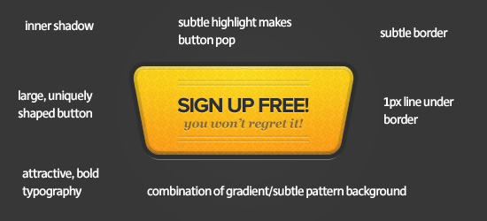
  • Experiment with various button shapes. Sometimes breaking the norm can garner more attention.
  • Try to contrast your buttons color against it’s backdrop.
  • Try to use bold, clear text, and great typography for your button’s copy.
  • Feel free to use humor, informative taglines or credible references within the copy.
  • Try to make the button more clickable. Think of it like a real button (who can resist pushing a button!).
  • Introduce subtle design touches (highlights, drop shadows, borders, indents, textures, patterns etc…). These can really help your button stand out.

To illustrate these tips I’ve laid out an example below:

Calltoactionexample1 in The Secrets Behind Great Call To Action Buttons

Calltoactionexample2 in The Secrets Behind Great Call To Action Buttons

Remember to keep it subtle!

Obviously the example above is fairly extreme just to demonstrate how some of the techniques I’ve mentioned can make a button have more impact. The idea is not necessarily to implement all of them, but to create an attractive, effective call to action button that makes your users take notice. You don’t want to over do things and end up with a tacky, overwhelming call to action that will dissuade your users. Instead, tweak your buttons styles until you’re happy with the result.

It’s not all about looks…

Whilst you don’t want to overwhelm your users, it’s equally important not to get hung up on how beautiful your calls to action are. Some of the ugliest calls to action have the best click through rates. If you’re trying to run a business then really you should value sales/conversions over aesthetics. A great solution is A/B testing. Perhaps design a few variations on your button and see which perform better, and which get the best feedback from your users.

Inspiring Call To Action Buttons

Here are 40 inspiring examples of effective and well designed call to action buttons. Hopefully these will inspire your own designs!

Ronin App
Ronin use a large, bright call to action button that really pops against the relatively subdued background color. The 1px highlight at the top of the button and subtle outer glow make the button appear more 3D and ‘clickable’, thus encouraging action on the part of the user. The tagline ‘No credit card required’ provides a subtle extra incentive to click the button.

Calltoaction1 in The Secrets Behind Great Call To Action Buttons

Ehab Aref
This is a great example of how contrast can lead to an effective call to action button. In this case the simplicity of the button is what helps it stand out. The background is bright and integrates a woven pattern design. Therefore the lighter, simpler call to action button contrasts this and draws the eye. Notice also how the button text is darker than the surrounding headline text, which helps attract clicks.

Calltoaction2 in The Secrets Behind Great Call To Action Buttons

Light CMS
One of the more effective call to action buttons in this article. There is a whole lot going on with this button! First of all, look at the backdrop – there is a kind of indented area in which the button sits, which instantly adds depth and creates intrigue in the viewer. Then the button itself stands out, using a teal color in the midst of a large block of orange background. Subtle inner glows, drop shadows etc… are applied to really make the button pop. Finally, the button is divided into two halfs ‘sign up’ and ‘for free’. This creates the illusion of two call to action buttons, despite there only being one. This seems to create double the attention from a users perspective, surely resulting in more click throughs.

Calltoaction3 in The Secrets Behind Great Call To Action Buttons

Shane Guymon
Shane Guymon uses two prominent call to action buttons on his homepage. These buttons work really well, as they both stand out from, and fit in with the overall design. The red and blue buttons fit with the main colors of his logo/slogan, yet really stand out against the plain white background of the main content area. There is a clear visual hierarchy at work, as the red button is given more visual precedence. This is achieved through it’s slightly larger size, more apparent gloss style, and preferential positioning (as we read left to right we encounter this button first).

Calltoaction4 in The Secrets Behind Great Call To Action Buttons

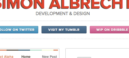
Simon Albrecht
The call to action buttons at Simon Albrecht’s page are really well designed. Interestingly each button mimics the color-scheme of the social networking site that it links to. This helps establish instant brand recognition, and should boost click throughs. One point to note is that whilst these buttons may be effective, they are in fact navigating away from his main portfolio site. If this is the aim fine, otherwise they may be hindering more than helping.

Calltoaction5 in The Secrets Behind Great Call To Action Buttons

Web App Heaven
Really interesting call to action button, as it promotes a newsletter, rather than a product sale. The square button shape makes the button appear almost more like a banner ad than a call to action button. However, the intricate icons and masterful typography are very enticing. Overall this is a very nicely designed button, but perhaps the site owner should consider a more traditional button shape.

Calltoaction6 in The Secrets Behind Great Call To Action Buttons

Resume Baking
Easily one of my favorite buttons from this collection. In a world dominated by traditional rectangular or rounded rectangular buttons, this retro shaped button is incredibly eye catching. The shape and side lines make this button almost resemble a car logo. The bold red color helps the button pop, whilst the indented background design, drop shadow and gradient fill all help give the button depth and purpose.

Calltoaction7 in The Secrets Behind Great Call To Action Buttons

Studio Press
The two main call to action buttons at Studio Press are effective for a number of reasons. Their 1px stroke effect and drop shadows help make them stand out from the background. The typography is also consistent with the main navigation at the site, implying that the buttons should be clicked. The copy is simple and straight to the point. ‘View Our Themes’ could not be clearer, so the users know exactly what to expect.

Calltoaction8 in The Secrets Behind Great Call To Action Buttons

Snoack Studios
Snoack Studios is a great example of how call to action buttons don’t need to do anything too revolutionary. Sometimes simple is best. The traditional button shape, bold blue design and contrasting text work well. A little extra impact is provided by the button’s inner glow and subtle arrow.

Calltoaction9 in The Secrets Behind Great Call To Action Buttons

Concept Engine
Concept Engine has a great call to action button. Not only does it contrast well against the main page background but it feels very clickable due to a heavy bevel/drop shadow effect. Finally, the unusual arrow shape makes the button feel somewhat like a sign post directing the site’s users further into the website.

Calltoaction10 in The Secrets Behind Great Call To Action Buttons

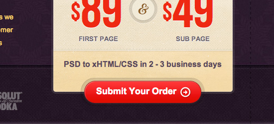
Code my Concept
Code my Concept use a pretty unique call to action button, which integrates into the pricing box directly above it. This indented design feature creates a direct link between the prices/services offered and the option to place an order. The low opacity stroke effect really helps to define the button, and the arrow icon should help boost click through rates.

Calltoaction11 in The Secrets Behind Great Call To Action Buttons

Now Up
Now Up uses quite a cartoony style call to action button, which really fits with the surrounding aesthetic. The subtle metallic gloss on the text and gloss on the button make the button stand out against the plain, vector style page background.

Calltoaction12 in The Secrets Behind Great Call To Action Buttons

Vision 18
Vision 18 is one of the most creative examples in this post. The designer has photo manipulated the sofa image that acts as a welcome graphic, making one of the cushions red. This red cushion then acts as a bold call to action button, that creatively integrates with the surrounding graphics. It’s both artistic and functional.

Calltoaction13 in The Secrets Behind Great Call To Action Buttons

Square Space
Square Space use a really large call to action button that grabs plenty of attention. The bright green button design really pops against the dark gray backdrop and the text is clear and direct. The additional text ‘no credit card required’ is indicative of a growing trend I’m seeing, where important extra details are displayed as part of the call to action button, in a tagline format.

Calltoaction14 in The Secrets Behind Great Call To Action Buttons

Reynolds Digital
This is another example of a simple but effective call to action button. Nothing fancy going on, but the call to action works. The user is not distracted by unnecessary bells and whistles, but instead views the button as having an obvious purpose (in this case as represented by the copy ‘submit design brief’).

Calltoaction15 in The Secrets Behind Great Call To Action Buttons

Site Plan
Couldn’t analyze the copy in this example (my language skills are that bad!). However, the design for this button is solid. Fairly simple, yet the rounded edges, bright gradient and Museo typeface all combine to create a modern, elegant call to action.

Calltoaction16 in The Secrets Behind Great Call To Action Buttons

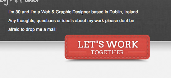
Alan Power
One of my favorite call to action button designs. The details are really inspiring, such as the subtle stitching and indented lines. The creative drop shadow style helps at depth and draws the users eye towards the button. The text is given a subtle outer glow to make it pop against the button backdrop.

Calltoaction17 in The Secrets Behind Great Call To Action Buttons

Bomb Plates
This simple call to action button works well by following the wider site color-scheme. It’s position on the page works well as your eye is drawn down the left of page towards the button. The subtle noise effect for the button background adds a nice design touch.

Calltoaction18 in The Secrets Behind Great Call To Action Buttons

Custom Bags HQ
A lovely pair of call to action buttons, using nice complimentary colors. The inner glow and button highlights give them an appealing glossy appearance, whilst the outer border effect gives a really professional touch. A great example of how the details can make or break an effective call to action button!

Calltoaction19 in The Secrets Behind Great Call To Action Buttons

DFied
Another great example of a call to action button being integrated into content areas. This button straddles the main welcome area and area underneath, and appears to be indented due to a semi-transpareant border effect. The indented text adds depth and the bright orange color-palette really helps the button pop.

Calltoaction20 in The Secrets Behind Great Call To Action Buttons

Pierre Saikali
These call to action buttons are simple but effective. Perhaps one of their main draws is the huge amount of white space around them. They comprise most of the content in a vast header area, and therefore the eye is naturally drawn towards them.

Calltoaction21 in The Secrets Behind Great Call To Action Buttons

Iphone Icon
The ‘order now’ button on this page is practically the only colorful element on the page, which is otherwise gray/white. Therefore it really stands out. Additionally the call to action button uses bold typography, a fairly heavy drop shadow, and a highlight effect to grab attention.

Calltoaction22 in The Secrets Behind Great Call To Action Buttons

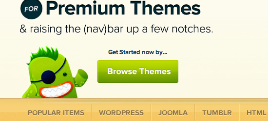
Mojo Themes
Mojo Themes have a great call to action button. Apart from the obvious great design of the button itself, it’s the surrounding elements that really make this button work. The site’s mascot is gesturing towards the button, whilst the tagline ‘get started now by…’ leads the users eye down to the button.

Calltoaction23 in The Secrets Behind Great Call To Action Buttons

Platinoom
The call to action button here is effective for a number of reasons. The button is large and prominent, with subtle design touches such as an inner shadow, 1px border etc… The shopping cart icon instantly creates a visual link for the purpose of the button (buying the theme).

Calltoaction24 in The Secrets Behind Great Call To Action Buttons

Pixel2Html
This call to action button has a great retro design that fits with the overall design of the site. The subtle patterned background, chunky border and large drop shadow all make it jump off the page and the copy ‘submit your order’ couldn’t be clearer.

Calltoaction25 in The Secrets Behind Great Call To Action Buttons

Make It Bead
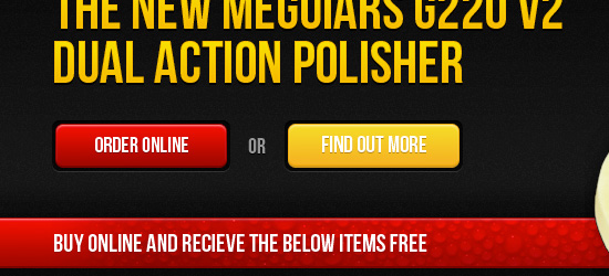
Make It Bead use a nice clean, bold set of call to action buttons. The designer has used a classic technique of visual precedence to encourage people to click on the brighter red button, whilst offering a secondary option (the yellow button). The indented style for each button just makes you want to push them as they look almost real!

Calltoaction26 in The Secrets Behind Great Call To Action Buttons

Quote Roller
Quote Roller’s call to action button would be fairly plain, but the heavily rounded shape and indented button add a lot to quite a simple design. The arrow icon is a great visual element to suggest additional content – we wonder ‘what is that arrow leading to?’.

Calltoaction27 in The Secrets Behind Great Call To Action Buttons

Slamdot
The bright neon green color of this call to action button really pops against the blue backdrop. Importantly the tagline underneath the primary text helps explain where the user is clicking.

Calltoaction28 in The Secrets Behind Great Call To Action Buttons

Reflex Studios
The only other elements on the homepage using the pink of call to action button are the bullet points leading down to it. Therefore a clear visual flow is established scanning down the bullet points (which highlight services provided) to the call to action (‘view our work’). As the brightest element on the page, this is where users are most likely to click.

Calltoaction29 in The Secrets Behind Great Call To Action Buttons

Geekletics
Geekletics use one of my favorite call to action buttons in this collection. The button is really prominent and large, so instantly grabs people’s attention. The real selling points for this button are the details. The subtle border, inner glow and gradient work beautifully together. Combine this with excellent typography (notice the subtle color difference on the word ‘Go’), and the simplistic but effective icon. The Zazzle logo adds a lot of credibility to the shop which the button links to.

Calltoaction30 in The Secrets Behind Great Call To Action Buttons

Wire Hive
Wire Hive mount their call to action button on top of a curved graphical area. This positions the button totally central, so is really eye catching. The indented graphic on the button helps make it stand out, and the sharp drop shadow adds depth and perspective.

Calltoaction31 in The Secrets Behind Great Call To Action Buttons

Desk Time
DeskTime uses a fairly standard call to action button, but it’s very effective. Another example of how simplicity can work wonders! The green on blue combination helps the button stand out, and the subtle drop shadow and gloss effect add impact.

Calltoaction32 in The Secrets Behind Great Call To Action Buttons

Baby Li.st
One of the simpler call to action buttons in this compilation, yet one of the more artistic. This is a great example of how typography can make a button much more interesting. The word ‘BabyList’ uses the site’s logo text, rather than the font used elsewhere on the button. This subtle variation is really eye-catching and helps maintain the company’s brand.

Calltoaction33 in The Secrets Behind Great Call To Action Buttons

WP Zoom
A super bright call to action button which starkly contrasts the dark blue background. The main button text is accompanied by a cheeky subtext ‘You will definitely find one you’ll like!’. This helps establish a personal/emotional connection with the viewer, who is most likely used to plain/boring copy buttons they encounter.

Calltoaction34 in The Secrets Behind Great Call To Action Buttons

Podio
Podio’s call to action buttons are understated, but work well with the page design. By staying small and sleek they support the quietly professional brand of the website. There is a visual hierarchy established by the colors of each button, whereby the ‘get started for free’ button is given more precedence than the ‘find out more’ button. Clearly the brighter button is encouraging users to sign up, as the primary call to action on the page.

Calltoaction35 in The Secrets Behind Great Call To Action Buttons

FanExtra
FanExtra uses a large call to action button that has adopted some of the graphical elements of a banner to help draw plenty of attention. The button includes a professional icon design, as well as copy that clearly states what is offered by signing up. The ‘sign up today!’ text is styled bright yellow in order to stand out the most.

Calltoaction36 in The Secrets Behind Great Call To Action Buttons

Assistly
Assistly uses a simple, elegant call to action button to encourage users to sign up for their service. The green button compliments the purple background well, yet the button stands out partly through use of a drop shadow effect.

Calltoaction37 in The Secrets Behind Great Call To Action Buttons

Hello Bar
Hello Bar has a great call to action button. The button is one of the most colorful elements on the page, and uses a bold outline/inner glow effect to stand out. The ‘signup now’ text uses a very bold font, which helps it have the impact of a headline or title area. This is a great example of subtle design aspects making a button more ‘clickable’. The very subtle texture used on the button design makes it feel more real/palpable and jumps out more to users.

Calltoaction38 in The Secrets Behind Great Call To Action Buttons

Open Public App
Open Public use maroon for highlights against a largely blue/gray web design. The bold maroon ‘DOWNLOAD’ button is really bold, and the white text provides a great contrast. The subtle drop shadow adds depth to this button.

Calltoaction39 in The Secrets Behind Great Call To Action Buttons

Janko at Warp Speed
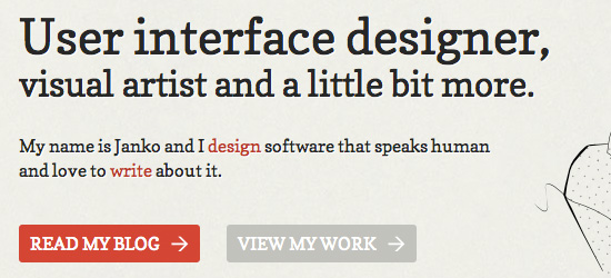
Another great example of a layout with two call to action buttons and a clear visual hierarchy. The bolder ‘read my blog’ button is clearly given more precedence than ‘view my work’. Both buttons are enticing though. Whilst they fit with the subdued color-scheme of the website the arrows help draw attention, and the large amount of padding given to the buttons helps them stand out against a plain backdrop.

Calltoaction40 in The Secrets Behind Great Call To Action Buttons

(rb)


The Heritage Of Berlin Street Art And Graffiti Scene

Advertisement in The Heritage Of Berlin Street Art And Graffiti Scene
 in The Heritage Of Berlin Street Art And Graffiti Scene  in The Heritage Of Berlin Street Art And Graffiti Scene  in The Heritage Of Berlin Street Art And Graffiti Scene

Art critic Emilie Trice has called Berlin “the graffiti Mecca of the urban art world.� While few people would argue with her, the Berlin street scene is not as radical as her statement suggests. Street art in Berlin is a big industry. It’s not exactly legal, but the city’s title of UNESCO’s City of Design has kept local authorities from doing much to change what observers call the most “bombed� city in Europe. From the authorities’ point of view, the graffiti attracts tourists, and the tourists bring money to a city deep in debt.

This article looks at the development of the Berlin street art scene, from its beginnings as a minor West Berlin movement in the late ’70s to its current status: the heritage of a now unified city.

The Development Of The Berlin Graffiti Scene

After the few East Germans who crossed the Berlin Wall in the ’80s blinked and pinched themselves, what do you think was the first thing they saw?

They saw big bubbly letters, spelling out words in German, English and French. They saw political slogans, either carved indelibly into the concrete or sprayed temporarily onto surfaces, commenting not only on the situation in Germany, but on the whole political world: “God Ble$$,� “Concrete Makes You Happy,� “Death to Tyrants.� As far as they could see, covering every inch of wall, was layer upon layer of zest, life and color.

Wall-final2 in The Heritage Of Berlin Street Art And Graffiti Scene

If they’d crossed in the ’60s, however, they’d have been tempted to jump straight back. Abandoned buildings, derelict streets, piles of rubble — the immediate areas around the wall were reminiscent of World War II, and it would take another 10 years for the first communities to settle there.

Even then, those early settlers weren’t “real� Berliners, but outsiders: draft resisters, anarchist punks and Turkish migrants. They either opened businesses or formed squats and, with no resistance from the West German government, began turning walls into monuments to their own thoughts and beliefs.

By the end of the ’70s, a new wave of graffiti artists, arriving with innovations such as stencils and spray cans, were contributing genuine works of art. Our East German friends would have been staring not just at the defacement of Communist property, but at what graffiti artists had by then claimed as their Mecca.

After The Wall

After the collapse of the Berlin Wall, the graffiti artists marched straight into East Germany. Mitte, Friedrichshain, Prenzlauer Berg — all of the areas that the military had occupied became a new playground for the Western artists and became a new world for the Eastern artists who joined them. Few doubted that the East Germans’ work was weightier. It wasn’t that they were better artists, but that they could express — with authority — the one concept close to the hearts of all people now living in the city: what it meant to be free.

Friedrichshain in The Heritage Of Berlin Street Art And Graffiti Scene
A street in the East Berlin area of Friedrichshain a year after the fall of the Berlin Wall.

One East Berliner to make an impact during this period was “Tower.� With his name printed in a variety of colors and fonts on what looked like car stickers, people must have initially mistaken his work for advertising. But the more they saw it — on lamp posts, on post boxes, on trash cans, on fences — the more they understood what he was trying to communicate: Tower, as in the communist TV tower; Tower, as in the skyscrapers that dominated the skyline of almost every major city — built not for the people who lived there, but for the egos of the people who ran them. Tower’s aim was to reclaim the word as a symbol of strength and, in doing so, proclaim that the majority, not the minority, should be shaping the public space.

Tower9 in The Heritage Of Berlin Street Art And Graffiti Scene

A Case Study: Linda’s Ex

In the summer of 2003, posters of a boy bemoaning the loss of his ex-girlfriend, Linda, began to appear on walls and fences in the Friedrichshain district. Sometimes he looked like a boy ready to kill himself; sometimes he looked like a man ready to kill. Whichever way the artist drew him, his sad eyes always asked passersby the same question: “Where’s Linda?�

Eyes1 in The Heritage Of Berlin Street Art And Graffiti Scene

At first, people either ignored the posters or were mildly curious. But as both the pictures and messages increased in intensity, they had no choice but to take notice. On one poster, Linda’s ex told his estranged lover that he would be waiting to speak to her at a certain bar every Saturday and Tuesday night. People were starting to believe that his suffering was real. And if his suffering was real, then they did not doubt that he needed help.

Lindabar in The Heritage Of Berlin Street Art And Graffiti Scene

“He loves you, Linda� one person wrote in a newspaper ad.

Angel in The Heritage Of Berlin Street Art And Graffiti Scene

A caller to a radio show wasn’t so kind. “He’s a cad,� the person said to Linda. “Don’t go back.�

Dec1 in The Heritage Of Berlin Street Art And Graffiti Scene

Everyone seemed to have a point of view, and the more they expressed it, the more posters appeared.

Lindapic-e1308773587848 in The Heritage Of Berlin Street Art And Graffiti Scene

Takemihand in The Heritage Of Berlin Street Art And Graffiti Scene

Finally, a year later, Linda’s Ex, the alias of artist Roland Brueckner, faced the public. There was no Linda, he confessed. The whole campaign had been a hoax.

The New Artists

Linda’s Ex was successful because he communicated with and responded to his audience almost every day. If he had stopped, even for a month, the public’s interest would have dissipated.

The critiques below examine the artwork of three Berlin street artists working today — maybe at this very moment. Like Linda’s Ex, XOOOX, Alias and Mein Lieber Prost make certain that their work remains in the public eye, constantly.

XOOOOX

Berlin has the typical street art spots… but I like more the classical writing scene, with the huge street bombings and the masses of tags.

To most people, the letters xoooox represent hugs and kisses. To XOOOOX, they represent symmetry and strength, for no matter how much he rearranges them, they remain a powerful signature that could belong to no one but him.

This tells XOOOOX’s public as much about him as they need to know: what you see is what you get. For instance, many people would like to believe that his black and white stencils are an ironic, anti-capitalist statement. But as the artist claims himself, they are a straight homage to the fashion world.

His fascination with fashion began when he discovered a pile of his parent’s old fashion magazines in the cellar. He would cut out parts of the pictures, mix them up and stick them on the walls of his room.

Collage still fascinates him, but he says that on the street, stencils are far more practical. At home, he creates a stencil from one of his fashion magazines — including everything from Harper’s to Vogue — and then, armed with his spray paint and stencil, he replicates the image on the streets.

Sample of XOOOOX’s Work

Piss in The Heritage Of Berlin Street Art And Graffiti Scene

Xooox-3 in The Heritage Of Berlin Street Art And Graffiti Scene

Xooox-2 in The Heritage Of Berlin Street Art And Graffiti Scene

Analysis of XOOOOX’s work

People enjoy XOOOOX’s approach because of his objective treatment of his subjects, presenting each model as neither happy nor sad, neither warm nor cold. He even draws one model urinating on the ground; while some might interpret the piece as a sign of arrogance, XOOOOX’s signature, flowing from her head like a thought bubble, persuades sensitive observers to judge her on a more humane level. She is, he suggests, just like everyone else.

What sets her apart is her beauty. The artist highlights this by always spraying her image on the grayest and ugliest of concrete walls, amidst the most innocuous of graffiti scrawls. Like the pretty girl sitting alone in a bar, passersby rarely walk past without giving her a second glance.

Overall, XOOOOX’s images show an artist with a genuine appreciation of conventional beauty. In a scene that likes to subvert conventions, this must make XOOOOX the most unconventional artist working on Berlin’s streets today.

Alias

My motives are often introverted and emotional, but… they brand… themselves on the memory of people passing. They are supposed to inspire people to interpret the motives on their own.

Judging from the number of his pieces, Alias must rarely sleep. His artwork certainly suggests someone at odds with society: black and white pictures of hooded skater types staring at the ground, and young kids unknowingly sitting on live bombs. One senses that something is very wrong with Alias’ world.

Alias left school early and moved to Hamburg, a city with its own impressive array of street artists. Developing his skill there to an advanced level, he moved on to Berlin, where people soon recognized his work as among the best in the city.

Sample of Alias’s work

Alias2 in The Heritage Of Berlin Street Art And Graffiti Scene

Alias1 in The Heritage Of Berlin Street Art And Graffiti Scene

Alias-2 in The Heritage Of Berlin Street Art And Graffiti Scene

Analysis of Alias’s Work

Alias’ dark and somber images make him the city’s most serious artist. He stencils each of his pictures with great care, and always places them in a spot that best communicates his message. His picture of a man asking people to keep his identity a secret is stuck not on the wall of a busy thoroughfare, but at the bottom edge of a staircase. It gives the impression that, beyond the playfulness, he genuinely wants to keep his identity a secret.

Alias’ signature then is essential to understanding his work. The picture of a hooded teenager with a blank face communicates a need to give outsiders a voice. The irony is that the one person humane enough to give them that voice, a street artist, has to remain anonymous. That, Alias suggests, is his reward for daring to question society.

Mein Lieber Prost

All that’s come out is a result of my happiness, my courage, my fantasies or my disappointments. All great artists are great not for their technique, but their passion.

Most people will walk by graffiti without even noticing it. It hides in the corners of doorways and blends in with its surroundings. Prost’s characters, however, point and laugh directly at passersby. The characters are often a simple black outline. On occasion, Prost takes the time to fill the characters in with red, white and black. Whatever the method, he places his artwork in just about any free spot he can find: side streets, high streets, advertisements, doorways, signs. Nowhere in the city is safe.

And yet the public knows little about the artist himself. For legal reasons, he safeguards his identity. At a more artistic level, the anonymity enables him to present the smiley faces, and not himself, as the essence of his work.

Sample of Mein Lieber Prost’s Work

Prost-1 in The Heritage Of Berlin Street Art And Graffiti Scene

Prost-3 in The Heritage Of Berlin Street Art And Graffiti Scene

Prost-2 in The Heritage Of Berlin Street Art And Graffiti Scene

Analysis of Mein Lieber Prost’s Work

It’s easy to miss the point of Prost’s smiley faces. On the surface, they look like the simple one-minute doodles of a high-school student. And the artist probably drew them in half that time. But that simplicity is what makes Prost’s faces so interesting, for two reasons.

First, it allows Prost to put his images in places that few other artists would dare to go. Alias, for example, needs time to place and spray his images and, therefore, works in more secluded spots to decrease the chances of getting caught. Prost has only to draw a quick outline, and then he’s finished. In fact, he has now drawn so many that he no longer needs to leave his signature: his work, rather than his name, has become his identity.

Secondly, the artist positions his characters to look like they are taking in their surroundings, laughing aloud at something happening right at that moment. It is natural, then, on seeing Prost’s characters pointing at them, for people to wonder what the joke is, asking themselves: is it me? Each character forces passersby to question their surroundings and (hopefully, if they don’t want to leave paranoid) to find a satisfactory answer.

Moving Into The Mainstream

Visitors to Berlin tend to ask the same question: is the street art legal? It is a difficult question for Berliners to answer. In central parts of the city at least, there is variously so much and so little criticism directed at it that no one quite knows. Head of the anti-graffiti team, Chief Detective Marko Moritz, insists, however, that the city views graffiti as a crime.

In an interview with The Local newspaper, he states that his team’s main goal is to catch the tagging crews whose work has its roots not in art, but in gang culture. In what he calls bombings, crews will spray whole trains and sometimes buildings with their signatures and colors. But Moritz is concerned not only with the defacement of public property; some crews, he claims, are starting to carry firearms.

Unlike19 in The Heritage Of Berlin Street Art And Graffiti Scene

Their behavior, while disturbing, is a byproduct of the authorities’ attempt to turn the street art scene into an industry. When UNESCO named Berlin as a City of Design, few people doubted that the thriving street art scene was partly responsible. Local businesses and even local authorities hired artists to paint murals on the fronts of their buildings. Most famously, on a wall in Kreuzberg, the artist Blu painted two men trying to rip each other’s masks off — symbolizing, he claims, Berlin’s struggles during its first few years of reunification.

Today, such work has made the street art a tourist attraction. Kunsthaus Tacheles, once an artists’ squat and still a focal point of the scene, holds disco nights downstairs and sells urban art books upstairs — its bar is as expensive as anywhere in the city. Artists such as XOOOOX, Mein Lieber Prost and Alias have started to exhibit and sell in galleries. They still work on the street, but they are no longer impoverished artists — if they ever were. They can afford to travel and work in countries across the world.

Murals in The Heritage Of Berlin Street Art And Graffiti Scene

While these artists believe that street art needs to appeal to a wider audience, the local, more traditional artists, such as the tagging crews, disagree. They argue that street art derives its power from being on the margins of society; only from the outside can they address problems within it. That difference of opinion is opening a space in the scene that can be filled only by the mainstream. In the next few years, street art has the potential to become a social movement as inclusive as anything from the ’50s and ’60s.

(al)


© Simon Thomas for Smashing Magazine, 2011.


  •   
  • Copyright © 1996-2010 BlogmyQuery - BMQ. All rights reserved.
    iDream theme by Templates Next | Powered by WordPress