Design

The Medium Is The Message

Advertisement in The Medium Is The Message
 in The Medium Is The Message  in The Medium Is The Message  in The Medium Is The Message

Since the early days of communication, humanity has been captivated by the methods it uses to convey and preserve information. How we communicate with each other defines who we are and constitutes so much of what makes a culture and an individual unique.

Over the centuries, we have seen media evolve across a wide array of channels, from print to radio to television to the Internet. Each one of these channels, or media, has its own unique characteristics, much like the people who use them.

Parabol in The Medium Is The Message
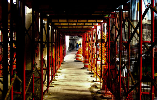
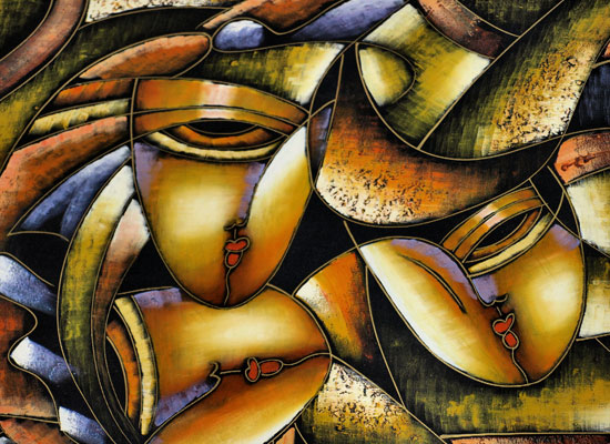
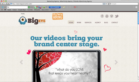
The medium through which we choose to communicate matters. (Image: Jon Ashcroft)

When it comes to understanding these various media, one of the best to learn from is Marshall McLuhan. Born in 1911 and passing in 1980, McLuhan had no opportunity to experience the Web the way we know it today, but that didn’t stop him from exerting a huge influence on it. It was McLuhan who first spoke about technology and communication having the ability to create a “global village.� As an early educator and pioneer of the study of communication and its evolution over time, McLuhan introduced a lot of observations about the impact of new forms of expression and media. Most notably, McLuhan’s expression “The medium is the message� has had a resounding impact not just on Web design but on mass media in general.

“The medium is the message� as a phrase sums up a much deeper communication theory, which is that the medium through which we choose to communicate holds as much, if not more, value than the message itself. At first, this concept might seem vague and indeed a lot to grasp. But I can honestly say that understanding the meaning behind these words revolutionized the way I approach Web design; not from a technical or procedural standpoint, mind you, but from a fresh mental perspective that provided clarity on how to approach and design for the Web.

On The Surface

McLuhan’s theory has certainly not been neglected or forgotten. On the contrary, it has been widely studied in a number of circles and applied to television, print and the Internet alike. While many people seem to grasp the general point, the deeper truth is often missed or misinterpreted. In order to get to this deeper meaning, exploring the general concept first may be necessary.

Perception in The Medium Is The Message
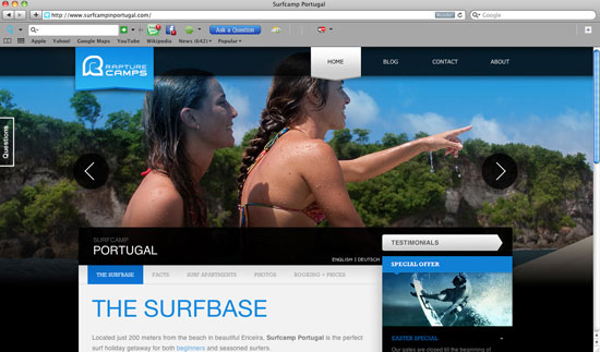
Perception of a medium plays a vital role. (Image: Jon Ashcroft)

The central theory behind “the medium is the message� is that the medium through which content is carried plays a vital role in the way it is perceived. We no doubt see this with the Internet today, in the way we get our news compared to how we got it with print. But perhaps an even clearer illustration can be painted without reference to technology or communication at all.

Imagine, if you will, a deep well in the middle of a vast desert. The well is our medium (as the radio or Web would be), and the water is our message. A rich and reliable well in the middle of the desert would naturally become the hub of travel routes and even a sustainable population. The water by itself is of no use without the well. If it were inaccessible or people were unaware of its existence, it could not support life. The well, as a medium, delivers water to the people passing by or living nearby. As a result, the well becomes synonymous with water and life, despite really being just a hole in the ground.

A Real-Life Comparison

Building on this illustration of the well being a medium for the water, we can extend the theory to modern technology. Let’s compare a feature film to a website as we know them today. Communicating the same general content to the user in both media is possible. However, because the media are inherently different, we experience the content in entirely different ways.

A film is a linear experience. Everyone watching the film participates in the same preset series of a beginning, middle and end. We watch characters and stories unfold over the timeline, working towards a conclusion. Since the creation of film, this idea has been integral to the planning and development phases. All of this is determined by the medium, regardless of what the message may be.

Transformers1 in The Medium Is The Message
The upcoming Transformers movie offers a very different experience to that of the Web.

Move the same content over to a website and the experience changes dramatically. In the context of a website, information is rarely passed to the user as a linear experience. Instead, character traits, back story and plot points might all be split up into different pages or sections. It is up to the user to decide how to consume the information and reach a conclusion. Just as a beginning, middle and end are a part of the entire film process, this segmentation and fluidity should be a part of the planning stages of a Web project.

Expanding Our Understanding

This is all well and good, but saying that we experience different media in different ways doesn’t really sound groundbreaking. A lot of people are inclined to take McLuhan’s theory here as a lesson learned and a day’s work done.

Well, sit tight because we’re just getting started in exploring how the deeper truth of “the medium is the message� can change the way you design and develop for the Web.

Medium-message-screenshot22 in The Medium Is The Message
Link yourself onto the highway of mass media communication. (Image: Jon Ashcroft)

Going back to our example of water being delivered through a well, we can quickly draw a comparison to the impact that fresh water has on our society. In the same way, we can see how a new medium can affect us. Before the telephone, there was no such thing as having a conversation with a friend or colleague in another town or region, at least not without a journey that would span days or longer. Today, we are always just a phone call away from a friend or family member abroad. We even take for granted that we can be in touch with people so quickly.

Going further, we can ask whether there was such thing as a “global event� before mass media communication such as satellite links and the Internet. Today, we often cite various events as things that will “change the world,� but 100 years ago the entire world was not reachable. Before we had the ability to learn about natural disasters, wars, elections and technological achievements through mass media, a “global event� simply did not exist. As a result, we could argue not only that mass media is a tool to channel global events, but that it made them possible in the first place.

World-vision in The Medium Is The Message
For World Vision, the Internet is an invaluable tool for expanding and executing its mission.

Think about it. Without the Internet, Justin Bieber would not exist to almost all of us. Of course, he would still be a part of the world, but without the medium that drove his success, a cure for Bieber Fever would be entirely unnecessary.

An Impact On Web Design

The real takeaway here is that Web designers are able to create tools, experiences, services and communities as a result of their medium. The Internet has a more powerful reach than any other medium in history, which in turn has equally large implications for its status as the message. As a message, the Internet preaches accessibility, expandability and instant satisfaction, things that we designers should keep in mind when approaching any project.

Think about how your projects will use the Internet, not as a medium but as a message. In the disaster that struck Japan this past spring, the Internet became the medium of choice in every way. From the people-finding tools introduced by Google to the relief websites and news coverage across the globe, websites stood out not because they were fashioned with HTML5 or designed responsively, but because they enabled us to be in touch with friends and family and to donate to the cause. New tools, trends and CSS3 gimmicks are a part of the medium, but they play mere supporting roles to the message.

Zen-garden in The Medium Is The Message
One of the original outlets for demonstrating the power of style, CSS Zen Garden remains a powerful showcase for how a unique design can shape a message.

This doesn’t mean we should minimize or eliminate design and aesthetics. Rather, designers should always consider how a design decision shapes the message. The very techniques we practice every day — using line, color, shape and other fundamentals — all play a role in the way the message is received. Using design principles to shape the tone and audience of a message, versus creating a stylish and trendy look, is what separates professionals from amateurs in our industry. Realizing your full potential as a designer has a lot to do with your ability to control the message.

Controlling The Message

We’ve come full circle, back to the original point of this article. As Web designers, how do we utilize McLuhan’s phrase “the medium is the message�?

It starts as soon as an idea or request for a project comes to us. As professionals, we need to guide our clients down the right path and show them how best to take advantage of the Internet. We need to recognize that Joe’s Hardware Store on the corner might not benefit as much from a domain name and website as it would from a Twitter and Facebook account or no Internet presence at all. If good ol’ Joe has no intention or need to market to anyone outside of his neighborhood, then the Internet’s message just isn’t necessary for him or his customers.

Fractals-desktop-screenshot in The Medium Is The Message
The whole message is more than the sum of its parts. (Image: Jon Ashcroft)

On the other hand, if Joe wants to market his patented new handsaw to a larger market and expand his business, then the Web might just be the place to do that. As a designer, you can help Joe harness the power of instant Web exposure, social marketing, online orders and all of the other fantastic tools that can help his business grow. Joe’s new website will be a beacon of Web standards: it will be responsive, elegant and unique. Of course, we may notice that none of these things actually earn Joe a lick more of money. Rather, the Internet, when used as a message to new customers, holds the real power.

Of course, this is just the tip of the iceberg with using the Internet to benefit a business, service or application. The gradual ubiquity of the Web makes this topic only more exciting and powerful. Staying true to the message that our medium presents goes hand in hand beautifully with building solutions that are adaptive and constantly expanding with technology.

As stated earlier, my tools, skills and process for designing and developing websites have always been evolving. Still, the motivating factor behind Web design is in the message. The message is what makes money, makes an impact or expands your reach. Without it, interest in websites and applications would never get off the ground.

The Takeaway

When all is said and done, it is important to remember two things about McLuhan and his teachings. First, the medium through which a message is experienced shapes the user’s perception of the message. Secondly, a medium can be the message itself if it is delivering content that would otherwise be impossible to access.

Simplify-screenshot22 in The Medium Is The Message
Keep it simple, and let the medium do some of the communicating. (Image: Jon Ashcroft)

As you start projects and are approached for your professional opinion on how to harness the power of the Internet, always consider the message. Designers who jump into talking about how the latest and greatest trends can help a new project are missing the point. We use the Web to create beautiful and unique solutions that would have been impossible just a few years ago. As a designer, make sure you always respect the powerful message that this medium is.

Additional Resources

  • “A Checklist for Content Workâ€�
    An excerpt of Erin Kissane’s book The Elements of Content Strategy. A fantastic resource for taking online content to the next level and enhancing your message.
  • “Make Your Content Make a Differenceâ€�
    Digging further into content development, this article outlines some of the myriad advantages to spending more time on your content.
  • “The Medium Is the Massageâ€�
    Get your information from the source! This book is a concise summary of McLuhan’s thoughts.

(al)


© Jason Gross for Smashing Magazine, 2011.


The Keys to Making Fresh, Forwardly Aesthetic Web Designs

Advertisement in The Keys to Making Fresh, Forwardly Aesthetic Web Designs
 in The Keys to Making Fresh, Forwardly Aesthetic Web Designs  in The Keys to Making Fresh, Forwardly Aesthetic Web Designs  in The Keys to Making Fresh, Forwardly Aesthetic Web Designs

Great graphics. Beautiful typography. Clean design. These are all things designers typically think of when creating stunning websites. But is it really just that combination of elements that produces something that can take your breath away? Of course it’s much more than that; but what?

Far too often, web designers like to blame the breath taking factor of websites on the genius of another designer. Not to take away from any designer, but creating a stunning website is absolutely do-able for any designer with a good set of skills (or the ability to outsource). So, how can you do it?

Detailed Development

Coding and development is an extremely important portion of the website building process. Sometimes web designers get so caught up designing as best as possible, we can sometimes forget that great development will take your design to a different level. Clean coding that pays attention to the smallest details of the design and even the web browser will create an excellent experience.

Construction1 in The Keys to Making Fresh, Forwardly Aesthetic Web Designs
Constructing a website can be tedious, but it’s worth it to create fresh websites. Image Credit

HTML5 and CSS3 are fairly new technologies that have come about to really help developers do their work as best and as easily as possible. While there are some kinks in it, we would strongly suggest that coders really get into learning it and making it work for them. The purpose of updating the HTML and CSS libraries was and is to make things a bit more intuitive and more consistent among different coding languages (i.e., javascript, php, etc.).

HTML5 + CSS3

There are tons of articles about the pair of these and how they are really changing the way of development. Take a peak at some of these articles to help you out.

Movement is absolutely required on stunning websites. Pages don’t have to jump and bounce around but noticing fine details to make the website look like it’s living and breathing really helps. Javascript and it’s various libraries really help make web sites live, especially when we are talking about the interaction of elements in browser windows as well as loading images.

For example, on the Sellected site, you are able to filter the content you wish to see in a way that doesn’t require you to refresh and reload the page. Everything aesthetically transforms in front of you. The roll-overs on this page are also magnificent because they are smooth, make sense and again, are aesthetically pleasing.

If you are interested in more Javascript and jQuery types of transitions and tricks, check out 150+ Best jQuery Effects for Designers and Developers. Mastering CSS3 and HTML5 can also really get things moving on a page–positioning, fluidity, and other techniques contribute to this.

Cleverly Coded Sites

In terms of development and coding there are details as well as tricks that can be used that really take a website from 0 to 60 in seconds. We could never list them all here, but we will give you a short list of websites that really paid a lot of attention to the details in the development or either made their coding a central piece of the web site.

Awdigital-dev in The Keys to Making Fresh, Forwardly Aesthetic Web Designs
The screen shot of this website does it no justice. It isn’t heavily designed and it could be argued that it’s not even necessary. The negative space shows you exactly what you are supposed to look at. The way in which this whole thing is animates and transforms is amazing and something several of us have never seen before. Very neat

Guyvernes-dev in The Keys to Making Fresh, Forwardly Aesthetic Web Designs
Once again, not a very heavily designed website–the focus here is on the clothing. Viewing this site on a huge monitor is definitely fulfilling especially when you play around with the window. The page transitions are exceptional as well.

Piccirilli-dev in The Keys to Making Fresh, Forwardly Aesthetic Web Designs
It looks like a pretty static website, but the attention to the details, especially when you view the ‘Work’ page really shows they were particular about their content. This is a design agency and obviously they wanted to strip away as much crap as possible and get you to look at what they can do. Super clean and powerful

Sellected-dev in The Keys to Making Fresh, Forwardly Aesthetic Web Designs
This is another fun site where the attention to detail will keep you on the site forever. Go to this website and play around with the window size as well as with the filter on the site. This is like a living, breathing, intuitive person!

Freeassoc-dev in The Keys to Making Fresh, Forwardly Aesthetic Web Designs
The development as well as layout of this site really work together in helping this site look like it’s not as content rich as it actually is. Simple. Not overwhelming.

Adam-dev in The Keys to Making Fresh, Forwardly Aesthetic Web Designs
More great coding and a pretty solid design. If you fool around with the window size, you’ll notice the great detail taken in the development of this website.

Unorthodox Design & Layout

Have you ever gone to a website, looked at it, and just got a tingly feeling? Or has a website ever been so overwhelmingly good to you that you just stare at it or look at every single element and say “That’s crazy”? An extremely fresh design really can make your website standout from the crowd, but how do you know when you’ve got the right design?

Painting1 in The Keys to Making Fresh, Forwardly Aesthetic Web Designs
Web design is subjective, much like Fine Art, but there’s no denying when something’s good Image Credit

There are a lot of things that go into designing websites. The most important thing you must do as a designer is figure out your target audience and figure out what the purpose of the website is (I,e., is it to sell or is it to inform?). Once you’ve got those two things, you’ve got to figure out how to combine the two in a way that the audience enjoys and that is effective towards the purpose of the site. Then you really have to build around that as far as the design and layout is concerned.

Let’s be honest, a large header and a right sidebar are right for some websites, but not all websites. The way a website’s design becomes stunning or breath taking is when the designer really steps outside the box. The trick though, is to not get SO outside the box that the website fails to make sense or lose sight of it’s purpose.

There’s no strict code to figuring out how to create super fresh designs. Many like to stay fresh, of course by looking at design inspiration (use it as an influence, not a rubric) and practicing their program of choice. Personally, practicing without any type of outside product (no brushes, custom shapes, etc.) really helps you think of different solutions to different problems without looking like something that’s already out.

Now understand, this will not work for everyone but the idea here is just to be as creative as possible and not to be afraid of being creative. We sometimes fear creativity because we’re not sure how an audience will accept something different, but challenge yourself to be bold and forward thinking when it comes to design.

After all, at some point, all the current trends have to be pushed aside for new ones, don’t you want to be ‘cutting edge’?

Stunning Sites

Design and Art are relative and really depend on personal taste. Now, do understand these exemplified websites are personal preference, but we plan on really pointing out why these designs aren’t just pretty, but why they work. Visit the sites and really look around to see how the design and layouts really interact with everything. Also, notice how many of these sites stepped outside the box and created something super fresh.

Bigeye-des in The Keys to Making Fresh, Forwardly Aesthetic Web Designs
This website’s design is a little lacking, but the layout WORKS for them, as they are a bit more content rich than other websites. They have an obvious working hierarchy for their site, which is complimented by a pretty standard, but effective layout

Rapture-des in The Keys to Making Fresh, Forwardly Aesthetic Web Designs
Movement and good clean, effect design all in one place. Again, this isn’t a life changing design but it works for their service and you know exactly what’s going on. Interesting Navbar, too.

Skittles-des in The Keys to Making Fresh, Forwardly Aesthetic Web Designs
An extremely unorthodox layout as well as an unorthodox design. The message is simple–have fun and eat Skittles, along with some social media implementation. Very fun design here. Very playful and fresh!

Ideage-des in The Keys to Making Fresh, Forwardly Aesthetic Web Designs
This is one of the freshest sites to hit the screen in a while with a good combination of design and detailed coding. Very unorthodox but it works–while you might have no idea what it says, not sure that really matters too much. This site is GREAT

Meister-des in The Keys to Making Fresh, Forwardly Aesthetic Web Designs
This an extremely different type of thing here…the navigation is actually on a live web camera. That’s really different. The inside pages aren’t too shabby either.

Kult-des in The Keys to Making Fresh, Forwardly Aesthetic Web Designs
This is a pretty standard layout, but the design elements used are really magnificent. There are alot of unexpected things about this site and it’s design. More proof you can really expand on a standard layout.

Stay Inspired

Always be on the lookout for fresh new ideas and see what people are doing. Again, don’t use these sites as rubrics, but be creative and use them as influences to help you think outside the box and see different techniques in action. Here’s a list of some of the best web design showcases the Internet has to offer:

  • Make Better Websites – Dedicated to absolutely the freshest web sites I’ve ever seen. More portfolio sites.
  • WebCreme – Pretty good stuff here, too. Lot’s of different types of websites.
  • DesignShack Gallery – A one stop shop gallery of all things good.
  • The Best Designs – Another good one for fresh ideas

(rb)


Useful Ideas And Guidelines For Good Web Form Design

Advertisement in Useful Ideas And Guidelines For Good Web Form Design
 in Useful Ideas And Guidelines For Good Web Form Design  in Useful Ideas And Guidelines For Good Web Form Design  in Useful Ideas And Guidelines For Good Web Form Design

The input form is an essential element of almost any website or application these days. Input is a core method of interaction, and in many cases it represents the hard conversion point between success and failure. With the amount time and effort we put into bringing users to our sign-up and contact forms, it’s surprising that we tend not to spend a proportional amount of time on the forms themselves.

A number of techniques and elements can be used in Web forms to turn them from abject failures into successful conversion points. In this article, we’ll present some interesting examples and useful guidelines for Web form design.

A Dash Of Quirkiness

Part of Web design is about communicating personality and being relatable, because people enjoy dealing with other people. One quality that almost always helps is a bit of quirkiness and fun. A small dose of friendliness and personality will make the input process a bit more enjoyable and human.

Jarad Johnson

Jarad Johnson‘s contact form has a flavor of good ol’ post card. The visual appearance of the form makes it stand out from the usual generic forms found elsewhere. A very nice touch to an often forgotten element of Web designs. By the way, the Postage for the email postal service was already paid. Good to know. Very well done.

11jarad in Useful Ideas And Guidelines For Good Web Form Design

Red Tiki

Red Tiki’s quirkiness is tied to the company’s brand and identity, but is powerful here nonetheless. From the frame motif to the wooden character peeking out, this form feels fun and approachable. Little colloquial phrases like “This lovely form� and “We’re always keen to lend an ear� are fantastic ways to make the company more relatable. The form is bursting with personality and flare, which helps the user complete the form and click the “Submit� button.

3red in Useful Ideas And Guidelines For Good Web Form Design

Applicom

Applicom’s form is a great example of how to be clean and professional without being sterile. Styling the form like a letter — with a stamp, subtle paper texture, striped edge and handwritten addressee name — may seem cliche, but it demonstrates a certain level of personality and care. Language such as the “Do: Be fine, use your real address. Don’t: Be negative, spamâ€� may seem trivial, but it’s important. At the end of the day, it makes users feel like they are dealing with people who aren’t afraid to speak to them. Craftsmanship always indicates care and professionalism. People like that.

5applic in Useful Ideas And Guidelines For Good Web Form Design

Sophie Hardach

Sophie Hardach‘s form is another example of a post card idea implemented in a contact form. The input fields are a bit clearer than one would think, yet the “Submit”-button is a bit more difficult to find. In order to send the message, a stamp in the right upper corner needs to be dragged to the Stamp area of the form. In fact, the form is not only very original, but also accessible. Excellent work.

20sophie in Useful Ideas And Guidelines For Good Web Form Design

Two Paperdolls

Two Paperdolls has probably the busiest contact form of all the forms featured in this article. However, the form fits wonderfully to the overall design of the page which is a “We Are Hiring” page for designers with strong focus on typography. Notice the clean real-time validation for the form: the error indicator is diplayed in the right upper corner of each input field. Too bad that the navigation through form fields doesn’t work properly with “Tab”.

10twopaper in Useful Ideas And Guidelines For Good Web Form Design

Kontain

Kontain uses a different kind of a date picker for letting users pick the date for the form. The designers have arranged the dates in four rows rather than displaying them all vertically. A nice idea for reducing the horizontal scrolling for the users.

16-1kontain in Useful Ideas And Guidelines For Good Web Form Design

Wopata

Wopata‘s slider for the timeframe in their contact form is much different from the generic sliders, select-menus and radio buttons. This is a proof that filling in Web forms can be fun.

17wopata in Useful Ideas And Guidelines For Good Web Form Design

Fi

The language used on Fi is more friendly than formal. The inviting nature is reinforced by the short colloquialism for each form field that illustrates why the information is being requested. The language of labels should give off a little charm, without being insincere or overbearing. Isn’t everyone more engaged in a conversation if the other person is pleasant and approachable?

2fi in Useful Ideas And Guidelines For Good Web Form Design

egopop

egopop has a very simple, perhaps oversimplified contact form which however has a nice touch. The weird character on the right side plays wonderfully together with the other characters on the site and makes the contact form less boring than it would be otherwise. The contact form opens in a lightbox.

6egopop in Useful Ideas And Guidelines For Good Web Form Design

Idyllic Creative

Some forms are boring, while some are beautiful. Idyllic Creative‘s contact form is remarkably simple yet beautiful. Another example of a design agency which integrated a character from their work in their contact form.

8idyl in Useful Ideas And Guidelines For Good Web Form Design

Tinkering Monkey

Tinkering Monkey‘s character on their contact page is another interesting example of how the contact form page can be made a bit less boring. Notice the FAQ area on the right side of the contact form. An excellent idea for helping customers quickly find answers to their questions once they feel lost and can’t find a solution to their problem.

25tinkering in Useful Ideas And Guidelines For Good Web Form Design

Ditio

Ditio‘s designers have decided to combine their sign up form and a contact form in a hidden sidebar box, very much like it’s often done with the fixed “Give feedback” buttons on the left or right side. Once a trigger button “Inschrijven” is clicked, users can sign-up for their account and even upload a CV. Notice that there is no textarea available for lengthy details.

3ditio in Useful Ideas And Guidelines For Good Web Form Design

Treehouse Editing

Treehouse Editing’s contact form is another example of a quirky design with a clean and lean layout. When the user navigates to the page, the background changes to a spring theme, which is itself associated with making contact, thus encouraging them to fill out and send off the form. Notice that all that is necessary for initial contact fits into a couple of fields; further information can be collected in subsequent correspondence. Ask yourself whether a minimal layout would do the trick on your website as well.

4treehouse in Useful Ideas And Guidelines For Good Web Form Design

Amazee Labs

Amazee Labs doesn’t have to do much to make its form usable and inviting. The form has only a few quirks, namely the texture, the “Hi there, let’s get in touch!� line, and the “Send It!� button. It may not seem like much, but the casual language, careful color choice and overall texture help Amazee Labs instantly feel like a friendly and easygoing bunch.

6amazi in Useful Ideas And Guidelines For Good Web Form Design

Wing Cheng

The motif of Wing Cheng’s website is an open sketchbook, with most of the sections designed as sketches and thumbnail drawings. The contact form maintains this personality and coherency by following the motif. The form is simple and appropriate. The thought diagram with the email address adds visual interest. Maintaining the hand-drawn style is what brings out the quirkiness. Imagine how jarring and uninviting this form would be if it was a default HTML field set stuck on top of a beautiful paper texture.

7wing in Useful Ideas And Guidelines For Good Web Form Design

Break It Down

No one likes a humongous unending list, especially a list of elements to fill in or interact with. Just as a giant paragraph of text is daunting to the user, so is a giant block of empty fields. To coax the user to the finish line, the designer should make them feel like they are completing steps, or bite-sized chunks. Take a giant web project: trying to wrap your head around it all at once is almost impossible. But if you break it down into goals, and then stages, and then sets of tasks, it becomes much more manageable. This is what we want in a Web form, especially if you’re asking for a sizeable amount of information. Keep in mind that you can organize a form simply by sectioning off parts of it or by arranging the content into columns.

CollisonLabs

CollisonLabs‘s contact form might appear to be a bit too complicated at the first glance, but it’s quite straightforward. The left side of the contact page contains alternative contact information as well as a map which is designed with the overall design of the website in mind. On the right side, each input field is clearly represented and highlighted when the user fills out the form. Nice, clean work.

14collision in Useful Ideas And Guidelines For Good Web Form Design

Visual Republic

Visual Republic‘s choice of design for input field labels is similar to the solution by guys over the CollisonLabs. Giving the field label a solid background with an arrow to indicate where the text would need to be typed is a nice technique that could be used more often.

26visualrepublic in Useful Ideas And Guidelines For Good Web Form Design

CSS Tricks

CSS Tricks‘s comment area is a great example of a well-organized, helpful and clean comments area. Notice how the “star” image in the text area fades away as the user types in some text in the form.

22csstricks in Useful Ideas And Guidelines For Good Web Form Design

Barley’s Greenville

Barley’s Greenville‘s form for beer rating is an interesting example of how multiple sections can be combined to make the form intuitive and easy to use. Notice the arrow-like symbol between the first and the second section as well as various shades of the brown color within the form.

23barley in Useful Ideas And Guidelines For Good Web Form Design

Blue Sky Resumes

Blue Sky Resumes uses sections to make its extremely long form much more manageable. Standard headings and horizontal rules are used to divide sections. The designer was also careful to visually distinguish the different sections so that the form doesn’t look like a long list of fields.

 in Useful Ideas And Guidelines For Good Web Form Design

Validate Clearly

Users will not spend extra time making sure they have given you all of the information you need. Many designers believe that form validation detracts from the user experience, but its effects are adverse only when done poorly. When validation is simple and clear, it merely offers alerts and guidance to the user.

Make sure that you clearly mark the problem and tell the user exactly what is wrong. The fastest way to kill the user experience is with generic error alerts that mean nothing to the user. People are more than happy to quickly fix an issue if it is pointed out to them plainly.

Moody International

Moody International provides an excellent example for a contact form that nicely combines different types of contact information in one place. On the left, you’ll find a postal address along with a map, a phone number as well as the company’s email address. The right side is dedicated for more detailed inquiries and consulation requests. The form’s labels disappear once the user has provided their data. Unfortunately, the form doesn’t have an instant real-time validation and uses JavaScript pop-ups to inform the users about their input mistakes. Besides, the map on the left side could be integrated a bit better by using zoom controls as well as search functionality provided by Google Maps.

1moody in Useful Ideas And Guidelines For Good Web Form Design

El Passion

El Passion is another example of a contact form that combines various types of contact information in a very compact and meaningful way. Real-time validation in use. The map on the left side could be zoomable, though.

5elpassion in Useful Ideas And Guidelines For Good Web Form Design

Orlando Advertising

Orlando Advertising‘s form beautifully integrates its branding colors in a clean and attractive Web form. The red borders might be misunderstood and could be used to visually highlight errors in the form, but instead validation errors are displayed once the “Submit” button is clicked.

28soap in Useful Ideas And Guidelines For Good Web Form Design

Reinvigorate

There are usually two essential elements to effective form validation: identifying the specific problem, and clearly marking how and where to fix it. Reinvigorate uses an alert icon and a loud red outline to indicate the problem, and then it uses the side column to tell the user what’s wrong with the information. Moreover, the user gets a visual indication when the information is corrected. Being clear about the problem and not leaving the user in the dark make for a smooth experience.

Reinvigorate in Useful Ideas And Guidelines For Good Web Form Design

GitHub

GitHub‘s sign up form is as simple as its overall design, yet its beauty lies not in aesthetics, but in its functionality. When you enter your credit card details, GitHub automatically recognizes the credit card provider and visually highlights it in the form, thus providing instant feedback to the user. A wonderful example of invisible design.

15-1-github1 in Useful Ideas And Guidelines For Good Web Form Design

15-2-github2 in Useful Ideas And Guidelines For Good Web Form Design

Blue Sky Resumes (revisited)

I would like to point out another great part of Blue Sky Resumes’ form. The error alert is clear and specific. By specifically telling the user that their name is missing, the user is spared confusion and is able to find their bearings quickly. To reinforce this message, the name field is clearly highlighted and marked as required.

 in Useful Ideas And Guidelines For Good Web Form Design

Interactivity

A form is an interactive part of a website or application. In general, people want to interact with elements that feel alive and that follow convention. Many forms have a slight indent, creating a slight 3-D effect, whereas other forms simply show a box outline to delineate form fields. The key to any interaction is expectation and feedback. Make sure your forms react to user input, mainly by specifying the focus and hover states of input elements.

Grooveshark VIP

On Grooveshark, its styling of the focus and active element makes it clear which field is being interacted with. Besides, erors are displayed in a nice, helpful way while error messages are displayed at the top of the “window” using Ajax.

12grooveshark in Useful Ideas And Guidelines For Good Web Form Design

The design helps the user to maintain focus and to breeze through the form. It even makes it kind of fun, because the user wants to see a response when they click on or interact with an element.

Unlocking

Unlocking‘s checkout form is a nice example of how simple design can work very well with appropriate level of responsiveness. The input fields look nice, the hover state is very clear and the hints on the right side are helpful and unobtrusive. The contact form shows a subtle blue background when the user focuses on a field.
The form uses an additional color to highlight fields. As long as the interaction creates a noticeable effect, the form will be more usable.
The highlighting is not as bold as on some other sites featured above, but still effective and interactive and perhaps even more usable.

18unlocking in Useful Ideas And Guidelines For Good Web Form Design

Jason Long

Jason Long‘s form silently sits on the page, doing nothing, unless… well, unless you send it out. Jason uses an animated contact form which flips and changes as the message is being sent. An interesting, memorable tweak that makes the user experience just a tiny bit more interesting.

38-1-black in Useful Ideas And Guidelines For Good Web Form Design

38-2-black in Useful Ideas And Guidelines For Good Web Form Design

38-3-black in Useful Ideas And Guidelines For Good Web Form Design

The Finish Line

An effective Web form should get the user to cross the finish line. It might be a “Submit� button, an order confirmation button or a sign-up button. At the end of the day, the designer wants the user to hit that conversion point and be reasonably happy with their decision.

Make sure that the way of submitting the form is bold and specific. Where possible, use language like “Send email� or “Finish signing up,� so that the user understands exactly what the button will do.

Squarespace

On Squarespace, the designer has gone as far as to label the button “Finish & Create Site� and has also made note of its function just below. This page is especially effective because of the contrast: the layout is completely monochromatic, so making the button green puts more focus on completing the process.

1sqr in Useful Ideas And Guidelines For Good Web Form Design

BLITZ

BLITZ has come up with an interesting solution for their contact form. A content block appears in a lightbox and presents three different types of contact forms: inquiry about business, jus saying “Hi” and CV submission. The forms have a similar appearance but have a different structure. In all cases, the user has a checkbox for email updates at the bottom as well as postal address under the form. One confusing bit is that the form fields get a red border when you type in your data. Some users might confuse it with error notifications.

12blitz in Useful Ideas And Guidelines For Good Web Form Design

Custom Bags HQ

Custom Bags HQ has tried to combine various content blocks within one context. The “Contact” link in the upper navigation leads to a page which contains both the contact form and the “About us” information. In our opinion, “About us” doesn’t really detract from the user experience, but it doesn’t enhance it either. The link doesn’t feel right here, at least at the first glance. Interesting idea: the form contains a checkbox asking users if they are interesting in receiving an email newsletter. A smart handle to keep customers close to you and keep them informed about your updates and news in the future.

7custombag in Useful Ideas And Guidelines For Good Web Form Design

Clear Labels

Any interaction that we encourage must be as non-threatening as possible. After all, we are asking for personal information of the user. They are under no obligation to provide it. The first step to avoiding frustration and confusion is to use plain and simple language. Make it to the point and not flowery.

Foundation Six

Foundation Six’s labeling is effective because it streamlines the process and simplifies commitment for the user. The company boils each category of information down to one word. The “Submit� button is also clear and straightforward. There is no confusion in the user’s mind. Another strength here is the balance between multiple choice and fill in the blank (which we’ll get to below).

Foundationsix 01 in Useful Ideas And Guidelines For Good Web Form Design

Bärnt&Ärnst

Bärnt&Ärnst‘s designers follow their minimalistic approach to design and provide all contact information such as postal address, phone numbers, email as well as a short form for user’s convenience. Often you really don’t need to require more information than that for the initial email.

2born in Useful Ideas And Guidelines For Good Web Form Design

Zoltan Hosszu

Zoltan Hosszu‘s contact page illustrates how icons can be used effectively to indicate the purpose of input fields. The form itself is very simple and quite unspectacular, but icons as well as some subtle textures make it a bit more distinctive and interesting.

33zoltan in Useful Ideas And Guidelines For Good Web Form Design

Stuck Axiom

The labels in Stuck Axiom’s “New business� contact form are short and concise. The simple language and clear labeling make the form non-threatening and easy for the user to fill out. Contrasting with the gray of the form fields, the “Submit� button is set off and accented in red, making it clear where to click.

8struck in Useful Ideas And Guidelines For Good Web Form Design

Solid Giant

With clear labeling, not too many check box options and predefined budget ranges, Solid Giant can get back to a potential client with a precise offer. The “Submit� button is clear and straightforward, marking the end of an intuitive path through the form. All elements are described carefully, and there is no room for the user to misinterpret what information to enter where.

9solid in Useful Ideas And Guidelines For Good Web Form Design

Joey Rabbitt

Joey Rabbitt isn’t a fan of lengty emails. The message of the textarea can contain at most 500 characters. However, if the user would like to email Joey directly, he can use an email on the right side of the page. Joey also showcases the networks he is a member of as well as his current location. Notice how beautifully the content is designed by using icons and various colors of grey throughout the page.

4joey in Useful Ideas And Guidelines For Good Web Form Design

Multiple Choice Vs. Fill In The Blank

Selecting items from a list is naturally easier than filling in a blank. A blank sometimes raises more questions than it answers, especially if the labeling is not clear or there are too many empty fields. The user may be confused by the format, the type of information being requested or how exactly to answer a question. In general, a choice is better than a blank, especially with information that could be confusing, such as scope, budget, project type, etc. This is why most order forms do not require you to fill out every piece of information.

Pieoneers

Pieoneers uses the fill-in-the-blank format in the left column for generic information, with established conventions for format and type. On the right, more complicated questions are in the form of drop-down boxes, letting you choose between broad options, so that there is no confusion or hesitation.

10pie in Useful Ideas And Guidelines For Good Web Form Design

Information Highwayman

Information Highwayman cleverly combines multiple choice and fill in the blank. The empty fields are for simple bits of information specific to the user: name, email address, comment. These are all non-threatening and could not be formatted as multiple choice. Questions related to services sought and budget tend to be more complicated. Giving user some options here simplifies the process of explaining what you’re asking for.

Information-highwayman in Useful Ideas And Guidelines For Good Web Form Design

Facio Design

Facio Design‘s contact form is probably the most difficult contact form featured in this article, and rightly so. The choice of typeface and the font size is suboptimal as it is very difficult to read, especially on Windows. The designers have tried to mimic the appearance of a letter, but it doesn’t quite work here. Perhaps a very simple, basic form would work better here. Please notice that according to some studies, using this Madlib style form design could increase conversion (thanks, Larry from the comments), but we believe that in this specific case aesthetics doesn’t aid the functionality of the form.

37facio in Useful Ideas And Guidelines For Good Web Form Design

Conclusion

This overview covers a few simple best practices that you can apply to Web forms. Just remember to spend the extra time on your next website; many of these approaches are not hard to implement and will lead to much higher conversion rates, but they are often overlooked. We spend so much time getting people to the door that we forget to make the door as inviting and useful as the path to it.

Useful Sources

(al) (il) (vf) (sp)


© Shawn Borsky for Smashing Magazine, 2011.


A Graphic Design Primer, Part 3: Basics of Composition

Advertisement in A Graphic Design Primer, Part 3: Basics of Composition
 in A Graphic Design Primer, Part 3: Basics of Composition  in A Graphic Design Primer, Part 3: Basics of Composition  in A Graphic Design Primer, Part 3: Basics of Composition

In the first two sections of this primer, we covered the basic elements of design, and the basic principles of design. In this section, we’ll cover the basic principles of composition.

There are a variety of different composition theories you should familiarize yourself with. Since this is just a primer, there’s a brief overview of the most common and important theories. You’ll want to study each in more depth before putting them to use, so we’ve included some additional resources for each.

Single Visual

The single visual method of composition is where a single, generally striking, visual image is used as the basis of the design. This is sometimes seen on single-page websites, or more commonly in print design.

The single visual pattern is the easiest composition to successfully achieve. Pick a strong image and let it do the bulk of the work for you. The key here is to make sure that other elements of your design (in most cases, the typography is the other major element of the design) support and reinforce the main visual, and don’t try to compete with it.

Sites like those created on About.me are a great example of the single-visual composition pattern.

Veen in A Graphic Design Primer, Part 3: Basics of Composition

Jamie Brown’s website has a similar single visual design:

Jamiebrown in A Graphic Design Primer, Part 3: Basics of Composition

The Divine Proportion

The Divine Proportion (also known as the Golden Ratio, Golden Spiral, Fibonacci Spiral, Golden Rectangle, or Phi) is approximately 1:1.618. It’s a ratio that is found throughout the natural world in the proportion of various things to one another. Placing elements along the lines created by the Divine Proportion

Fibonaccispiral in A Graphic Design Primer, Part 3: Basics of Composition

If you’re interested in designing websites according to the Golden Ratio, you may want to check out The Golden Grid, which was built with the ratio in mind.

The Rule of Thirds

The Rule of Thirds is sometimes confused with the Divine Proportion, but they are not the same. The ratio present in the Rule of Thirds is 1:1.667. In effect, though, it can serve as a sort of “lazy man’s” Divine Proportion. Most commonly, the Rule of Thirds is seen in photography (many cameras have built-in composition grids that follow this rule) and fine art, though it’s also regularly seen in graphic and web design.

Resources:

Focal Point

A focal point gives viewers of a design something to look at. It adds a sense of direction to the design, and can act as a grounding point for visitors. Every design should have a focal point of some kind. This could be an image, a bit of typography, a button, or something else entirely.

Think carefully about what your focal point will be. It should directly relate to the purpose of your design. If your site’s goal is to sell something, then you may want to make sure your call to action is the design’s focal point. If the goal of the site is something else, think about what makes sense as the focal point in relation to that goal.

The large typography is the obvious focal point here:

Girlfriendnyc in A Graphic Design Primer, Part 3: Basics of Composition

Grid Theory

Grid design is probably one of the most familiar design patterns for many graphic and web designers. Grids add structure and order to designs, and can be a useful method for achieving good proportion among elements in your work.

There are a huge number of grid frameworks out there (including both fixed and fluid grids). Some sites designed within a grid framework are obviously grid-based, while others are more subtle. In either case, though, a pre-defined grid can add a sense of pre-meditation to your designs that makes them cleaner and more refined.

The Oi Polloi site is a great example of an obvious grid design:

Oipolloi in A Graphic Design Primer, Part 3: Basics of Composition

Artworklove is another example of a grid-based design, with very specific vertical alignment:

Artworklove in A Graphic Design Primer, Part 3: Basics of Composition

Resources

Gestalt Principles

Gestalt is a German word meaning “whole”. In relation to design, it’s a study of the behavioral and psychological processes of people, and their visual perceptions of things. In other words, it’s a set of scientific principles for how the visual design of something has a direct psychological impact on the viewer.

Gestalt can be broken down into five distinct principles: closure, similarity, proximity, continuance, and alignment. Understanding and using these principles can help you more effectively control the emtional and intellectual reactions people have to your design.

Closure

Closure is the idea that your brain will fill in missing pieces in an image. For example, with a dotted line forming a circle, your brain recognizes it’s a circle, even with big chunks of the line missing. Simple shapes and images are the most easily recognized, but more complex images can also benefit from closure if they’re familiar (faces are one such example).

Closure in A Graphic Design Primer, Part 3: Basics of Composition

Effective use of closure leaves the viewer feeling more involved with the design, as they become an active participant, rather than just an observer.

Similarity

When too much visual information is presented, the brain naturally tries to group that information to make sense of it. Similarity is the idea that these groupings are often done based on what something looks like, regardless of any similarity beyond superficial appearance.

Similarity in A Graphic Design Primer, Part 3: Basics of Composition

There are a few visual cues that help indicate similarity between items: size, shape, and color are the three most common.

Proximity

The proximity of items—how close they are to one another—is an important psychological indicator of relationships. Items in close proximity are going to be perceived as related more closely than items that are further apart.

Proximity in A Graphic Design Primer, Part 3: Basics of Composition

Proximity can either reinforce or counteract similarity among items.

Continuance

Continuance is the principle that once you start looking in a direction, you’ll continue to look in that direction until something significant catches your eye. There are a few different ways to achieve continuance. First, if a person in an image in your design is looking in a particular direction, visitors to your site will be drawn to look in the same direction.

Paths in an image can also direct the eye in a particular direction. Things like roads, lines of trees, or other similar paths all direct the eye. Perspective does a similar thing, directing your eye toward a focal point.

Continuance can be used to direct a visitor’s attention to a specific element on your website.

Alignment

Alignment is such an obvious composition principle that it’s often overlooked. But there are different types of alignment, and each can be used for different effects.

Edge alignment is when shapes or elements are aligned based on their edges. Edge alignment is most commonly seen among simple geometric shapes like rectangles or triangles.

Center alignment is when elements are lined up based on their centerlines. This type of alignment works better with irregular shapes, though it can be used with simple geometric shapes, too.

Overlapping or inserted elements are another method of alignment, and are often seen in design (think of photo layouts where the images overlap one another for the most obvious example).

The Saga website is a great exmaple of edge alignment:

Saga in A Graphic Design Primer, Part 3: Basics of Composition

Veronika Goldberg’s site offers a great example of centered alignment:

Veronikagoldberg in A Graphic Design Primer, Part 3: Basics of Composition

The Giraffe website has overlapping elements in their grid-based design:

Giraffe in A Graphic Design Primer, Part 3: Basics of Composition

Resources

Z Layout

The “Z” Layout is based on common eye movement patterns. Eye-tracking studies have shown that people generally look at a website or other design in a roughly Z-shaped pattern (starting at the upper left, moving across the screen, scanning to the bottom left, and then reading across to the right again). Since this is a natural pattern, it makes sense to align important elements of your design along these lines.

A similar pattern is the F-shaped layout. It’s a similar concept, that people read the top line first, and then work their way down the page, scanning less of the content to the right as they go.

A great example of a Z-shaped layout:

Miguelbuckenmeyer in A Graphic Design Primer, Part 3: Basics of Composition

Another example of a Z-shape:

Thebrander in A Graphic Design Primer, Part 3: Basics of Composition

The Backpage Football site is a good example of an F-shaped design pattern:

Backpagefootball in A Graphic Design Primer, Part 3: Basics of Composition

Resources

Conclusion

By building a solid foundation in graphic design, including a thorough understanding of the elements and principles of graphic design, as well as the compositional patterns most common, you’ll have a stronger grasp of what makes a good design. The resources and points discussed in this series are only a starting point, but should give you a sense of where your current knowledge is lacking, and what you should spend time learning more about.

(rb)


A Web Developer’s Guide To Adobe InDesign

Advertisement in A Web Developer’s Guide To Adobe InDesign
 in A Web Developer’s Guide To Adobe InDesign  in A Web Developer’s Guide To Adobe InDesign  in A Web Developer’s Guide To Adobe InDesign

Over the past several years, there has been a big divide between designers: those who work in print distribution and those in digital distribution. The irony is that, despite the disputes, name-calling and flat-out arguments between the two camps, their techniques and methods are far more common than many believe. Both sides of this communications field are heavily influenced by each other. Grid systems and typography now play a strong role in Web-based design, and usability and user experience play a big part in developing print material.

Adobe InDesign is the primary application of print designers for laying out multiple pages and assembling print documents. This article gives you, the Web-based developer, a look at some of the tools in InDesign that translate directly into what you currently use. We’ll look at how the terminology in the two fields compare and how to apply your expertise to this other industry.

Jumping Right In

Folder Structure

As with any Web development project, organizing from the start ensures that you will have minimal problems with the files later on. Similar to many website root folders, InDesign gives you a main document folder and a resources folder:

Folder-Structures in A Web Developer’s Guide To Adobe InDesign

Above on the left is my folder structure for InDesign, and on the right the folder structure for my website. They are so similar that, if not for the different file extensions (.indd and .html), they would be practically the same.

Setting Up the Document

Setting up an InDesign document is similar to setting up a mobile website. You specify the height, width and purpose of the document. For print-based items, set the “Intent� to “Print.� If you will be using the file for an eBook or digital publication, then specify “Web.� If you will be using the document for both, then specify “Print� to ensure that the colors are maintained properly.

InDesign-New-Document in A Web Developer’s Guide To Adobe InDesign

The margins in InDesign are guidelines that are positioned on the page and are not like Web margins that affect objects on the page.

Your Main Tools

If you’re familiar with Photoshop and Illustrator, then you are used to finding the main group of tools on the left side of the workspace, at least by default. InDesign is the same. The way you interact with and build objects on the page, though, works slightly different than Adobe’s other design software. Containers are needed in order to place images, vector objects and textual content on the page.

You can import vector objects directly into the document, but you will usually be importing files into content boxes that you position in the layout. This should come easily to you because Web design operates on the same principle: creating DOMs that contain images or text, and then positioning them in the layout. The one major difference is that, while objects are positioned in a Web document relative to their structure (unless otherwise styled), objects on an InDesign layout are always given an x and y position based on the overall page (by default, the top-left corner, similar to absolute positioning).

Because we are working with a vector- and object-based layout, one of the main tools you will use for the majority of your editing is the Selection tool Tool Selection in A Web Developer’s Guide To Adobe InDesign, which gives you control of position and size. It also is used to select an object in order to change its properties. This is quite different from Photoshop, in which you edit individual layers. To change the color of an object, you need to select it first using the Selection tool, and then adjust it using one of the various ways to change color.

These content boxes can be created with various tools. The Type tool Tool Text in A Web Developer’s Guide To Adobe InDesign enables you to create a box for text. The Rectangle Frame tool Tool Frame in A Web Developer’s Guide To Adobe InDesign creates a box to add an image or linked resource. The Rectangle tool Tool Rect in A Web Developer’s Guide To Adobe InDesign is not assigned to any particular kind of content. These three frame types allow you to build the layout any way you want.

In spite of both the Rectangle and Rectangle Frame tools, many designers who were trained on older software use only the Frame tool. The one difference between them is that the Frame tool shows a placeholder (an x). The Rectangle tool merely allows for a cleaner workspace but does not affect the final output.

Context-Bars in A Web Developer’s Guide To Adobe InDesign

The context bars and option panes help you style the content. As in Photoshop, various objects will open up a context-sensitive toolbar at the top, allowing for quick editing based on the type of object(s) selected and the tool selected.

Also like in Photoshop and Illustrator, a multitude of panes are available to control the values associated with an object. Again, they apply only to selected objects. Selecting an option from a pane when an object is not selected will not cause any objects to change.

Style Sheets And Their Origins

CSS did not originate with the Web. The model of defining a set of instructions in order to style content was originally built for desktop publishing applications. In InDesign, this takes the form of object styles, paragraph styles and character styles. There are also table styles, row styles and cell styles for designing table objects, but we’ll stay away from these in this lesson.

Styles in InDesign work similar to Web-based CSS but have one major difference: you cannot group multiple style sheets of the same type. For example, you cannot apply multiple paragraph styles to one paragraph. However, you can apply a character style sheet to content in a paragraph that already has a style sheet applied to it.

Shortcuts and menu locations for the panes are given below. But the panes will already be open on the right side of your workspace if you have selected Window → Workspace → Advanced or have selected the “Typography� option. These function exactly like the panes in Illustrator and Photoshop: you can snap them together and arrange them to your liking, and they contract to icon format.

Object Style Sheets

Draw a content box on the page using the Rectangle tool. With the box selected, you can modify the content box — including the border, background and corner effects — as you would a div object. If you give it, say, a background color, a drop shadow and rounded corners, you can save that style by selecting a new “Object Style� in the Object Style pane when the object is selected (Window → Styles → Object Styles, or Command/Control + F7). You can give the style a name (much like a class name) and modify any of the style properties you’ve assigned.

After saving this new style, you’ll still need to apply it to the object. This may sound redundant; however, you’ve only created a new style based on the properties of the selected object. By clicking on the new style with the object selected, you will apply that style. Think of it like adding class="object_style" to an HTML element after you’ve set up the CSS.

Paragraph Style Sheets

Select the Text tool, and click in the newly styled box. Add a few paragraphs of content (you can cheat by going to Type → Fill With Placeholder Text). With your cursor in the first paragraph, you can start changing some of the properties of what, in Web terms, would be the <p> tag by using the Paragraph pane (Window → Type & Tables → Paragraph, or Command/Control + Alt + T).

Notice that options for modifying font size, letter spacing and weight are not available. This is because these aspects relate to the characters of the paragraph. While a paragraph style can and most likely will include instructions for these values, the Paragraph pane does not provide access to them.

Let’s create a paragraph style via the Paragraph Style pane (Window → Styles → Paragraph Styles, or Command/Control + F11). This opens a new window that gives you God-like control over all aspects of the text. Name your style, and jump to the “Basic Character Formats� option on the left.

Paragraph-Styles-Window in A Web Developer’s Guide To Adobe InDesign

This is what I meant when I said that character properties could be defined in the paragraph style. Change the font size, weight and spacing here, and click “OK.� As you did with the object styles, you will still need to apply it to the paragraph you are working with. To do this, put your cursor in the paragraph text or select a portion of it, and then click on the paragraph style’s name. If you have selected the entire object using the Selection tool, then the paragraph style will be applied to all of the content.

Character Style Sheets

With the Type tool still selected and your cursor in the paragraph, highlight a portion of the text. Using the Character pane (Window → Type & Tables → Character, or Command/Control + T), adjust the properties of the characters. You can add italics or bold or change the font family.

Once more, let’s create a style that incorporates these modifications. In the Character Styles pane (Window → Styles → Character Styles), create a new “class.� Name it something relevant, save it, and then apply it to the highlighted text. This would be akin to adding a little <span> tag to some text in a paragraph, which allows you to apply styles to that text independent of the parent element.

CSS vs. Style Sheets

We’ve just gone over a lot here. The reason we went over these three things is to illustrate that, unlike CSS styling, I cannot add a second style sheet of the same type to an element. In CSS, I can do something like this:

<div class="orange_box rounded"></div>

This would apply two styles to the same object (the orange box). InDesign attributes of a given type (whether object, paragraph or character) must be contained in a single style. Higher-level styles are overwritten by child items. For example, character styles overwrite paragraph styles, which in turn overwrite object styles; but you cannot apply multiple styles to a single object, etc.

As in CSS, I could overwrite an object manually. For instance, I could apply a style sheet that gives a paragraph a font size of 11 points and a leading (line height) of 14 points, but then manually change the leading to 16 points by adjusting it in the Character pane. This would result in Web code like:

<p class="standard_body" style="line-height: 16px;"></p>

As you can see, we end up with code that would be considered poor practice by most people. However, it does allow us to customize as issues arise.

Play Around With The Tools

Now that you’ve been introduced to how set up a document, start playing around with the tools, using what you already know of Photoshop or Flash. Position elements on the page, modify their color and font face, and create the layout for a product that you’ve already built.

In the next lesson, we’ll dive head first into learning how to create consistent layouts with some advanced style sheet options, and we’ll examine how to build a page structure from scratch. So, don’t forget your towel.

Additional Resources

For some more tools to help you build an initial layout and to learn the basics of building a document, please see the following:

(al) (il)


© Matthew Potter for Smashing Magazine, 2011.


  •   
  • Copyright © 1996-2010 BlogmyQuery - BMQ. All rights reserved.
    iDream theme by Templates Next | Powered by WordPress